VKA Brand Identity and Packaging Unification

Mariya Vasileva


Unifying Two Established Flavor Businesses Into One B2B Brand System
This case documents the 2024–2025 identity created for VKA. The work unified two established flavor businesses across identity, packaging, sales, and digital applications.
Client
VKA (merger of VK Aromatics & Creative F&F)
Sector
Flavour & Fragrance R&D
Main Market
Singapore, Southeast Asia
Timeframe
2024–2025 · Historical identity and packaging transformation
Engagement
Rebrand, Brand identity system, Packaging architecture, Sales and digital direction
What I created
Brand identity consolidation, Logo hierarchy and usage rules, Typography and color system, Packaging architecture, Production-ready packaging layouts, Website and digital direction, Sales and brochure system, 48-page living brand book, 27 modular layouts and components
VKA was formed from established flavor and fragrance businesses with strong technical history, but the visual and commercial experience had not yet caught up with the new company structure. Different marks, packaging approaches, sales materials, and digital touchpoints were still operating in parallel. The task was to make one established company feel coherent.
The problem
Following the merger that created VKA, the business was operating with multiple legacy brand expressions across identity, packaging, sales materials, and regional communication. The 2024–2025 project focused on consolidating those elements into one clearer B2B system while preserving the credibility of an established flavor and fragrance business.
The brand needed one structure strong enough to replace fragmented execution without discarding useful recognition from the legacy businesses.
Consolidate legacy identities into one master brand
Create packaging logic that could extend across bulk, trade, and export formats
Align sales, distributor, print, and digital communication
Give teams and vendors clearer production and usage rules
Support future market and SKU expansion without repeated redesign
What was built
Identity consolidation
The legacy identities were brought under one master brand with a defined logo hierarchy, proportions, typography roles, colour logic, and layout rules. The aim was not more variation. It was to make the company recognizable as one authority across regions and formats.
Packaging architecture
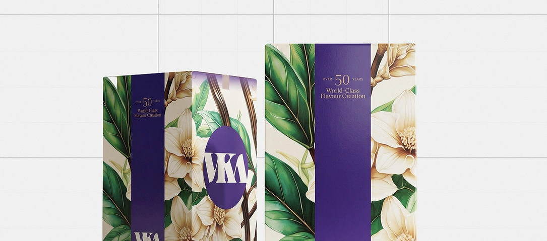
Packaging was treated as part of the brand system rather than a separate design exercise. A modular structure was created for bulk, trade, export, and future SKU formats, with repeatable hierarchy and production logic that vendors could follow.
Sales and digital structure
Brochures, sales materials, website layouts, and digital components were aligned with the same hierarchy used in identity and packaging. This gave enterprise buyers and distributors a more coherent experience instead of moving between disconnected brand expressions.
Documentation and handoff
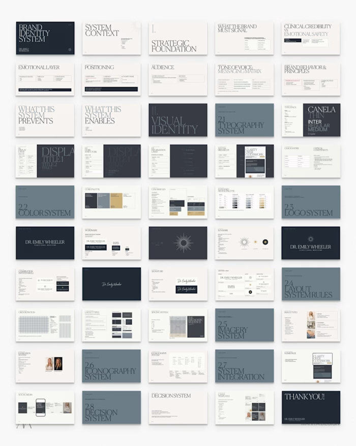
The system was documented in a 48-page living brand book built in Figma Slides, supported by 27 structured layouts and modular components. The documentation gave teams and future collaborators a working reference rather than a static presentation.
The result
The 2024–2025 VKA system consolidated several inherited brand expressions into one clearer identity across packaging, sales, digital, and vendor-facing execution.
One master brand replaced parallel legacy marks.
Packaging followed a more consistent hierarchy across formats.
Sales and distributor communication used the same visual logic.
Teams and vendors had a documented reference for future execution.
This case study documents the 2024–2025 VKA identity system, created before the later consolidation of the brand.
"Mariya is FANTASTIC! Very professional, excellent project management and communication. She hits the mark right away and truly understands design.
Thank you Mariya, and I look forward to many more projects with you!"
Barry P.
Like this project
Posted Sep 15, 2026
This case documents the 2024–2025 identity created for VKA. The work unified two established flavor businesses across identity, packaging, sales, and digital.
Likes
0
Views
6
Timeline
Jan 1, 2024 - Jan 1, 2025