
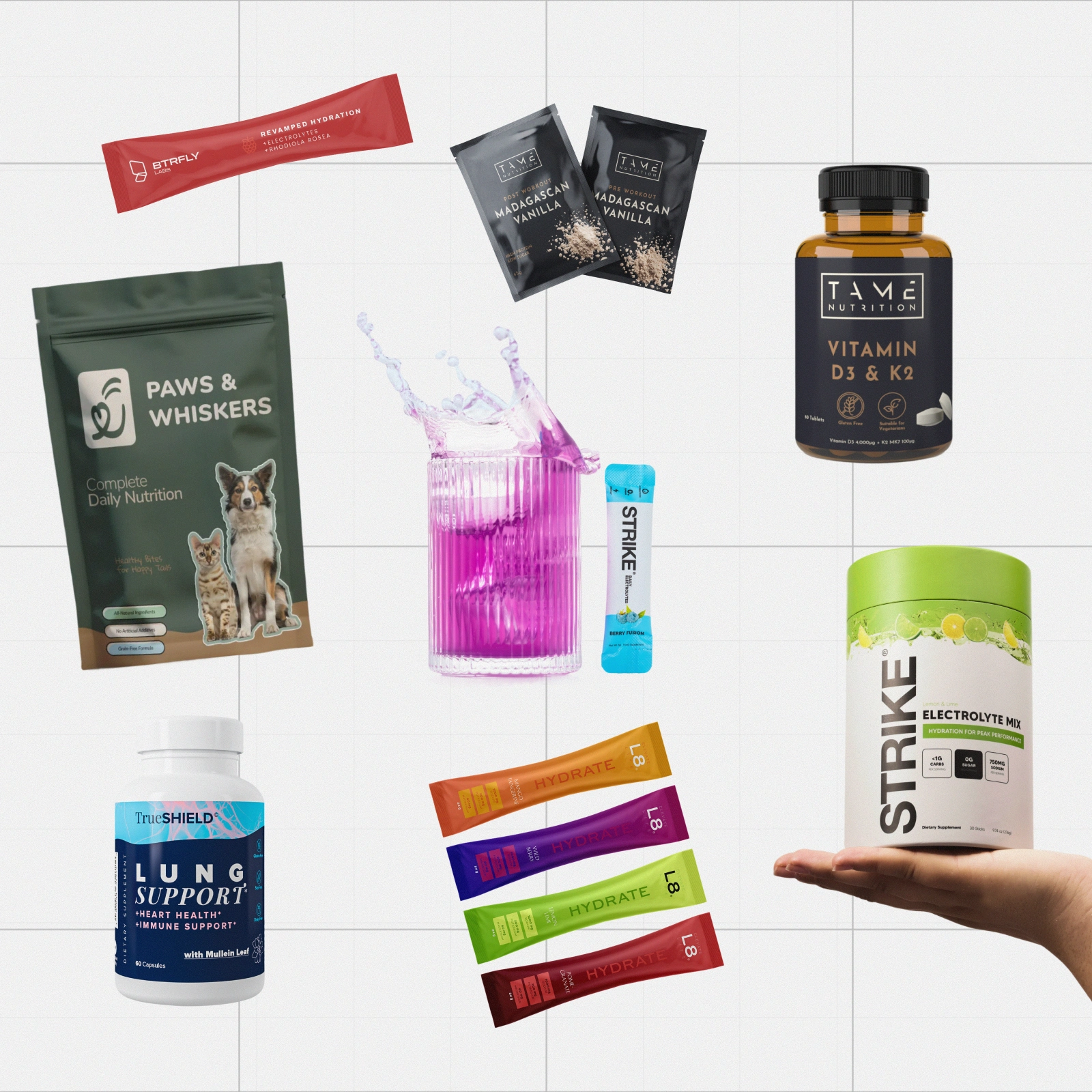
Supplement Packaging Systems: Multi-SKU Packaging Architecture
This is a multi-project case study rather than a single-client rebrand. Across supplement, hydration, functional nutrition and pet wellness work, the recurring challenge was the same: one pack could look strong, but the brand needed a system before the second, fifth or tenth SKU arrived.
I developed packaging architecture across tubs, sachets, bottles, boxes and pouches, defining what should remain consistent and what could change. The work covered master-brand placement, product hierarchy, flavour and variant logic, benefit and claim sequencing, compliance zones, colour coding, format adaptation and production-ready handoff.
The value was not simply making individual packs look good. It was creating rules that made future products easier to recognise, easier to extend and easier to produce without redesigning the range every time it grew.
Projects within the study include work for Strike Nutrition, Paws & Whiskers, L8 Life, BTRFLY Labs, TrueSHIELD, Tame Nutrition and other supplement and wellness brands.
My role: Packaging design, brand design, brand strategy and art direction.
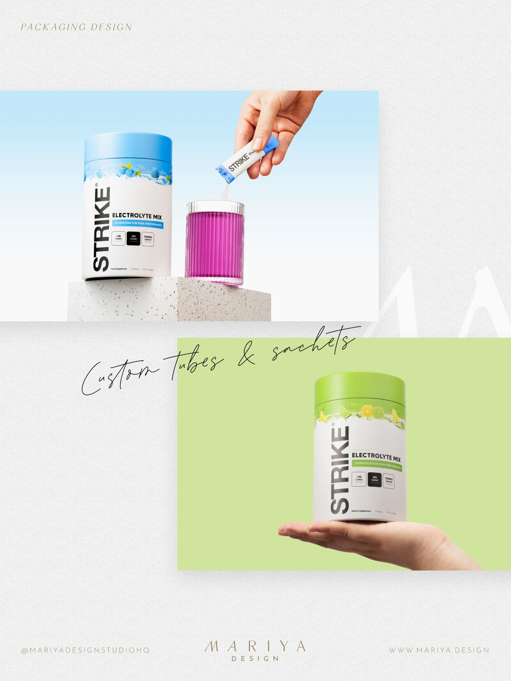
Strike Nutrition: cross-format packaging logic across tubs, sachets and hydration formats.
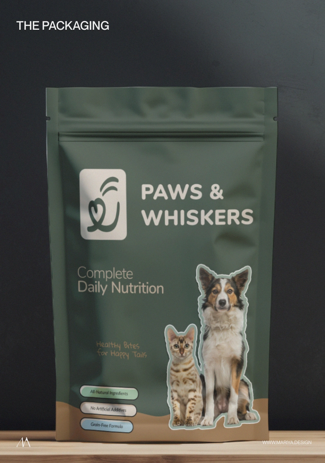
Paws & Whiskers: human-grade pet wellness packaging with a warmer, premium hierarchy.
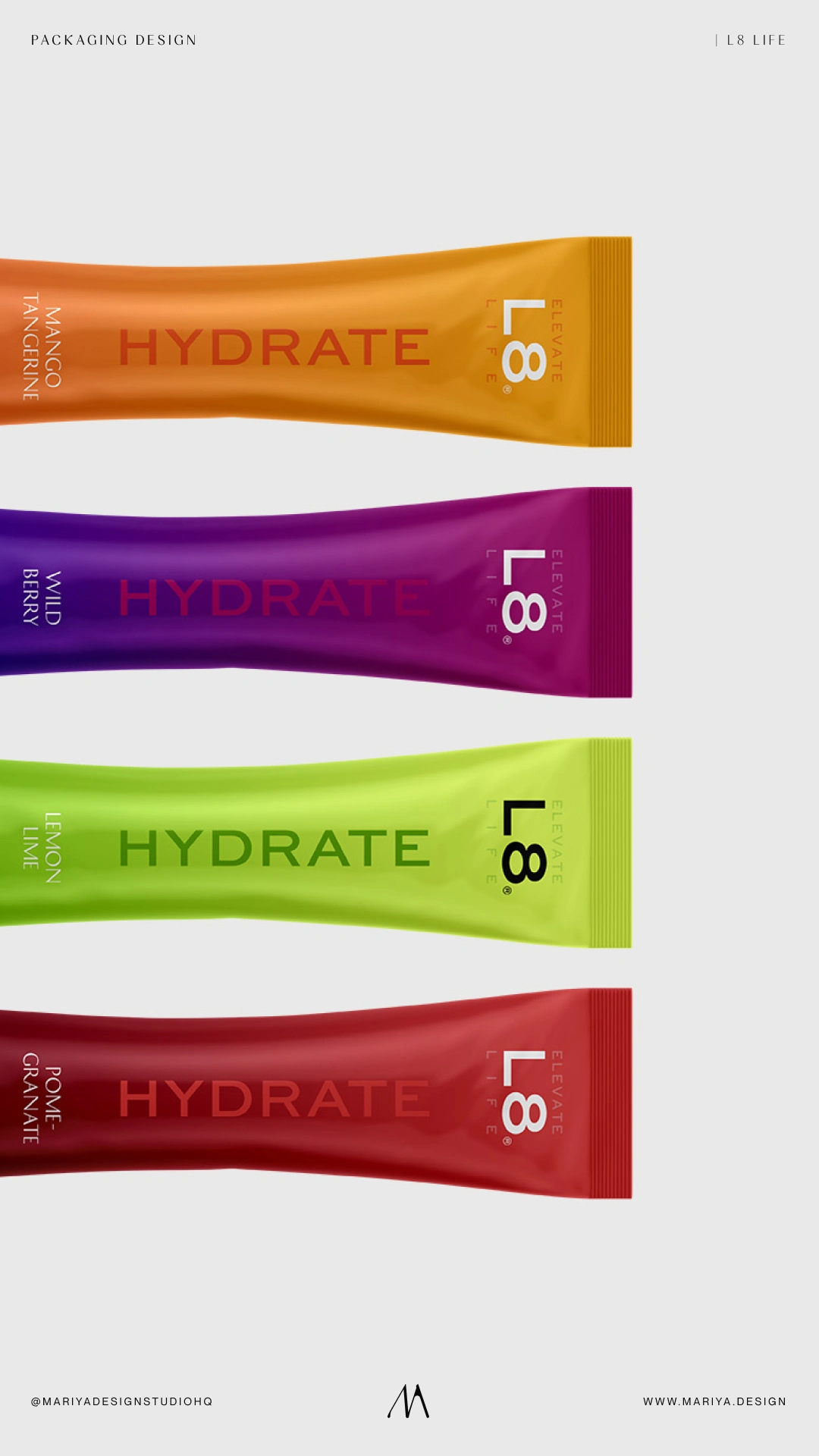
L8 Life: flavor differentiation through bold color within a controlled packaging structure.
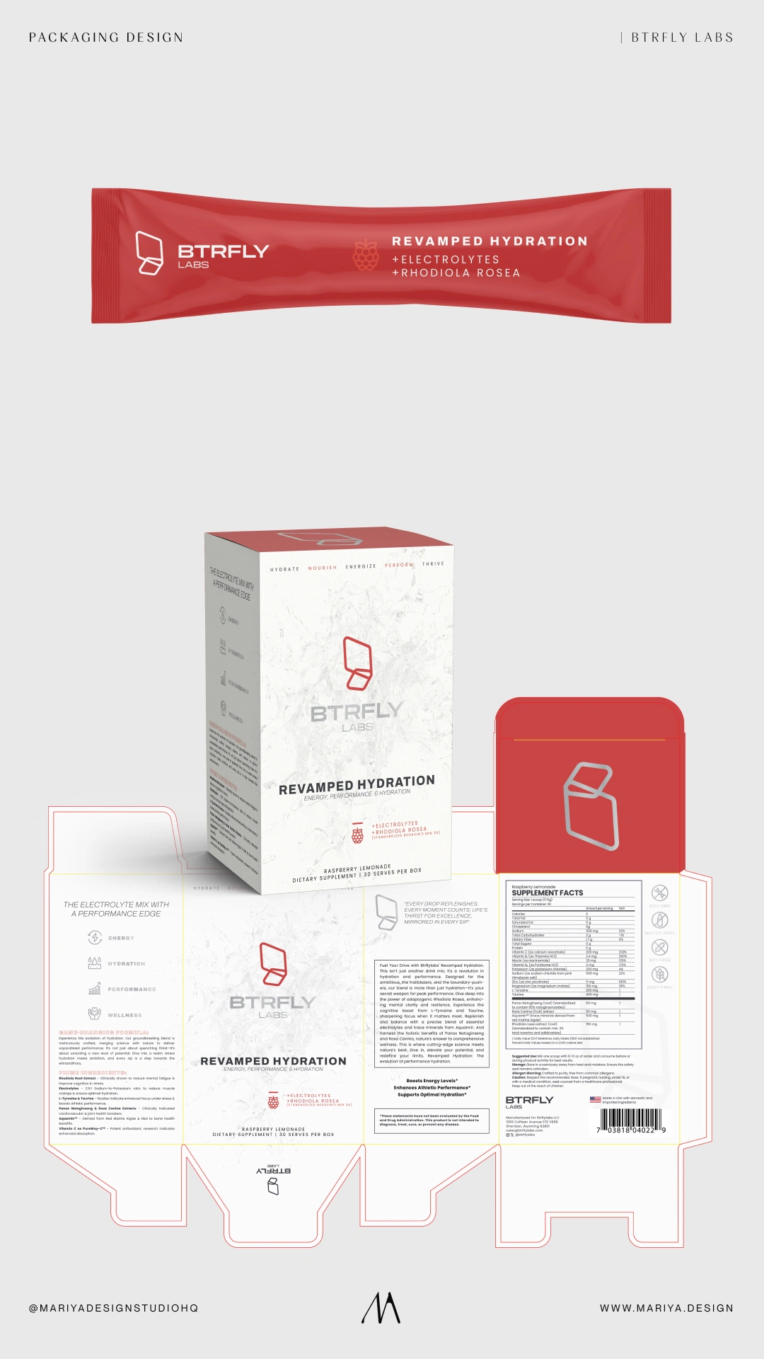
BTRFLY Labs: a coordinated sachet and box system for performance hydration.
0 likes · 14 views · Sep 15, 2026
Packaging systems built to keep supplements, hydration and wellness ranges consistent as SKUs, flavours, claims and physical formats multiply.

