
Full-Stack & AI Developer | Next.js, AI Agents
- $25k+
- Earned
- 9x
- Hired
- 5.0
- Rating
- 63
- Followers
Full-Stack & AI Developer | Next.js, AI Agents

UI/UX Designer | Framer & Video Editing
- $1k+
- Earned
- 3x
- Hired
- 5.0
- Rating
- 35
- Followers
UI/UX Designer | Framer & Video Editing


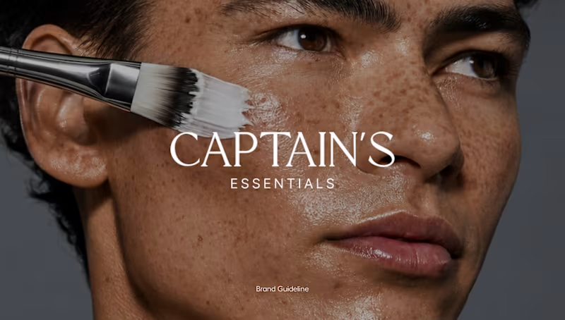


Brand, web and digital products for ambitious businesses.
- 1x
- Hired
- 5.0
- Rating
- 10
- Followers
Brand, web and digital products for ambitious businesses.
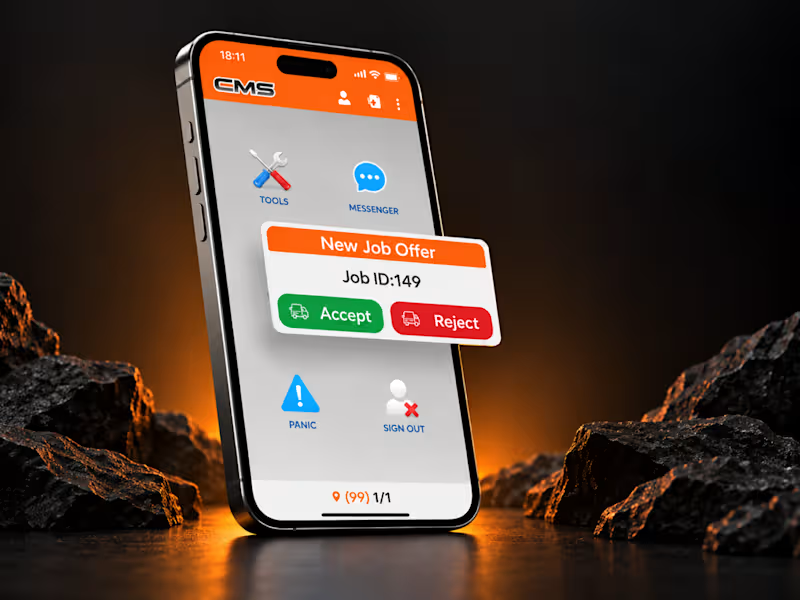
CMS Driver App | Driver Job & Pickup Flow
Designed the core driver flow for receiving jobs, checking pickup details, and progressing through active trips in a clear, fast mobile experience.
View Full Case Study → (https://contra.com/p/elPkOQbM-cms-ltd-or-taxi-and-mobility-mobile-apps?r=muhammad_hunain_ld4bdm1s)
0
196
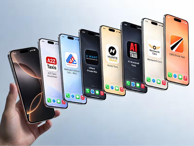

Worked on the brand and digital experience for ValetFinder, a platform that connects clients with valet providers for events, restaurants, hotels, and venues. The project included website design, marketing visuals, responsive screens, and separate dashboards for both clients and providers to manage requests, leads, profiles, and ongoing activity. The focus was on making the whole experience feel clear, trustworthy, and easy to use while keeping the brand consistent across every touchpoint.
0
299

Product Development Partner for Early Startups to Enterprise
- $5k+
- Earned
- 1x
- Hired
- 5.0
- Rating
- 63
- Followers
Product Development Partner for Early Startups to Enterprise
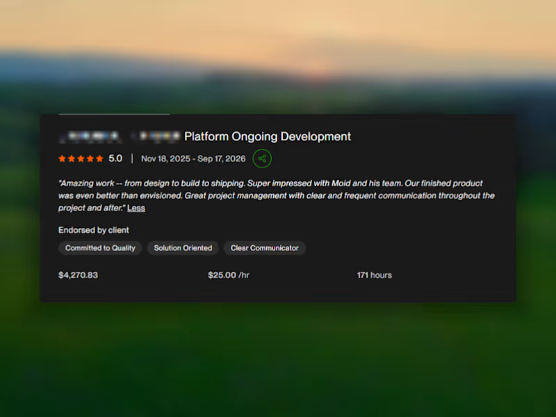
Helping a mission-driven platform raise $180,000+ through a product we designed and built has been one of those outcomes that speaks for itself.
From product strategy and UX to development and launch, we built the infrastructure behind the experience - and it’s now processing real impact at scale.
The client’s words say the rest.
$180K+ raised. Built from design to deployment.
1
292
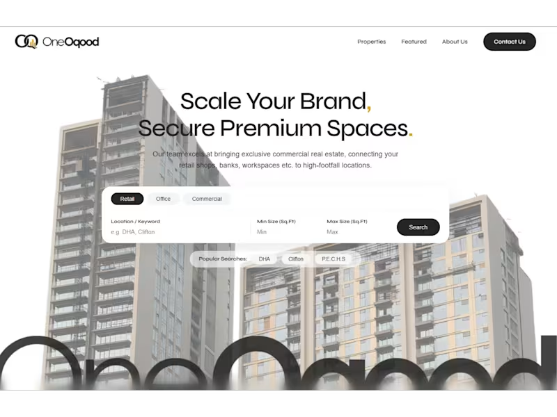
Designed & Custom-built something fresh for OneOqood - a B2B real estate enterprise.
The founder wanted an attractive first look that immediately grabs the attention of brands and organizations looking to scale their physical locations.
A multi-layered search bar with tight copy clearly conveys OneOqood’s message right from the entry point.
The footer links are clean, paired with a prominent big CTA.
Would love some comments!
Like for the final site URL and more design screenshots.
1
2
453

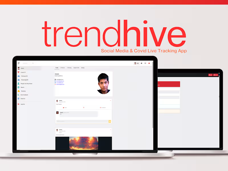

Brand, Product & Motion Systems for Funded Startups
- 1x
- Hired
- 5.0
- Rating
- 10
- Followers
Brand, Product & Motion Systems for Funded Startups
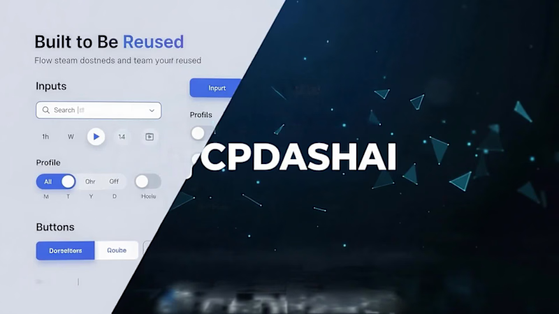
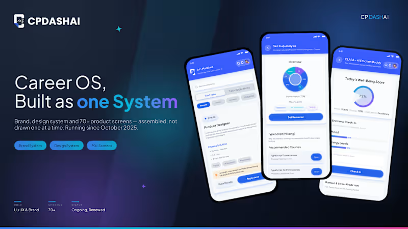
Seventy Screens, One System.
Assembled, not drawn one at a time.
A quick look at the CPDash.ai (http://CPDash.ai) product screens: 70+ interfaces, from job matching to AI interview coaching, all built from the same component system. Still growing since October 2025.
0
143

Digital, Brand & Product Designer | PS · Figma · Rive · AI
- 37
- Followers
Digital, Brand & Product Designer | PS · Figma · Rive · AI
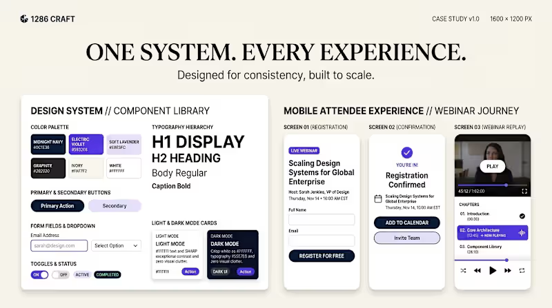
1286 CRAFT | Premium Webinar SaaS — UI/UX Concept
A self-initiated product design case study exploring a modern, conversion-focused webinar platform for creators, coaches, and educators.
The concept covers a creator analytics dashboard, streamlined onboarding and webinar creation, an interactive live webinar room, and a cohesive design system with mobile-first attendee experiences.
Design Focus: Product Design · UI/UX · B2B SaaS · User Flows · Dashboard Design · Design Systems · Mobile UX
The visual direction combines premium aesthetics, clear information hierarchy, accessible contrast, reusable interface patterns, and intuitive workflows.
This is an independent conceptual design study, not a commissioned client project or functional application.
1286 CRAFT — Designed with Intent.
0
70
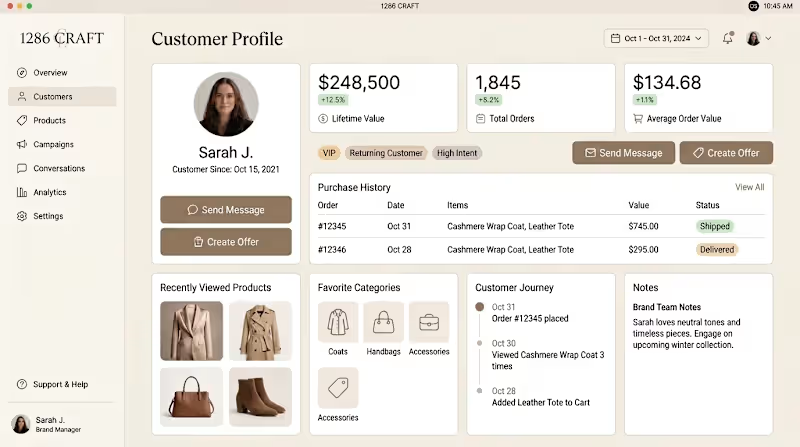
1286 CRAFT — Fashion Customer Experience OS
A connected product UI concept created in Figma, exploring how a premium fashion brand can manage commerce, customer relationships, conversations, and campaigns within one consistent digital experience.
The project includes a Commerce Overview dashboard, detailed Customer Profile, Customer Conversations workspace, and Campaign Builder. Each screen follows the same visual system with consistent typography, navigation, components, spacing, and warm neutral styling inspired by contemporary fashion brands.
The goal was to combine strong product functionality with a refined brand experience — making complex customer and commerce information easy to understand while maintaining a premium visual identity.
From tracking revenue and customer activity to understanding individual shopping behavior, managing conversations, and creating targeted campaigns, the screens were designed as one connected workflow rather than separate UI concepts.
Focused on UI consistency, information hierarchy, reusable components, product thinking, and development-ready design.
Designed in Figma.
0
75
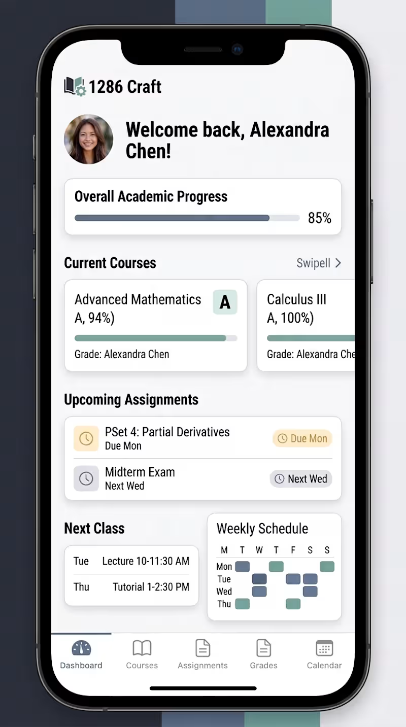
1286 Craft — Education Dashboard & Mobile Product Experience
A responsive UI/UX concept designed to explore how academic information can be organized into a clear, intuitive, and consistent digital experience across desktop and mobile.
The project includes a student dashboard, course overview, academic progress tracking, assignments, grades, schedules, course modules, and task management. Each screen was designed as part of the same connected product system, maintaining consistent typography, components, navigation, spacing, and visual hierarchy across different screen sizes.
For the mobile experience, the interface was adapted around the information students would need most frequently rather than simply scaling down the desktop layout. The goal was to keep course progress, upcoming assignments, grades, and navigation easy to understand at a glance.
This concept focuses on responsive product design, information hierarchy, design-system consistency, and creating a practical educational experience that feels cohesive from dashboard to course detail.
Designed in Figma.
2
0
111
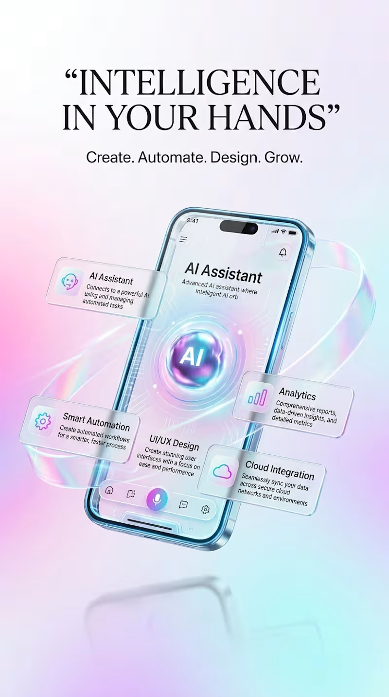
AI MOBILE EXPERIENCE — Intelligent Design in Motion
A futuristic mobile UI/UX concept exploring how artificial intelligence, automation, analytics, and connected digital tools can come together inside one seamless mobile experience.
The visual direction combines clean interface design with immersive 3D mobile mockups, floating AI elements, dynamic motion, and contrasting light and dark environments. Each scene was designed to communicate a different side of an intelligent digital workspace — from creating and analyzing to automating and connecting.
The concept focuses on:
• AI-powered mobile experiences
• Modern UI/UX design
• Smart automation workflows
• Analytics and productivity tools
• Futuristic visual storytelling
• Light and dark interface exploration
The goal was to create more than a mobile interface — a visual experience that feels intelligent, interactive, modern, and ready for the future.
Designed as an original AI-assisted creative concept for my portfolio.
0
58


Senior Product Designer | SaaS, Fintech & AI Dashboards
- 5.0
- Rating
- 25
- Followers
Senior Product Designer | SaaS, Fintech & AI Dashboards
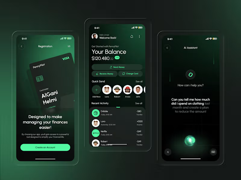
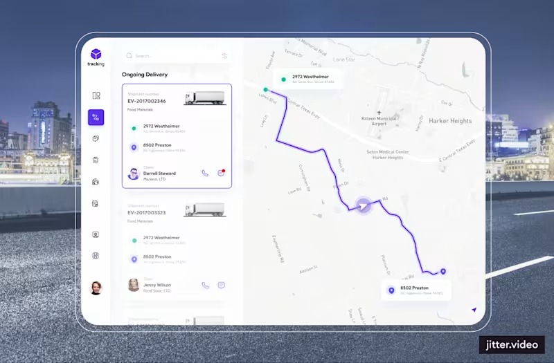
Ongoing Delivery – Logistics SaaS Dashboard UI/UX Design
A well-structured logistics dashboard plays an important role in making complex delivery operations easier to understand and manage.
This visual showcase focuses on an ongoing delivery experience within a modern logistics and supply chain management interface, bringing together dashboard UI design, visual hierarchy, and motion-driven presentation.
Key Design Focus:
Logistics Dashboard UI/UX Design
SaaS Product Design
Delivery Management Interface
Supply Chain & Fleet Management UX
Enterprise Dashboard Design
UI Motion & Interaction Design
Visual Hierarchy and Layout Structure
The goal of effective logistics software design is to make complex operational information easier to navigate, understand, and act on.
Working on a logistics platform, SaaS product, or enterprise dashboard? Let's create a better product experience.
#LogisticsDashboard #SaaSDesign #DashboardDesign #ProductDesign #UIDesign #UXDesign #EnterpriseUX #SupplyChainManagement #Figma
2
0
144
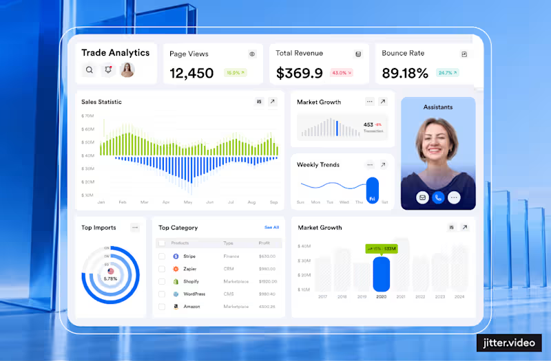
Why Good Dashboard UI/UX Design Starts With Clarity, Not Visuals
Most dashboards don't fail because of poor UI design. They fail because users struggle to understand what matters, where to focus, and what action to take next.
With 7+ years of experience in UI/UX and Product Design across SaaS, Fintech, and AI-powered products, I use these 3 questions to evaluate every dashboard screen:
1. Visual Hierarchy: What is the most important information users should notice first?
2. User Flow & Actions: What is the next logical action users should take?
3. UX Simplification: What can be removed without compromising usability or clarity?
These simple UX principles help create better SaaS dashboards, improve information architecture, reduce cognitive load, and make complex digital products easier to use.
Watch the quick breakdown above.
Which area do you find most challenging in dashboard design: 1, 2, or 3? Share your thoughts in the comments.
Follow for practical insights on SaaS UI/UX Design, Product Design, Dashboard UX, and AI-powered digital products.
#UIDesign #UXDesign #ProductDesign #SaaSDesign #DashboardDesign #EnterpriseUX #UXStrategy #Figma
0
89


Crafting Stunning Designs That Drive Results


