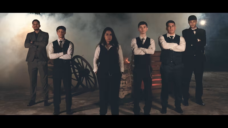
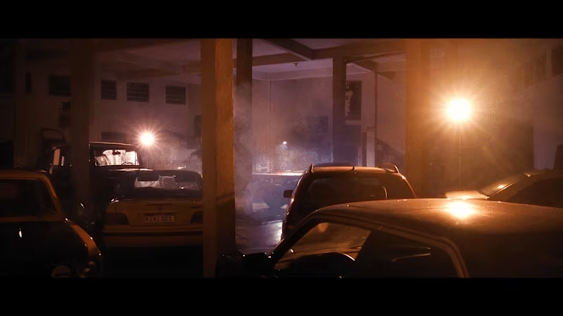
Cinematic, human-centered filmmaker & creative director.
New to Contra
Cinematic, human-centered filmmaker & creative director.
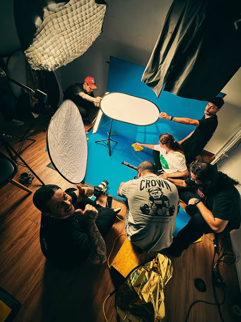
Strategy gives the story direction. Creativity gives life to it.
We believe the strongest films are built where strategy meets creativity.
At MNZS, we work across strategy, storytelling and cinematic production to turn ideas into meaningful visual experiences.
0
53
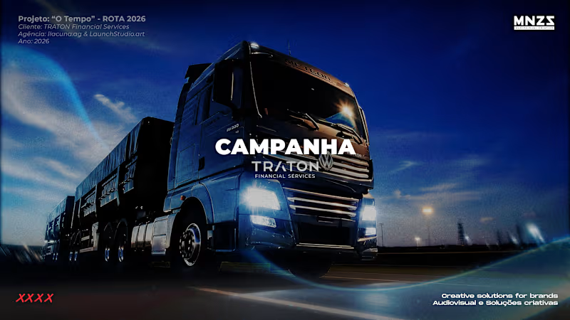
For TRATON Financial Services, the challenge was to turn the concept of time into a film that could represent the first year of the brand in Brazil.
We joined forces with @launchstudio.art (http://launchstudio.art) and @lacuna.ag (http://lacuna.ag) to develop a visual language around the idea of time as a force that moves the economy forward.
From the first concept to the final frame, we translated this idea into movement, connecting cinematography, motion design and VFX to make time feel tangible.
The result is a film that doesn't simply explain what TRATON Financial Services does.
It gives form to an idea.
1
133
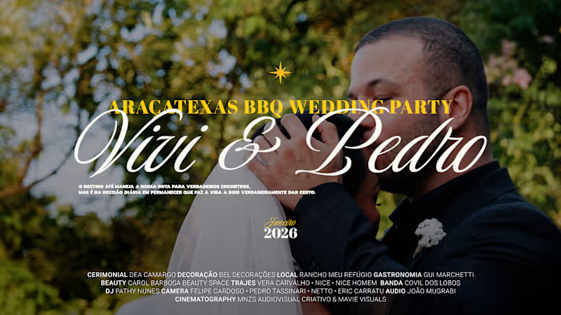
Intention, emotion, intimacy and a cinematic point of view.
The anticipation.
The people.
The details we chose.
The energy of the day.
The quiet moments between everything else.
As a couple, we experienced the day.
As filmmakers, we also had the privilege of shaping how that experience would live on.
From cinematography and sound to editing, color and final storytelling, the film was created entirely around our relationship and the atmosphere of the day.
This is the approach we bring to wedding cinematography at MNZS.
For couples who care about the story as much as the celebration.
For celebrations that deserve to be remembered beautifully, wherever in the world they happen.
1
119

Worldwide Ai Imagery for fashion, beauty & premium lifestyle
Worldwide Ai Imagery for fashion, beauty & premium lifestyle

Image direction through AI as an authorial practice.
We approach AI image-making as a space to construct atmospheres and work with runway garments and show pieces, translating their language beyond the catwalk. Clothing that challenges visual normality becomes central to the image, allowing silhouettes, volumes and gestures to exist outside conventional formats.
Textures are treated with precision and curiosity — detailed, tactile and often unexpected — while environments and set effects are used to amplify mood and narrative. Rather than seeking perfection, we focus on tension, material presence and visual character.
AI operates as a tool to extend image direction, enabling fashion, texture and atmosphere to coexist in a deliberate, expressive and contemporary visual language.
3
21
311

We’re new around here, and excited to share our latest AI-first imagery creations.
At SHEBA KARA Studio, we develop fashion, beauty and lifestyle visuals combining established image-making expertise with AI-assisted workflows.
Every image is carefully art-directed, built with intention, and grounded in real-world references.
We work exclusively with real products provided by our clients — no fictional designs, no invented items.
AI is used as a production tool to extend visual possibilities, not to replace product reality.
More work coming soon.
5
7
192

Reorganizing our portfolio and refining our workflows — with a strong focus on skin enhancement across our AI-first images.
We pay close attention to texture, tone and light, ensuring skin feels natural, nuanced and never over-processed. Every visual is built with intention and grounded in real products, digitally styled to preserve material truth.
More updates coming soon.
1
7
160


Graphic designer and Art Director +8 years of experience.
- 1x
- Hired
- 5.0
- Rating
- 21
- Followers
Graphic designer and Art Director +8 years of experience.

Fashion Campaign Art Direction
Pátio Higienópolis is a shopping mall, located in São Paulo. Since 2022, I've been creating and developing the brand, to little by little make it closer to the fashion market.
Following the Institutional campaign of the year and the non linear stories approach, for Christmas I have developed a film an photos that makes part of one big story but without sequence. The concept was a ”Get Ready and Go” photoshoot, inspired on the Get Ready short videos adding the ”Go” part.
1
3
186

I’m not a particularly mystical person, but sometimes that world crosses my path.
Not long ago, I had the opportunity to take a Design class where we were challenged to create our own version of a Major Arcana Tarot card, choosing both the card and a design style to represent it.
The Sun has always held a significant place in my life—not just as a concept, but as a tangible physical presence—so the choice was easy. From there, I had no doubt about choosing Art Deco as the primary style, as it evokes the same feeling in me that the Sun does: absolute passion.
My final design was built from an illustration created in Illustrator and refined in AI: a stained-glass window that captures the light passing through it and radiates it back out into the world.
9
27
866

[part 2] Old but Gold Project
I published part of this series last week and feel I need to share a bit more of it. It’s a project where I decided to create unique hand-lettered designs for my favorite types of wine. After sketching them, I vectorized the designs and added illustrations, along with the finishing touch: a painting of grapes created with acrylics on canvas. If you enjoy themes related to drinks, keep an eye out for upcoming posts :)
#typography #typedesign #branding
1
4
188

This is an Old But Gold Project :)
I enjoy creating work in series.
At some point in the past, I decided to create hand-lettered designs for some of my favorite types of wine.
I started with simple hand-drawn sketches on paper and later developed them into vector graphics. Then, I created Art Deco-inspired posters for each of them. I also painted the grapes myself, using acrylic paint on canvas.
This is one of them, let me know if you’d like to see the others :)
6
19
839


AI Creative and Digital Designer
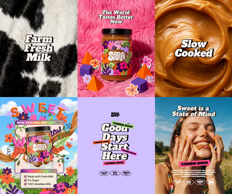
Brazilian Sweet 100% AI Brand and Visual Design
Today, it's almost impossible to think about design without thinking about AI. Recently, I joined a @CapCut Design Studio challenge in other platform where the goal was to create an entire brand and campaign using only the platform.
I was skeptical at first and expected limited results, but I committed to the process and intentionally stepped away from my usual workflow.
The images below showcase part of the final campaign and reflect how AI supported different stages of the project as a creative partner.
Concept: 90% AI
Logo: 100% AI
Color Palette: 70% AI
Product Stills: 100% AI
Campaign Posts: 50% AI (AI assets combined with manual art direction and composition)
5
370
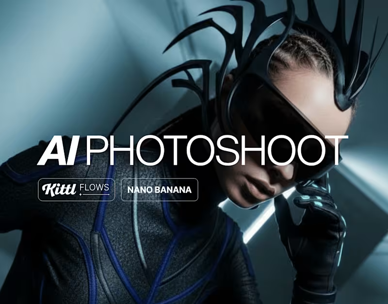
In addition to being a creator and Kittl platform expert, I’ve been actively using the system for both personal and client projects since last year, diving deeply into the platform’s integrated AI tools and capabilities.
To be honest, even though I’ve previously worked with Motion Design, Video Editing, and even Photography, this side of the creative process was never really my strongest skill nor something I particularly enjoyed professionally. However, ever since @Kittl introduced video workflows inside Kittl Flows, I’ve started creating templates there, and it has been an incredibly interesting journey so far.
Especially with the latest briefs released. These are some of the video and templates I created this week, and I hope they’ll soon be published in the library.
2
329


Product Designer, UI Designer, AI Content Creator
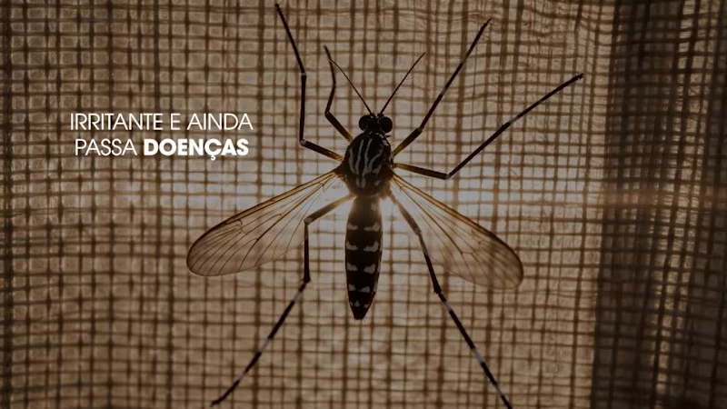
SBP — "Ação Magnética" | Animatic 01
First animatic in the SBP Season 26/27/28 campaign (client: Sara Lee), produced end-to-end with generative AI, from concept to animatic delivery, starring actress Giovanna Antonelli.
Pipeline: Concept > Storyboard > Animatic > Animation
Tools: Seedream 5 Pro (stills), Midjourney (reference exploration), Seedance 2.0 and Minimax (video animation), Photoshop (post-production)
"Ação Magnética" centers on dengue mosquito protection, built around a signature protective dome VFX that expands to shield Giovanna and her family — from the initial mosquito macro shot through product application to full-family coverage.
Character fidelity to Giovanna Antonelli, product packaging accuracy, controlled dome VFX language (soft iridescent shell, never blue-tinted or cold), and film-accurate cinematography (Sony A1 + 35mm f/1.2 for human scenes, 100mm macro f/2.8 for insect detail, Kodak Ektar 100 film look) were all achieved through AI generation. Seedance and Minimax were tested scene by scene for animation, each performing better on different shot types — while Seedream 5 Pro delivered the strongest concept stills across the animatic.
Scope: concept development, script breakdown, still generation, I2V animation, and end-to-end creative direction.
0
112
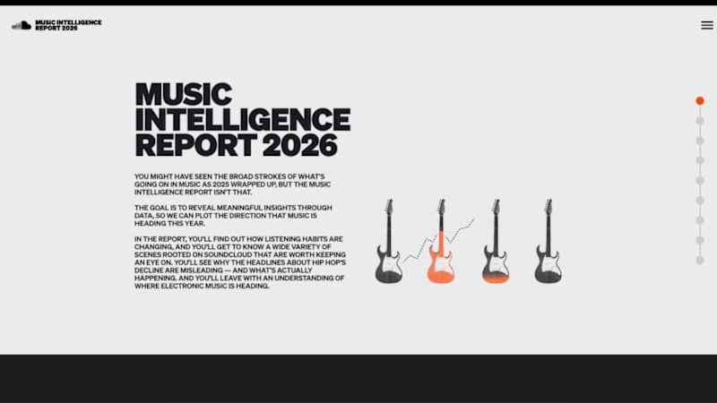
From Xerox-inspired print to an interactive digital experience.
What happens when you take a printed music report full of personality and bring it to life on the web?
That was the challenge behind SoundCloud’s Music Intelligence Report 2026: turning a bold, print-inspired editorial piece into a digital experience that feels just as distinctive, tactile, and engaging as the original.
From the Xerox-inspired textures and expressive layouts to the animations, transitions, navigation, and interactive timeline, every detail was designed to make the experience feel alive — inviting people to explore, discover, and enjoy the content at their own pace.
I designed the experience in Figma and led the development process, working to bring the original vision to life with as much fidelity as possible, down to the smallest details in spacing, motion, and interaction.
The result is an immersive, responsive editorial experience that brings music insights to life through design, movement, and storytelling.
Take a look around and explore the full experience.
Explore the Music Intelligence Report → (https://soundcloud.com/company/music-intelligence-report-2026)
Role: Digital Product Design, UI/UX, Interaction Design & Development Direction
1
3
159
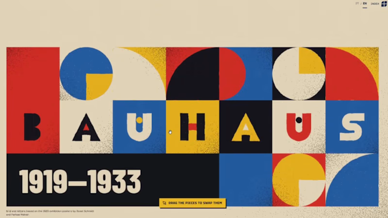
Who Closed the Bauhaus? — An Interactive Editorial Experience
What happens when design becomes a threat to political power?
Who Closed the Bauhaus? is an independent editorial web project exploring the history of the Bauhaus, one of the most influential design schools of the 20th century, and the political persecution that led to its closure under Nazi Germany.
Through historical research, visual storytelling, and an immersive digital narrative, the project examines the relationship between design, ideology, and political power. It challenges the idea that design exists outside its social and political context, inviting visitors to look beyond aesthetics and understand the forces that shape visual culture.
The project brings together editorial content, historical references, and digital design to make a complex chapter of design history accessible and engaging.
The central question is simple: who closed the Bauhaus, and what does that history tell us about design and society today?
Explore the project: https://quemfechoubauhaus.com.br/en/
8
8
332

Creative Producer • AI Filmmaker • Storyteller

GLITCH VERSE
Social Brand Identity & Editorial Content System
Glitch Verse is an editorial platform exploring artificial intelligence through audiovisual creation, visual culture, VFX, sound, authorship, and creative direction.
More than a social media identity, the project was developed as a complete communication system—combining concept, visual language, art direction, typography, color palette, analog textures, editorial layouts, and adaptable content formats.
Its central statement, “Direction Before the Prompt,” expresses the brand’s core belief: AI can expand creative possibilities, but intention, authorship, visual knowledge, and human decision-making remain essential.
The visual identity draws from unconventional 1960s and 1970s science fiction, analog technology, CRT screens, archival imagery, spectral color, and cinematic composition. The result is a visual universe that feels like a recovered fragment from a film that may never have existed.
The system was designed to work across carousels, static posts, Reels, video content, manifestos, educational pieces, critical analysis, and visual experiments—maintaining consistency while allowing each format to serve a different editorial purpose.
Glitch Verse does not present AI as a shortcut to create faster. It presents AI as one part of a broader creative process, where direction gives meaning to possibility.
The machine generates possibilities.
The author decides what deserves to exist.
0
34

This 30-second branded film explores the Sacred Feminine through the symbolism of fire, water, earth and air. The creative direction transforms each element into a visual expression of strength, intuition, transformation and freedom. Developed with cinematic storytelling, AI visuals, editing and sound design, the project was designed to create an emotional, memorable and visually striking campaign.
0
48

Branded content featuring MMA fighter Luana for a sports equipment brand. The project combines cinematic visuals, intense movement and strong editing to highlight performance, discipline and the power behind every impact.
0
38

Developed a complete visual identity system for Eixo Criativo, combining clean geometry, editorial layouts and a modular graphic language. The project was designed to scale across digital platforms, presentations, social media, printed materials and audiovisual communication while maintaining a strong and recognizable visual identity.
0
39

Filmmaker and photographer for brands