Projects in Rabat-Salé-KénitraProjects in Rabat-Salé-KénitraI spent three weeks trying to make a website look boring on purpose
Here's a thing nobody tells you about designing for finance: almost every VC and private equity site looks like it was made by the same person. Dark hero section. Gradient mesh in the background. A stat counter that ticks up when you scroll. A stock photo of four people in a glass conference room, all laughing at something off-camera that clearly wasn't funny.
I know this because I looked at probably 40 of them before I started Stills.
And at some point I stopped taking notes on what to do and started taking notes on what to avoid. That list got long fast. No gradients. No drop shadows. No "trust badges" made of client logos in grayscale. No carousel testimonials with five-star icons, because nobody buying a $50M fund stake needs a Yelp rating to feel confident.
What I kept coming back to was: none of this actually looks like money. It looks like a SaaS company borrowed a suit.
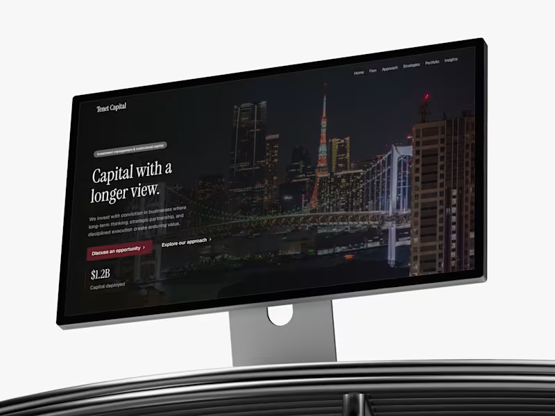
So I asked myself a dumb-sounding question — what does an actual institution's printed material look like? Not their website. Their annual report. Their LP deck. Their internal memo. And the answer was obvious the second I framed it that way: serif headlines, generous whitespace, almost no color, typography doing all the emotional work instead of visual effects. Nobody at a family office is impressed by a hover animation. They're impressed by restraint.
That became the whole design brief. One serif for headings — Source Serif 4, because it reads institutional without reading old. One sans for body — Geist, clean and quiet. Two colors, full stop. Canvas and Ink. Every single hierarchy decision made with opacity instead of a new color, a new shadow, a new border. If I found myself reaching for a gradient to fix a section that felt flat, that was a sign the layout was wrong, not the palette.
The hardest part wasn't building it. It was resisting the urge to add things. Every "just one more effect" instinct I had, I killed. A slideshow here. A cursor trail there. All cut. The version that shipped is the version with the least in it, and that took longer to get to than the version with the most.
I called it Stills — because a still frame doesn't need motion to hold your attention. That was the whole bet.
It's live now. 14 pages, full CMS for portfolio companies, leadership, and research notes, built for VC funds, private equity, family offices, wealth managers — anyone whose website needs to say "we've been doing this since before you were interested in it" without saying it out loud.
If you design in this space, or you're building something in fintech/wealth/institutional finance and every template you've found looks like it's trying too hard — take a look: https://www.framer.com/community/marketplace/templates/stills/
Curious what other designers in here are doing to make finance and institutional sites feel less like generic SaaS. Feels like an underbuilt niche. Wanting to combine one of my interests, building custom mechanical keyboards, with my pursuit of learning new web technologies such as Vue.JS, Typescript and Cypress, I decided to take on the challenge of building a fully fledged web store with the most important core functionalities.
Customers can enjoy a minimalistic and responsive design on desktop and mobile devices, a simple e-commerce flow, a robust, refresh persistent shopping cart and fast loading times, due to client side form validation and optimized image content.
Shop owners can easily add new products through the products file. Subsequently, product category boxes, product pages, page routes and SEO metadata are created automatically and components styled dynamically.
"Happy" and "unhappy" customer purchase flows have E2E tests, the navbar has implementation tests and the cart some component tests to gain a small impression of Cypress's abilities. Produced high-quality short-form and promotional videos with a strong focus on storytelling, pacing, and visual impact. Each project was edited to maximize audience retention through seamless transitions, cinematic color grading, motion graphics, dynamic captions, sound design, and platform-specific optimization. The result is engaging content tailored for Instagram Reels, TikTok, YouTube Shorts, and marketing campaigns.