The network for creativity
Join 1.25M professional creatives like you
Connect with clients, get discovered, and run your business 100% commission-free
Creatives on Contra have earned over $150M and we are just getting started
Back to feedPost

A Social Media Strategy deck template I created for one of my partners. How would you rate it out of 10?
presentationdesignvideoMarketing StrategyPresentation DesignSales Development RepresentativeGoogle SlidesMicrosoft PowerPointPrezi


The network for creativity
Join 1.25M professional creatives like you
Connect with clients, get discovered, and run your business 100% commission-free
Creatives on Contra have earned over $150M and we are just getting started




Related posts

meet my first draft of a video edit for A TIGER CUB, founded by eric, who's a young man with a monumental & meaningful goal: he's committed to showcasing the beauty of culture in community through 100 experiences in atlanta. this is all footage from the dragon boat festival, not captured by myself (shoutout to kadin), but retold through glimpses of the variety the event offered to attendees & eric's participation through storytelling & crafting at his vendor booth!
come rain or come shine, when people show up to support one another, magic happens.


The community-focused story feels authentic.

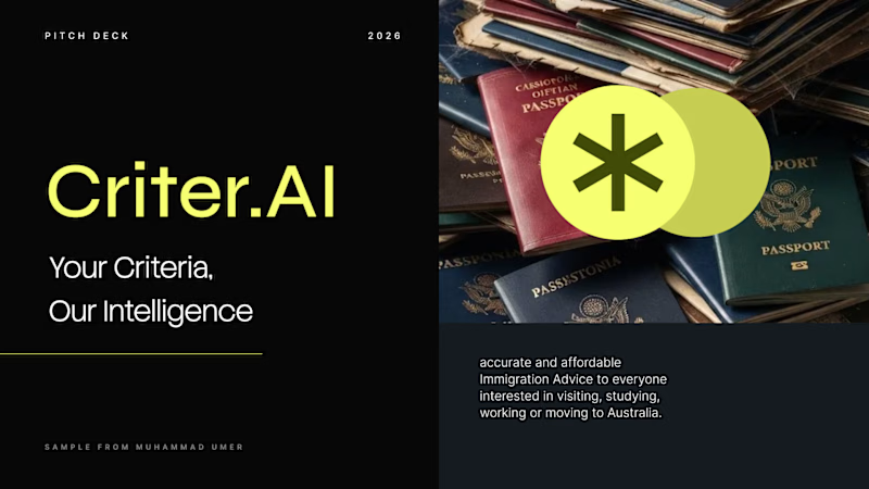
Criter.AI: Pitch Deck Cover, Two Design Directions
For an AI immigration advice platform serving Australia, I explored two cover directions to test how tone changes perception.
Direction 1, Olive gradient: warm, human and trustworthy, with a rounded image card and gold accents.
Direction 2, Dark and neon: high contrast, modern and investor-ready, with a bold split layout.
Both keep the brand mark, the tagline "Your Criteria, Our Intelligence" and the hero imagery, so the difference is purely in the design language.
Scope: pitch deck cover design and visual direction
Tools: Figma, PowerPoint, etc.
Available for pitch decks, presentations and brand design. Open to new projects.
Contra tags: , Presentation Design, Graphic Design, Branding, Startup Design
3 voted
50%

3 voted
50%
6 votes
Closed


Motion Graphics for a new product launch.


the freeze protection card is a nice touch. is this for a real app or a concept?