Freelance Visual Designers in QuebecFreelance Visual Designers in Quebec
Designing Impactful Brands for Innovators & Change-makers
$1k+
Earned
1x
Hired
5.0
Rating
22
Followers
Designing Impactful Brands for Innovators & Change-makers
Product Designer for Operational Workflows & Prototypes
11
Followers
Product Designer for Operational Workflows & Prototypes
Cover image for Chromatic Duel is a visual
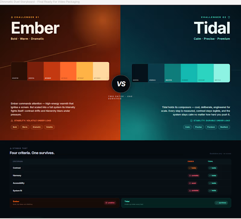
Chromatic Duel is a visual decision experience built in Wonder for the Contra x Wonder Challenge. The project explores a simple idea: Color palette selection should not only be about taste. It should survive pressure. Chromatic Duel turns two competing palette directions into a visible stress test. Ember enters as the bold, warm, dramatic direction. Tidal enters as the calm, precise, premium system direction. Instead of presenting both palettes as moodboards, the Wonder canvas frames them as a duel. The question is not: “Which one looks better?” The question is: “Which one survives?” Inside Wonder, I used the canvas to shape the full decision journey: the initial duel, the stress-test comparison, the iteration trail, the pivot in criteria, the workflow proof layer, and the final verdict. The palettes are compared through four qualitative lenses: Contrast Harmony Accessibility System fit As the system became clearer, Ember felt expressive but less stable. Tidal held together better across the interface direction, making it the stronger final choice. Final Wonder verdict: TIDAL SURVIVES. Ember is archived. I also created a Framer page as a bonus interactive wrapper. It lets visitors try challenger palettes and compare them visually against the fixed Tidal benchmark. The Framer page extends the experience, but the official build, workflow, and final decision remain in Wonder. The core memory line: The palette that survives the stress test wins. Wonder file: https://app.wonder.so/faadil-boussari/files/019f35d4-04d2-7664-afd6-bb717a9100bf Walkthrough video: Uploaded directly with this submission. Framer bonus page: https://cyan-lettuce-159672.framer.app/
1
6
342
Cover image for BRAYD: The Braided Focus Flame
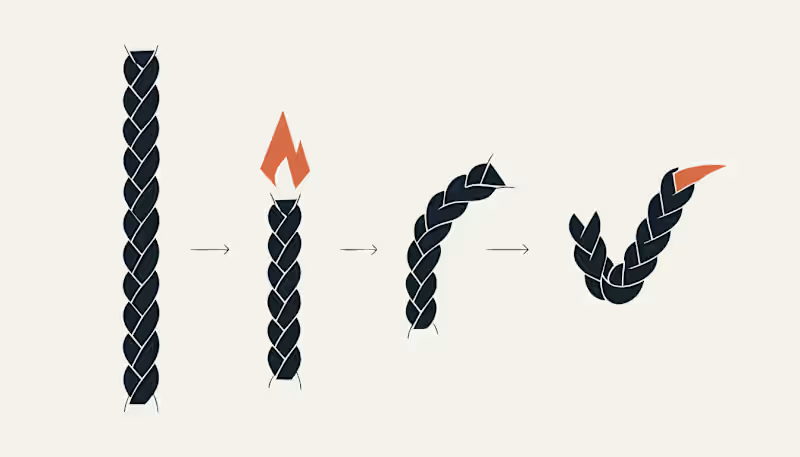
BRAYD: The Braided Focus Flame 🔥 BRAYD is an original mascot created for BURN THE TASK, a fictional productivity ritual brand built around focus, completion, and quiet discipline. Rather than designing a cute candle character, I built a full mascot system around one clear visual behavior: focused time burns into completion. BRAYD is a braided wick core inside a faceted wax body. As a task progresses, the wick burns down, the wax form changes through clear stages, and the final braided strand becomes a checkmark. The mascot was designed to stay recognizable across every touchpoint, from the custom wordmark and hero poster to the sticker system, focus ritual packaging, burn sequence, and consistency board. Every asset uses the same visual DNA: the same braided wick, the same faceted wax body, the same angular flame, and the same final checkmark. This project explores how a single mascot can become the face of a fictional productivity world by turning an abstract idea, focus, into a visual ritual. Character Brief Name: BRAYD Role: The Braided Focus Flame Personality: quiet, intense, disciplined, stubborn, focused, and encouraging without being soft. BRAYD does not rush you and does not distract you. He simply burns with you until the task is done. His braided wick represents focused effort, his faceted wax body represents pressure and progress, and his final checkmark represents completion earned through attention. Recraft Project Explore the full project here: https://www.recraft.ai/project/a75515d8-3533-42f4-9a93-9815d2f3f7e3 Applications Included The BRAYD system includes a custom name logo, hero poster, sticker pack, focus ritual packaging, burn to checkmark sequence, and a final consistency board showing the mascot across multiple moments and touchpoints. Proof of Consistency Same wick. Same facets. Same flame. Same final checkmark. #RecraftAI #CharacterDesign #MascotDesign #BrandIdentity #CreativeAI #Illustration #DesignChallenge #BrandDesign #ConceptArt #MotionDesign #GraphicDesign #MascotSystem #ProductivityDesign #DigitalArt
12
22
750
Cover image for Editorial AI: Designing the Quiet
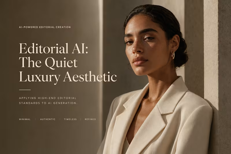
Editorial AI: Designing the Quiet Luxury Aesthetic Overview This project explores how editorial art direction principles can be applied to AI-generated imagery to create premium visual assets that feel timeless, authentic, and brand-aligned. Rather than pursuing hyperrealism or trend-driven aesthetics, the objective was to develop a visual language rooted in restraint, sophistication, and intentionality. The result is a collection of AI-generated editorial imagery designed to embody the principles of Quiet Luxury. The Challenge A significant portion of AI-generated content is instantly recognizable due to over-stylization, excessive detail, artificial lighting, and unrealistic visual cues. The challenge was to create imagery that feels: Natural rather than synthetic Premium rather than promotional Timeless rather than trend-driven Editorial rather than purely generated Creative Direction Aesthetic Philosophy The visual system is built around the principles of Quiet Luxury: Minimalism over excess Authenticity over spectacle Texture over visual noise Presence over attention-seeking Warm neutrals, organic materials, and understated compositions establish a sense of trust, confidence, and sophistication. Visual Language The project relies on: Earth-toned color palettes Natural window lighting Soft contrast Clean compositions Intentional negative space Each image is designed to communicate calm confidence and enduring value. Technical Execution To achieve an editorial-quality appearance, generation workflows were optimized using: 85mm portrait lens simulations Shallow depth of field Controlled lighting ratios Cinematic framing Consistent styling references These techniques help bridge the gap between AI generation and professional photography. Outcome The resulting imagery demonstrates how AI can be used to create sophisticated visual assets that align with premium brand positioning. Rather than appearing artificial or trend-driven, the content functions as a cohesive editorial system suitable for luxury, lifestyle, hospitality, fashion, and personal branding applications. Key Takeaways ✅ Editorial Art Direction ✅ Premium Brand Storytelling ✅ Luxury Visual Identity ✅ AI-Assisted Creative Production ✅ Consistent High-End Aesthetics Project Outcome This project showcases my ability to translate luxury brand principles into scalable AI-generated visual systems, creating imagery that feels intentional, tactile, and commercially relevant.
0
78
Graphic and web designer crafting clean, modern design.
Senior ‍Visual Designer crafting digital experiences
New to Contra
Senior ‍Visual Designer crafting digital experiences
Illustrator & Graphic Designer
3x
Hired
5.0
Rating
3
Followers
Illustrator & Graphic Designer