Tahina Branding & Packaging
Auriane Bertil
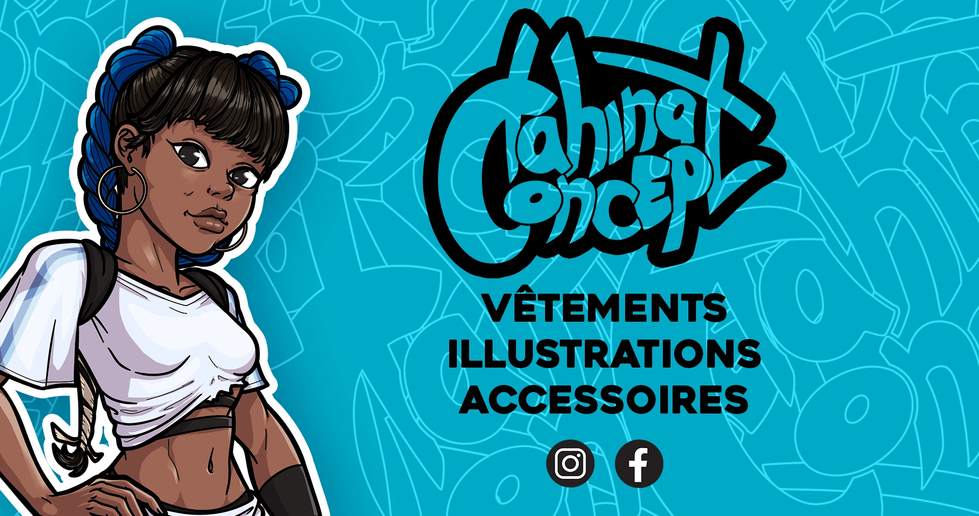
Tahina Concept approached me for a rebranding to improve visual consistency and brand recognition at pop-up events. The original branding lacked a clear direction, with inconsistent typography, imagery, and color schemes.
Through research into the client’s love for comics and cyberpunk, I developed a bold, dynamic identity that combined blue and pink for a striking color palette, and a refined logo with thick outlines for better visibility. The updated typography, including Heavitas and Shakles, complemented the modern aesthetic. Graphic elements like comic-style frames and speech bubbles reinforced the playful, youthful tone.
I applied the new branding across packaging, event banners, and product tags, ensuring the logo was prominent and easily identifiable. The rebranding resulted in a more cohesive, impactful identity that stands out at events and in social media, helping the brand connect more clearly with its audience.
Like this project
Posted Mar 25, 2025
Tahina Concept approached me for a rebranding to improve visual consistency and brand recognition at pop-up events.
Likes
0
Views
3
Timeline
Jan 27, 2025 - Feb 27, 2025