Freelancers using Adobe Illustrator in Prague
Sign Up
Post a job
Sign Up
Log In
Filters
2
Projects
People
Oleksandra Marchenko
pro
Prague, Czechia
Product Designer 🥷 SaaS Mobile App Fintech UI UX
$25k+
Earned
3x
Hired
5.0
Rating
1.1K
Followers
Top
Follow
Message
Product Designer 🥷 SaaS Mobile App Fintech UI UX
13
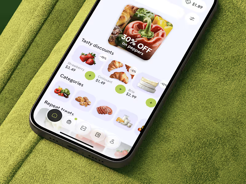
🥐 Product design for food delivery app | Hyperactive
13
80
12
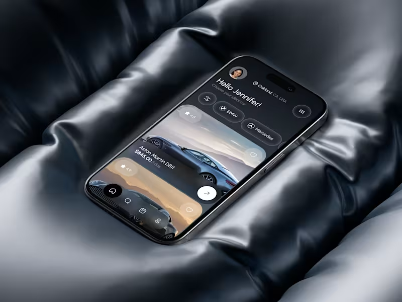
🚙 Mobile app design for car rental service | Hyperactive
12
29
9
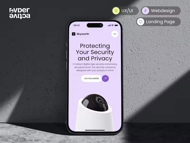
HYPERACTIVE | CAMERA | WEBSITE
9
42
10
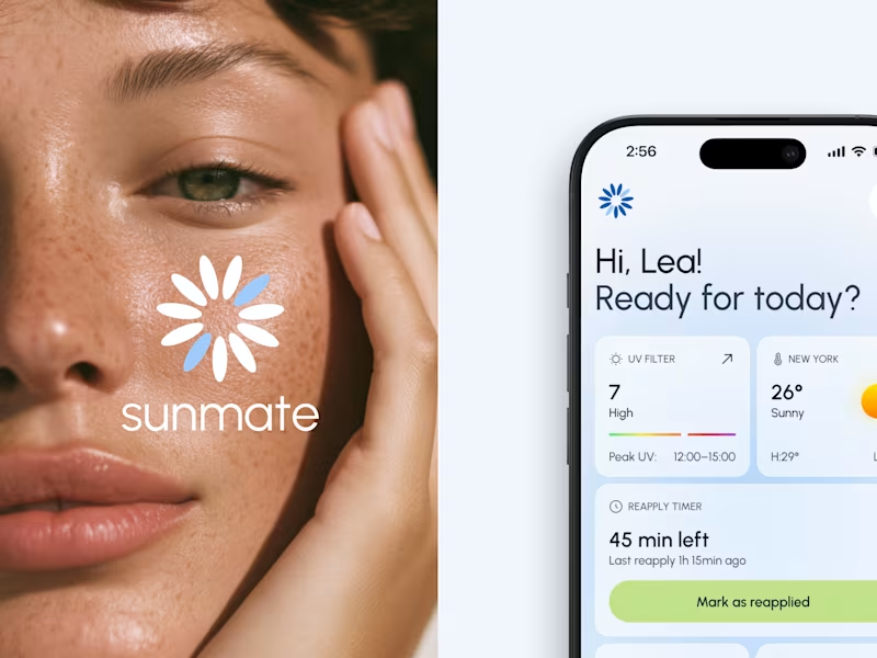
HYPERACTIVE | SUN PROTECTION | MOBILE APP
10
31
Adobe Illustrator
(8)
Follow
Message
Lucie Bajgart
pro
Prague, Czechia
Your shortcut to a brand that connects meaning with feeling.
$50k+
Earned
7x
Hired
5.0
Rating
276
Followers
Follow
Message
Your shortcut to a brand that connects meaning with feeling.
6
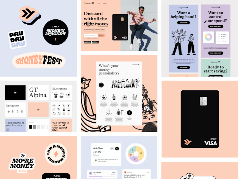
Brand assets & Website for a Fintech company
6
101
2
Brand design for a global fintech app
2
51
3
Brand design for investing app
3
61
59
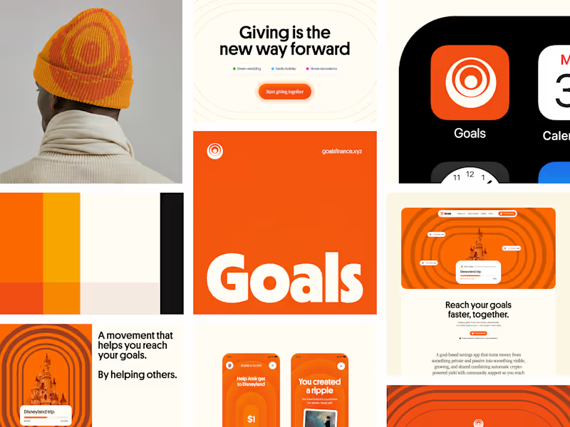
Brand and App Design for Crypto Social Savings App
59
1.1K
Adobe Illustrator
(3)
Follow
Message
Creative Mints
pro
Prague, Czechia
Award-Winning Brand, Web & 3D Design for Startups
$25k+
Earned
8x
Hired
5.0
Rating
149
Followers
expert
Club
Follow
Message
Award-Winning Brand, Web & 3D Design for Startups
2
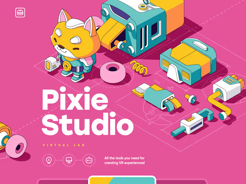
Pixie / Design Lab
2
30
0
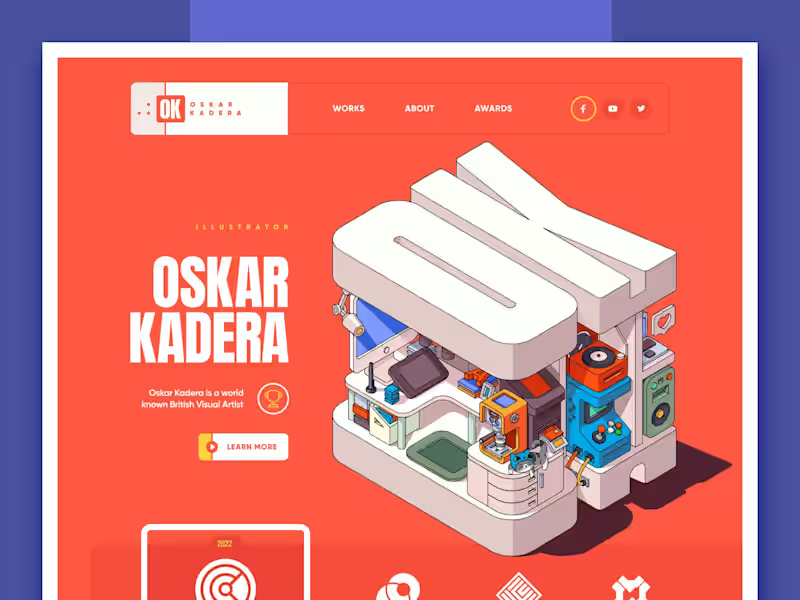
Portfolio design
0
19
1
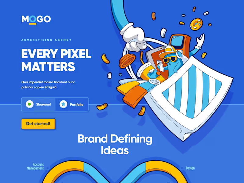
Mogo: Advertising agency
1
29
0
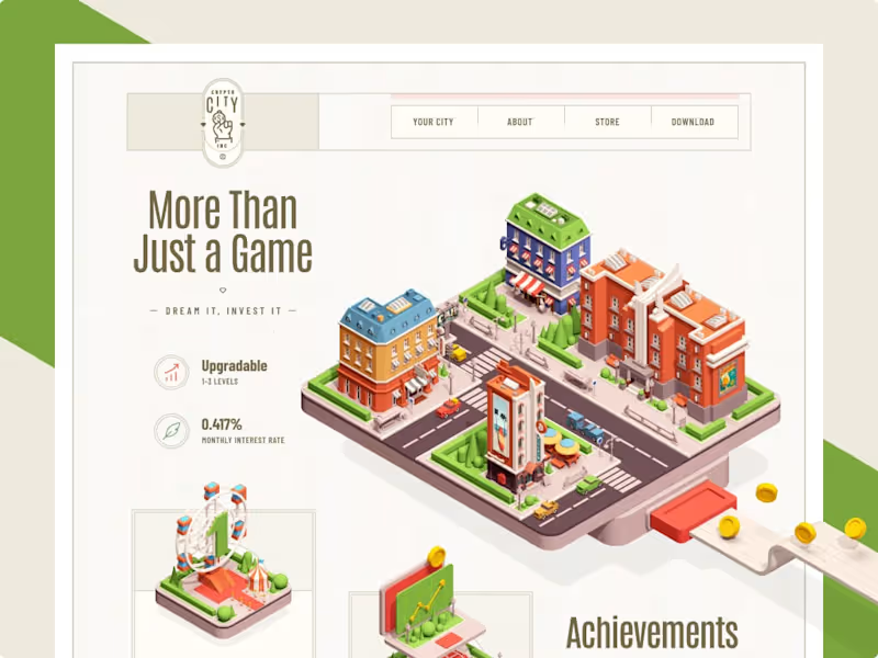
Crypto City / Web site design
0
11
Adobe Illustrator
(9)
Follow
Message
Alice Razumova
pro
Prague, Czechia
Strategic Brand Designer for Ambitious Founders
$5k+
Earned
5.0
Rating
114
Followers
expert
Follow
Message
Strategic Brand Designer for Ambitious Founders
2
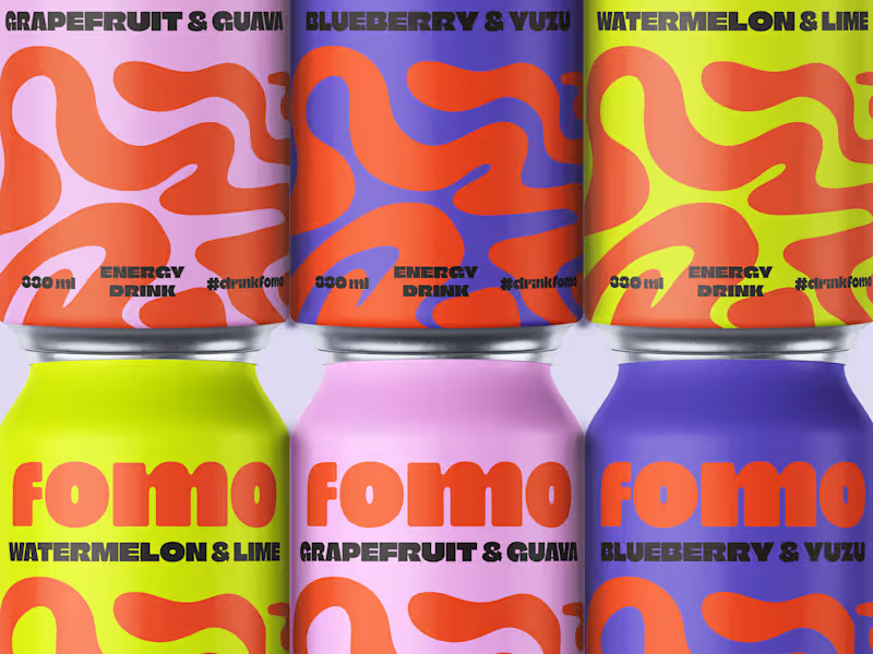
FOMO Brand Identity Design
2
60
1
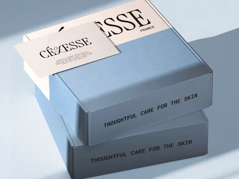
Célesse Brand Identity and Packaging Design
1
16
128
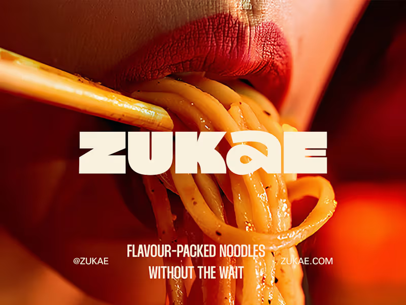
#contraquest week 2, here we go! The project I’m proud of is the brand identity I created for Zukae, an instant cup noodles brand. Before this project, I was still exploring my visual style. Zukae gave me the space to fully lean into it and be bolder with my design choices. Full case study here (https://contra.com/p/A7FONOFY-zukae-brand-identity-design)😊 The project was created using my go-to tools: Illustrator and Photoshop. In 2026, I'd love to work with clients who have a strong vision for their business and want a brand identity that’s as ambitious as they are.
57
128
3.2K
80
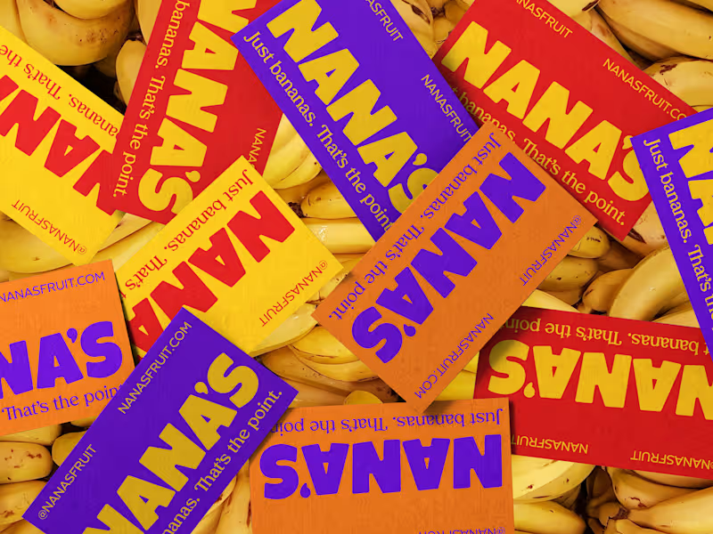
Thank you for all the love on the Nana’s brand 🍌 Grateful for the support, and and a big thank you to Contra for featuring the post! It means a lot, especially as a new member of the Contra community. Sharing a few more visuals from the project. Full case study coming soon😊
29
80
2.7K
Adobe Illustrator
(10)
Follow
Message
Marcos Silfa
pro
Prague, Czechia
Brand design / Art direction / Digital design / Packaging
20
Followers
Follow
Message
Brand design / Art direction / Digital design / Packaging
6
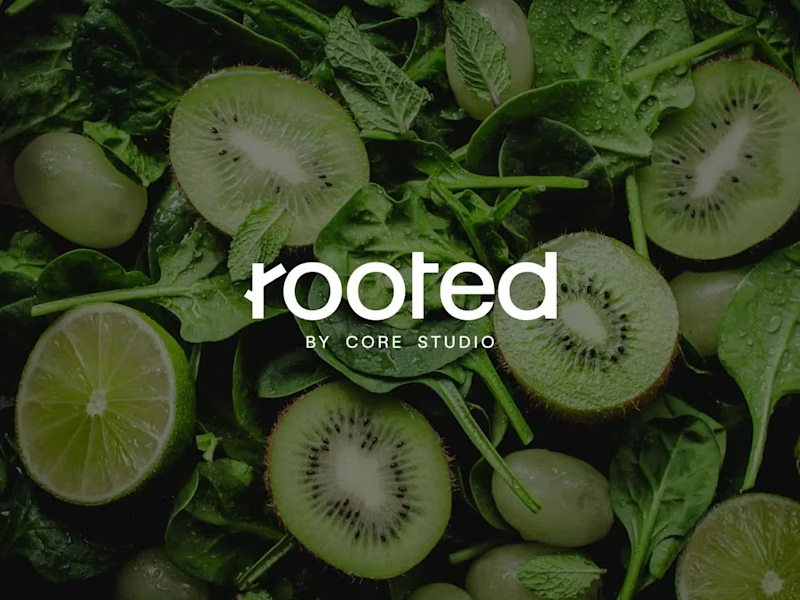
Rooted by Core Studio Logo Design Rooted is a nourishment concept developed as a sub-brand of Core Studio, a ladies-only boutique Pilates studio in Abu Dhabi focused on community and holistic well-being. The logo was conceived as a custom typographic wordmark where meaning is embedded directly into the structure. A subtle branch is integrated into the letter “R”, reinforcing the idea of growth and origin without relying on external symbols or common wellness clichés. The controlled geometry of the typography balances the organic gesture, maintaining a calm, modern, and premium tone aligned with Core Studio’s visual language. The result is a scalable and versatile logo designed to support future growth beyond smoothies into coffee, food, and retail applications, while preserving visual cohesion within the Core Studio ecosystem.
4
6
262
6
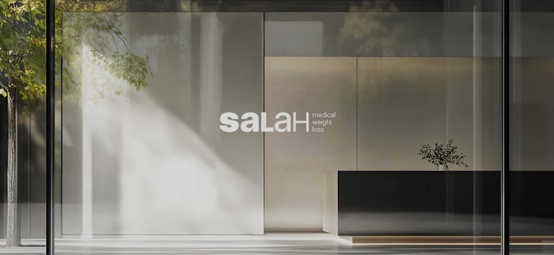
Salah Medical Weight Loss is a medical clinic specializing in physician-supervised, sustainable weight loss and long-term health management. Challenge Communicating a complex, medically driven approach to weight loss while standing apart from generic wellness clinics. Strategy Create a clear and credible visual system that translates medical care, lifestyle guidance, and long-term follow-up into trust and clarity. Identity A bold-to-light wordmark reflects the patient journey. A secondary shield symbol with a downward arrow represents health protection and controlled weight loss. Outcome Stronger medical credibility, clearer communication of services, and increased patient confidence across digital platforms.
6
6
509
3
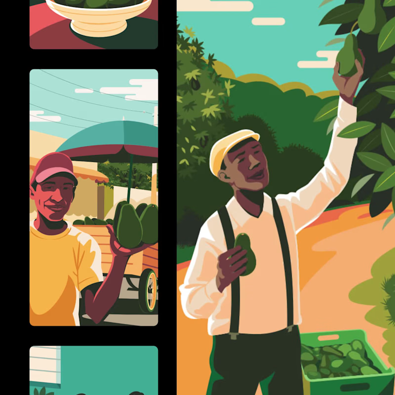
Dominican avocados brand identity system
3
35
41
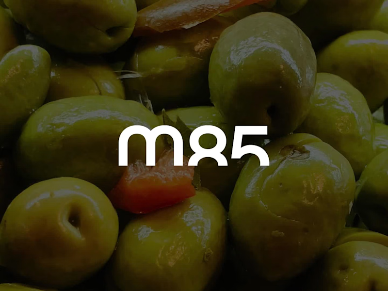
Maison 85 — Brand System What they do Maison 85 is a US-based importer and curator of premium European gastronomy. They act as a logistical and commercial bridge, representing established continental brands. The challenge Building a strong identity that supports—rather than competes with—the brands it represents. The system must integrate diverse product origins and formats under one coherent structure. The strategy A restrained system focused on structure over decoration. I implemented a dual-use logic: maison85: For institutional clarity. m85: A compact mark for operational and logistical efficiency. The result A disciplined, scalable framework designed to stay quiet so the products can speak. Design as infrastructure, not expression. #BrandSystem #VisualIdentity #MinimalistDesign #FoodLogistics #DesignStrategy
16
41
1.2K
Adobe Illustrator
(8)
Follow
Message
Anna Turchyna
Prague, Czechia
Brand Identity Designer for Growing Businesses
5.0
Rating
3
Followers
Follow
Message
Brand Identity Designer for Growing Businesses
0
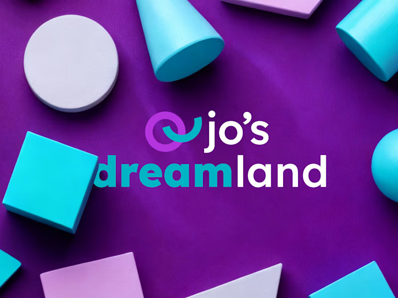
Brand Identity Design for Jo's Dreamland
0
6
0
Brand Identity Design for Marinus & Partners
0
7
0
Visual Identity Design for Aesthetic Autocare
0
10
0
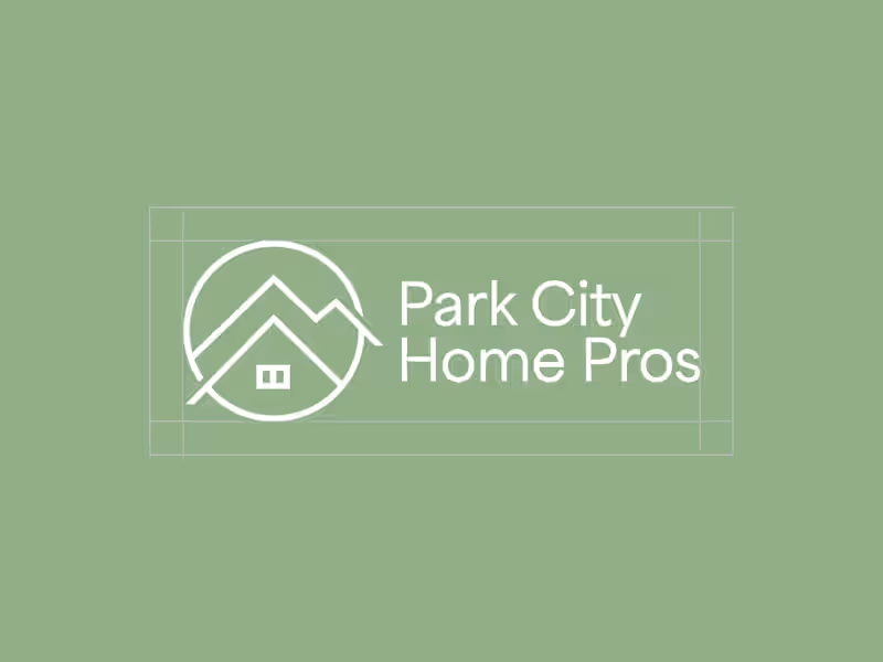
Premium Visual Identity for Park City Home Pros
0
5
Adobe Illustrator
(5)
Follow
Message
Tom Garcy
Prague, Czechia
Trusted to design what matters. Built to make you smile.
9
Followers
Follow
Message
Trusted to design what matters. Built to make you smile.
3
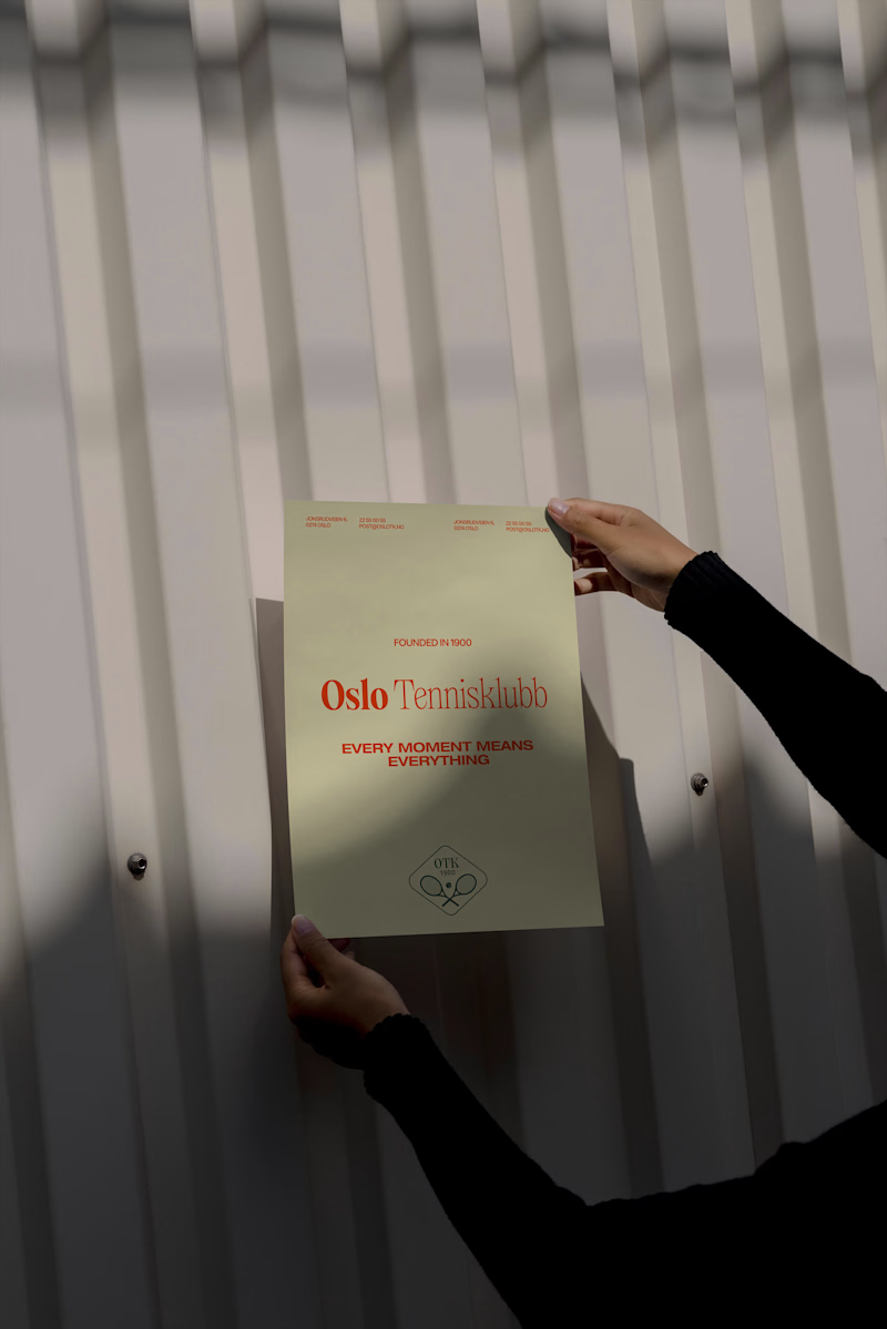
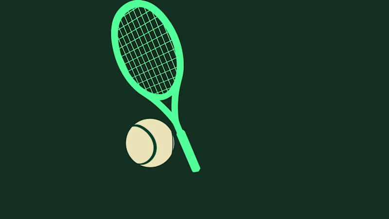
Oslo Tennisklubb (https://www.oslotk.no/) has been around for 125 years. From the beginning, we knew this had to be an evolution, not a revolution. The club's original symbol carried real emotional weight, so we preserved its essence and refined everything around it. At the same time, we had the creative freedom to build something bold enough to stand out – not just in tennis, but across the entire sports world. Oslo Tennisklubb is one of Norway's most prestigious clubs. But it's also open, human, and welcoming. A place where a Bentley owner and a 22-year-old discovering tennis for the first time share the same court – and both feel they belong. That tension became the foundation of the identity. Exclusive not by who it keeps out, but by the quality it keeps in. What started as a logo update became one of our most cherished studio projects. It required deep historical respect, and gave us room to go bold without losing sight of what matters: community, passion, and timeless quality. We're proud of what this team built together. Symbol Design: Helena Jiskrova (https://www.linkedin.com/in/h26jd/)Production: Loren Goodknight (https://www.linkedin.com/in/loren-goodknight-2383b710/)Strategy: Jakub Čvanda (https://www.linkedin.com/in/jakubcvandaprofile/)Graphic Designer: Jaydip Sakhiya (https://www.linkedin.com/in/jaydip-sakhiya-48159811a/)Web Designer: Vašek Šrámek (https://www.linkedin.com/in/vaseksramek/en/) & Tom Garcy (https://www.linkedin.com/in/tomgarcy/)Motion Designer: Dominik Budimir (https://www.linkedin.com/in/dominik-budimir-7317341b6/)Creative Director: Tom Garcy (https://www.linkedin.com/in/tomgarcy/)
1
3
111
23
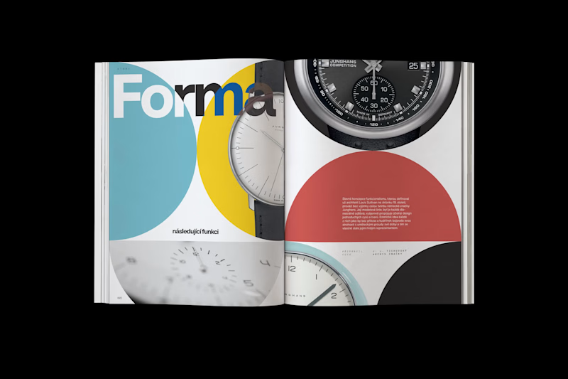
A new @ (https://www.instagram.com/garcy.studio/)garcy.studio (http://garcy.studio) project for Koscom is finally out – and today, we’re sharing a few of the designs. It was an honor to lead the art direction of Koscom’s anniversary magazine and work on 25 articles over the course of five months. We treated each article as a small piece of art. Carefully composed layouts, strong typography, and a visual language that lets the content breathe. For us, the magazine feels like a curated art collection, while the content itself is truly state of the art. Below, we’re sharing a few snaps from the magazine to show how some of the articles were designed. If you get the chance, see the magazine in person and visit Koscom. It’s a beautiful piece of work.
1
23
218
33
Oslo Tennisklubb rebranding coming soon!
1
33
326
1
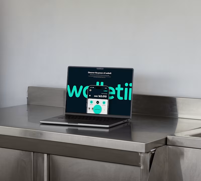
Development of walletii by Ooredoo Digital Wallet
1
18
Adobe Illustrator
(6)
Follow
Message
Katarina Gray
Prague, Czechia
Expert Packaging & Branding Designer
5.0
Rating
3
Followers
Follow
Message
Expert Packaging & Branding Designer
1
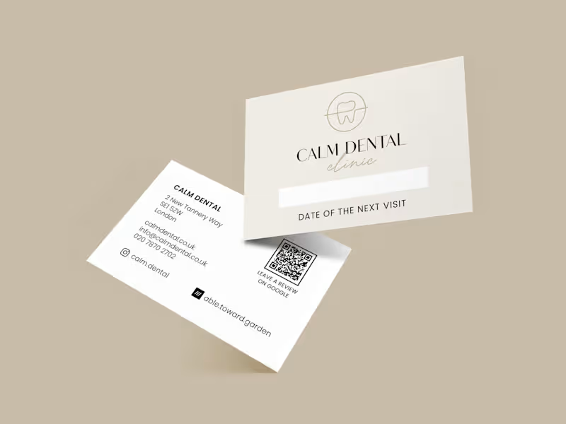
Logo and Brand Identity for a feminine Dental Clinic
1
9
1
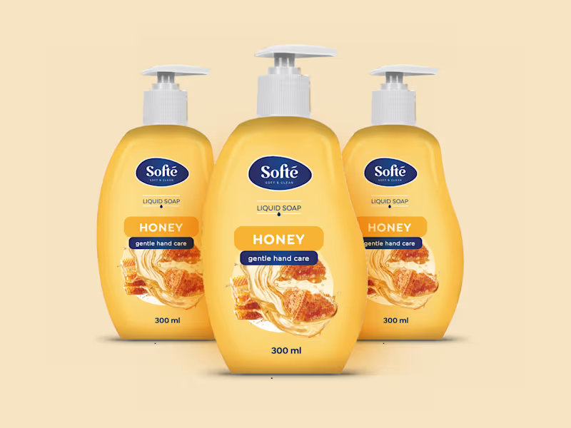
Packaging of the soap brand Softe
1
10
2
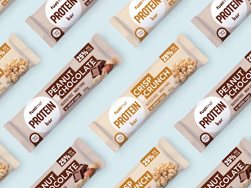
Packaging for a High Protein snacks
2
13
2
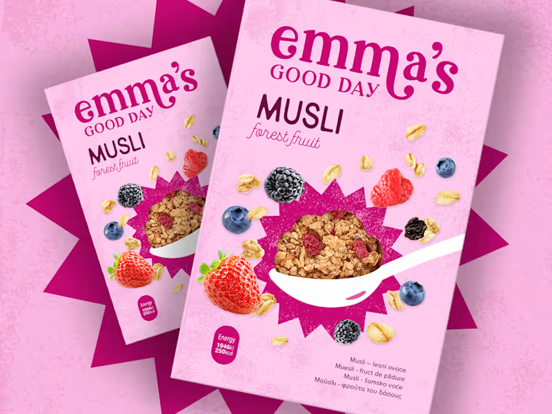
Packaging for a new cereal brand
2
14
Adobe Illustrator
(4)
Follow
Message
Explore people