The network for creativity
Join 1.25M professional creatives like you
Connect with clients, get discovered, and run your business 100% commission-free
Creatives on Contra have earned over $150M and we are just getting started
Back to feedPost


Oslo Tennisklubb has been around for 125 years.
From the beginning, we knew this had to be an evolution, not a revolution. The club's original symbol carried real emotional weight, so we preserved its essence and refined everything around it. At the same time, we had the creative freedom to build something bold enough to stand out – not just in tennis, but across the entire sports world.
Oslo Tennisklubb is one of Norway's most prestigious clubs. But it's also open, human, and welcoming. A place where a Bentley owner and a 22-year-old discovering tennis for the first time share the same court – and both feel they belong.
That tension became the foundation of the identity. Exclusive not by who it keeps out, but by the quality it keeps in.
What started as a logo update became one of our most cherished studio projects. It required deep historical respect, and gave us room to go bold without losing sight of what matters: community, passion, and timeless quality.
We're proud of what this team built together.
Symbol Design: Helena Jiskrova
Production: Loren Goodknight
Strategy: Jakub Čvanda
Graphic Designer: Jaydip Sakhiya
Web Designer: Vašek Šrámek & Tom Garcy
Motion Designer: Dominik Budimir
Creative Director: Tom Garcy


Great work 🙌
The network for creativity
Join 1.25M professional creatives like you
Connect with clients, get discovered, and run your business 100% commission-free
Creatives on Contra have earned over $150M and we are just getting started







Related posts


Visual identity revision for a psychology and management consulting firm



handsome works! anyway did you use any ai to generate mockups on that? or you did manual

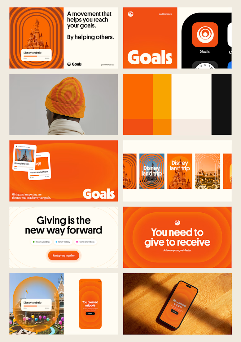
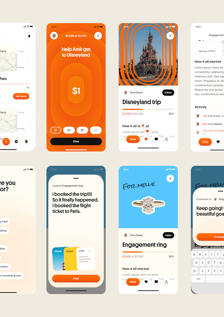
one of my favourite things about running a one-person studio is that nothing gets lost in translation.
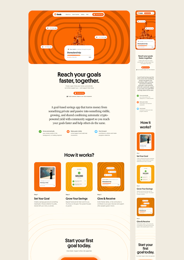
the idea behind the brand is the same idea that shapes the website and the product.
no handovers, no starting from scratch, no trying to explain the vision to someone new.
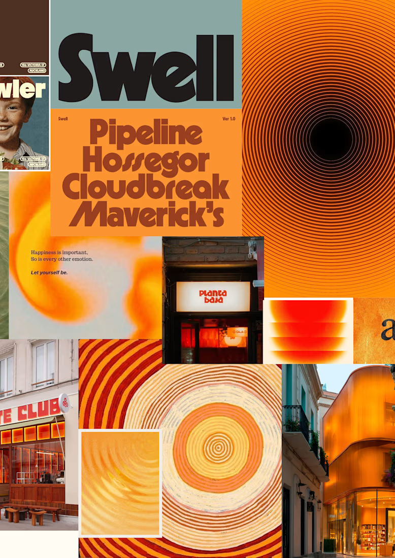
a little look at how that came together for goals, from the first moodboard to the app ↓

Love it!

Recruitment is a people business. The brand should feel the same way.
Wayforce connects top talent with businesses and needed an identity that spoke to both sides at once. Sharp enough for the companies hiring. Human enough for the candidates being placed.
The mark does two things: reads as W, moves like a direction. Acid yellow that stands out in a category full of grey corporate sameness.
Not another recruitment agency. A force that knows where you’re headed.

This is wonderful man. love the branding