The network for creativity
Join 1.25M professional creatives like you
Connect with clients, get discovered, and run your business 100% commission-free
Creatives on Contra have earned over $150M and we are just getting started
Back to feedPost

Rooted by Core Studio
Logo Design
Rooted is a nourishment concept developed as a sub-brand of Core Studio, a ladies-only boutique Pilates studio in Abu Dhabi focused on community and holistic well-being.
The logo was conceived as a custom typographic wordmark where meaning is embedded directly into the structure. A subtle branch is integrated into the letter “R”, reinforcing the idea of growth and origin without relying on external symbols or common wellness clichés.
The controlled geometry of the typography balances the organic gesture, maintaining a calm, modern, and premium tone aligned with Core Studio’s visual language.
The result is a scalable and versatile logo designed to support future growth beyond smoothies into coffee, food, and retail applications, while preserving visual cohesion within the Core Studio ecosystem.
logodesignfoodandbeveragehealthyfoodLogo DesignBrand DesignArt DirectionAdobe IllustratorAdobe Photoshop


Thank you! I’m happy the concept and the presentation came through clearly. I truly appreciate the feedback. 💛

Beautifully resolved wordmark. The way the branch is integrated into the “R” feels subtle and intentional without leaning into obvious wellness symbols. The balance between geometry and organic detail works really well.
I recently explored embedding meaning directly into...
on.contra.com
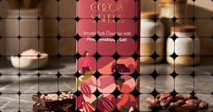
Crafting the Cocoa Sisters: Premium Brand Design Success
Connect with next-gen talent and tools to get work underway. Hire more independents. Start more projects. Get more creative.
Thanks, Rishi. I appreciate you noticing that balance. The intention was exactly that, to embed meaning without leaning on the expected visual cues. Glad it resonates.
The network for creativity
Join 1.25M professional creatives like you
Connect with clients, get discovered, and run your business 100% commission-free
Creatives on Contra have earned over $150M and we are just getting started








Related posts

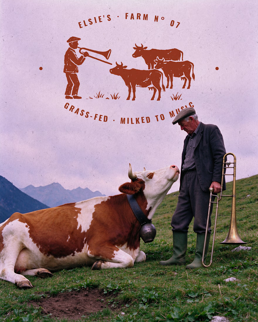
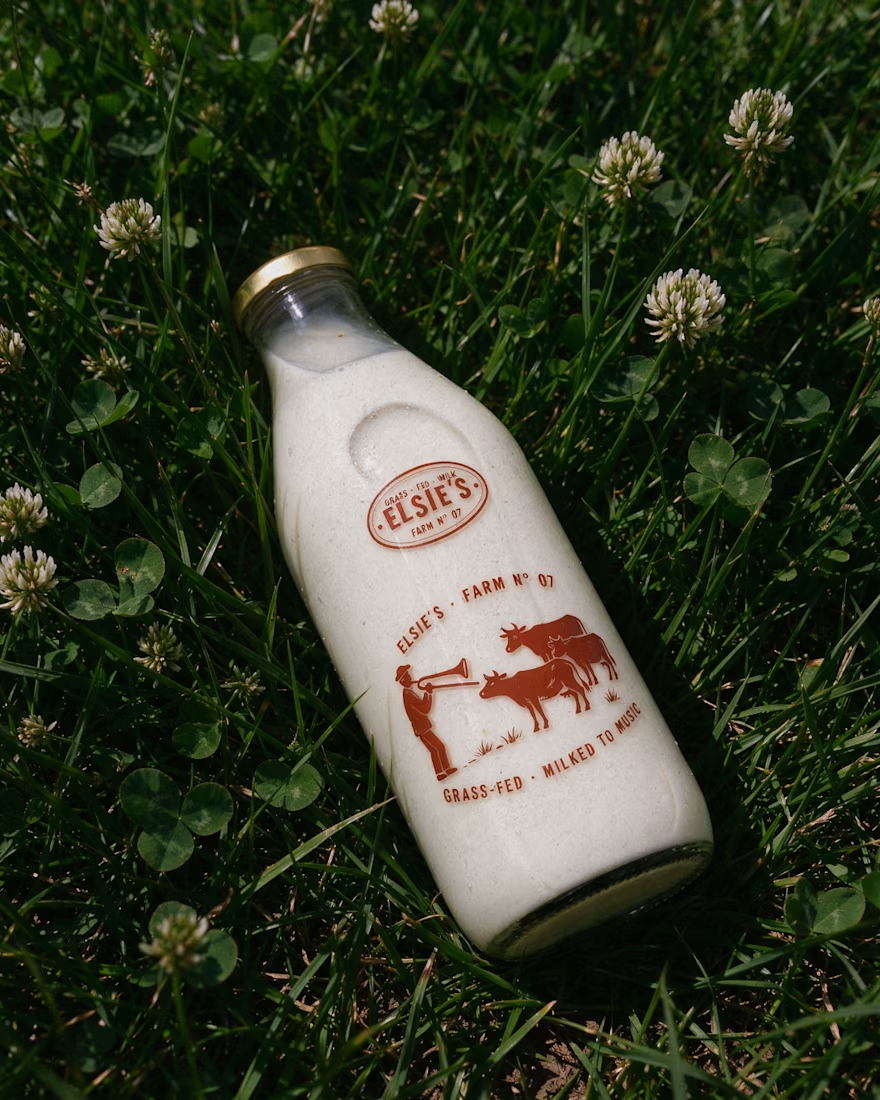
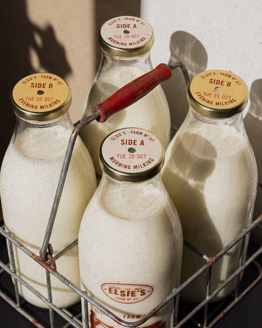
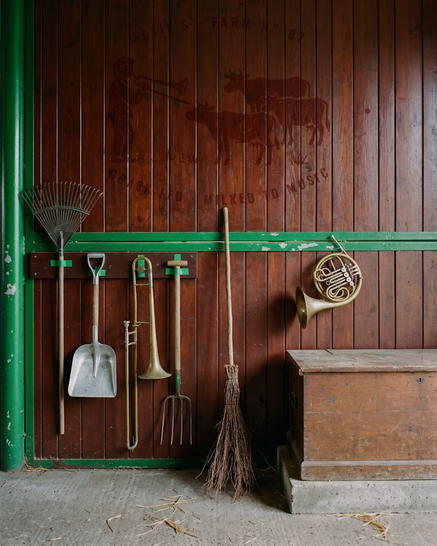
Elsie's: brand identity and packaging for the @designerbriefs weekly challenge (Brief 183). An organic milk brand from very happy cows who love fresh grass and good music.
The logo comes from the brass name plates farmers fixed to their milk cans, with every letter struck by hand. Then came a stamp-style illustration of a farmer playing to his herd, and a returnable glass bottle printed in barn red. All the imagery was made with my Augmented Art Direction process: AI as the tool, art direction and Photoshop retouching to finish every image by hand.
What song would you play to Elsie's cows? 🎺🐄




great work andreu

Little did I know this logo I designed would be seen billions of times.
And that kids would walk on the street rocking the logo on their chest 🤯

Seeing kids wear your logo on the street must be such a surreal feeling. Amazing work Tim!

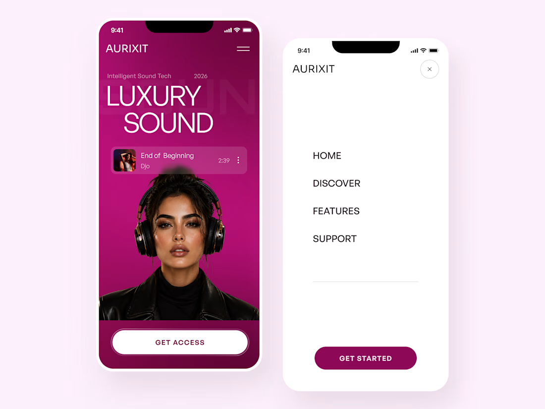
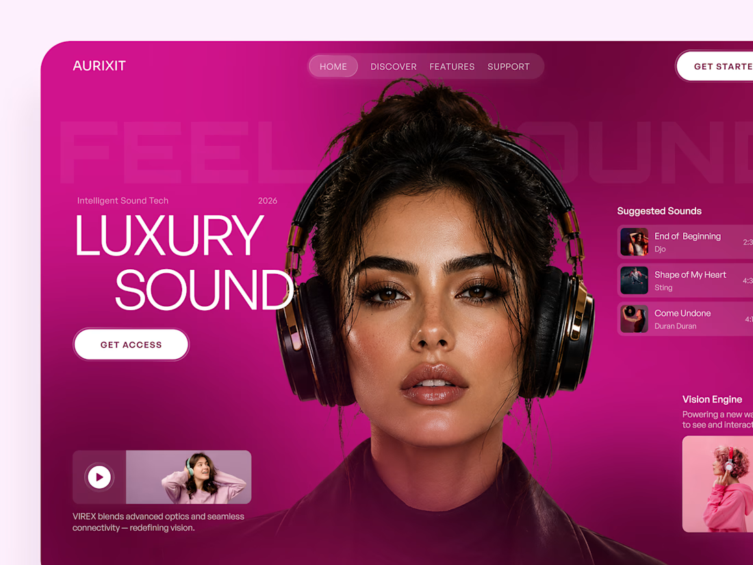
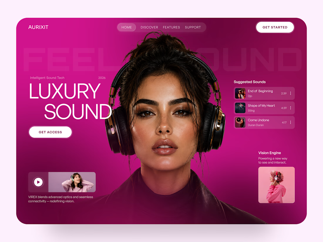
AURIXIT — Luxury Headphones Landing Page 🎧💗
A vibrant landing page concept for a premium audio brand, combining luxury sound, fashion-inspired visuals, and a bold digital experience
The design brings together bright magenta tones, oversized typography, lifestyle photography, and clean UI elements to create a modern, eye-catching aesthetic
Special attention was given to:
• Bold lifestyle-focused hero composition
• Vibrant pink and magenta color palette
• Clean, oversized typography
• Music playlist and suggested tracks
• Premium headphone presentation
• Clear CTA and minimal navigation
• Responsive mobile experience
The result is a fresh, stylish landing page that connects premium audio technology with fashion, music, and personal expression ✨


Magenta with the black headphones really pops. Was the small playlist text on pink tricky for contrast?