The network for creativity
Join 1.25M professional creatives like you
Connect with clients, get discovered, and run your business 100% commission-free
Creatives on Contra have earned over $150M and we are just getting started
Back to feedPost

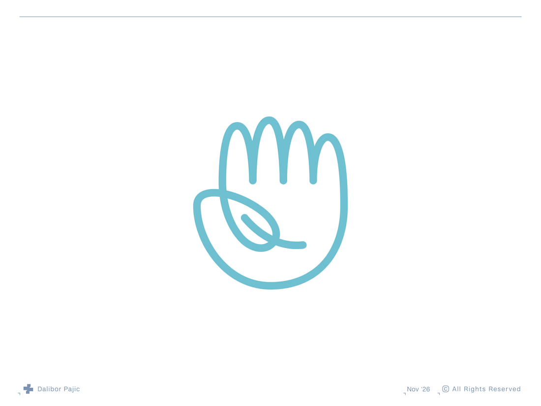
Hello Nature | Hand and Leaf Logo Mark
A throwback to one of my favourite logo concepts, created about 7 or 8 years ago, it was featured in LogoLounge 13.


clever and clean concept
Much appreciated!

The leaf and hand fit so naturally.
Thanks!

The leaf doubling as the negative space of the palm is what makes this stick. Curious how the open line weight held up when you tested it down at favicon size.
Thanks! It would probably look a bit blurry at 16 × 16 px, but luckily Retina displays pack much more visual information into those tiny spaces these days, making everything look sharper.

The leaf vein doubling as the crease of the palm is such a good find. It still holds up years later.
Thank you so much!

Clean
Huge thanks!
The network for creativity
Join 1.25M professional creatives like you
Connect with clients, get discovered, and run your business 100% commission-free
Creatives on Contra have earned over $150M and we are just getting started



Related posts



awesome

Bondri has been featured by 6 different curators in the past month and I’m still a bit in disbelief.😮
I put a lot of care into every detail of this one, from the illustrations to the packaging to how the day and night variants talk to each other. Seeing it recognized like this means a lot.
What makes you stop and really look at a project when you’re scrolling?
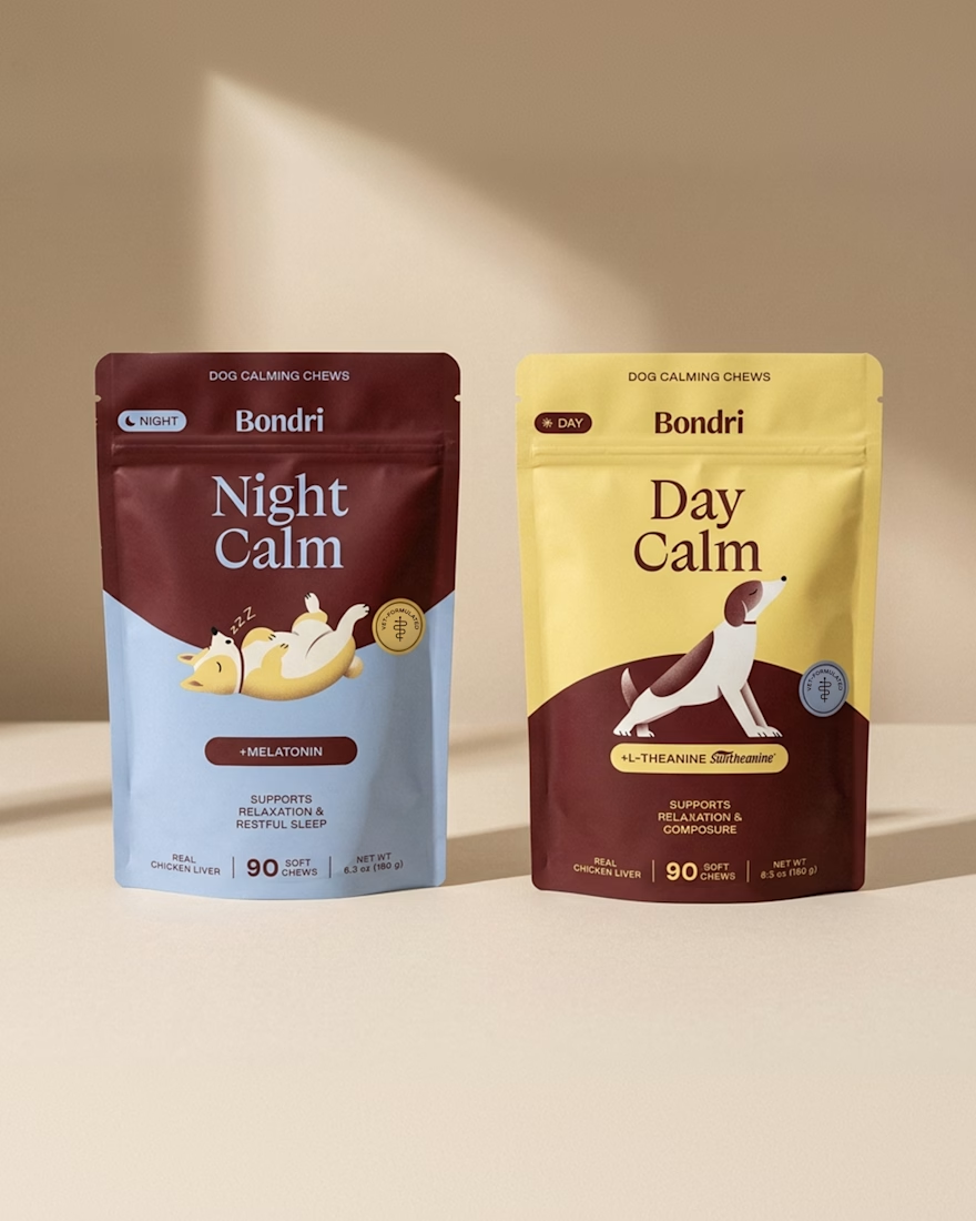
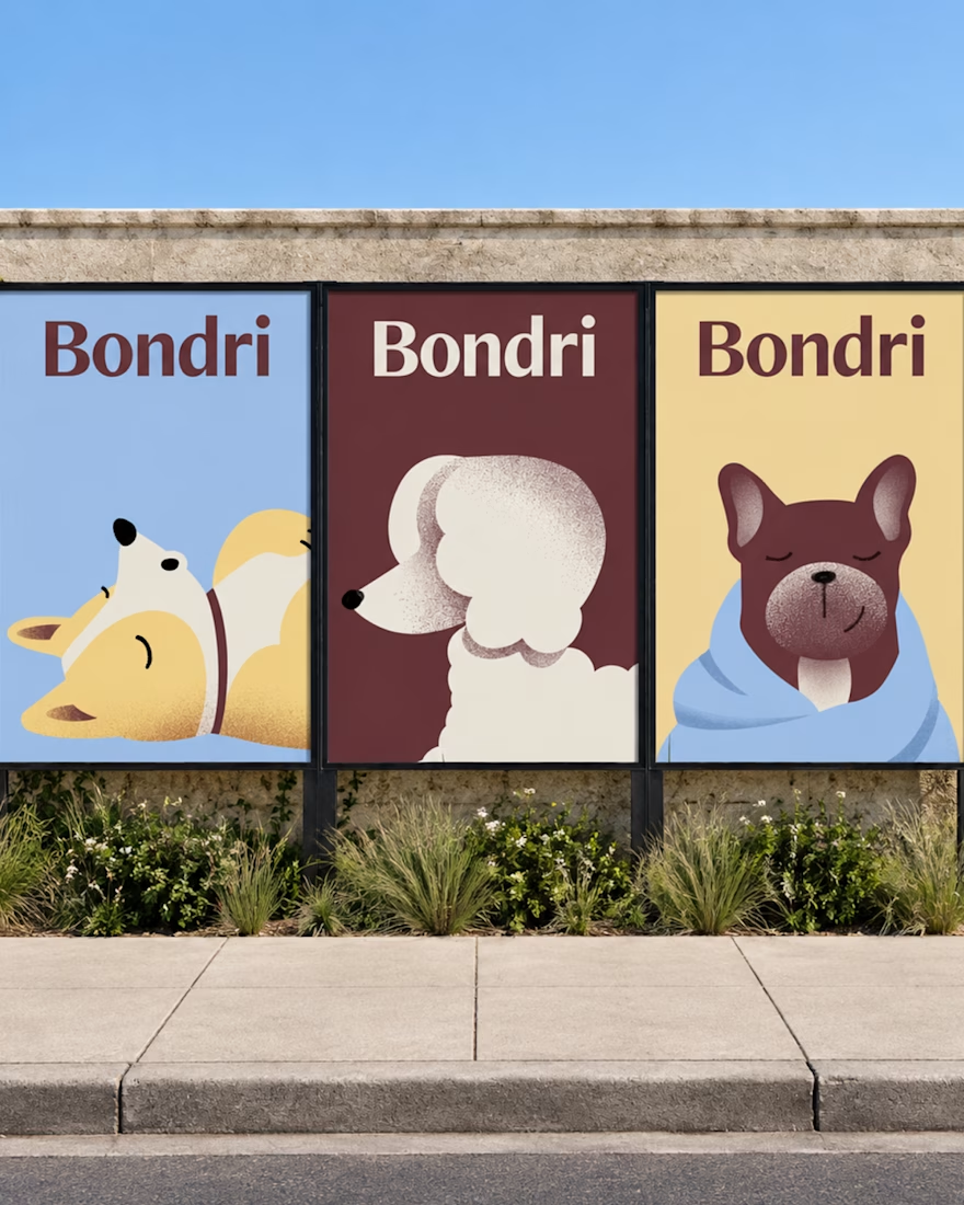
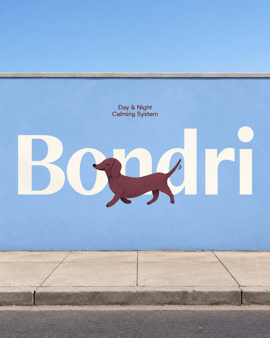

I think it’s the little details that make a project stand out. When everything feels intentional and tells a story, it naturally makes you want to stop and take a closer look. Love how much thought went into this! 👏
Well-done Chantal

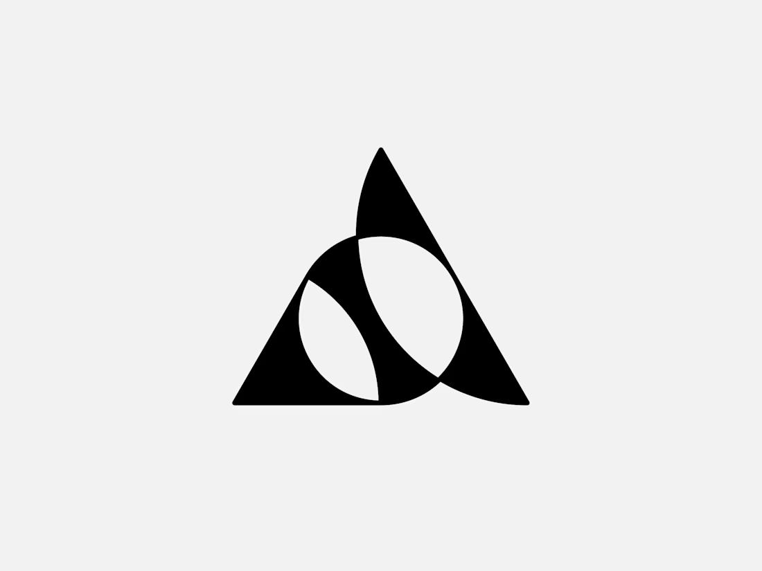
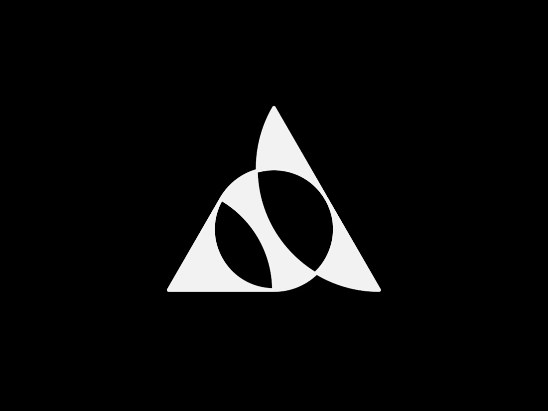
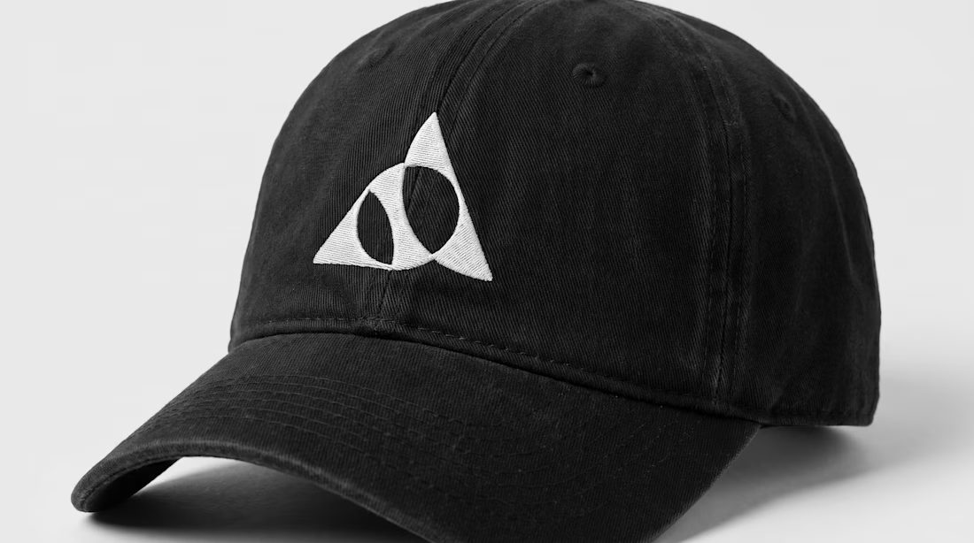
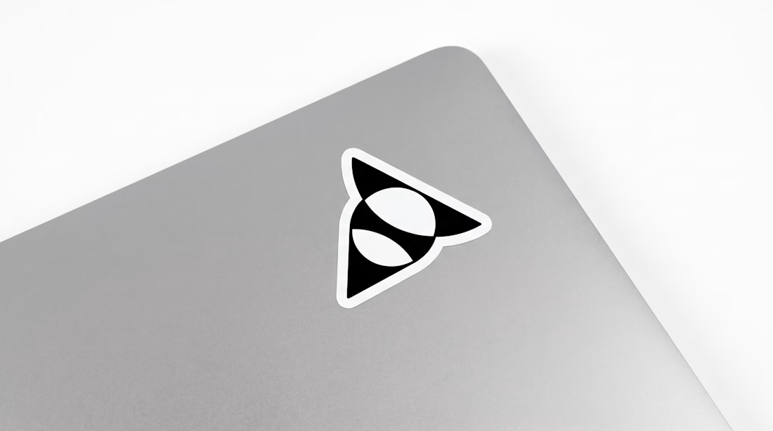
Exclusive premade abstract triangle A logo.
One buyer, full copyright transfer.
A triangle, a circle, and one sweeping curve forming a stylized letter A with two leaf-like shapes in negative space. Built for AI companies, tech startups, fintech platforms, and architecture studios.
Available now: https://brandforma.com/work/abstract-triangle-a-logo-for-sale
Design by Bohdan Harbaruk // Brandforma Studio


TOP!!