The network for creativity
Join 1.25M professional creatives like you
Connect with clients, get discovered, and run your business 100% commission-free
Creatives on Contra have earned over $150M and we are just getting started
Back to feedPost

Salah Medical Weight Loss is a medical clinic specializing in physician-supervised, sustainable weight loss and long-term health management.
Challenge
Communicating a complex, medically driven approach to weight loss while standing apart from generic wellness clinics.
Strategy
Create a clear and credible visual system that translates medical care, lifestyle guidance, and long-term follow-up into trust and clarity.
Identity
A bold-to-light wordmark reflects the patient journey. A secondary shield symbol with a downward arrow represents health protection and controlled weight loss.
Outcome
Stronger medical credibility, clearer communication of services, and increased patient confidence across digital platforms.
healthcarebrandidentitydesignerwellnessBrand DesignArt DirectionLogo DesignAdobe IllustratorAdobe Photoshop


Love this!
Thanks! Glad you like it.

It's good, i can see letter S, also a shield maybe?
Exactly. An abstract S shaped as a shield, symbolizing health protection and guided weight loss.
Good Work😍
Thank you!
The network for creativity
Join 1.25M professional creatives like you
Connect with clients, get discovered, and run your business 100% commission-free
Creatives on Contra have earned over $150M and we are just getting started








Related posts

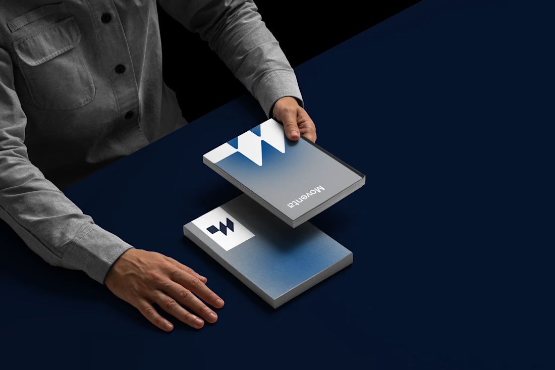
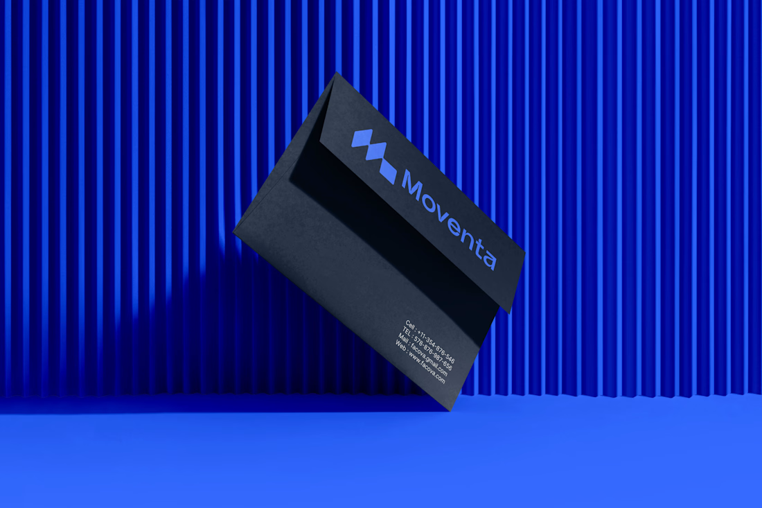
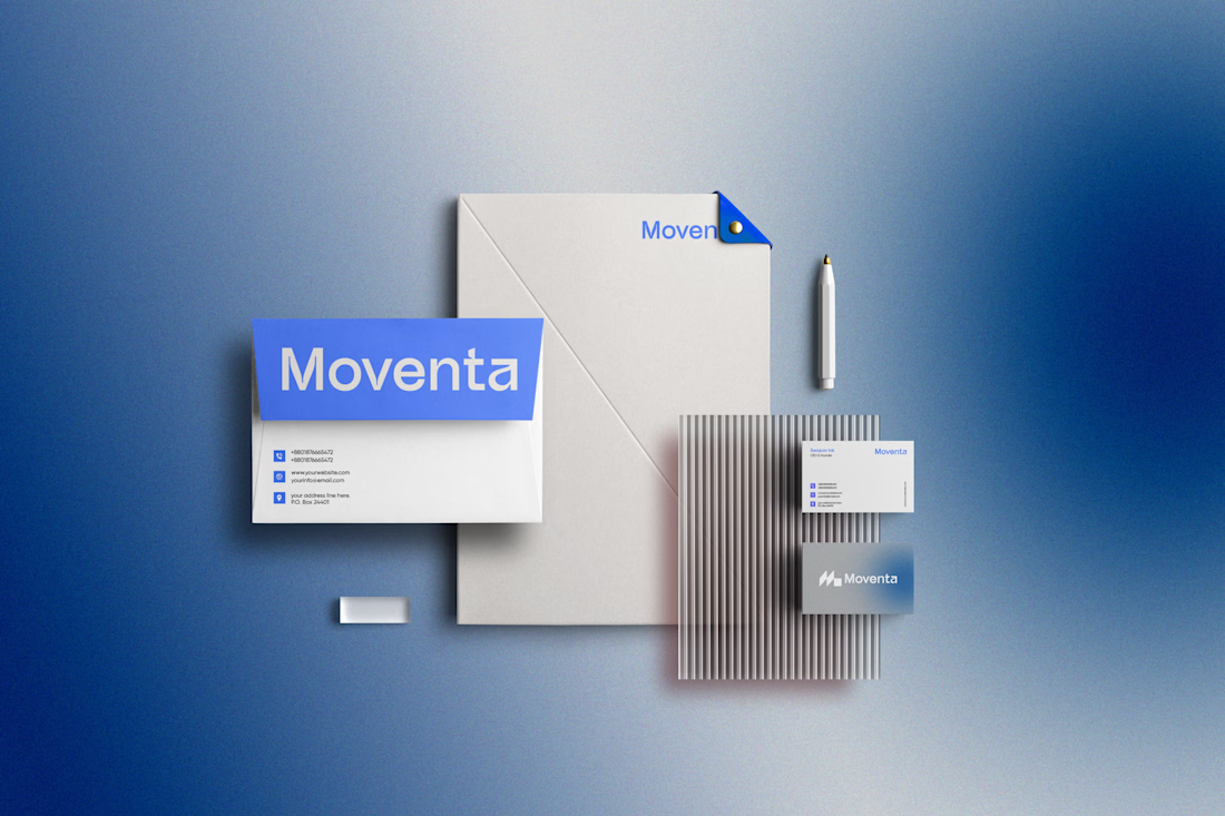

I like the Clarity and neatness in your work

VÉLLE - Minimal Luxury Fashion Brand Identity
A conceptual fashion brand built on quiet luxury and timeless essentials.
What I did:
→ Logo Design (Primary + Secondary)
→ Brand Identity & Color System
→ Product Mockups (T-Shirt, Cap, Tote Bag)
Concept: Less is more. Clean serif typography with subtle accent for premium feel.
Palette: Beige #E8DDD0 / Black #0A0A0A
Full case study on Behance: behance.net/gallery/257321557
Open for freelance projects - DM for fashion branding.

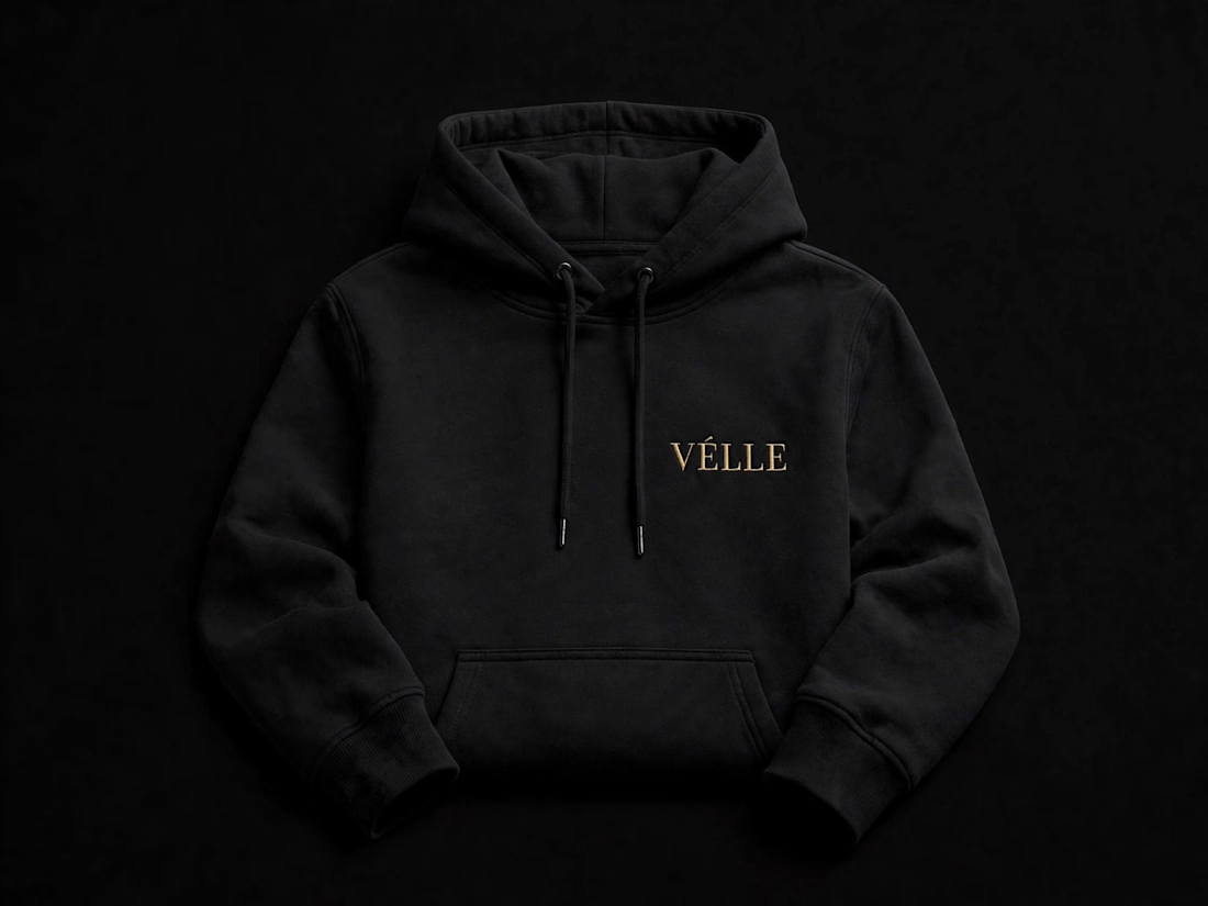
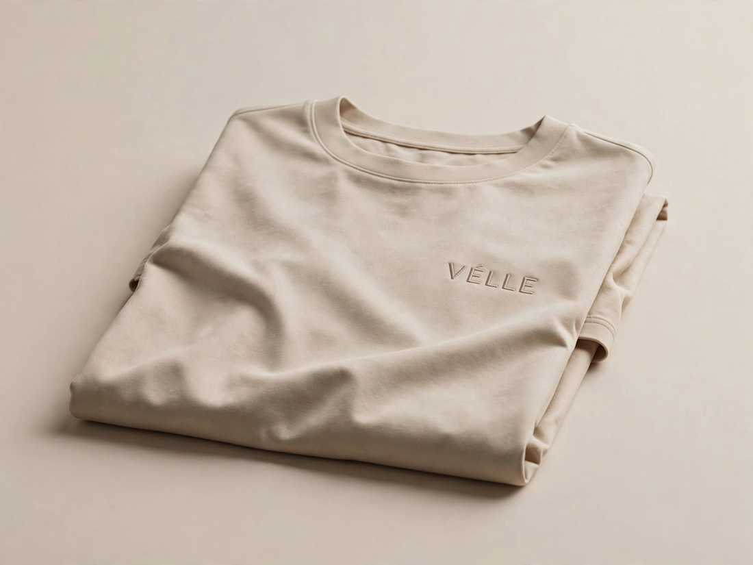
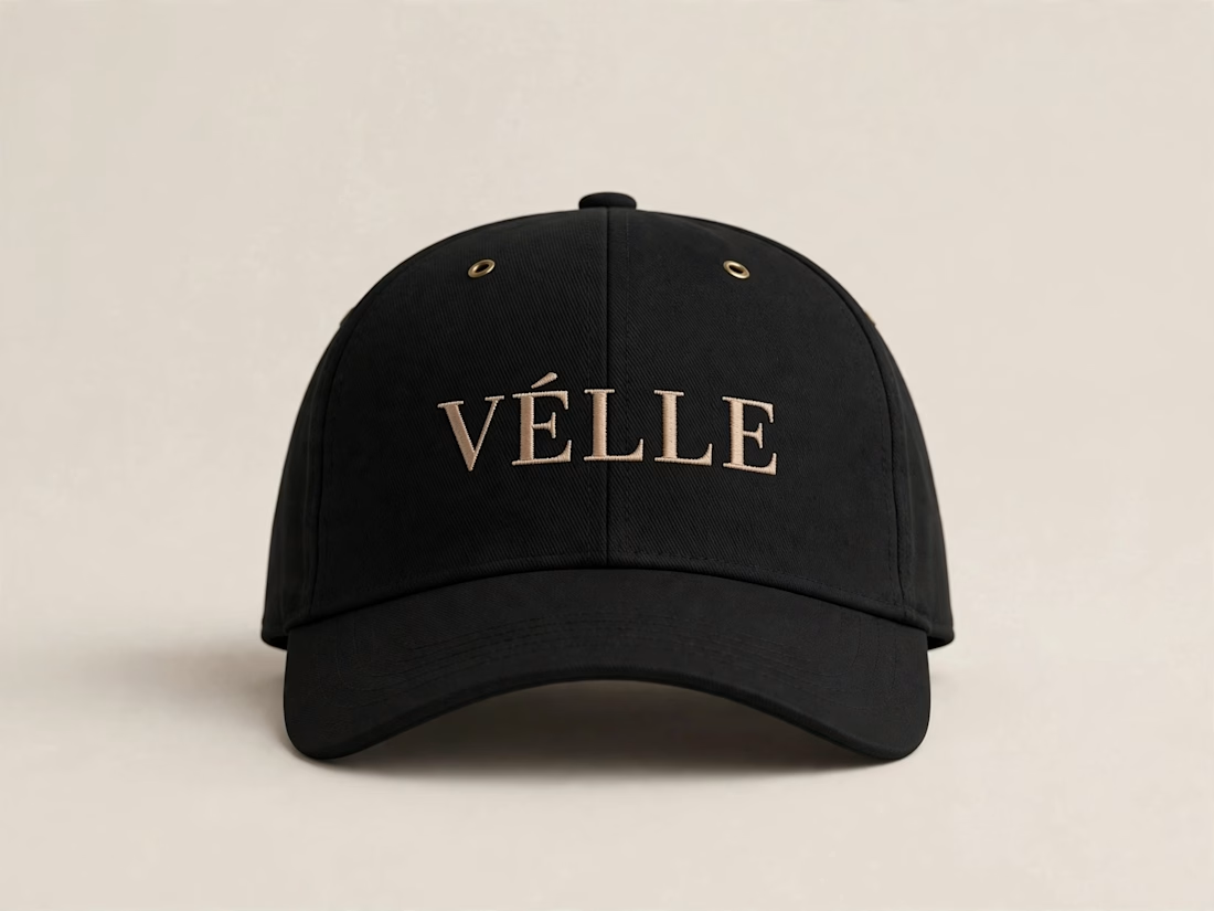
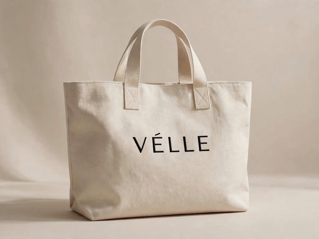

love the minimal direction on this. VÉLLE feels expensive but not loud, the tote and cap mockups are so good


Same brand. Same palette. Two completely different proposals for a real estate developer.
A: An isotype built from blocks. Geometric, precise, the language of construction. It says we build.
B: Custom lettering with movement. Warmer, more editorial. It says we build places you’d want to live in.
36 voted
51%

35 voted
49%

71 votes
Closed

My vote is B, Milagros. Custom lettering with movement has real editorial warmth, which suits a developer selling places people actually want to live in.