AI & ML Engineer
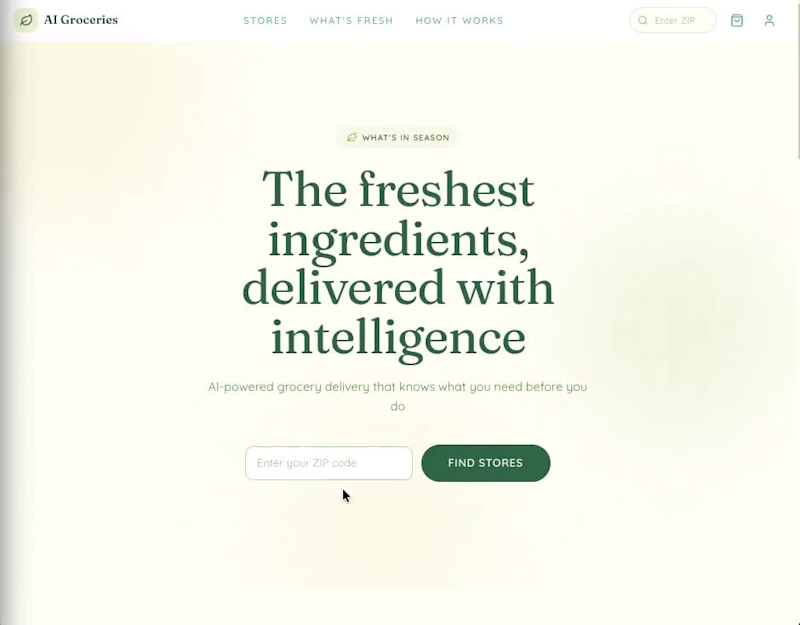
AI Groceries
An AI-powered online grocery delivery platform built with Next.js 15, React 19, Supabase, Claude API, and Stripe. Designed around "The Harvest Table" philosophy -- abundant, warm, and grounded in real food provenance.
1
326
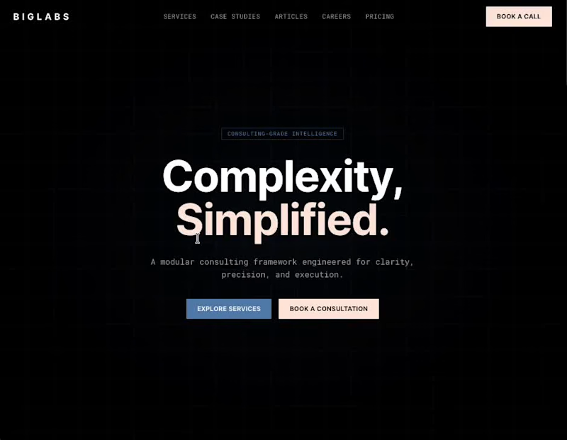
Biglabs
Consulting-grade template for professional services firms. Manage case studies, articles, services, careers, testimonials, and client consultations with AI-powered analytics. Deploy in minutes, no local setup required.
Features
Thought Leadership — Publish articles and insights with categories, excerpts, and rich content
Service Pages — Present your consulting services with detailed descriptions and feature lists
Consultation Booking — Public intake form for prospective clients with scheduling preferences
Careers Portal — Post open positions with departments, requirements, benefits, and salary ranges
AI Analytics — Claude-powered insights and reporting on your consulting data
And more.....
0
361
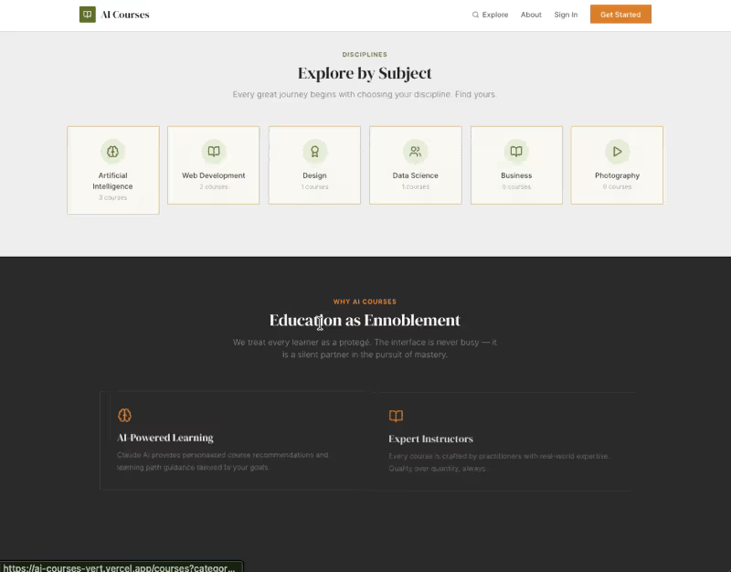
AI Courses
An online course marketplace with Claude AI-powered learning recommendations, instructor analytics, and platform management. Deploy in minutes, no local setup required.
Features
Course Marketplace — Browse, search, and filter courses by category, price, and level
Student Dashboard — Track enrolled courses, progress, wishlist, and messaging
Instructor Portal — Create courses with structured sections and lessons, manage content
Admin Panel — Moderate courses (approve/reject), manage users, configure platform fees
Claude AI Integration — Personalized learning recommendations, instructor analytics, platform health reports
And more......
1
1
156



Product & Visual Designer · Brand Identity · UI/UX
- 2x
- Hired
- 5.0
- Rating
- 68
- Followers
Product & Visual Designer · Brand Identity · UI/UX
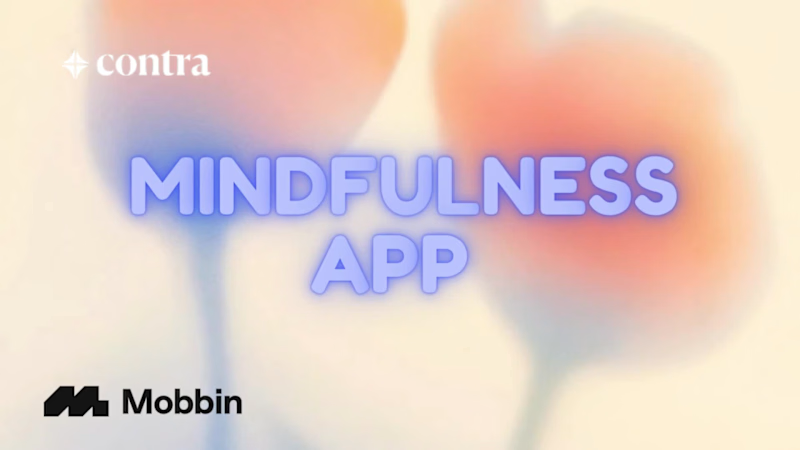
Here's what I built.
SENSA, a mindfulness app that actually gives you a reason to come back tomorrow.
The grainy navy background that makes the screen feel like a room with the lights dimmed. Glass buttons that don't shout. A streak that encourages instead of threatens.
Five sense paths: Breath, Sound, Focus, Body, Mind. Each one a different way of training presence.
The Breath Lab is fully built, a circle that expands and contracts in your hand, vibrating on every phase, guiding your nervous system without a single word.
And a Calm Score chart that shows you in your own numbers, that the practice is working.
Built on Vercel v0 in one weekend. Researched on Mobbin. Inspired by Duolingo's streak mechanic and Calm's visual language.
LinkedIn
(https://www.linkedin.com/posts/mollymittal_sensa-a-mindfulness-app-that-actually-gives-ugcPost-7443549326011871232-GN0q?utm_source=social_share_send&utm_medium=member_desktop_web&rcm=ACoAAC_0DC4BixouaIAU-uqpPv40e7S4CKji7g8)This one's personal. I hope it helps someone.
5
512
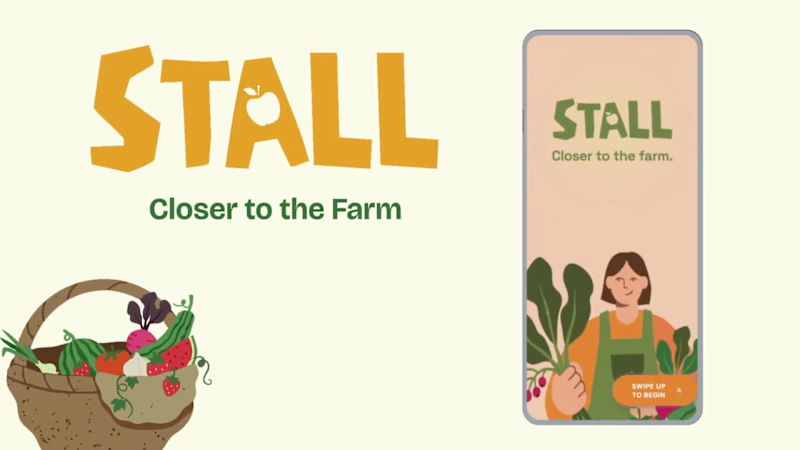
Project title
STALL — Your farmers market, alive.
A swipe-to-shop farmers market companion that connects local vendors with regulars before Saturday ever arrives.
The problem
Every Saturday, the same thing happens.
You show up to the farmers market at 10am. The ramp vendor you wanted is sold out by 9. You forgot cash. You walk past a honey stall three times because you can't remember if you already bought some. And that new mushroom farm you heard about? Gone before you spotted them.
On the vendor side, it's just as frustrating. Small farmers wake up at 4am, load the truck, drive an hour, and have no lightweight way to tell their regulars — the people who actually want what they grow — "I have asparagus this Saturday. Come find me."
STALL fixes both sides of that problem.
What STALL does
STALL is a two-sided farmers market app built around one weekly ritual: Saturday morning.
For shoppers:
Follow vendors at your local market
Swipe through a weekly produce deck — right to add to your list, left to skip — exactly like Bumble, but for ramps and sourdough
Get a Friday evening digest: what your vendors have this week, your auto-built shopping list, and where each stall is on the map
Pre-reserve high-demand seasonal items before you leave the house
Discover first-of-season arrivals with a "what's new this week" spotlight
For vendors:
Post a weekly inventory update in 3 taps — what you're bringing, quantities, price
Reach your regulars directly before market day
Manage pre-reservations without a complicated system
The app celebrates the seasonal nature of farmers markets — ramps in April, strawberries in June, squash in October. Every week feels like something worth showing up for.
How I built this with Google Stitch
STALL was designed and prototyped entirely using Google Stitch as the primary build tool, with Figma used only for initial wireframing.
The workflow:
Day 1 — Brand and wireframes
I started by defining the brand: the name, palette (Pumpkin Spice Forest — a warm amber, fern green, mauve, and cream system), and illustration direction. I wireframed the three core flows — swipe deck, Friday digest, and vendor post — before touching Stitch.
Day 2 — Into Stitch
I imported my Figma file directly into Stitch using the .fig import feature. From there I used streaming generation to build each screen live on the canvas — watching the splash screen, onboarding flow, and homepage assemble in real time was genuinely remarkable. The HTML-native canvas meant every animation I added — card tilt on swipe, drawer slide-up, bento tile stagger — rendered exactly as it would in production.
Key Stitch prompts used:
"Add a swipe gesture to the produce card stack — right swipe shows a green Added overlay with 5° card tilt, left swipe shows a mauve Skipped overlay with -5° tilt"
"Make the shopping list items stream in one by one with 120ms stagger on page load"
"Add a bottom drawer that slides up from the vendor card with spring easing — show the farm bio, full inventory list, and two action buttons"
"Build the Friday digest screen — vendor items animate in sequentially, the seasonal spotlight card pulses gently"
"Export web assets and deploy to Netlify"
In-place edits I used:
Swapped the swipe overlay color from red to mauve to match brand
Adjusted the bento grid gap from 8px to 6px after seeing it render on canvas
Changed the CTA button from outlined to filled after in-place visual comparison
Rewrote the seasonal spotlight copy directly on the canvas without regenerating
What Stitch made possible that nothing else could:
The swipe gesture interaction, the drawer spring animation, and the staggered list streaming — all three of these would have taken days to hand-code. In Stitch, they were prompt-driven and live on the canvas within minutes. The gap between "designed" and "interactive prototype" collapsed entirely.
Screens delivered
Splash screen — farmer illustration, full-bleed cream background
Onboarding screen 1 — market basket illustration, "Your market, every Saturday"
Onboarding screen 2 — swipe mechanic explainer with card UI
Onboarding screen 3 — Friday digest bento preview
Homepage — bento grid with market header, seasonal spotlight, list, map preview, swipe deck, streak tracker
Swipe deck — card front, vendor expand drawer, swipe right (added), swipe left (skipped)
Friday digest — streaming vendor list, seasonal spotlight, auto-built shopping list
Market day map — vendor stall grid, spot numbers, live confirmation states
Vendor post flow — 3-tap inventory update screen
Design decisions worth noting
The swipe mechanic — Borrowing the Bumble swipe pattern for produce discovery was the conceptual breakthrough. It transforms a passive browse into an active, satisfying decision. Every right swipe builds your list. Every left swipe still shows you where the vendor is on the market map — skipping is never permanent.
The Friday digest as the hero feature — Most apps make you come to them. The Friday evening push notification with a personalised market brief is the one moment where STALL comes to you. It changes Saturday morning from reactive to intentional.
Bento homepage — Instead of a scrolling feed, the homepage gives you everything at a glance: your market, your list, the seasonal moment, your vendors. Seven tiles, seven pieces of information, zero scrolling.
The color system — Pumpkin (#E8872A), Fern (#728040), Mauve (#B07090), Cream (#FDFAF6), and Moss (#4A5228). Every color has one job. Pumpkin is interactive. Fern is seasonal and confirmed. Mauve is reserved and streaks. Cream is every surface. Nothing competes.
What I learned
Stitch genuinely changes the prototyping workflow. The moment I stopped thinking of it as a design tool and started thinking of it as a build tool — one where the canvas is the product, not a picture of the product — everything accelerated. The in-place edit feature is the one I'll keep coming back to: being able to change a color, rewrite copy, or swap a component without regenerating the whole screen is the difference between iteration and rework.
STALL started as a hackathon idea. After building it in Stitch, it feels like something real.
Live Prototype: https://stitch.withgoogle.com/preview/8229547464152593644?node-id=e53124995cda49808685283be978dc8c
50
44
1K



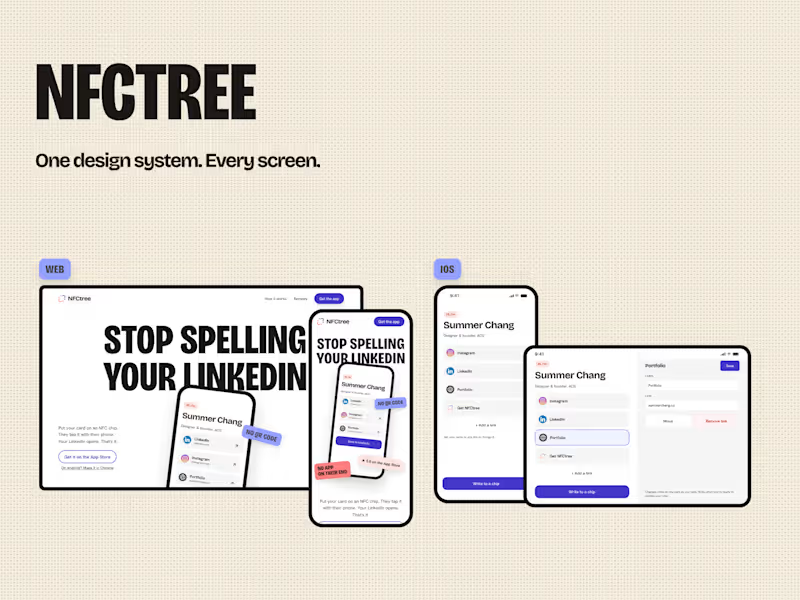
Design System for iOS, Web, Mobile + Promo videos
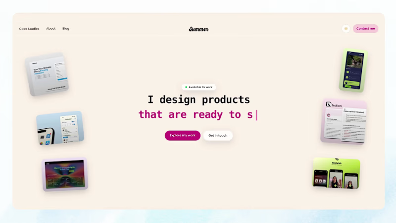
Portfolio website design
I designed and built my own portfolio in Next.js, React, and Tailwind so the site itself shows how I work, not just the case studies inside it.
It is an interactive site with case studies, about, and blog. Visitors can move through shipped product work, including PetCard, where I helped ship a real product using AI as a design collaborator. The goal was a clean, conversion-minded site that feels simple and makes the work easy to understand.
Live site: summerchang.co (http://summerchang.co)
2
65
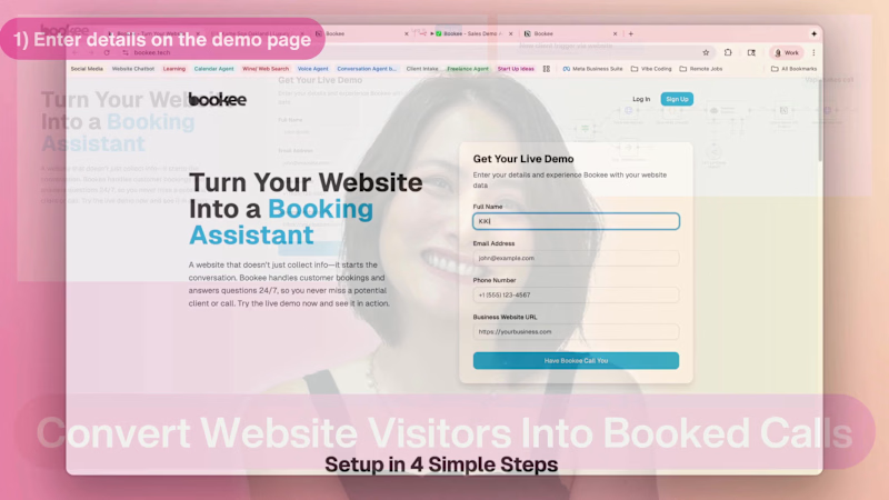
Bookee turns your contact form submissions into real conversations instead of missed opportunities. When someone fills out a form on your site, Bookee automatically calls them, already informed about your business from your website, and keeps the conversation going right away.
It can answer basic questions, qualify the lead, and help them schedule a call or appointment with you—so every form submission has a clear next step instead of getting stuck in your inbox.
0
127
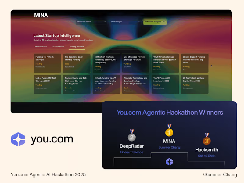
Mina is a startup research signal assistant I built for the You.com (http://You.com) AI hackathon, where it won first place for highlighting which startups are truly growing, not just generating hype.
Powered by the You.com (http://You.com) API, Mina pulls live data on a company’s product, funding activity, and public signals, then condenses everything into a clear snapshot with source links so users can quickly gauge momentum and decide where to dig deeper.
My role was to design the end-to-end user experience and translate a complex API into a focused, problem-solving workflow that makes startup discovery faster, clearer, and more actionable.
12
236

systems thinker, tinkerer, troubadour.

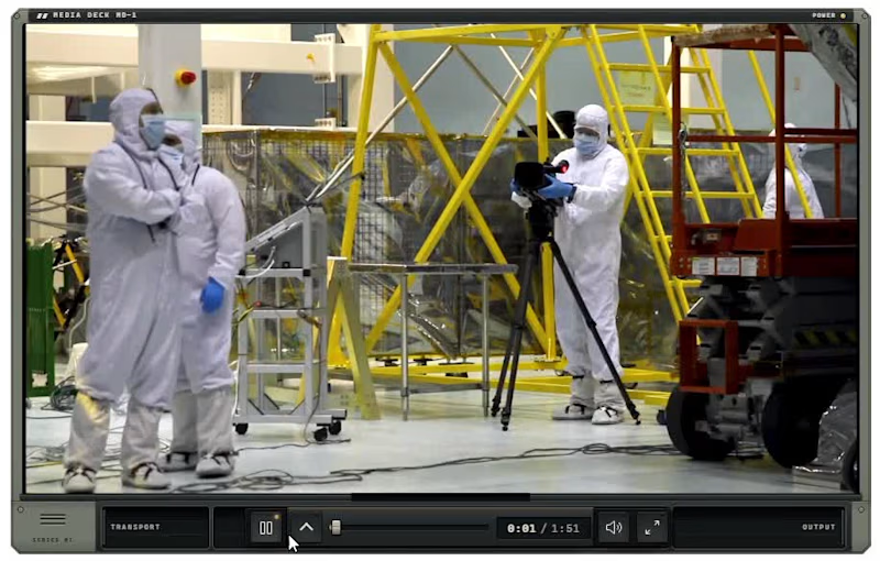
My entry into the Video.js skin challenge
Inspired by the days of Winamp skins and my love of Transformers, I wanted to build a video player that felt like an actual piece of retro-futuristic hardware rather than just another set of playback controls. Media Deck MD-1 brings that idea to life with mechanically unfolding controls, functional VU meters, a graphic equalizer, and video-reactive lighting—all wrapped in an old-school media console that transforms as you interact with it.
3
1
132
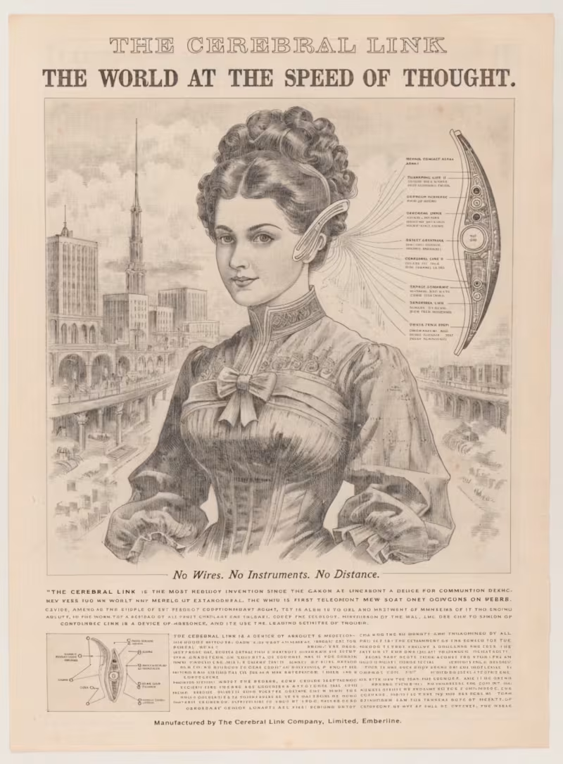
The Emberline Archive — A Future With a Past
What if a civilization from the distant future had a history we could discover? The Emberline Archive explores that idea through a collection of fictional advertisements, engineering illustrations, and cultural artifacts from a futuristic megacity. Using a custom Recraft Style built from authentic late-19th-century Victorian advertisements and illustrations, we combined historical visual storytelling with advanced technology, extraordinary architecture, and everyday life in a world that never existed. Rather than simply placing modern objects into old artwork, we wanted to create something that felt like genuine historical evidence of an entirely imagined civilization.
0
122
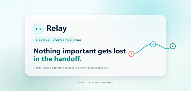
I built Relay, a mobile-first business handoff tool designed to keep important work from getting lost when responsibility moves from one person to another.
Relay gives someone a quick way to record what was completed, what still needs attention, and what the next person should do first. The handoff remains visible until someone acknowledges it. If follow-up is required, it stays in progress until the receiving person records what was completed and closes the loop. Priority levels, status alerts, completion records, and searchable history make accountability clear without turning the process into a complicated project-management system.
I built it because handoffs happen everywhere—between shifts, departments, field crews, project owners, service technicians, and people covering for one another. Most small teams handle them through text messages, scraps of paper, conversations, or memory. That works until something important gets missed and nobody is sure who was responsible.
The goal was to make the process fast enough that people would actually use it. A handoff should take about sixty seconds, work comfortably from a phone, and tell the next person exactly what they need without adding another administrative headache.
Relay was built entirely in Base44 and includes the complete workflow from creation and acknowledgment through completion, history, and deletion.
1
3
205



✍️ Substack Growth Expert + Creative Marketer
✍️ Substack Growth Expert + Creative Marketer

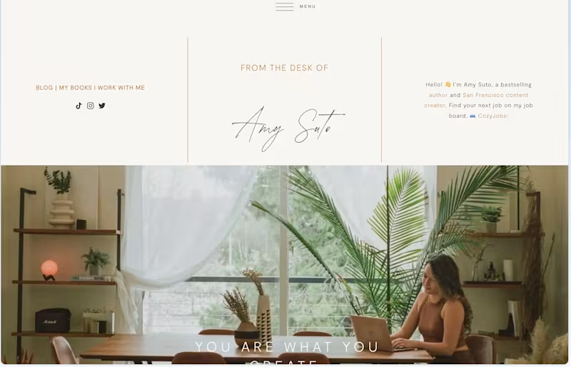
I build the profitable startup CozyJobs.com (https://CozyJobs.com) using Claude Code, Vercel, and Supabase.
2
529


Your Partner in Problem Solving


Your Partner in Problem Solving


I Help Biz Owners 10x Their ROI with AI Marketing Agents
- $1k+
- Earned
- 5x
- Hired
- 5.0
- Rating
- 26
- Followers
I Help Biz Owners 10x Their ROI with AI Marketing Agents