Logo Design Projects in New South Wales
Logo Design Projects in New South Wales
Sign Up
Post a job
Sign Up
Log In
Filters
2
Projects
People
Message
30
Sara Servan
pro
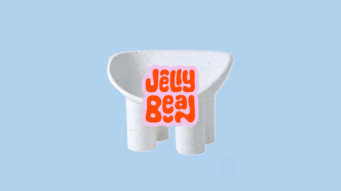
Jellybean Rebrand
30
261
Message
55
Xander Burgess
pro
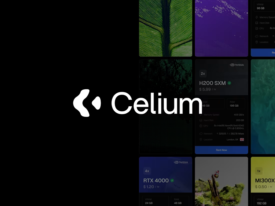
Celium — Brand Design & Strategy
55
398
Message
7
Ebony Ladmore
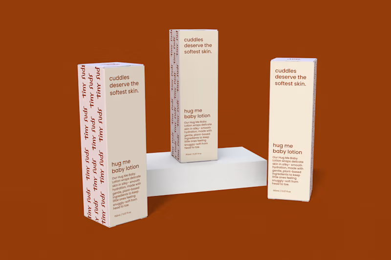
Tiny Suds – Brand Identity for Baby & Toddler Skincare
7
33
Message
7
Dillon McIntosh
Platinum DJ Services Logo Design
7
55
Message
2
Jeremy Mura
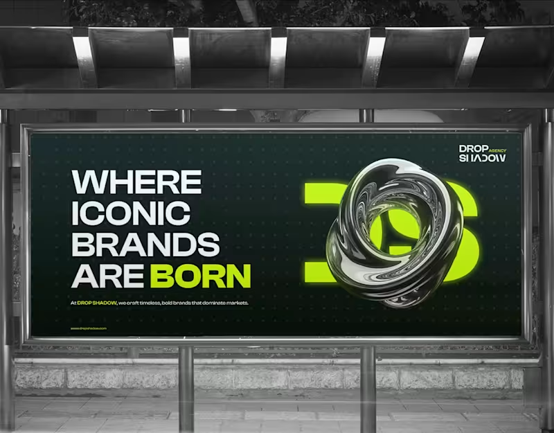
Drop Shadow Agency
2
9
Message
0
Nicholas Smith
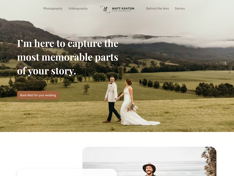
Logo & Site | Wedding Photographer
0
12
Message
0
P.D. Law
Occupational Therapy Logo Rebrand
0
7
Message
0
JunHao Zhong
pro
Black Leopard Animated Brand Reveal
0
7
Message
0
Ron Chio
pro
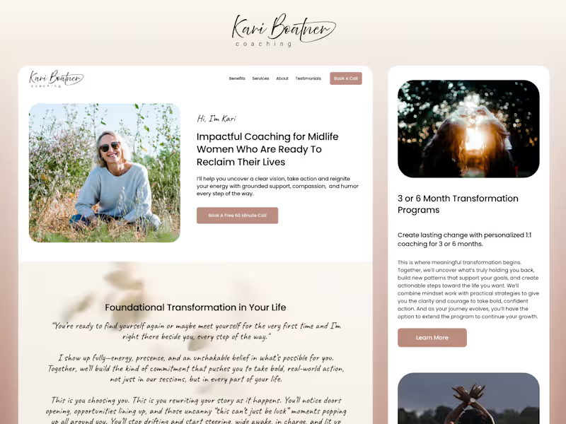
Kari Boatner Coaching
0
3
Message
3
Bearplus Fullstack Agency
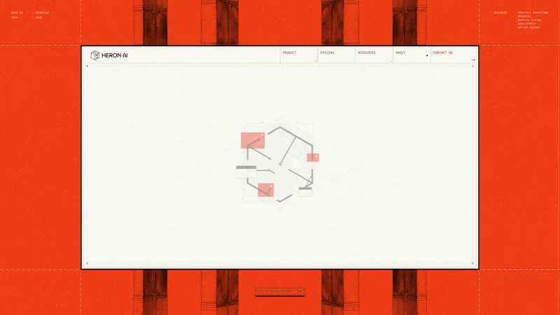
The About hero is a three-state sequence that does the identity work and the product explanation at the same time. It opens on a hexagonal floor plan drawn in full detail, with walls, fixtures and dimension strings. Red blocks then resolve over sections of the layout, marking the kind of issues Heron is built to catch. Finally the plan lifts into an isometric view and folds into the Heron wordmark's symbol, with the dashed hexagon beneath the mark matching the original building footprint exactly. The mark was constructed from the plan rather than drawn separately and rationalised later, which is why the transition holds. It also means the About page opens by demonstrating the product loop before any copy about the founders appears.
2
3
216
Message
1
Cait Pearl
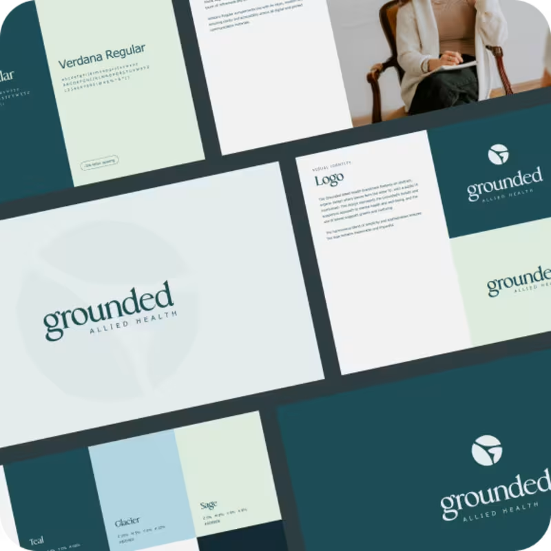
A calming allied health visual identity
1
7
Message
0
Just Create It
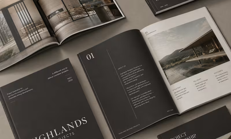
Highlands Bespoke Projects - Logo + Branding
0
1
Message
0
Sauce Studio
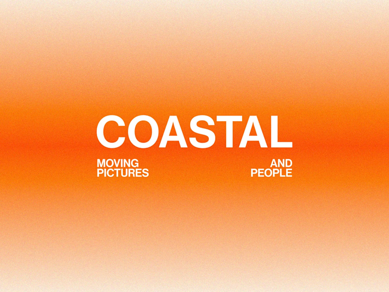
Coastal Brand Redesign
0
35
Message
0
Carina Cunha
pro
Trappi | Logo Design
0
9
Message
27
John Bresciani
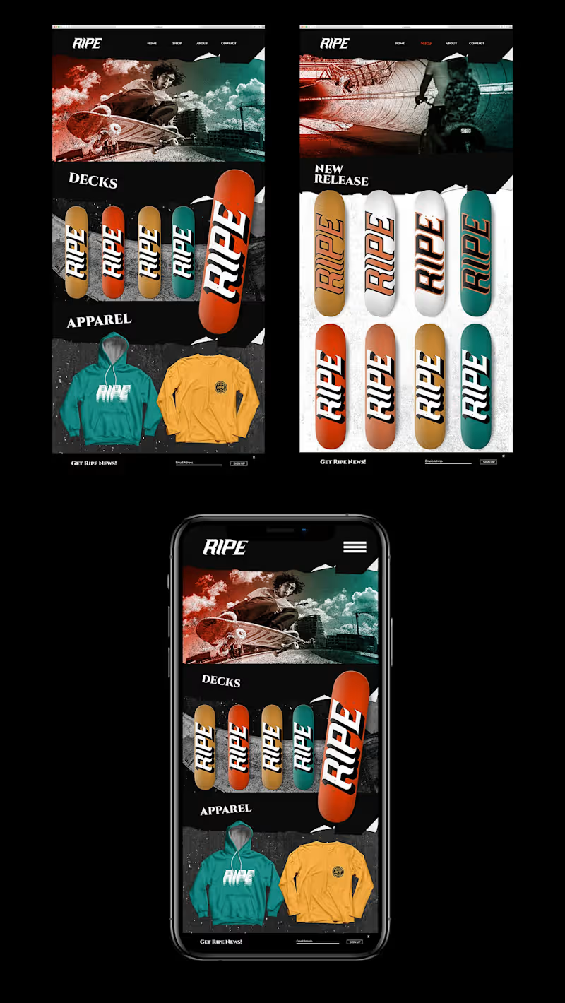
Ripe Skateboards Brand Identity (Barcelona, Amsterdam) About Locking horns with poser-operated corporations that trespass on core skate culture, Ripe set out to discern themselves from US operated brands and revolutionize what competitive skate culture means, without Identity sacrificing authenticity. Challenges How might we sever Ripe from the present-day jock evolution in skateboarding, retrieve the essence that made European skating exclusive and design a brand identity that communicates what tight knit, Spanish skate teams represent? Idea With an already united brotherly culture in its DNA, we chose to blend Ripe’s cherished personality traits by creating a brand based off intense skating, a rebellious familia and a visual homage to Barcelona’s historically Gothic architectural tone with sharp edges throughout.
1
27
335
Message
14
Jason Lam
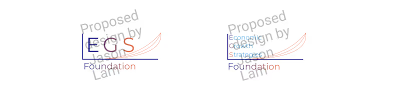
Economic Growth Strategies is a non-profit organisation that was seeking a new logo design with their full branding as well as the compact form with the EGS abbreviation. #avantgarde is one of my design philosophies and an application of this concept in my proposed design is via the triple curve design of different gradients with the same endpoint. This is not just a mathematical expression but to communicate visually that eventually that no matter the pace, there should be a similar optimal outcome for all involved. Additionally, I experimented with a more contemporary appearance commensurate to illustrate a more forward outlook. Another one of my design philosophies is #accessibilityforall and to implement it accordingly I blended visual accessibility for all with precisely defined colours of the EGS branding as required.
14
143
Explore projects