Product Designer | Mobile apps, Web apps, Software

Product Designer | Mobile apps, Web apps, Software

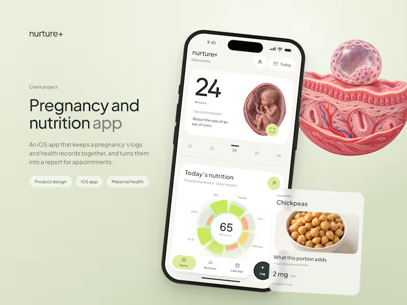


Product & Web Designer for AI/Tech Startups

Product & Web Designer for AI/Tech Startups


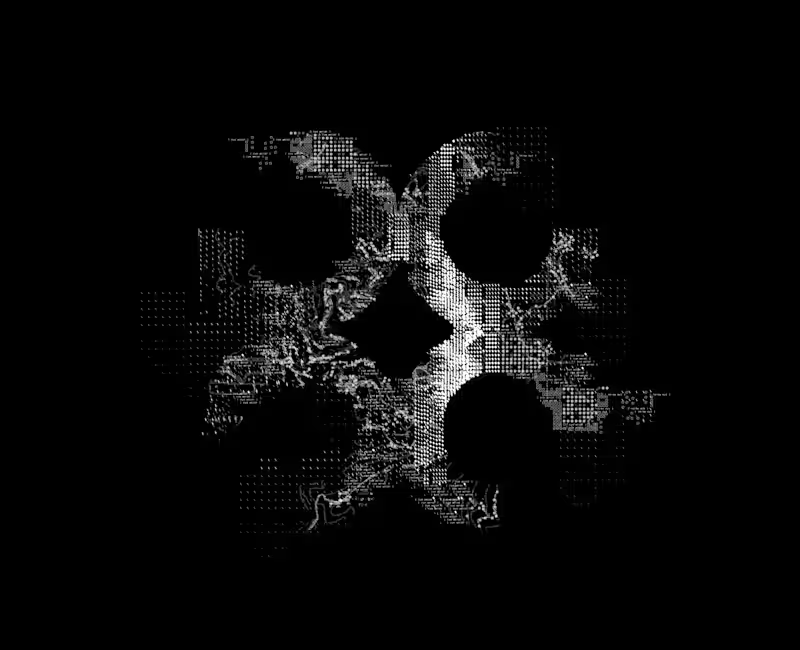
Building a brand pattern for a diagnostics AI company — this one’s a work in progress!
I’ve been experimenting with micro-details like symbols (slashes, squares, text fragments) and topographical map lines inspired by the brand’s origin location to bring depth and structure to the logomark.
Still refining the details over the next few days, but I think it has started to shape up really well!
4
651

Brand & Visual Identity Designer


Visual & Interface Designer (Apps & Websites)

Visual & Interface Designer (Apps & Websites)

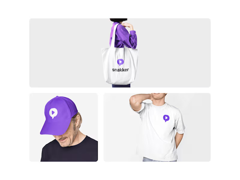

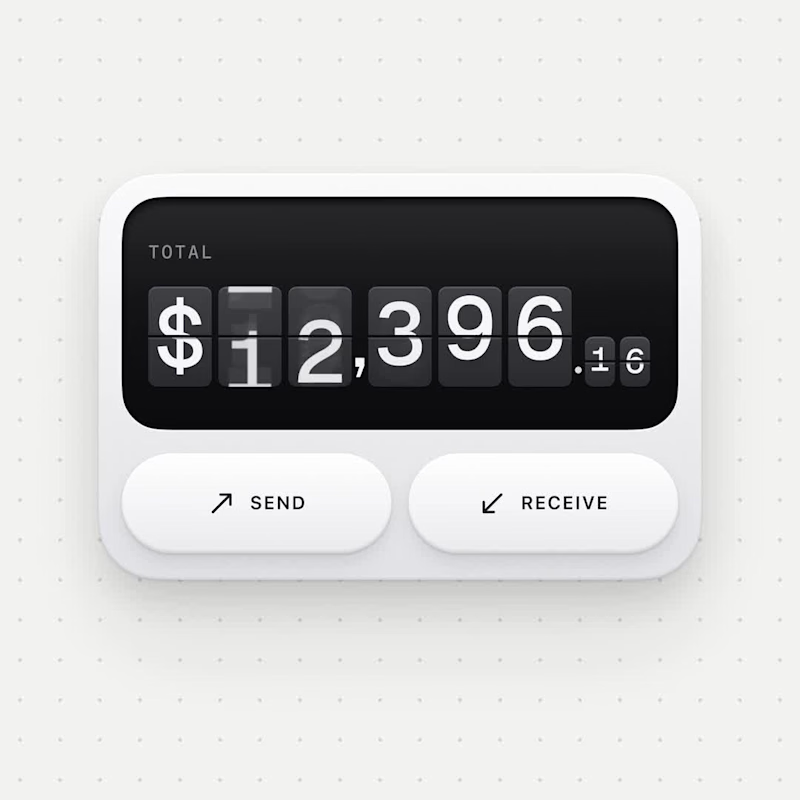
Clean, trustworthy, and distraction-free. Use a calm palette, clear hierarchy, and bold numbers where money matters. Micro-interactions should feel smooth and precise, reinforcing a sense of control and financial confidence.
Book a free design discovery call with me - https://calendar.app.google/mvDiiLENkfAjX3pX8
1
187


Crafting bold brands & intuitive digital experiences.
Crafting bold brands & intuitive digital experiences.


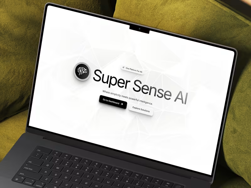


Strategic product design partner for fintech companies.
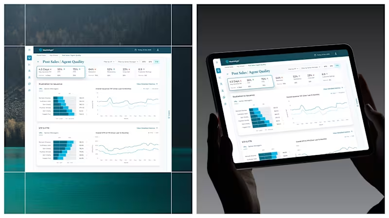


Your Design Partner


UI/UX designer simplifying ideas into user-friendly designs.
UI/UX designer simplifying ideas into user-friendly designs.