Freelance Data Visualizers in Mumbai
Sign Up
Post a job
Sign Up
Log In
Filters
2
Projects
People
Abu Aasif Ansari
Bhiwandi, India
I build AI-powered data apps and dashboards
13
Followers
Follow
Message
I build AI-powered data apps and dashboards
2
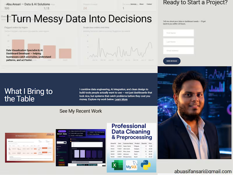
Project Overview This is a personal portfolio and services site built for a working freelancer β myself β as part of the Make It Real Challenge. I'm a data visualization specialist and AI dashboard developer, and I wanted the site itself to reflect that work rather than just describe it. So instead of stock photography and generic copy, every visual on the site is a real screenshot from a project I've actually shipped. The Concept Most freelance portfolio sites lean on polished lifestyle photography β laptops on wooden desks, people in blazers looking thoughtfully at monitors. I wanted to flip that: let the actual product screens do the talking. The site is built around a simple idea β "solutions built on data, not guesswork" β and that shows up literally in the visuals, not just the copy. What's on the site Homepage: A direct hero statement ("I Turn Messy Data Into Decisions") backed immediately by a real dashboard screenshot from my Anomaly Review & Action Console, followed by a "recent work" section pulling in three separate real projects. Services page: Four core offerings β Anomaly Detection Dashboards, Power BI & Data Analytics, AI-Integrated Internal Tools, and Custom Data Automation β each paired with an actual screenshot of that specific project (not a mockup). About page: A short, direct bio and a real photo, no filler. Contact page: A simple inquiry form paired with a data-visualization graphic that matches the site's overall theme. How I used Finish Layer Block Animations: I used on-appear and on-scroll triggers (Reveal and Slide styles) across the homepage, services, and contact pages. Section headings reveal as the page loads, and content blocks slide/fade in as the visitor scrolls β this turns what would be a static, all-at-once page into a guided, paced experience. Block Transform: Rather than a flat grid, I applied a subtle rotation to a couple of key visuals (a dashboard screenshot and the contact-page graphic) β just a few degrees, enough to break the rigidity of the layout without sacrificing readability. It gives the page an asymmetrical, more intentional feel instead of looking templated. Process I built this using Squarespace's Blueprint AI to get a fast base structure, then went through every page replacing AI-generated placeholder content (stock imagery, generic service descriptions, an accidental product/ecommerce section) with real project data, real screenshots, and copy that actually reflects how I work with clients. The site is password-protected rather than published on a paid plan, and is fully responsive across desktop and mobile. Access: π Site: https://pike-megalodon-4yb2.squarespace.com (https://pike-megalodon-4yb2.squarespace.com)π Password: Omega
2
263
0
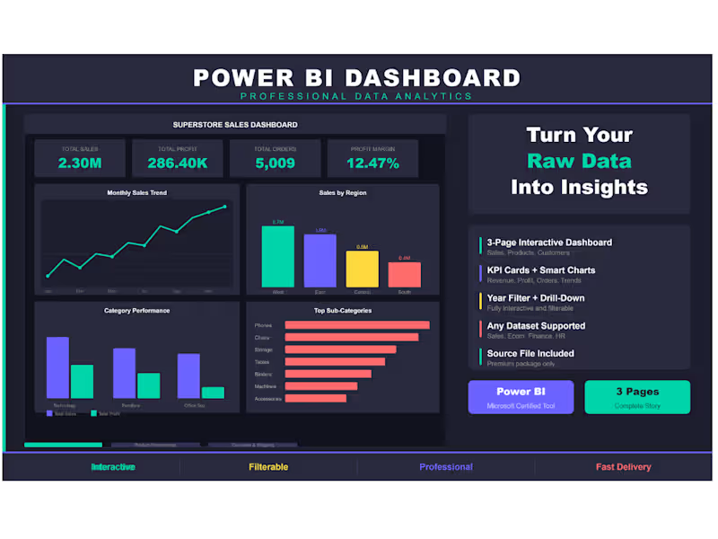
Superstore Sales Dashboard β 3-Page Power BI Report Built an interactive 3-page Power BI dashboard using the Superstore Sales dataset (9,994 orders across USA). Page 1 β Sales Overview: KPI cards, monthly trend, regional breakdown, category performance. Page 2 β Product Performance: Top products, category donut, profit analysis, sales vs profit scatter. Page 3 β Customer & Shipping: Segment breakdown, top 10 customers, monthly growth, ship mode distribution. Tools: Power BI, DAX, Superstore Dataset Theme: Dark professional with interactive year filter.
0
159
1
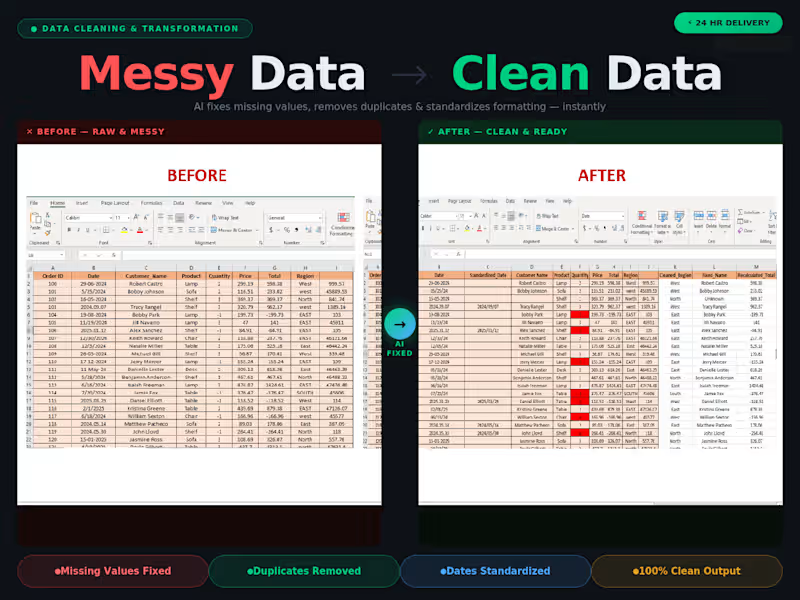
AI-Powered Data Cleaning Tool Development
1
10
1
AI-Powered Data Cleaning Tool
1
6
Data Visualizer
(11)
Follow
Message
Manigandan Acharya
Mumbai, India
Data Specialist for Clean, Organized & Smart Reports
New to Contra
Follow
Message
Data Specialist for Clean, Organized & Smart Reports
0
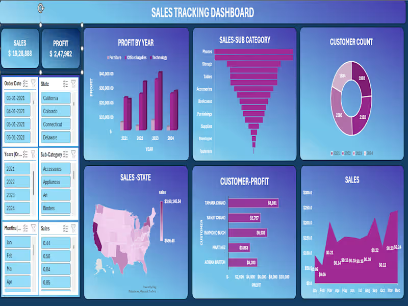
π Sales Tracking Dashboard | Excel + Power BI Project Built an end-to-end interactive Sales Tracking Dashboard covering 2021β2024 across the entire US market. Top-Line Numbers: π° Total Sales: $19,28,888 π Total Profit: $2,47,962 π₯ Total Customers: 8,314 across all years What the dashboard reveals: π Best-selling sub-categories: Phones ($2,79,464) and Chairs ($2,77,058) lead the pack β together accounting for nearly 29% of all sales π Profit growth year-on-year: β 2021: $49,556 β 2022: $61,618 β 2023: $81,786 β consistent upward trajectory across Furniture, Office Supplies & Technology πΊοΈ Geographic concentration: California dominates at $3,90,145 in sales. New York ($2,46,517) and Texas ($1,51,436) follow. West Virginia sits at the bottom with just $536 β a clear signal for regional strategy review. π¦ Technology drives profit β highest-margin category across all 4 years, despite Furniture holding significant volume π§Ύ Seasonal trends: Q4 is king β November ($2,34,013) and December ($2,41,464) are the strongest months. February dips to just $59,640 β opportunity for targeted campaigns. π€ Top customer by profit: Tamara Chand at $8,981, followed by Raymond Buch ($6,939) and Sanjit Chand ($5,757) Tools used: Microsoft Excel Β· Pivot Tables Β· Power Query Β· Charts & Slicers Β· Dashboard Design This project sharpened my ability to turn raw transactional data into a clean, decision-ready visual β with filters for state, date, year, sub-category, and month. Open to feedback! π #Excel #DataAnalytics #SalesDashboard #DataVisualization #BusinessIntelligence #MicrosoftExcel #DashboardDesign
0
20
0
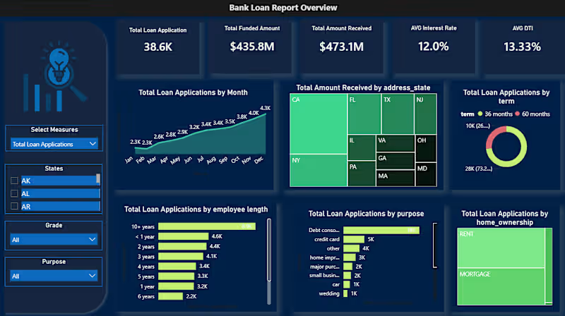
π¦ Bank Loan Portfolio Analysis | Power BI Dashboard Project Analyzed 38,576 loan records across 50 states to give a bank's lending division a unified view of portfolio health β something they simply didn't have before. What the data revealed: β Net-positive portfolio: $435.8M disbursed, $473.1M recovered β οΈ 13.8% bad loan rate = $28.25M net capital loss π Debt consolidation drives nearly half of all loan applications β³ 73% of borrowers chose 60-month terms over 36-month π 60%+ of repayments concentrated in just 5 states (CA, NY, FL, TX, NJ) Tools used: PostgreSQL β Excel β Power Query β Power BI + DAX Built two interactive dashboards: β Summary: KPI cards, good vs. bad loan segmentation, loan status grid β Overview: Trends, geographic maps, term/purpose/employment breakdowns The next phase? Building a predictive risk scoring layer using DTI, interest rate, and employment length to flag at-risk loans before they default. Open to feedback from data folks in the community π #PowerBI #DataAnalytics #SQL #DAX #BankingAnalytics #PortfolioAnalysis #DataVisualization
0
31
0
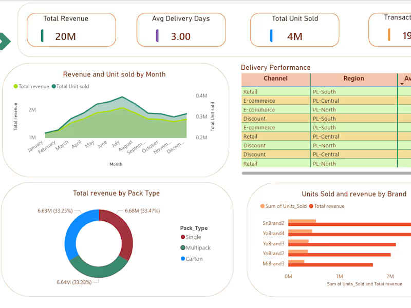
I Built a two-page Power BI dashboard on 190K+ FMCG transactions β tracking revenue, SKU performance, promotional impact, and delivery across 3 channels and 3 regions. Uncovered a balanced 33% revenue split across all channels and identified the top 3 revenue-driving SKUs for smarter inventory decisions. Tools: Power BI Β· DAX Β· Excel
0
64
0
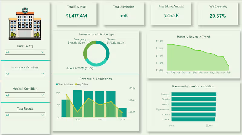
Every hospital generates thousands of data points daily but without the right lens, it's just noise. Built this Healthcare Analytics Dashboard to turn patient records into decisions. From tracking $1.4B in revenue across admission types to spotting a consistent dip in monthly billing trends the numbers tell a story most teams never get to read. The insight that stood out? Diabetes and Obesity quietly lead revenue by medical condition which says a lot about where healthcare demand is heading. This is what data visualization is actually for not prettier reports, but faster, clearer thinking. Tools: Power BI Β· DAX Β· PostgreSQL Β· Power Query
0
54
Data Visualizer
(3)
Follow
Message
Tejas Shinde
Mumbai, India
Merging insights with storytelling
Follow
Message
Merging insights with storytelling
0
Ipman201/Cognizant_AI_Internship
0
3
0
Ipman201/Time-Report-Swords-Freelance-Work
0
4
0
GitHub - Ipman201/Basic-Statistical-Analysis-of-Job-Data-Freelaβ¦
0
30
View more β
Data Visualizer
(3)
Follow
Message
Bharat Sahu
Mumbai, India
Data Analytics & Visualization Expert π―
Follow
Message
Data Analytics & Visualization Expert π―
0
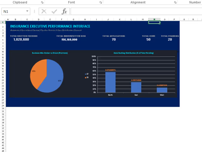
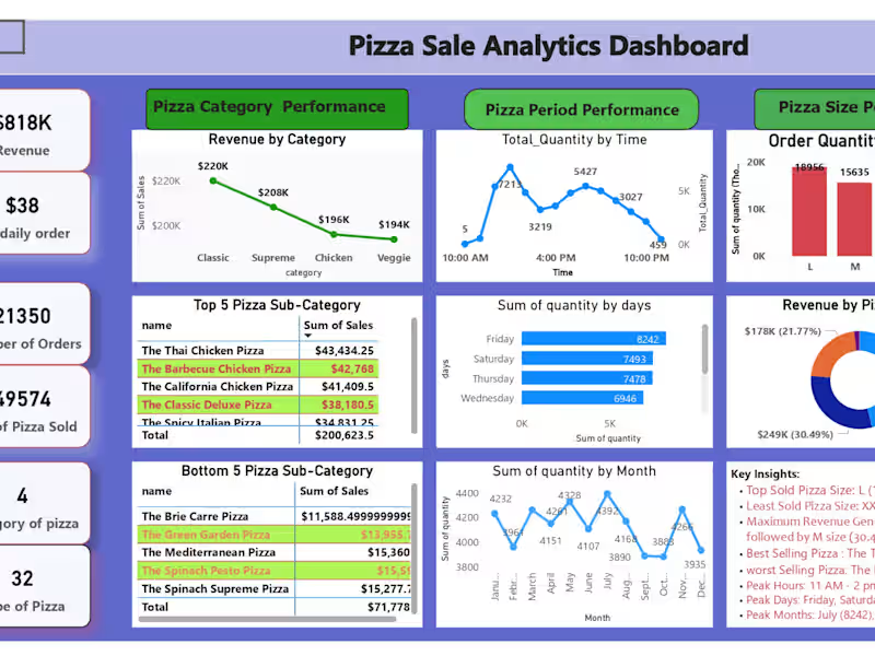
Pizza Sales Analytics Dashboard using MS Excel
0
22
0
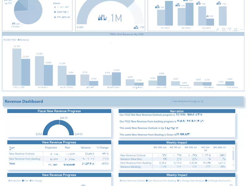
CSM Performance Dashboard using PowerBI
0
28
0
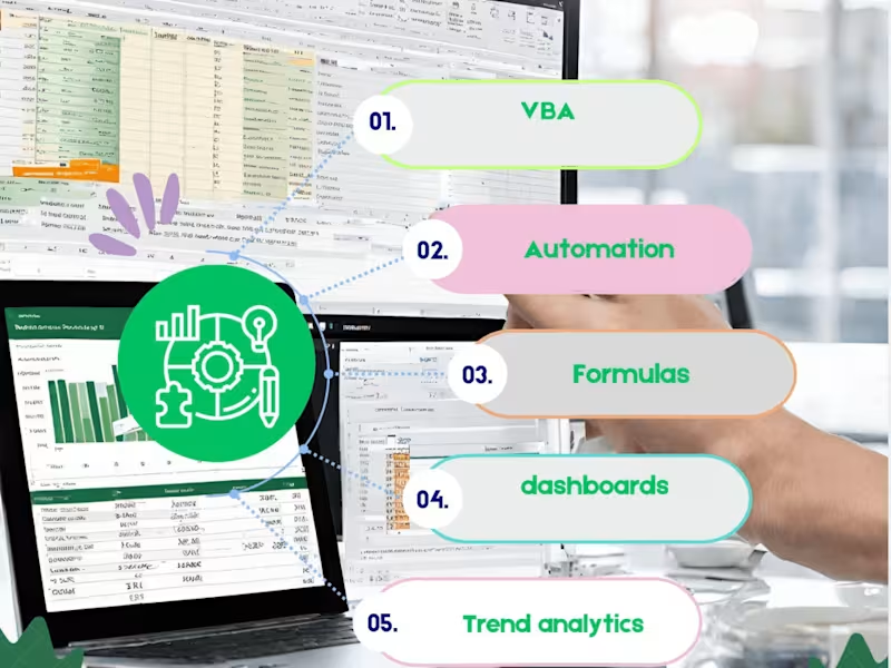
Excel Automation with VBA
0
23
0
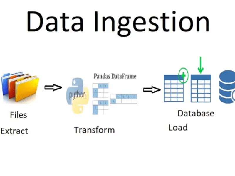
Customer Data Integration with Python
0
10
Data Visualizer
(4)
Follow
Message
Khan Nakhat
Mumbai, India
Founder at NextGen Annotator | AI Data Annotation | QA.
New to Contra
Follow
Message
Founder at NextGen Annotator | AI Data Annotation | QA.
4
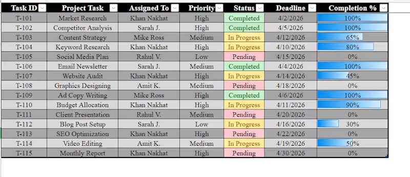
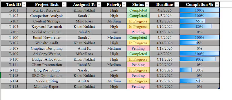
"I just finished building this Dynamic Task Tracker in Excel! π To make project management easier, Iβve added: β Visual Status: Green/Yellow/Red indicators for instant updates. β Progress Bars: Automated bars to show task completion at a glance. β Organized Workflow: Structured by priority and deadlines. If you need help organizing your business data or creating custom Excel dashboards, Iβm available for new projects! π"
2
4
181
0
Dynamic Project Management & Task Tracker 2. About this work (Description) "I developed a highly visual and organized Task Management Tracker in Excel to help teams monitor project progress efficiently. Key Features & Skills: Visual Status Tracking: Implemented Conditional Formatting to highlight task status (Completed, In Progress, Pending) for quick updates. Progress Visualization: Integrated Data Bars in the 'Completion %' column to provide a clear visual representation of work done. Data Management: Organized tasks by Priority, Deadlines, and Assignees to ensure smooth workflow management. Professional Layout: Clean grid design with structured headers, making it easy for any manager to use and update."
0
53
0
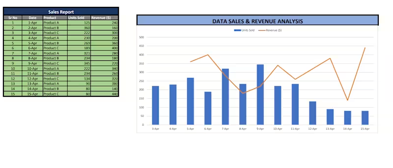
"I love turning messy numbers into clear insights! π Hereβs a recent Data Entry and Analysis project where I used advanced Excel functions to track units sold and revenue. Precision and efficiency are always my top priorities."
0
55
0
π Scaling Your AI Models or Data Operations? Let Our Team of 40 Handled the Heavy Lifting! Hey Contra Community! π Are you struggling to keep up with massive datasets, messy annotations, or slow image verification pipelines? If you are an AI startup, tech agency, or enterprise looking for a reliable partner to handle high-volume data tasks, we are here to help! I manage a structured, fully trained team of 40 data annotation and QA specialists ready to deploy immediately. βοΈ What We Bring to the Table: Massive Volume, Fast Delivery: With 40 people working in sync, we can process thousands of images, posts, or data rows daily without breaking a sweat. Flawless Quality Control: We donβt just annotate; we implement a strict internal QA layer to ensure 99%+ accuracy before final delivery. Versatile Expertise: Experienced in Image QA/Review (like matching AI outputs to inputs), Data Labeling (Bounding boxes, tagging), and Large-scale Data Entry (CSV/Sheets management). πΌ Flexible Setup: Whether you have a 1-week urgent sprint or need an ongoing monthly workforce, we scale according to your project requirements. Let's remove the bottleneck from your operations. DM me directly to discuss your project requirements or to set up a quick sample/pilot task! Letβs build something great together. π
0
47
Data Visualizer
(3)
Follow
Message
Gauravi Kumari
Mumbai, India
I Fix Bad UX Decisions That Silently Kill Revenue
New to Contra
Follow
Message
I Fix Bad UX Decisions That Silently Kill Revenue
0
Exportify Connect : Seamlessly Connecting Global Trade
0
2
0
3D Design & Marketing for DeFi.
0
4
1
GoodLives Mental Health Platform UI/UX Design
1
6
1
Vaxikart mobile app case study (GSK)
1
3
Data Visualizer
(3)
Follow
Message
Arunima Ray
Mumbai, India
Designer making engaging visuals, videos and UI designs.
Follow
Message
Designer making engaging visuals, videos and UI designs.
0
Talaas: A Data-Driven Visualisation into Bharatnatyam Rhythms
0
1
0
IRCTC - Usability Testing Report on Redesigned Website
0
2
0
Cognitive Science - Discord
0
0
View more β
Data Visualizer
(1)
Follow
Message
Arsal Khan
Mumbai, India
"From Data Chaos to Business Clarity."
Follow
Message
"From Data Chaos to Business Clarity."
0
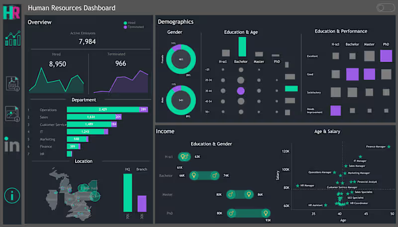
Human Resources (HR) Report
0
16
0
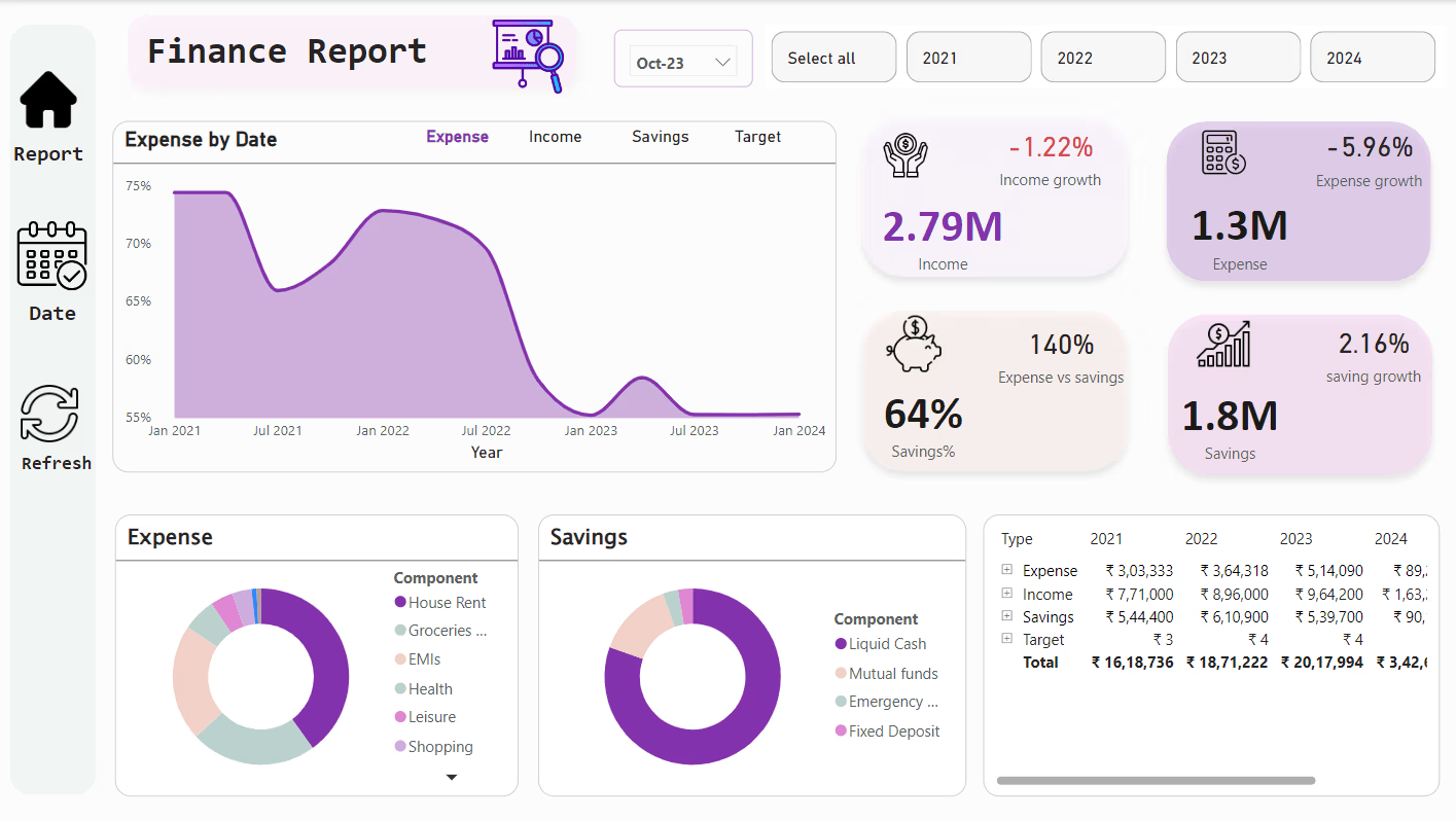
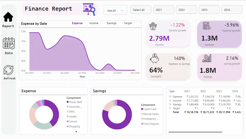
Financial Report
0
32
0
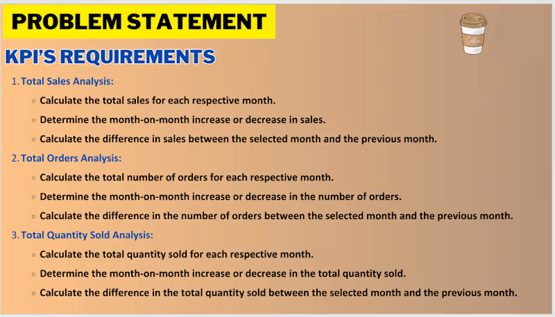
Coffee Shop Sales Analysis
0
25
View more β
Data Visualizer
(1)
Follow
Message
Explore people