
Aditi Patil
Stories run through my veins
New to Contra
Aditi is ready for their next project!


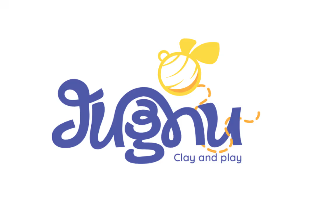
Jugnu is an inclusive clay-play concept designed for neurotypical and neurodivergent children.
The project explored how a product could make creative play more engaging, tactile, and inclusive through its sensory experience. Inspired by the firefly, or jugnu, the brand represents the light and individuality within every child. The clay itself glows in the dark, adding an element of surprise and playfulness to the experience while reinforcing this idea of finding and expressing the light within.
I developed the brand identity, kit materials, packaging, and brand photography, with the packaging designed to transform into an interactive board game, giving it a second life as part of the play experience.
Designed across: Branding · Packaging · Visual Identity · Product Experience · Photography
A project where I fell in love with brand identity design. JUGNU has a piece of my heart.
7
14
1.3K
Challenged myself to create a Brand Identity in a single day.
Presenting Legacy works.
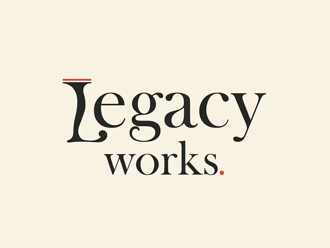
Legacy Works is a brand identity concept for an antique furniture store, built around the idea of bringing heritage and craftsmanship into a more bold, contemporary visual language.
Rather than leaning into the typical browns and earthy tones associated with antique furniture, I explored a sharper palette of charcoal, warm beige and red. The custom wordmark draws directly from the forms of antique furniture, with the “L” inspired by the curved leg of a vintage piece.
2
180
Poké : Branding & Visual Identity
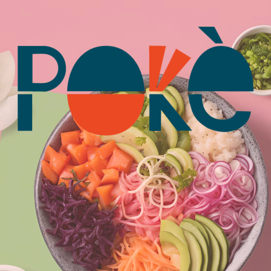
Poké was my first self-initiated branding project, developed from a brief I found on Designer Briefs back in 2023. Not bad for a first branding project, considering I drew the illustration using a mousepad and sheer determination haha.
I played with the typography to turn the letters themselves into visual elements, using the shapes of a poké bowl and chopsticks to build the logo and create a playful, recognizable identity.
My Process
I started by exploring the visual world of poké culture- fresh seafood, tropical elements, the ocean, and playful food imagery. From there, I developed a colour palette inspired by tropical foliage, fresh fish, sea and waves, and tropical florals. I then built a supporting illustration system around these ideas using hand-drawn elements like fish, shells, flowers, lemons, and coconuts.
2
253
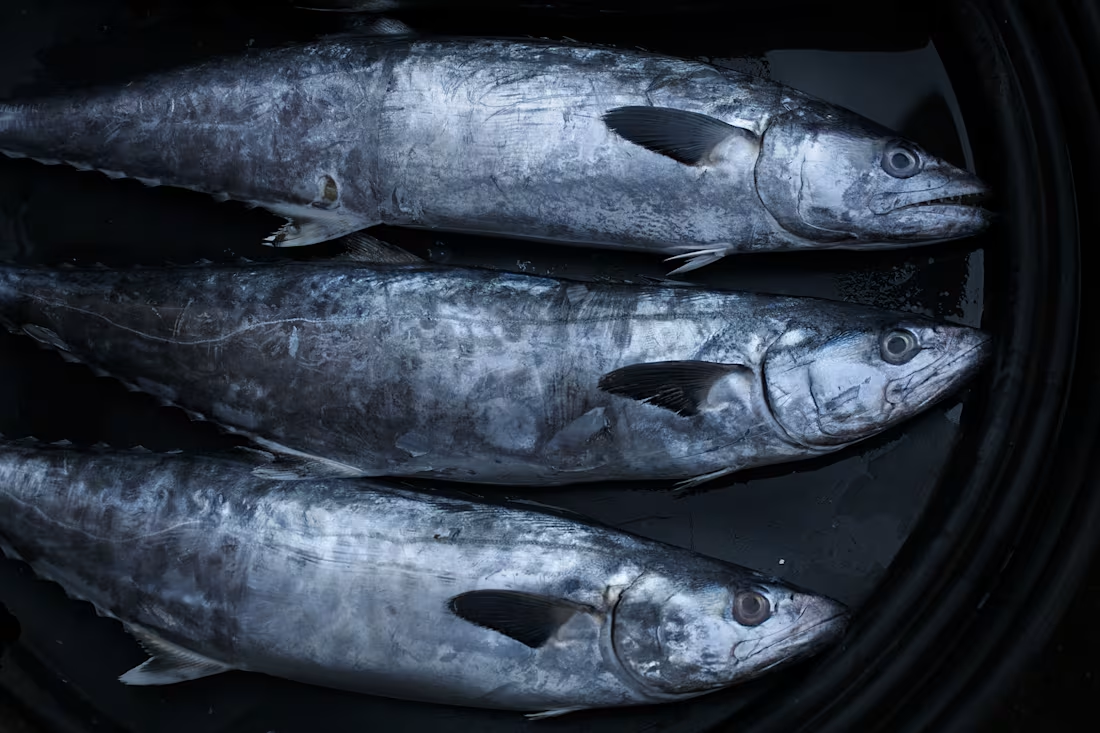
Morning Rhythms of Uttan: A Fishing Village Photostory
1
13