Financial Report
Arsal Khan
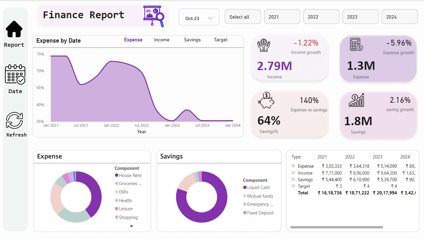
This Finance Report Dashboard is designed in Power BI to offer a comprehensive view of financial performance over the years, using data transformed through ETL processes and DAX for calculations and analysis. Here’s a breakdown of the key elements and insights presented in the dashboard:
1. Dashboard Header
Title and Icons: The top displays the "Finance Report" title with relevant icons and date filters for dynamic selection. Users can toggle between years (2021-2024) and view consolidated data or select specific timeframes.
Date Selection: Dropdown for selecting specific months (e.g., Oct-23) and toggling yearly filters for focused insights.
2. Expense by Date (Line Graph)
A line chart tracks the percentage of expenses over time, highlighting trends from January 2021 to January 2024.
This visualization enables users to monitor fluctuations and identify periods with high or low expenses, which may correlate with income or savings trends.
3. Key Metrics (KPI Cards)
Income: Displays the total income (2.79M) and shows a decrease of -1.22% in income growth.
Expense: Total expense (1.3M) with a decrease of -5.96% in expense growth.
Savings %: Reflects the percentage of income saved (64%), indicating financial health.
Expense vs. Savings: A 140% indicator showing that expenses exceed income significantly, drawing attention to potential overspending.
Savings Growth: Shows a 2.16% growth in savings, with the total amount saved being 1.8M.
4. Expense and Savings Components (Donut Charts)
Expense Breakdown: A donut chart categorizes expenses into components like House Rent, Groceries, EMIs, Health, Leisure, and Shopping. Each segment visually represents the proportion of each component to the overall expense.
Savings Breakdown: Another donut chart shows the distribution of savings across different categories, such as Liquid Cash, Mutual Funds, Emergency, and Fixed Deposits, providing insights into asset allocation.
5. Data Table (Expense, Income, Savings, Target)
A detailed table at the bottom provides a year-by-year breakdown of expense, income, savings, and target values for 2021 to 2024.
Each category shows amounts for each year, followed by a total row at the bottom, giving a quick overview of the cumulative values.
6. ETL and DAX Implementation
ETL: Data cleaning and transformation processes have been applied to ensure accuracy and consistency in the dataset, including handling missing data, normalizing categories, and preparing the data for Power BI.
DAX Calculations: Measures and calculated columns in DAX were used to compute growth percentages, savings ratios, and target comparisons, enhancing the analytical depth of the report.
7. Navigation Pane
The left sidebar includes icons for navigation:
Report: Default view displaying the current dashboard.
Date: Possibly links to a date-wise breakdown or filter view.
Refresh: Option to refresh the data, ensuring users are viewing the latest information.
Summary
This dashboard provides a holistic view of financial performance, offering insights into income, expenses, and savings trends. Through interactive charts, KPIs, and tables, users can identify financial patterns, make data-driven decisions, and adjust strategies based on the presented data. This Power BI report, with its clean design and robust data structure, is an efficient tool for ongoing financial analysis and planning.
Power Bi Report
Like this project
Posted Oct 29, 2024
This dashboard provides a holistic view of financial performance, offering insights into income, expenses, and savings trends. Through interactive charts, KPIs,