
Creative Director, Brand Identity & AI Film
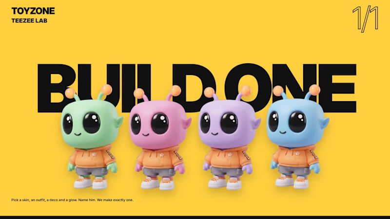
One alien, infinite editions. TEEZEE’s mint skin, glossy black eyes and orange antenna tips anchor four editions: Blast, Skate, Groove and Explore. Bold colour, oversized typography and graphic packaging create a flexible identity with the character at its centre.
The store demo follows a shopper from homepage to checkout, using motion to guide browsing, clarify product choices and confirm purchases. Animated edition transitions, quick-add interactions and a four-figure set builder make the journey playful and easy to follow.
TEEZEE Lab extends the concept into customization. Shoppers choose skin, outfit, print and antenna colour, then name their character. Live pricing and packaging previews track each choice before the finished figure becomes a boxed “1 OF 1” collectible.
A looping brand-guidelines film carries the identity across packaging, merchandise, retail and digital applications. AI-assisted imagery was refined by hand to maintain consistent typography, branding and pricing.
Together, the films demonstrate a complete creative system—from character and identity to an animated shopping experience.
0
67
Ocean Getaways
Brand identity, guidelines, website and social
A private yachting advisory, established in 1984 in Flushing, New York, curating charters and journeys worldwide. The identity rests on one gesture: a wave drawn through the A, the moment a hull meets open water. Deep Ocean navy, Aegean blue and warm sand, set in Playfair Display and Montserrat, with photography that leads with the journey and lets the brand stay quiet.
Identity
A stacked and a horizontal wordmark, a Q-shaped monogram for small spaces, and four fine-line icons drawn like a nautical chart: wave, compass, journey and horizon. The voice is short and confident. Discover. Explore. Charter. Experience. Belong.
Website
Every page leads with the journey, then the advisory. Full-bleed destination photography, generous white space, a sticky navigation that turns solid as you scroll, and a single navy call to action that ends in a one-line inquiry.
0
76
Overview
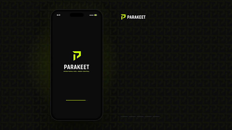
Parakeet is a brand concept created to demonstrate how a complex B2B software platform could be transformed into a modern, enterprise-grade technology brand. The objective was to move beyond generic SaaS aesthetics and position Parakeet as a trusted operational risk intelligence platform serving industrial, energy, manufacturing, and infrastructure organizations.
Challenge
Most risk and compliance platforms rely on outdated corporate branding that feels technical but lacks clarity, authority, and differentiation. The goal was to create a brand that communicated trust, precision, operational excellence, intelligence, and enterprise credibility while remaining visually modern and scalable.
Solution
I developed a complete brand system including:
Brand positioning
Logo and visual identity
Color palette and typography system
Iconography suite
Website direction
Product UI concepts
Social media assets
Sales deck and collateral design
The visual language combines industrial strength with technology-forward sophistication through a high-contrast black, carbon, and safety-lime palette inspired by control rooms, infrastructure, and mission-critical operations.
Result
The final concept demonstrates how strategic branding can elevate a technical software product into a premium enterprise platform with a clear market position, strong visual differentiation, and a cohesive customer experience.
Services: Brand Strategy, Creative Direction, Visual Identity, UI/UX Direction, Product Marketing, Sales Enablement Assets
0
75


UI/UX Designer & Webflow Developer for Stunning Interfaces
- $5k+
- Earned
- 7x
- Hired
- 5.0
- Rating
- 12
- Followers
UI/UX Designer & Webflow Developer for Stunning Interfaces


Senior Graphic Designer | Digital Ads | Web Design | Figma
- 2x
- Hired
- 5.0
- Rating
- 15
- Followers
Senior Graphic Designer | Digital Ads | Web Design | Figma


Principal product designer for data-heavy software
Principal product designer for data-heavy software

Crafting impactful brand identities and websites
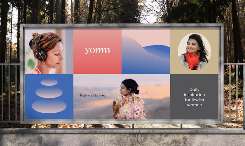


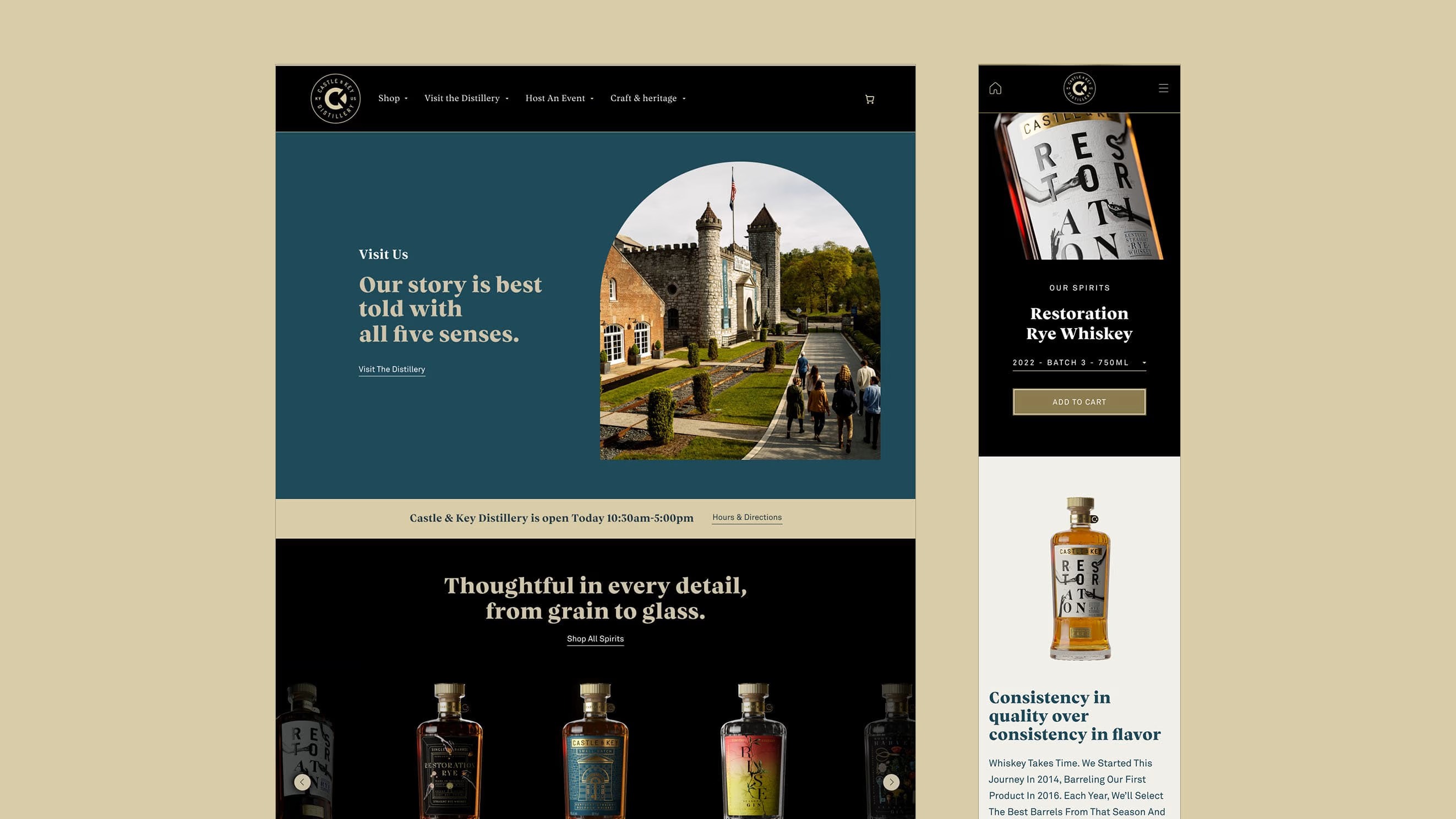
Barrett & Friends is a creative studio in Minneapolis

Barrett & Friends is a creative studio in Minneapolis


View more →

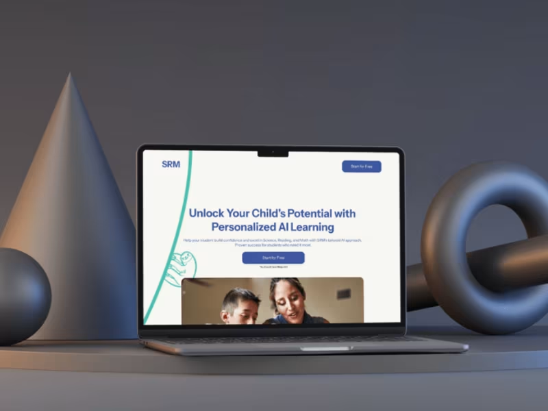
UI/UX Design for High-Converting SaaS Landing Pages
UI/UX Design for High-Converting SaaS Landing Pages
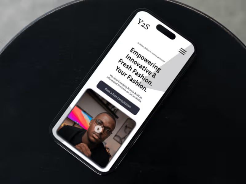

Principal UX Product/Service Designer for Top Tier Clients✨
Principal UX Product/Service Designer for Top Tier Clients✨


