
WordPress websites, brand and product design. Twenty years.
WordPress websites, brand and product design. Twenty years.

Information Designer specialising in branding and much more!
New to Contra
Information Designer specialising in branding and much more!
Smart Living — Tech Summit Event Identity & Digital Collateral
Smart Living is an innovative tech and smart-lifestyle brand bringing people together to create meaningful change through connectivity.
The Challenge: Develop an energetic, modern brand identity for the Smart Living Summit that seamlessly translates across event signage, digital attendee cards, and large-scale conference slide decks.
The Solution: We crafted a flexible visual identity system centered around a circuit-node motif, representing community networking and tech innovation. Driven by a high-energy palette of electric blue, coral, and teal, paired with clean geometric typography and dynamic constellation patterns, the identity creates a cohesive, memorable experience across all physical and digital touch points.
Collateral & Digital Application
Event Access & Lanyards: Dual-colored ID badges with customized fabric lanyards featuring woven constellation network patterns and logo repeats.
Exhibition Banners & Signage: Tall pull-up banners pairing high-contrast event photography with overlayed geometric network webs and bold call-to-action typography.
Digital Profile Cards / Mobile UX: Sleek mobile-first team member cards with integrated circuit linework, arched headshot frames, and bio excerpts.
Presentation Decks & Conference Collateral: Modular slide decks featuring duotone photo treatments, coral speaker banners, and node-grid background graphics for the Smart Living Summit.
0
14
CEM Mining — Corporate Brand Identity & Collateral Design
CEM Mining is a specialized consultancy delivering focus-centric, practical solutions to the mining and mineral extraction industry.
The Challenge: Modernize and elevate the brand’s industrial presence, creating a identity that appeals to corporate stakeholders while remaining grounded in technical precision.
The Solution: We designed a brand identity around a concentric geological focal mark, representing geological strata, radar target mapping, and laser-focused consulting. Paired with a charcoal, slate, and metallic gold color system, bold typography, and a suite of high-end corporate collateral (billboards, stationery, branded outerwear, and site merchandise), the visual identity positions CEM Mining as an authoritative, forward-thinking industry leader.
Out-of-Home & Billboard Advertising: High-impact, dark-mode environmental displays combining industrial imagery, worker portraiture, and gold contrast typography.
Corporate Stationery: Clean, executive letterheads incorporating subtle background watermark rings of the contour mark and structured footer details.
Branded Apparel & Gear: Premium dark outerwear (puffer jackets) featuring stitched metallic gold logo detailing and two-tone inner hood lining.
Field Merchandise: Earthy ochre-orange matte aluminum water bottles and field equipment featuring full brand mark prints for on-site durability.
0
25
Haute Creations — Brand Identity & Digital Design
Haute Creations is a high-end interior and bespoke woodwork brand specializing in luxury spaces and tailored joinery.
The Challenge: Craft a brand identity that bridges the raw, organic beauty of natural wood craftsmanship with modern luxury interiors.
The Solution: We developed an identity system centered around natural timber rings and custom line-art emblem motifs. Paired with a sophisticated deep navy and metallic gold palette, elegant high-contrast typography, and full digital collateral (business cards, web concept, and social grids), the new look positions Haute Creations as a leader in high-end bespoke space solutions.
1
1
38
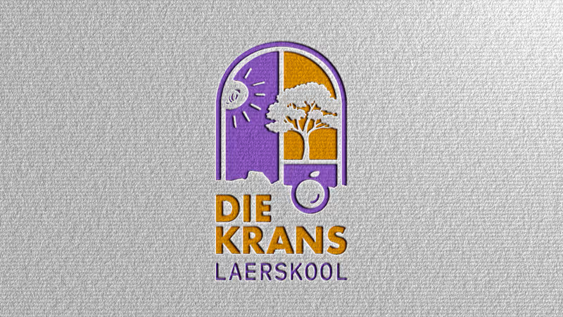
Die Krans Laerskool — Primary School Brand Identity & Web Design
Industry: Primary School Education
Concept & Inspiration (Logo Creation)
Symbolic Heritage: Grounded in Biblical symbolism (Psalm 127:3-5 and the Fruit of the Spirit) and rooted in local heritage.
Iconography Integration: Weaves together five core motifs—an arched window of opportunity, a piece of fruit, a flourishing tree, radiant sunlight, and a mountain cliff silhouette (krans). Together, these symbolize a safe haven designed to foster growth, independence, and love.
Color Palette Inspiration
Nature & Energy: Inspired by the iconic purple jacaranda blooms, balanced with deep cosmic blues.
Warmth & Joy: Energized with contrasting accents of vibrant orange, warm yellow, and red, conveying enthusiasm and a welcoming learning environment.
Die Krans Laerskool is a primary school dedicated to nurturing young minds in a safe, loving, and growth-oriented environment.
The Challenge: Modernize the school’s visual identity while honouring its faith-based foundations, local landscape heritage, and commitment to holistic child development.
The Solution: We created a warm, cheerful brand identity centered around an arched window emblem that integrates symbolic motifs—sunlight, a flourishing tree, a mountain cliff, and the fruit of the spirit. Paired with a Jacaranda-inspired purple and vibrant orange palette, playful typography, and custom digital/print collateral, the new identity positions Die Krans as a dynamic, joyful haven where small steps lead to big dreams.
0
30

Brand, Lettering and Typography
Brand, Lettering and Typography


Create | Curate | Repeat
Create | Curate | Repeat


Designing brand stories with strategy & style
Designing brand stories with strategy & style


Graphic Designer - Founder - WABU STUDIOS


Brand Identity & Social Media Designer
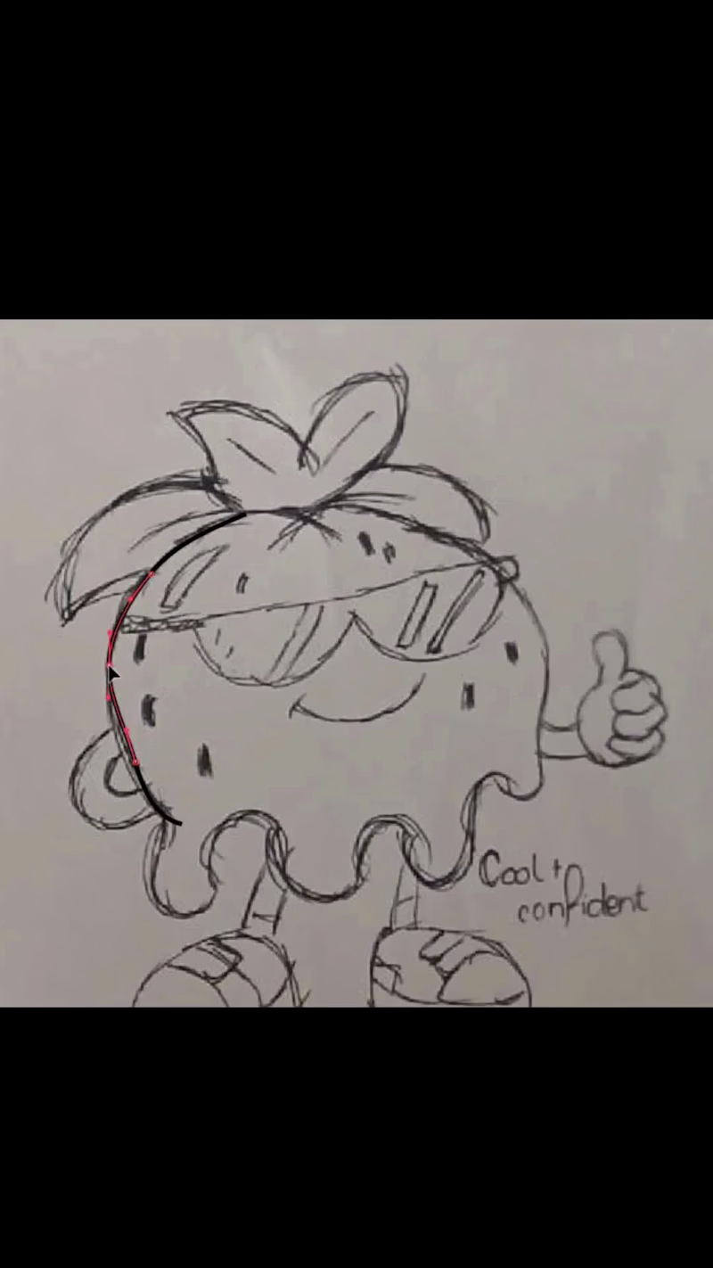
Designing a strawberry mascot 🍓
I wanted to create a fun, playful mascot for a fictional ice cream brand starting with a simple strawberry and turning it into a character with its own personality.
From rough sketches to the final illustration, this was such a fun little branding exercise.
Would you buy ice cream from this little guy? 👀
#CharacterDesign #MascotDesign #BrandIdentity #BrandingDesign #Illustration #GraphicDesign #PackagingDesign #LogoDesign #CreativeProcess #Contra
3
84


Brand designer • UX/UI • Print Design Expert
Brand designer • UX/UI • Print Design Expert


