
Die Krans Laerskool — Primary School Brand Identity & Web Design
Industry: Primary School Education
Concept & Inspiration (Logo Creation)
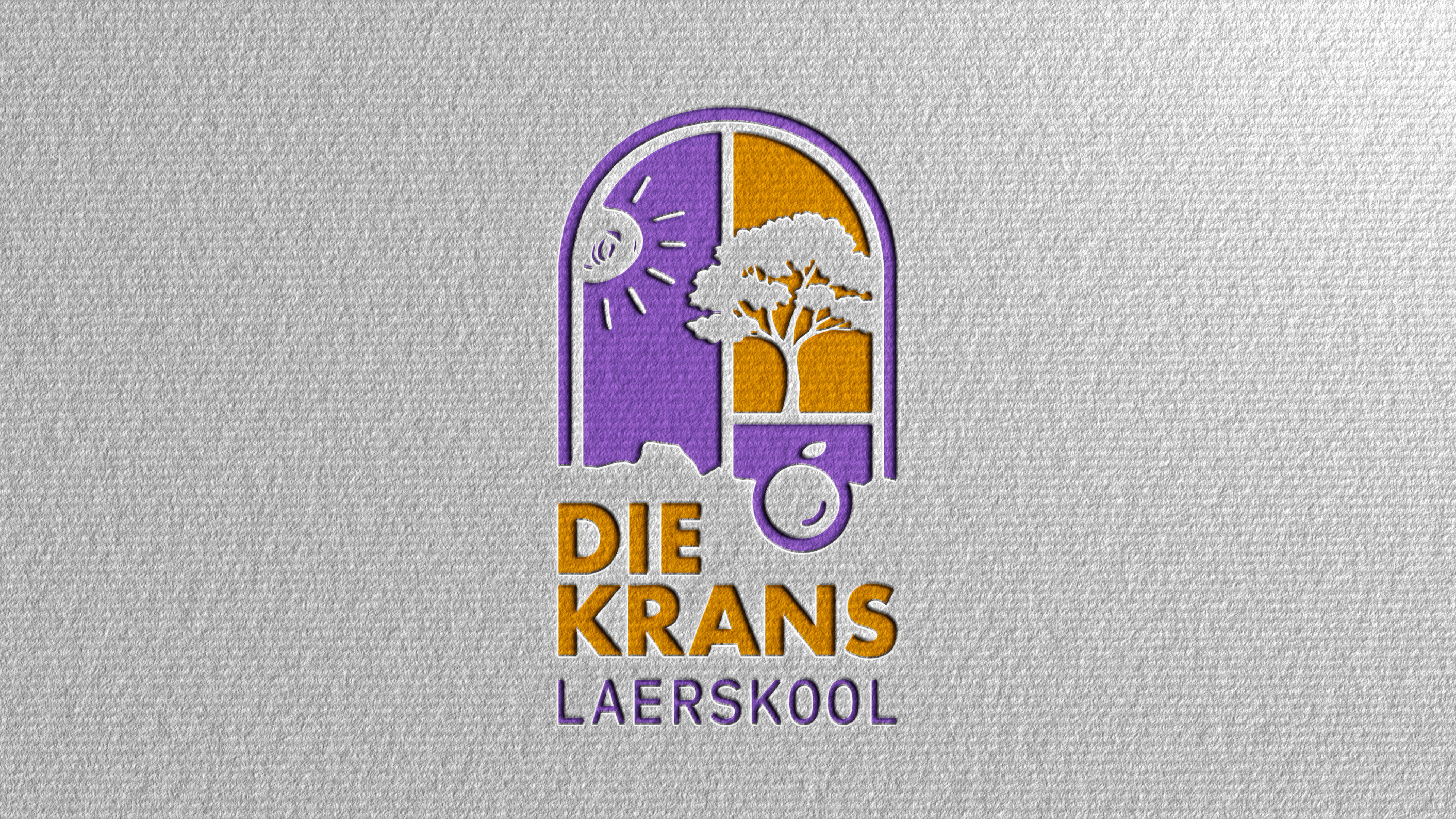
Symbolic Heritage: Grounded in Biblical symbolism (Psalm 127:3-5 and the Fruit of the Spirit) and rooted in local heritage.
Iconography Integration: Weaves together five core motifs—an arched window of opportunity, a piece of fruit, a flourishing tree, radiant sunlight, and a mountain cliff silhouette (krans). Together, these symbolize a safe haven designed to foster growth, independence, and love.
Color Palette Inspiration
Nature & Energy: Inspired by the iconic purple jacaranda blooms, balanced with deep cosmic blues.
Warmth & Joy: Energized with contrasting accents of vibrant orange, warm yellow, and red, conveying enthusiasm and a welcoming learning environment.
Die Krans Laerskool is a primary school dedicated to nurturing young minds in a safe, loving, and growth-oriented environment.
The Challenge: Modernize the school’s visual identity while honouring its faith-based foundations, local landscape heritage, and commitment to holistic child development.
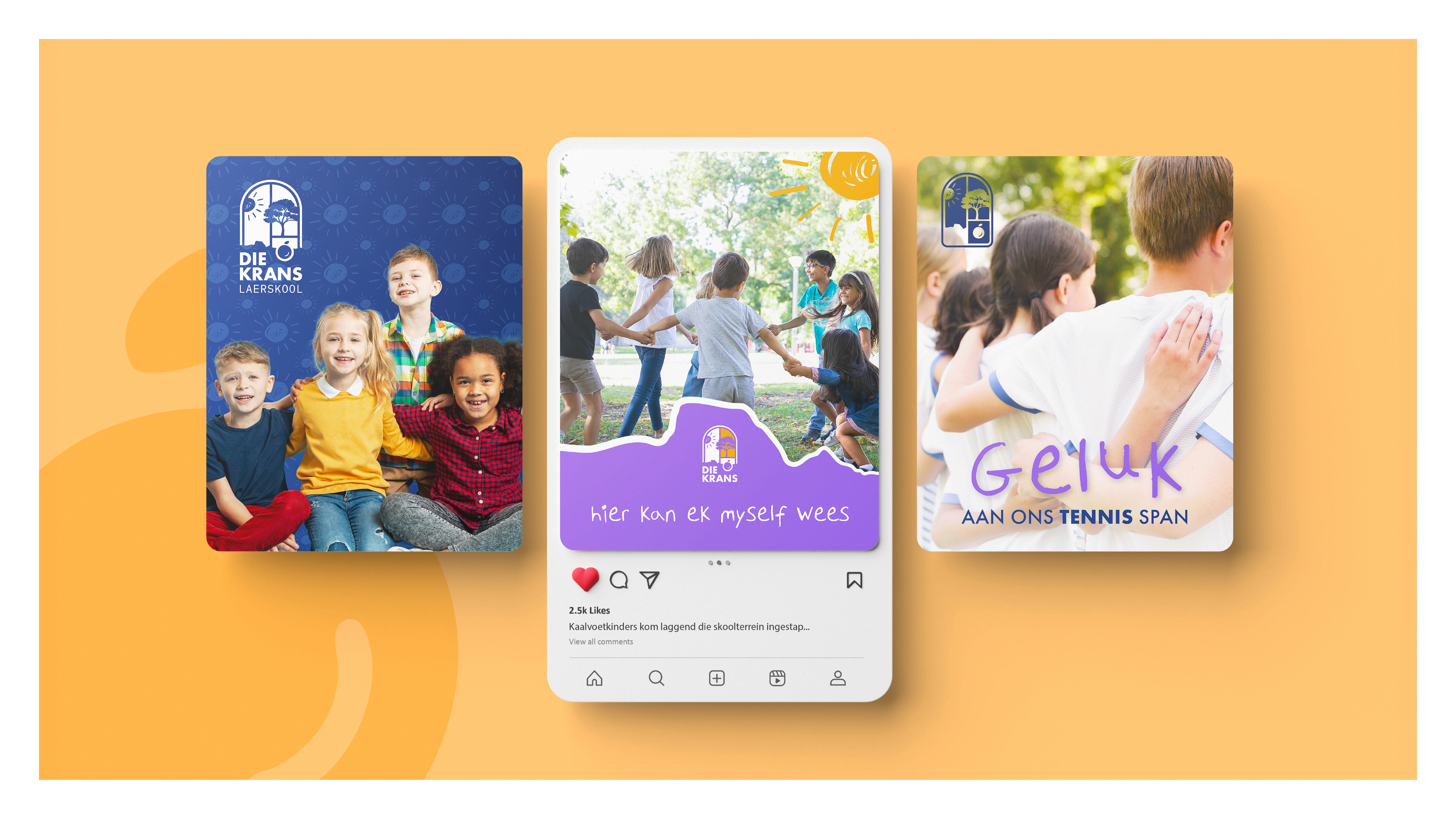
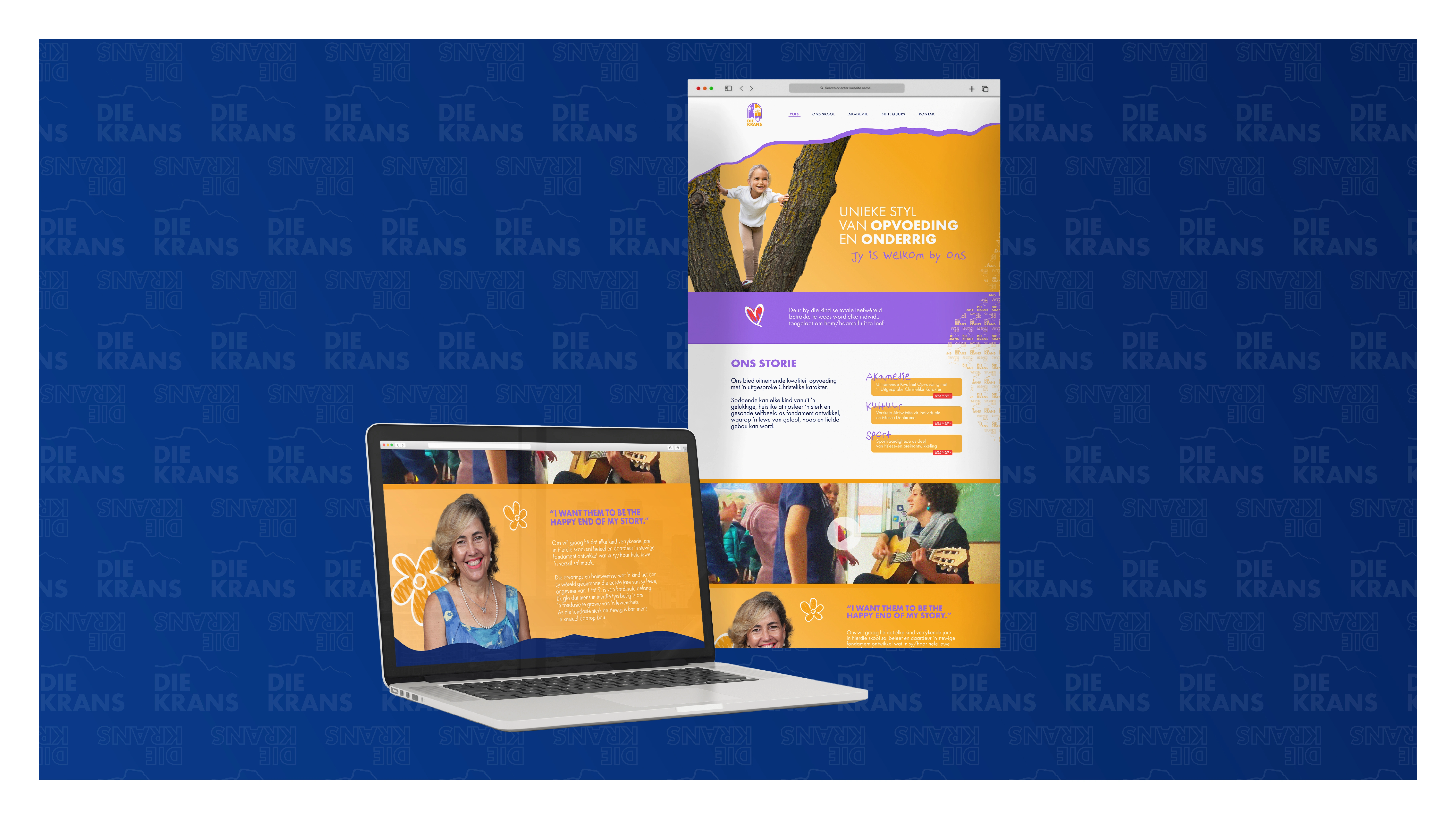
The Solution: We created a warm, cheerful brand identity centered around an arched window emblem that integrates symbolic motifs—sunlight, a flourishing tree, a mountain cliff, and the fruit of the spirit. Paired with a Jacaranda-inspired purple and vibrant orange palette, playful typography, and custom digital/print collateral, the new identity positions Die Krans as a dynamic, joyful haven where small steps lead to big dreams.

0 likes · 0 views · Oct 15, 2026
Die Krans Laerskool — Primary School Brand Identity & Web Design Industry: Primary School Education Concept & Inspiration (Logo Creation) Symbolic Heritage: ...

