Projects using Adobe InDesign in Madrid
Projects using Adobe InDesign in Madrid
Sign Up
Post a job
Sign Up
Log In
Filters
2
Projects
People
Message
18
Lalila Studio
pro
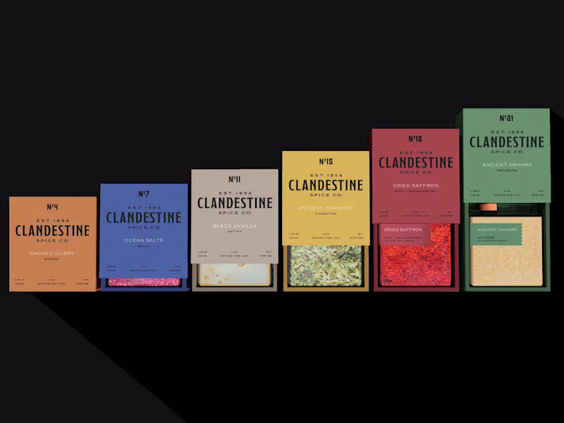
CLANDESTINE Brand and Packaging Design
18
94
Message
0
Jose Maria Gonzalez-Ecija
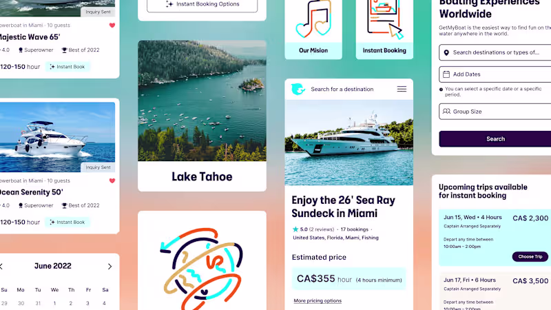
Getmyboat: Brand Development & Illustration
0
5
Message
18
Carol López-Burbano
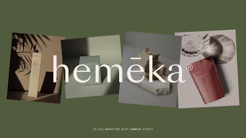
☘ Hemēka
18
93
Message
1
Meg Quintos
pro
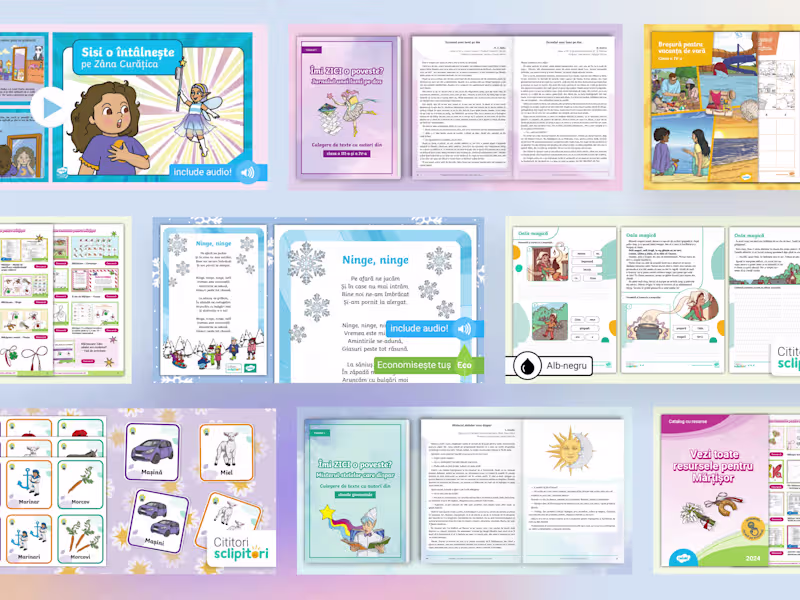
Creative Design for Educational Materials
1
41
Message
0
Cristian Rodriguez
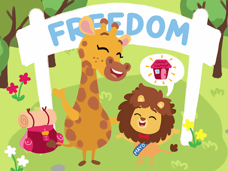
Finding Freedom
0
73
Message
0
Ainara | Eyenara
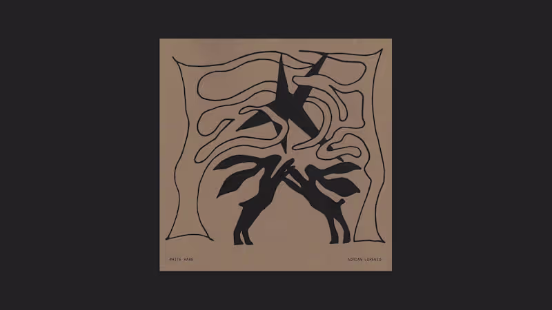
White Hare: A Winter Photobook Design 🐇
0
7
Message
1
Antoine GUEUTIN
Artistic Direction for Medicings' New Platform
1
2
Message
0
Simona Todorova
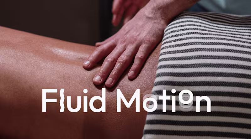
Fluid Motion Brand Identity Design
0
6
Message
0
Mario Nevado
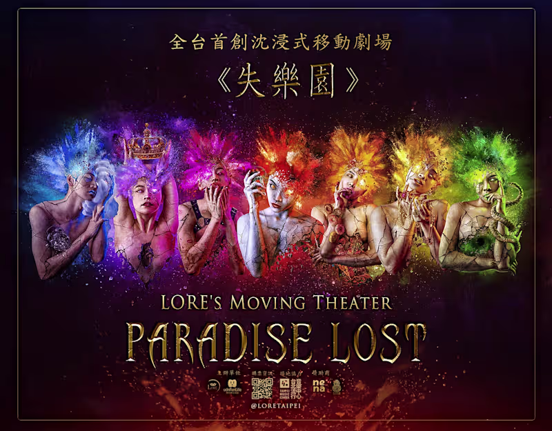
Lore's Moving Theatre Advertising Campaign
0
2
Message
1
Andreina Herlop
Editorial Design
1
7
Message
0
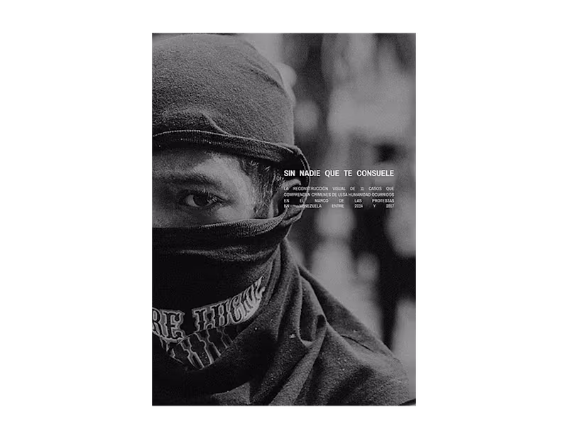
Julio S. Castro
Sin Nadie Que Te Consuele
0
5
Message
0
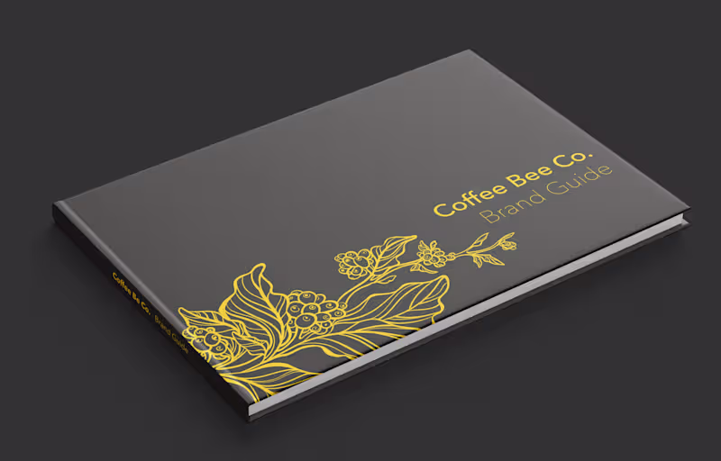
Hellen Cárdenas
Branding: Coffee Bee Co
0
1
Message
3
Virginia Roson
pro
Brand Identity & Packaging Design
3
514
Message
23
Carlos Huertas
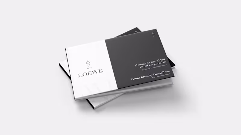
Maybe it's not very common to see projects about the luxury industry here but I wanted to share this branding project that I did. Hope you like it! Rebranding for Loewe + brand guidelines. Loewe is a Spanish luxury brand that focuses primarily on craftsmanship and sustainability. This rebranding was carried out with the aim of highlighting and emphasizing these brand values that set it apart in a sector as consumerist as luxury fashion. The goal was to approach this rebranding from a transparent perspective, directly connected to nature but taking into account the luxury, exclusivity, and elegance of the brand. Create a visual identity manual with brand guidelines in order to maintain a clear and consistent visual identity over time.
2
23
270
Message
0
Joy Z
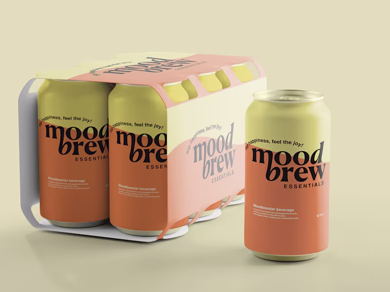
Moodbrew branding
0
15
Message
1
Marang Garcia
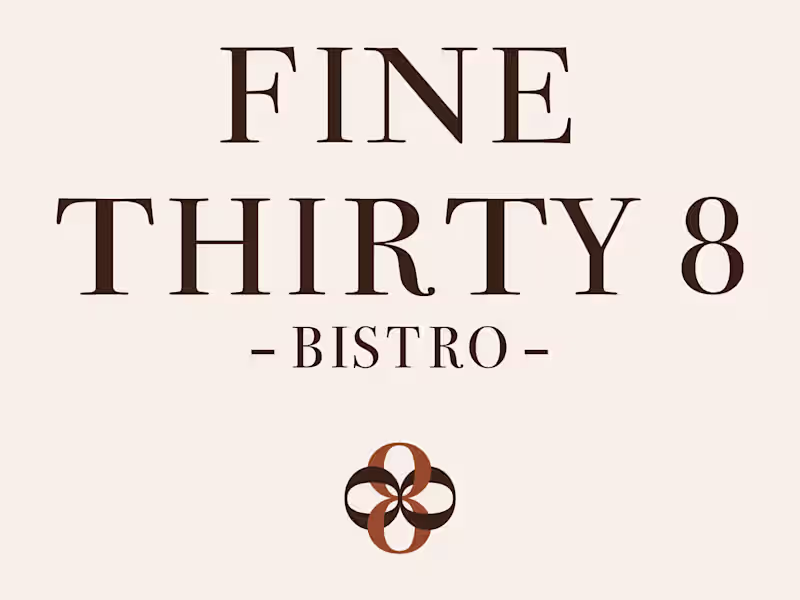
Fine Thirty-8 Wine & Grill, Full Restaurant Rebrand When Fine Thirty-8 came to me, they had a great restaurant but a brand that wasn't telling their story. My job was to change that. The challenge: build a complete visual identity that could flex across three completely different dining experiences, casual breakfast, bistro dining and fine dining, while staying coherent and on-brand throughout. Here's how it came together: Breakfast Menu — Warm, playful and inviting. Script typography, coral and teal colour play, a feel-good Sunday morning energy that makes you want to sit down and stay a while. À La Carte Menu — Fresh, elegant and bistro-cool. Deep forest green, gold accents, the oversized 8 as a bold graphic element. Sophisticated without being intimidating. Tasting Menu — Pure luxury. Rich chocolate brown, linen texture, gold typography. The kind of menu you hold and immediately feel like the evening is going to be special. Three distinct moods. One coherent brand family. Every design decision was built around Fine Thirty-8's vision, location and budget, not my preferences. That's the approach I bring to every project.
1
34
Explore projects