
Web Designer | Webflow and Wordpress Developer


Design & Development Made Easy



Website Designer | LMS, eCommerce & Digital Marketing
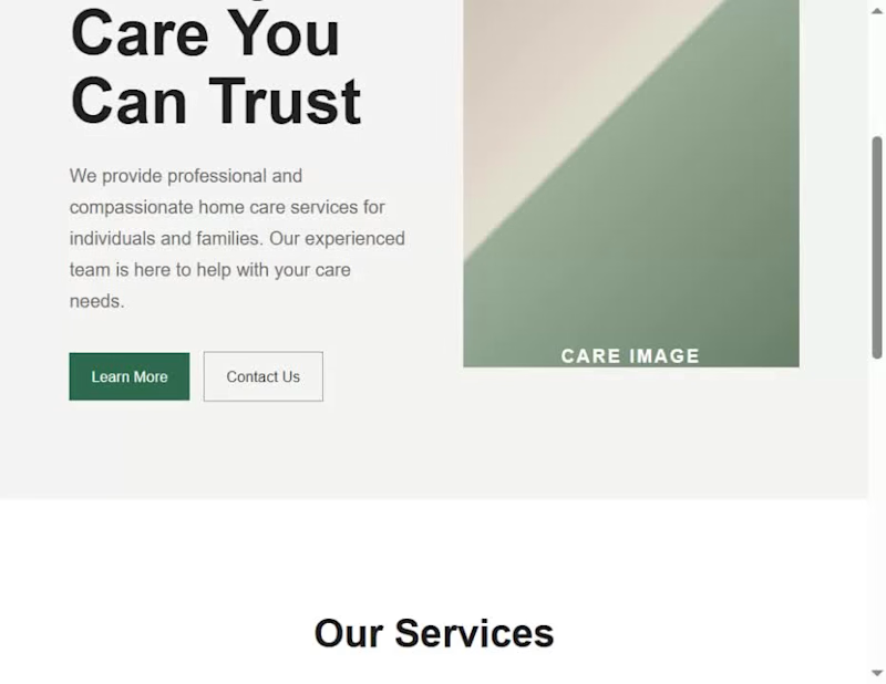
I built a complete care-service website for a fictional brand, HAVEN, to demonstrate a design principle I use in my real website-design workflow: the 5-second test.
When I review a website, I don't begin by asking whether it looks beautiful. I first ask whether a visitor can understand its purpose quickly. My test is built around three questions:
Who is this for? What do they get? What should they do next?
I started with a deliberately generic version of the HAVEN homepage. Although the structure was functional, the messaging was broad, the value wasn't immediately clear, and the page presented competing calls to action.
I then worked through the three questions before touching the visual polish.
First, I clarified who the website is for. Instead of a generic care statement, I positioned HAVEN around families looking for thoughtful support for someone they love.
Second, I clarified what the visitor gets. I replaced vague messaging with a more specific explanation of the in-home support HAVEN provides and the outcome it is designed to create.
Third, I clarified what the visitor should do next. I established a stronger primary call to action, “Explore care options,” and structured the rest of the page to support that decision.
Once the message and hierarchy were working, I moved into the visual design: typography, spacing, color, layout, responsive behavior, and subtle motion. These elements were used to reinforce the message rather than distract from it.
The final website is therefore not just a visual redesign. It demonstrates how I move from problem → decision → design, and how I use a simple test to decide what deserves attention before I spend time polishing a website.
The lesson I want another designer to take away is simple: before making a website more beautiful, make sure its purpose is obvious.
My 5-second test is:
Who is it for?
What do they get?
What should they do next?
If those three things aren't clear within a few seconds, I'm not finished designing
1
2
167
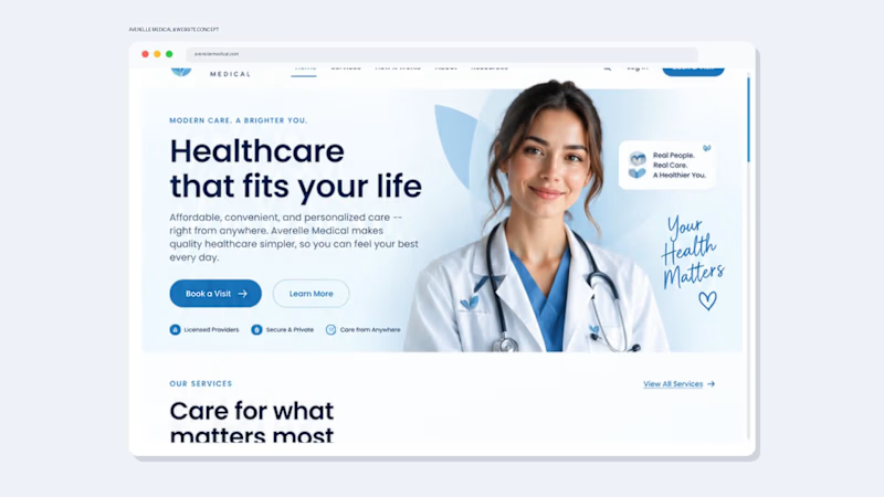
Healthcare Website Design That Builds Trust Before the First Appointment
A healthcare website needs to do more than look professional—it needs to build trust, explain the service clearly, and make the next step effortless.
I designed this Averelle Medical concept as a modern telehealth experience focused on clarity, credibility, and conversion.
The Goal
Create a healthcare website that feels:
Professional. Responsive. Clear. Easy to navigate.
The design uses a calm coastal blue + white palette, generous whitespace, rounded UI elements, and a clean visual hierarchy to create a trustworthy healthcare experience without feeling cold or overly clinical.
What I Designed
• High-impact healthcare hero section
• Clear service categories
• Simple 3-step “How It Works” journey
• Trust and credibility sections
• Patient testimonial section
• Mobile/app experience
• Strategic calls-to-action throughout the journey
• Responsive desktop-to-mobile design direction
• Complete footer and navigation system
The UX Thinking
Every section answers a question a potential patient may have:
What does this service offer?
Can I trust this provider?
How does it work?
What happens next?
The result is a website designed to move visitors from curiosity → confidence → action.
Design Philosophy
For healthcare and wellness brands, I believe great design sits at the intersection of:
Trust + Clarity + Experience + Conversion
That means beautiful visuals are only the starting point. The website also needs to communicate the right information, reduce friction, and guide users naturally toward taking action.
Looking for a healthcare website like this?
I help healthcare, telehealth, wellness, and service-based businesses create professional websites, landing pages, and digital experiences that are designed around both brand credibility and user experience.
Available for website design, redesigns, landing pages, and complete brand + website projects.
1
2
216
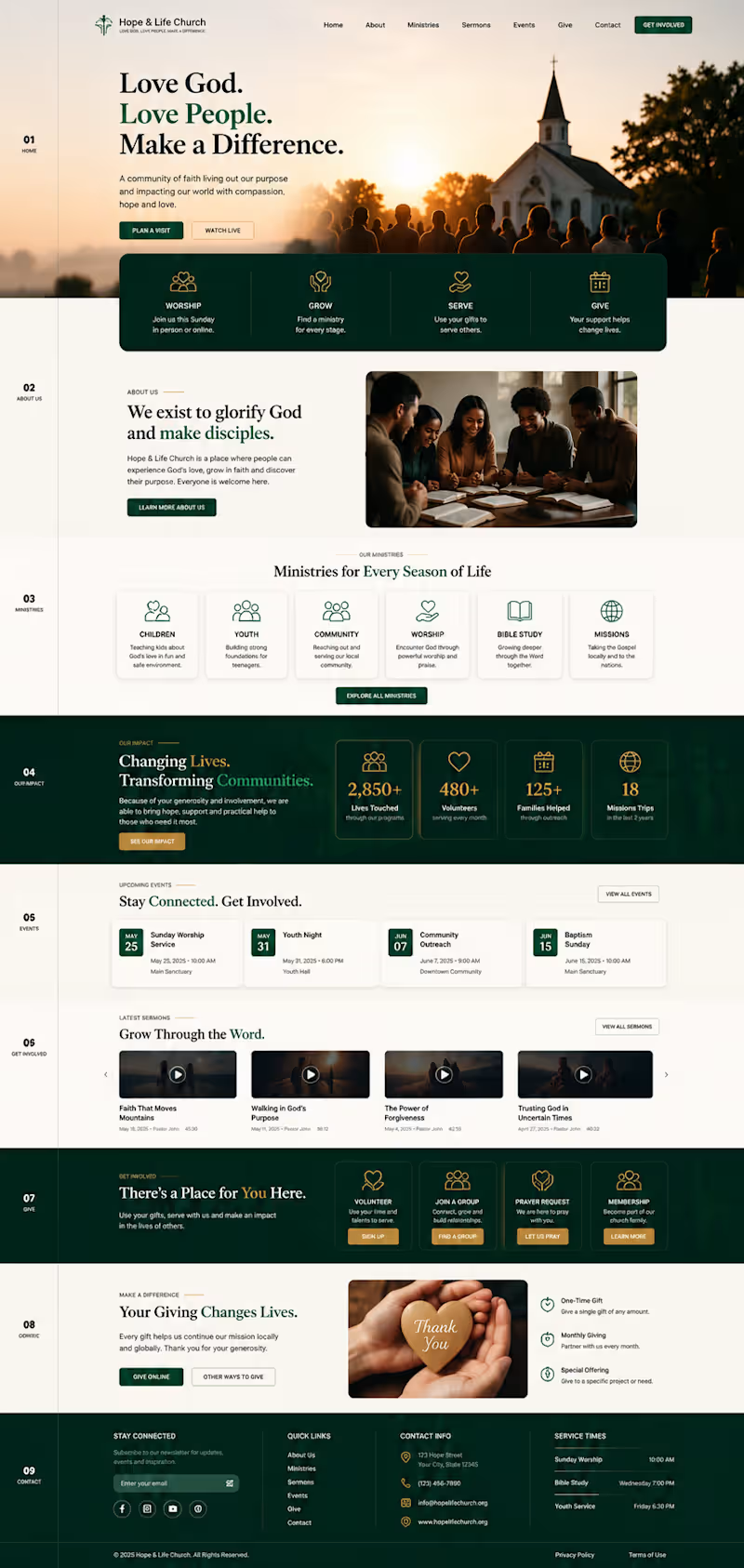
A church website concept created to show how thoughtful design can turn a ministry’s mission into a clear, welcoming digital experience. I structured the homepage around the real journey of a visitor from discovering the church and exploring ministries to watching sermons, finding events, volunteering, requesting prayer and giving online.
The design combines warm, faith-centered visuals with simple navigation, clear calls to action and dedicated sections for ministries, community impact, events, sermons, involvement and giving. Every section has a purpose: helping people understand the mission, find what matters to them and take the next step.
The result is a responsive, modern website concept that feels less like a generic organization template and more like a digital home for the church and its community.
1
121
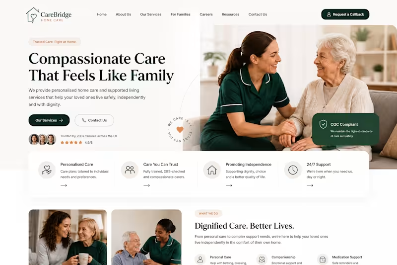
Designed and developed a modern home care website focused on building trust and making services easy to understand. The project included responsive page design, clear service sections, enquiry and callback pathways, careers navigation, local service information, and conversion-focused calls to action. The website was structured to provide a smooth experience for families, prospective clients, referral partners, and job applicants across desktop and mobile.
2
96

Fractional CTO • AI • Workflows • SEO • Systems


Latest n8n automation. Apologies for the redactions, client privileges. This automation takes data and creates two distinct sets of outputs and sends to to their Slack as a private message. Simple and powerful. This saves the client 20-ish hours of work.
This is the first part. The second part includes auto-posting to socials.
0
107


Designing intuitive solutions for complex problems
Designing intuitive solutions for complex problems


Newsletter production, copyediting & CMS publishing


Fractional CTO | AI Agents, SaaS & Hands-on Engineering
Fractional CTO | AI Agents, SaaS & Hands-on Engineering
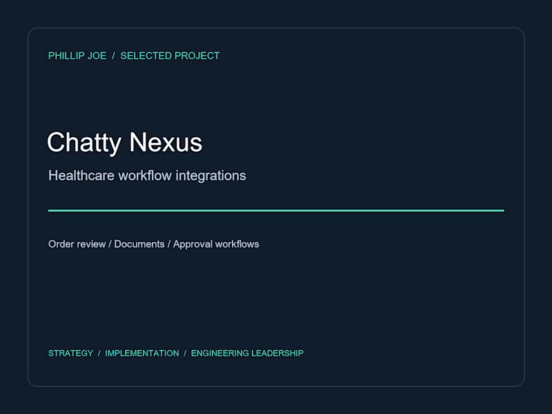
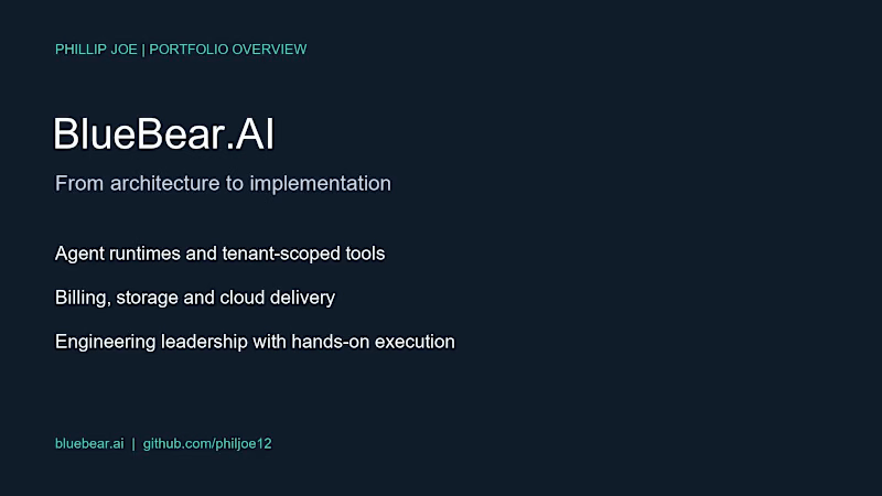
I’m updating my portfolio with BlueBear.AI (http://BlueBear.AI) and Pix2Code: AI agents, MCP/API integrations, SaaS architecture and hands-on engineering leadership.
I bring nearly 20 years of technical experience and stay involved in implementation, code review and delivery. I’m open to paid remote fractional CTO and AI integration work, within an overall maximum of 20-30 hours/week.
This short video is a portfolio overview.
Portfolio: https://contra.com/phillip_joe_mb6kxspp/work
(https://contra.com/phillip_joe_mb6kxspp/work)GitHub: https://github.com/philjoe12
For teams shipping AI workflows: which is the biggest blocker right now—integrations, access controls or production reliability?
0
25

Web Developer_Designer


Redesigned a non-profit coaching and consulting website built with WordPress.
The update includes a mega menu for better navigation and the right form integration to collect information and book consultation calls easily.
A more organized, user-friendly experience that aligns with the brand’s mission and helps visitors connect effortlessly.
#WordPressRedesign #NonProfitWebsite #WebDesign #WebsiteImprovement #UXDesign
2
22
170