FLIT Invest - Brand Identity
Steven Maya
FLIT Invest - Impact investing made for everyone
FLIT Invest is a rapidly growing fintech startup providing young professionals with a seamless, user-friendly digital impact investing experience. The brand identity redesign aimed to create a fresh, modern look that resonates with the target audience and reflects the company's innovative approach. FLIT Invest needed a brand overhaul for its website and mobile app.
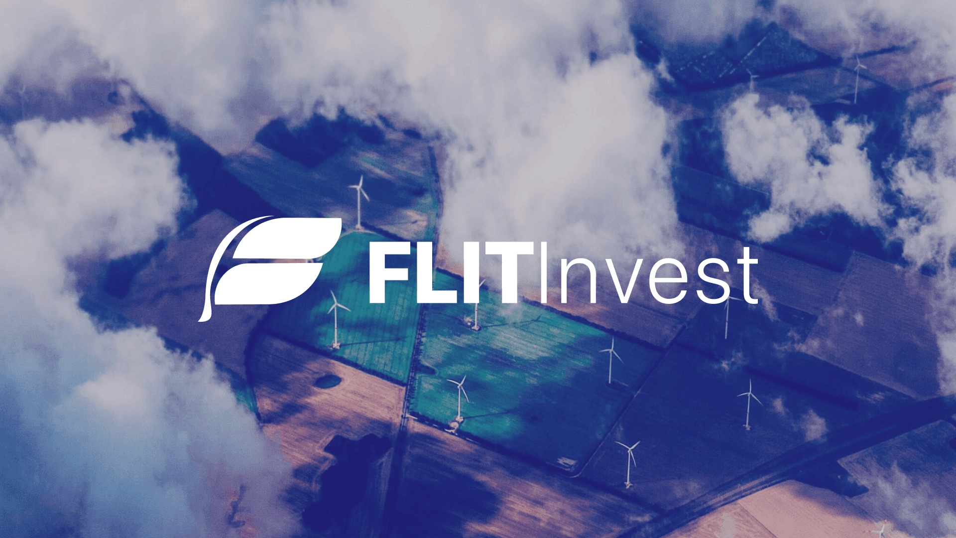
FLIT Invest
Project discipline:
Brand identity, Product Design
Role:
Lead designer
Team:
Product Owners: Alejandro Fritz, Serena Fleischman, Richard Papp,
Marketing: Jake Crahan
UX Research: Nick Reedy
Design: Eszter Zsubori, Tianxiao (Tina) Li, Jiaqi Jiang, Ashley Xiang, Jacqueline Kang, Aihang Jin, Peggy (Yining) Zhu, Rachel Hong, Tong Liu, Jia Meng
Logo credit: Aihang Jin
Challenge
Previous website
Previous mobile app
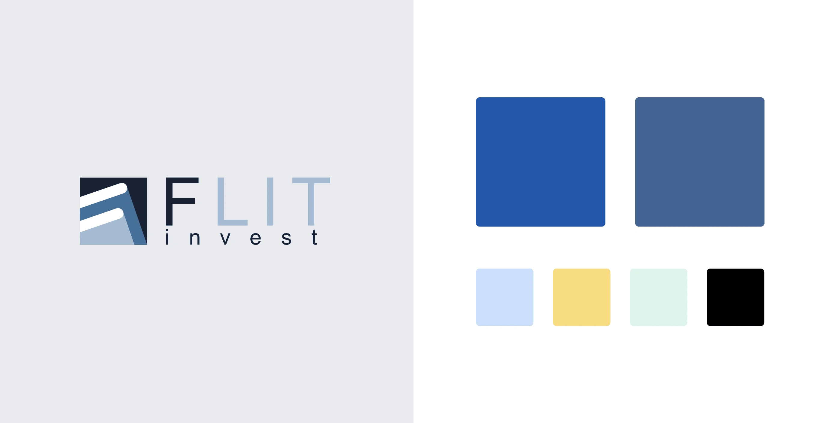
Previous logo and branding
First launched in 2020, FLIT Invest had not been updated and lacked brand guidelines to expand its assets to meet the high marketing demand. The challenge was differentiating the brand and maintaining its bold, dependable, and innovative qualities. Therefore, the redesign of FLIT Invest aimed to create a memorable, impactful brand identity that effectively communicated the brand's progressive values, appealed to young professionals and positioned it as a trusted and rising leader in digital impact investing within the competitive fintech landscape.
Brand Strategy
Vision: To revolutionize the digital impact investing experience for young professionals.
Mission: To provide user-centric investing solutions that empower our customers to generate measurable environmental and social impact alongside a financial return.
Values: Progressive, simplicity, trust, and customer-centricity.
Positioning:
FLIT Invest is the go-to digital investing platform for young professionals seeking measurable environmental and social impact alongside a financial return.
Solution
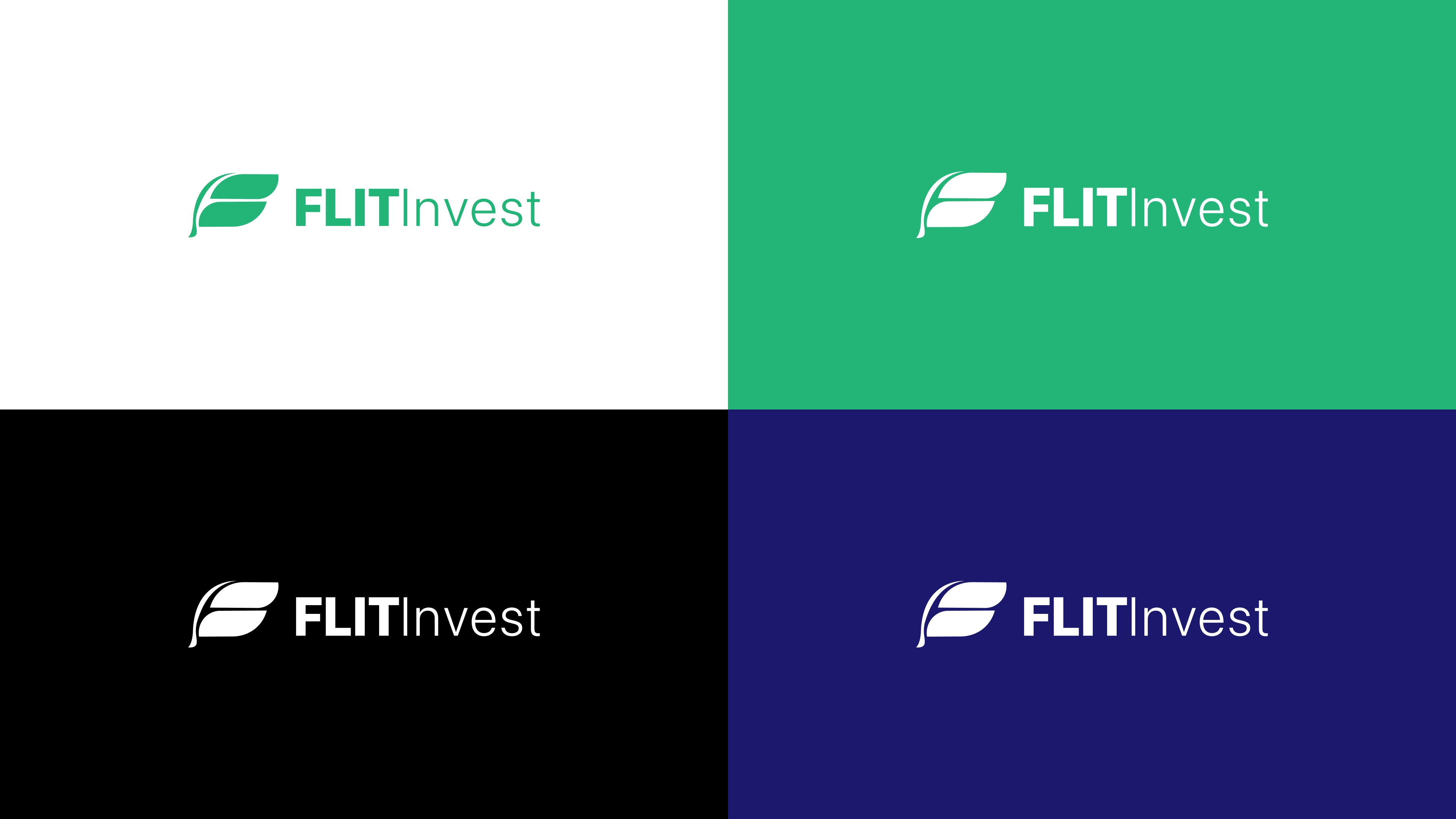
FLIT Invest logo, wordmark and branding
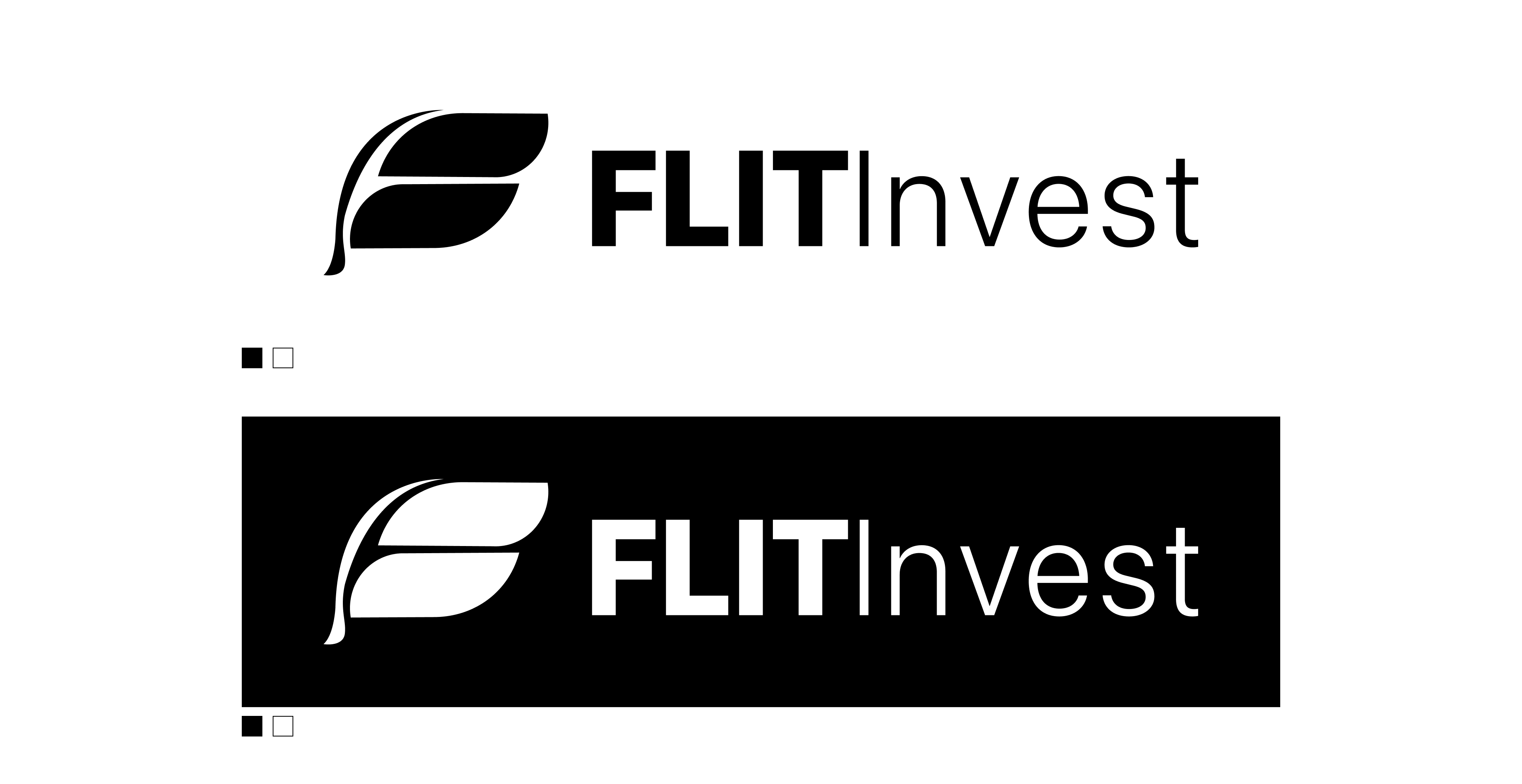
Primary logo lock-up (Black & White)
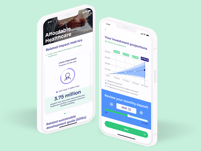
To bring the brand to life, we built a new visual identity, including a new typeface, logo, color palette, and brand guidelines. This new system also served as the foundation for the updated website and mobile app. The final brand identity showcases a clean, modern logo representing innovation and forward movement. The vibrant color palette emphasizes the brand's focus on simplicity and trust.
Typeface
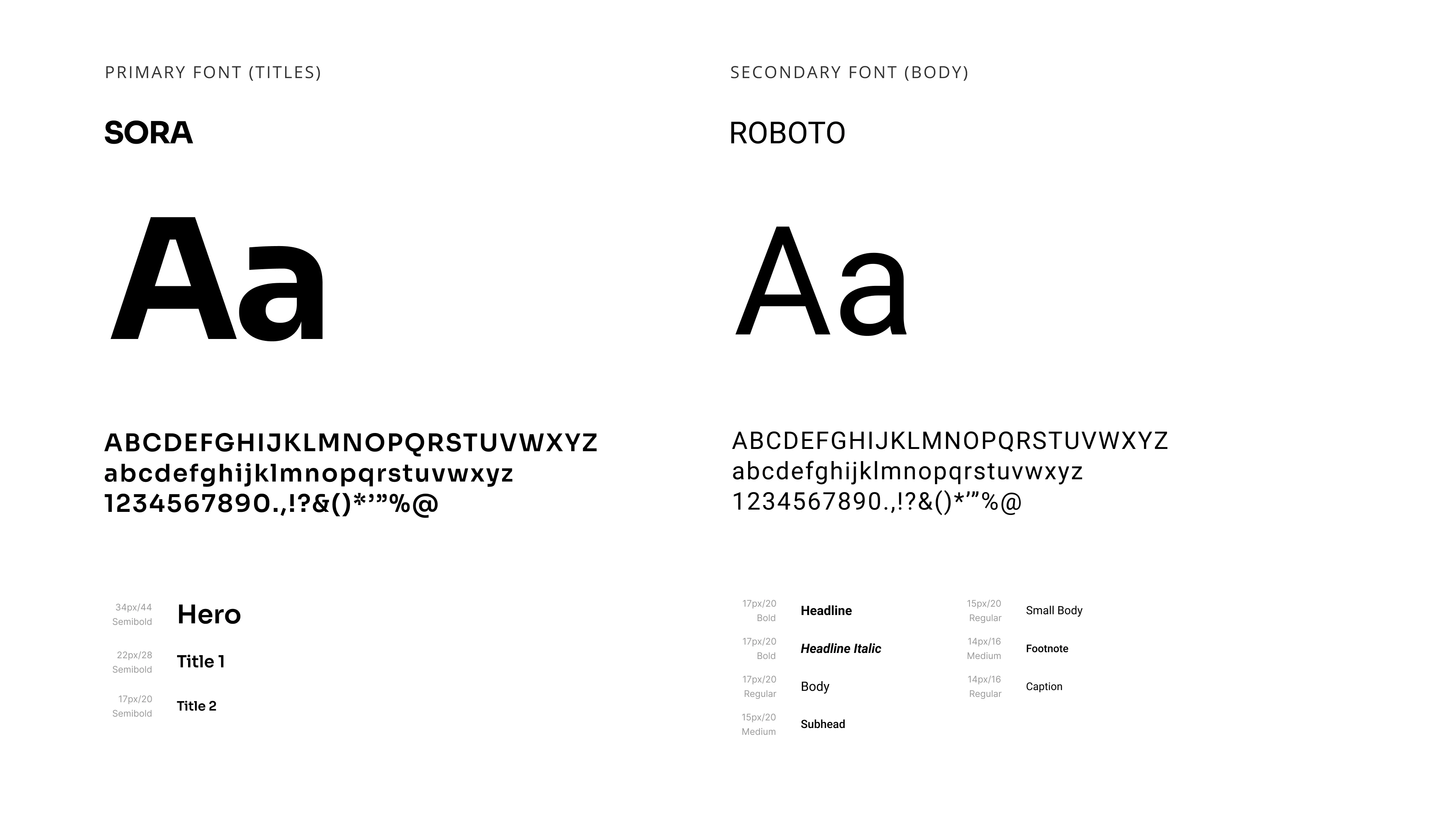
We selected Sora for titles and headlines and Roboto for body copy after exploring various typefaces to find a unique, aesthetic, crafted typeface that reflects the brand's combination of innovation and reliability in its typography, using a contemporary sans-serif font for headlines and a mobile-friendly sans-serif for body copy.
Color Palette
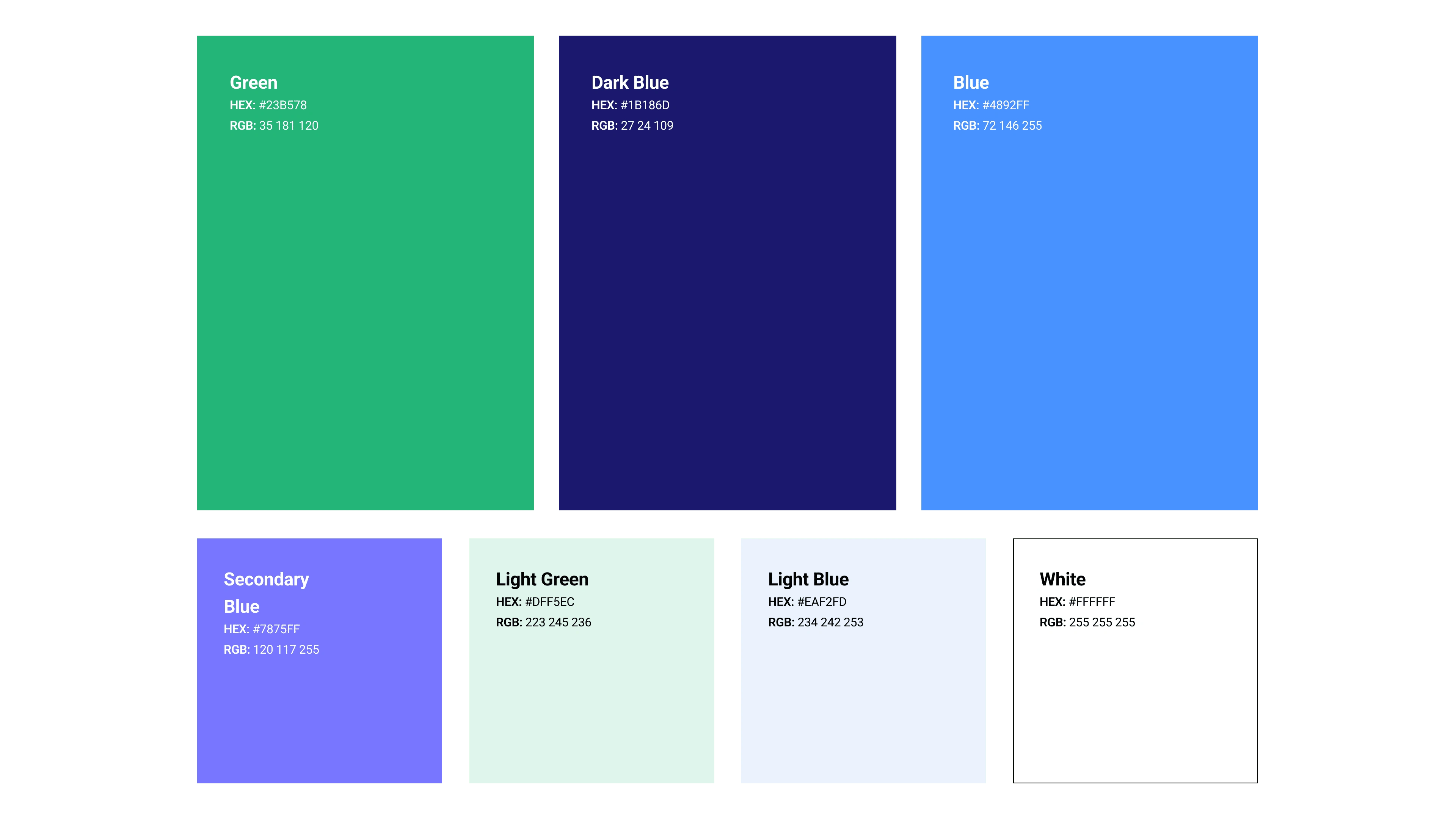
Our primary colors are vibrant and distinct. Combined with black and white creates a minimalistic style while still looking modern and bold.
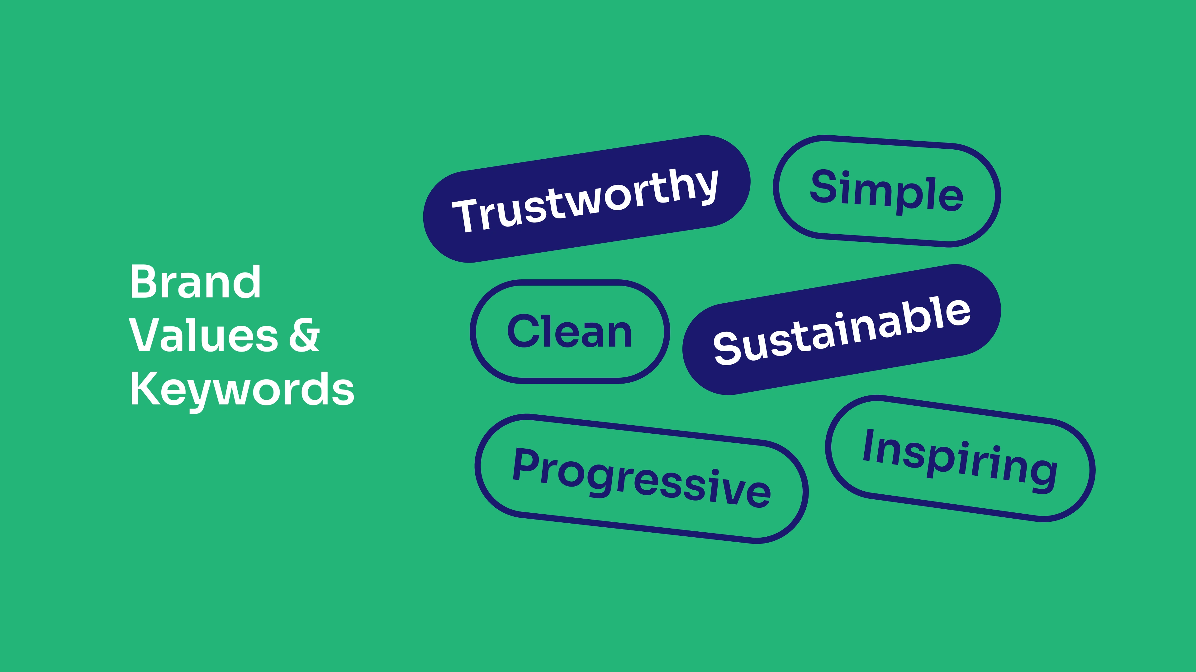
Brand keywords
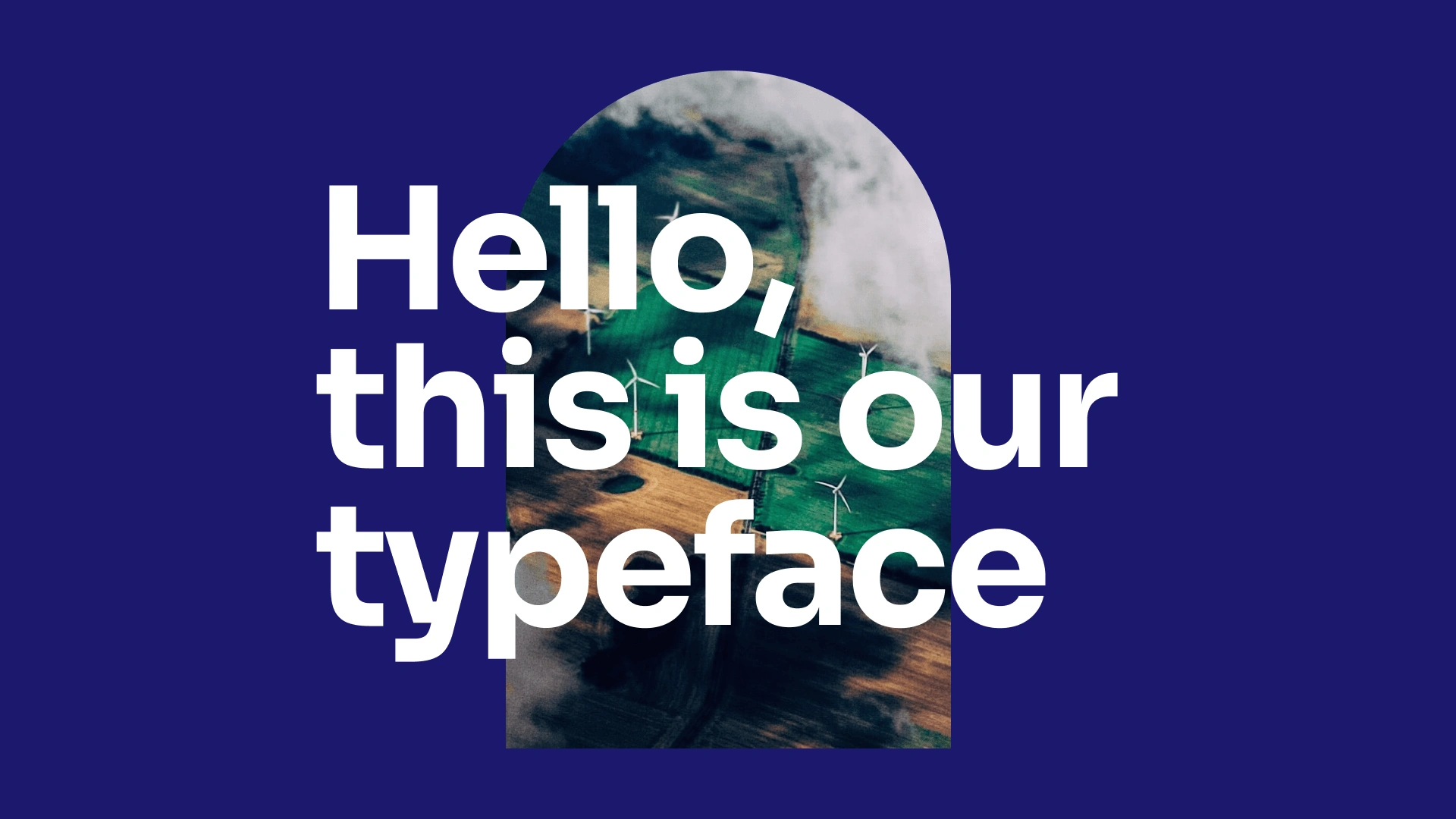
FLIT Invest typeface
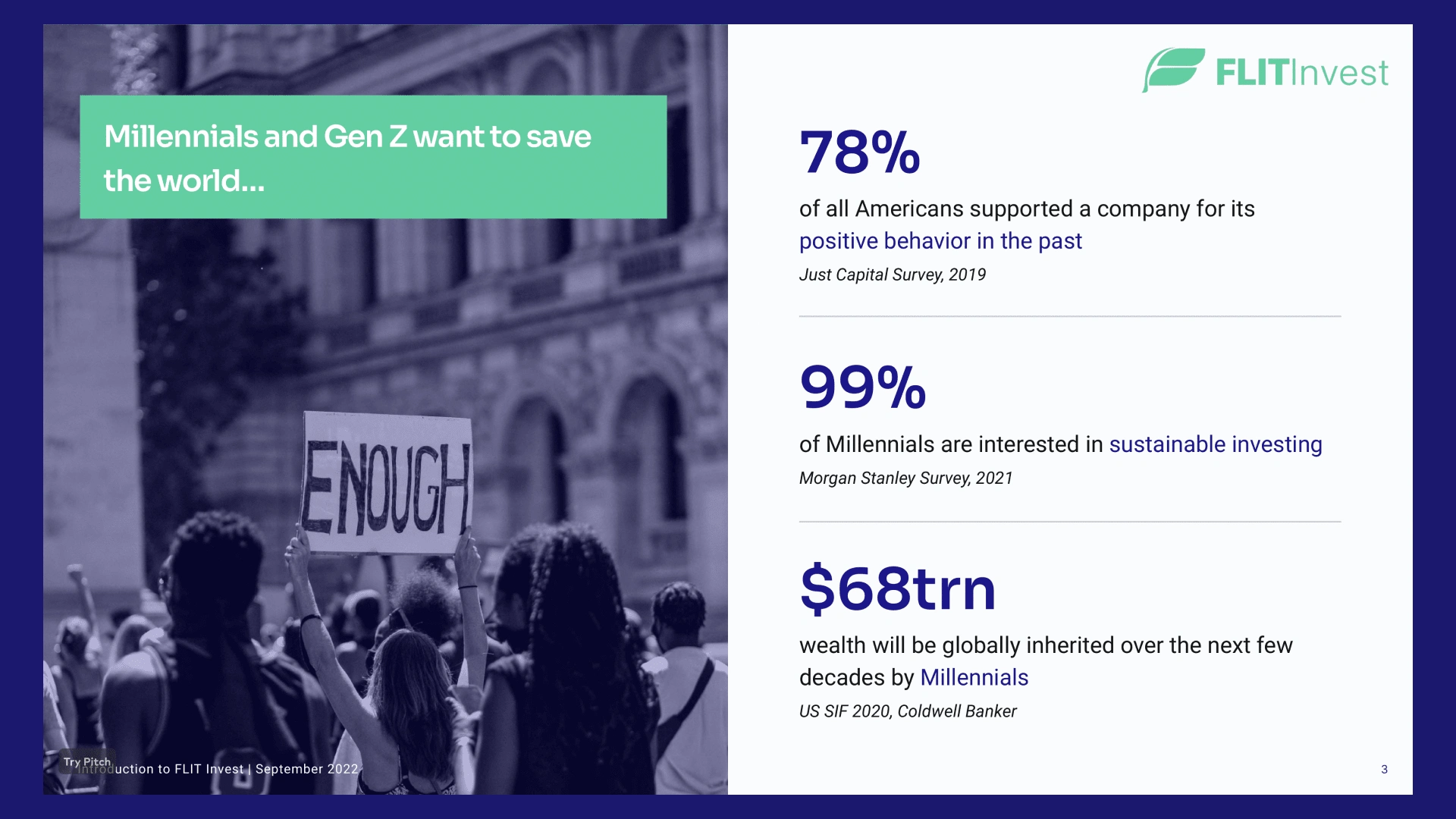
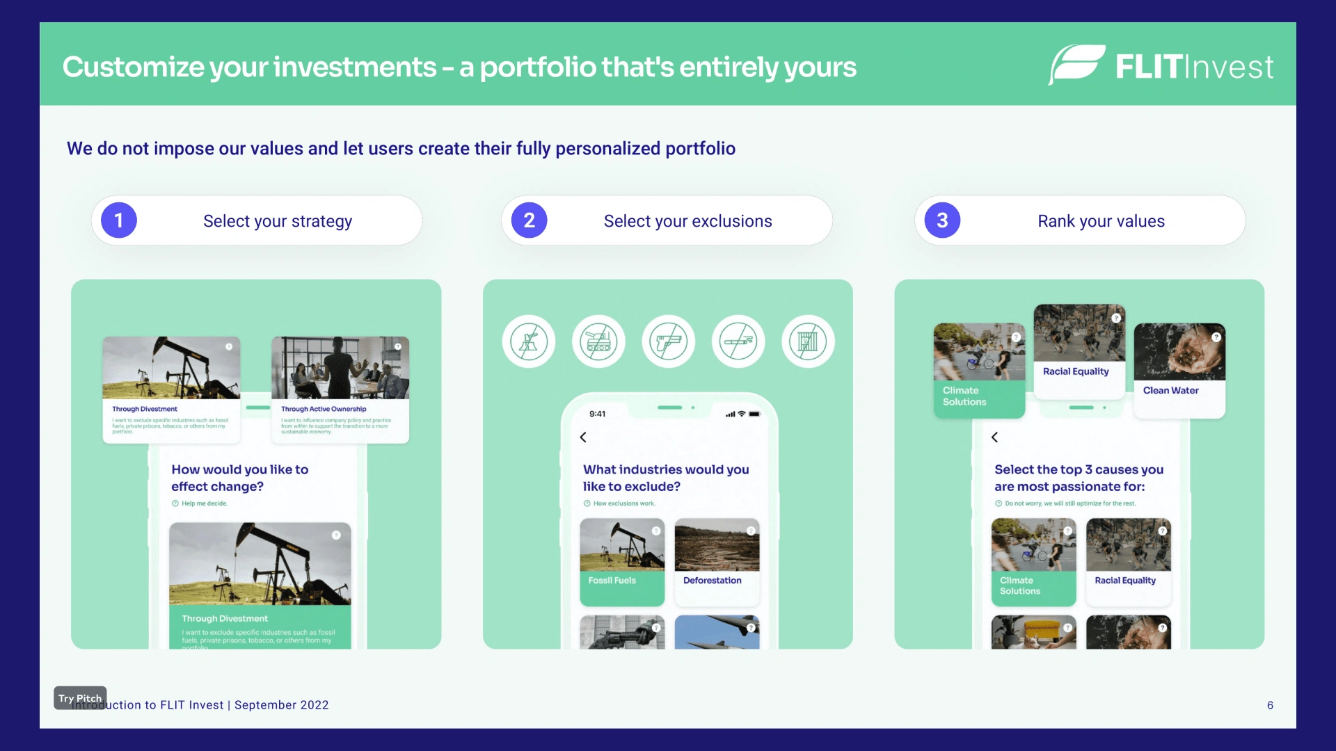
Pitch deck
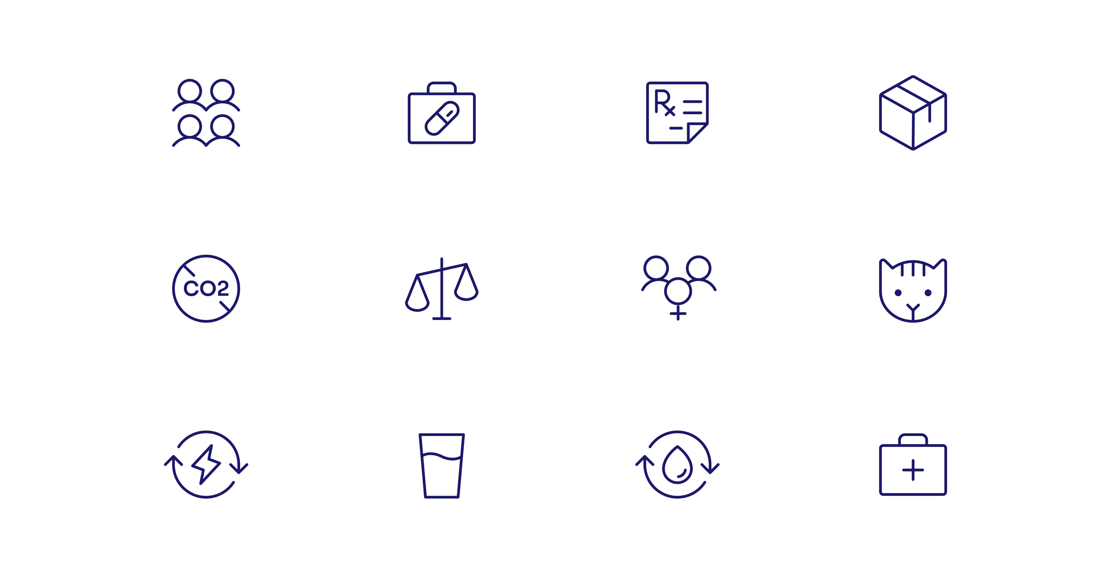
Custom icons
Marketing graphics
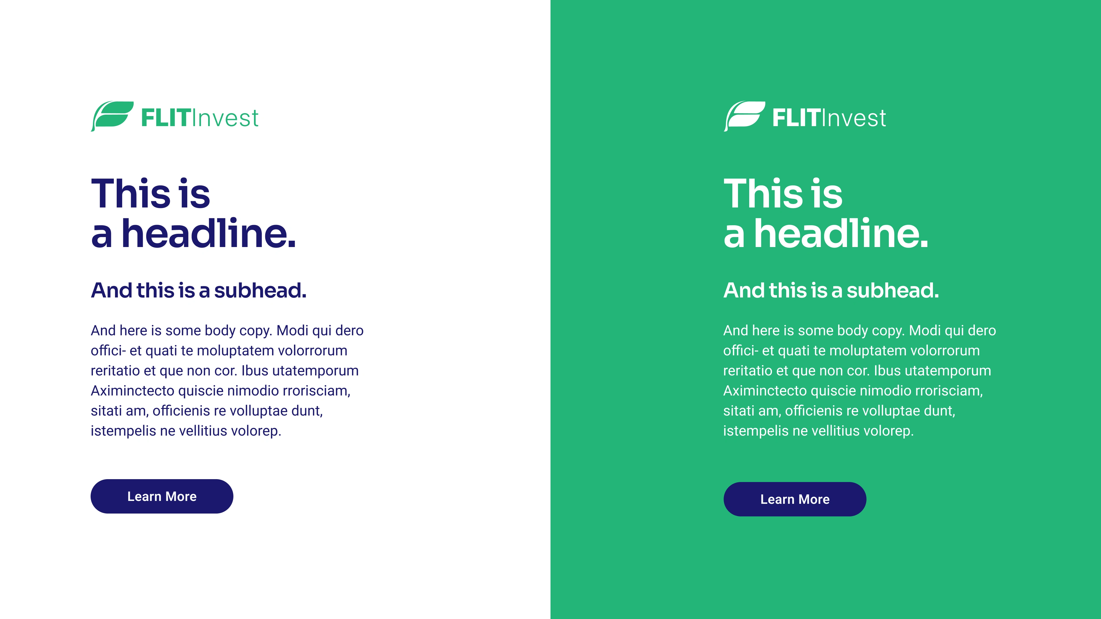
Typeface use example
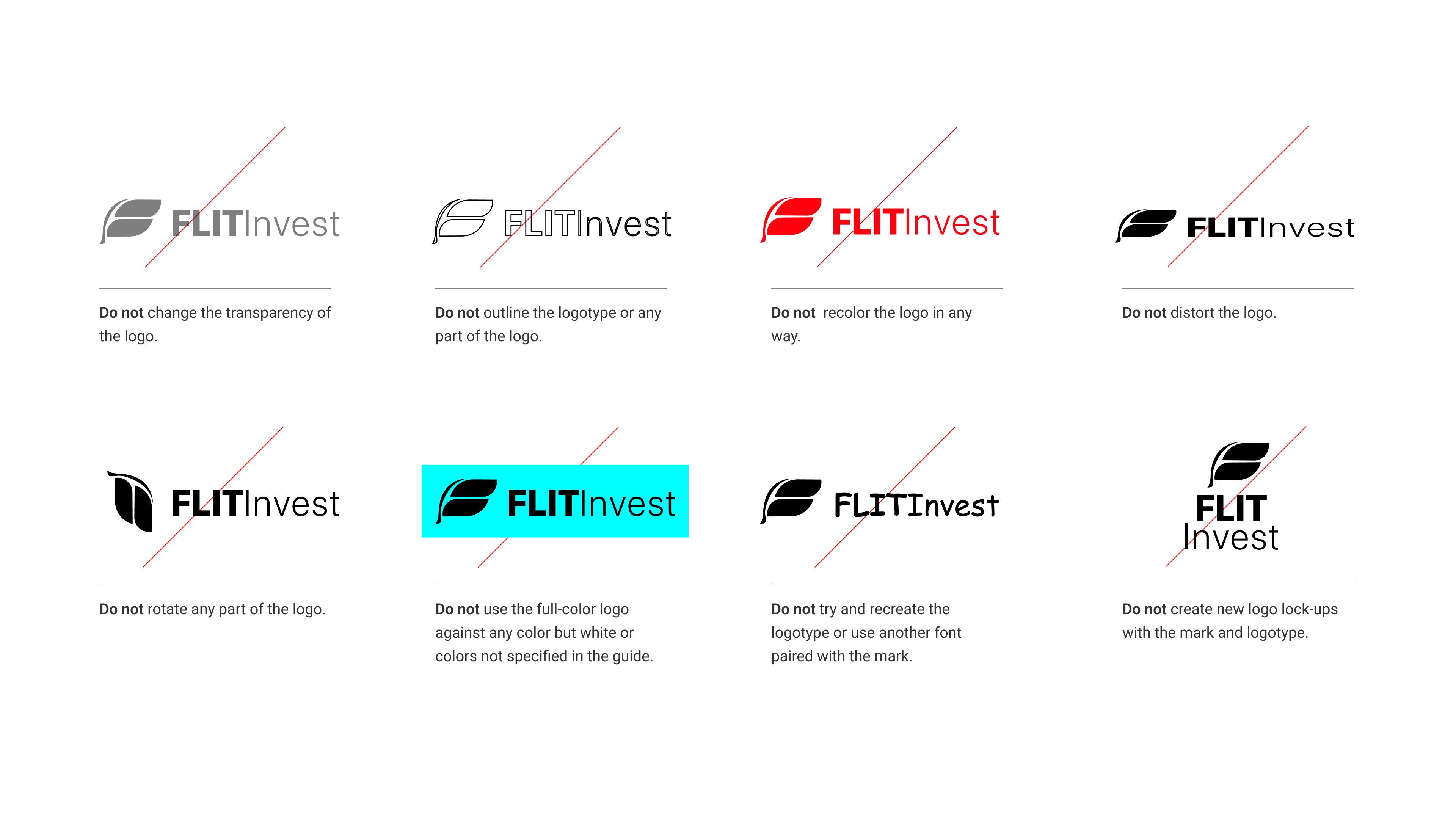
Logo guidelines
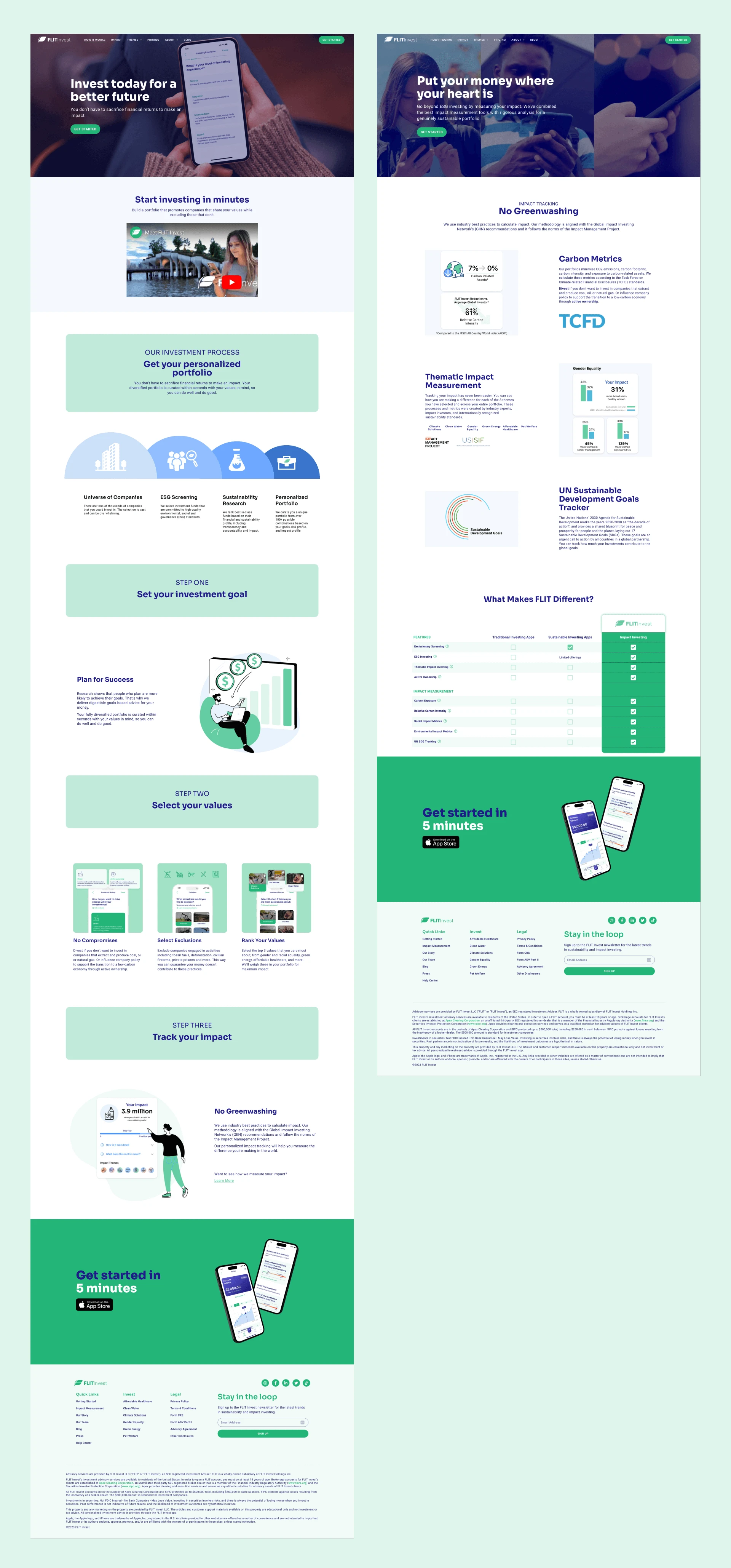
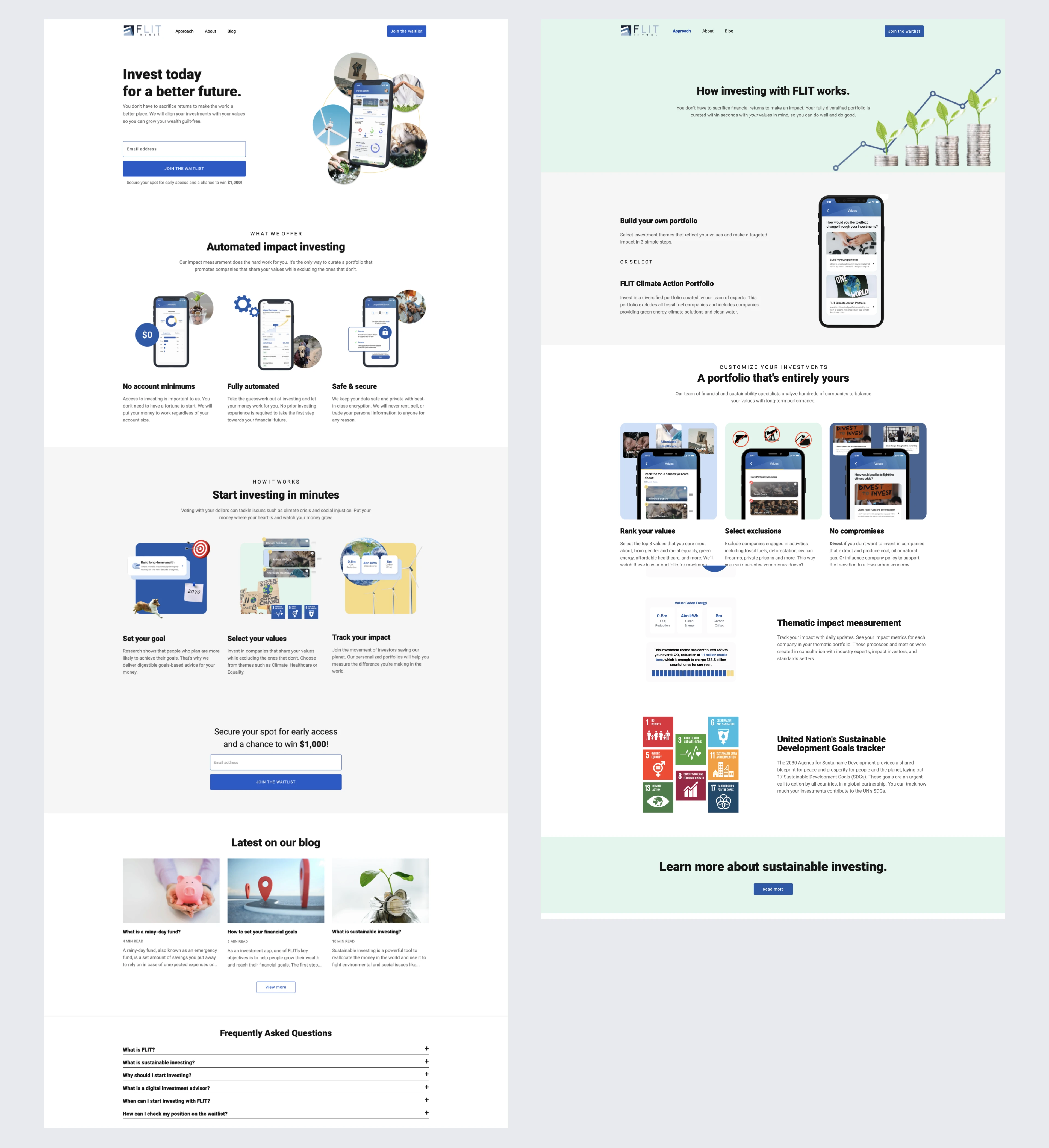
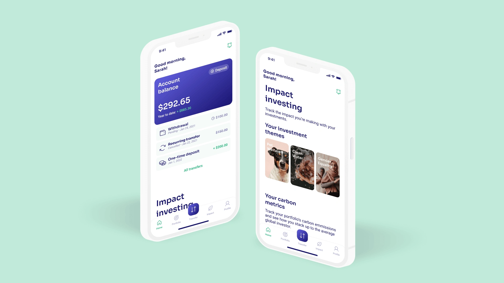
Website
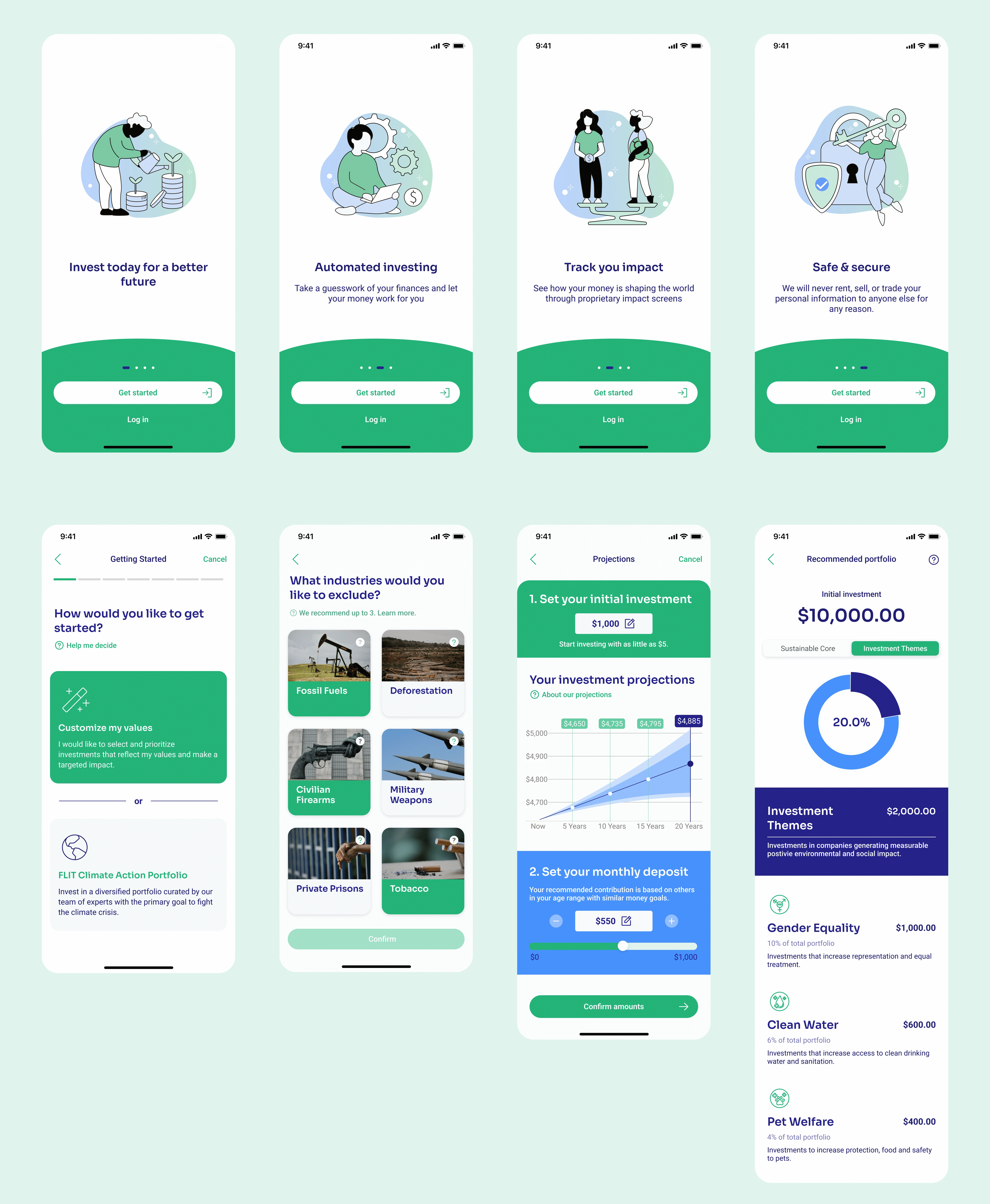
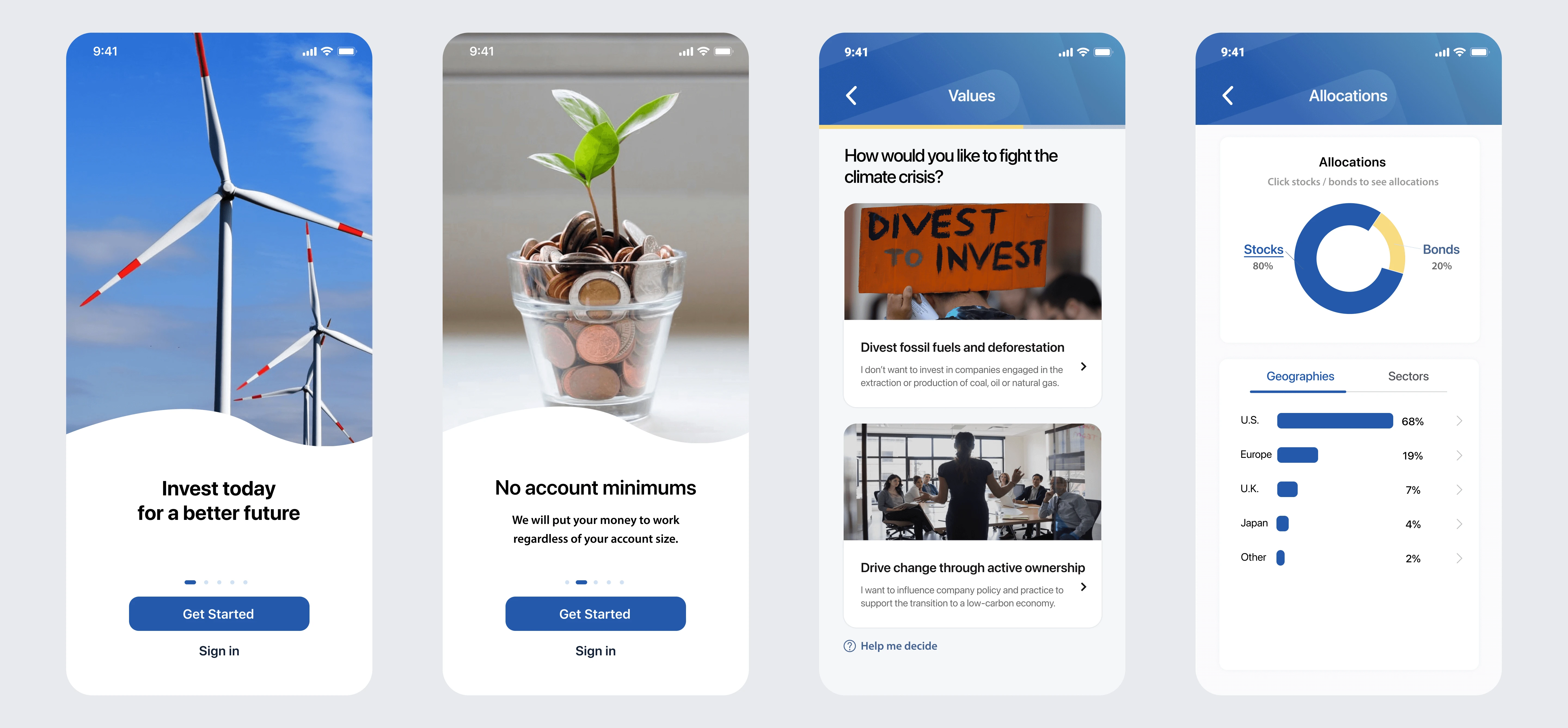
Mobile app
Conclusion
This project presented an exceptional opportunity to delve into the fintech industry and tackle its branding challenges. By striking a balance between innovation and trust in our design, we successfully incorporated stakeholder feedback and user testing insights. As a result, the refreshed brand identity enables FLIT Invest to lead the way into a new era of fintech while offering trust, innovation, and accessibility.
FLIT Invest team
I hope you enjoyed exploring the FLIT Invest brand identity redesign. Feel free to browse the rest of my portfolio, including my additional work with FLIT Invest.
Like this project
Posted May 6, 2023
As a lead designer, I helped develop a memorable brand identity that positions FLIT Invest as a rising leader in digital impact investing.
Likes
1
Views
411
Clients
FLIT Invest