
CRO specialist, Web/product analytics expert


WordPress & WooCommerce Website Developer
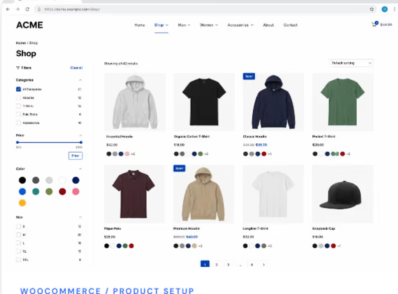
The store needed a cleaner and more organized shopping experience where customers could quickly browse products, use categories and filters, compare product options, and find the items they wanted without feeling overwhelmed. The product listing also needed to look professional and work smoothly across different screen sizes.
I designed and developed a structured WooCommerce shop page with a clean product grid, intuitive categories, filtering options, clear pricing, and easy shopping actions. The layout was optimized to make
1
127

7 Signs Your Website Is Frustrating Smartphone Users
Your website may look perfect on a laptop but feel like hard work on a phone. And that matters: the 2025 Web Almanac found that only 48% of mobile websites achieved good Core Web Vitals, compared with 56% on desktop
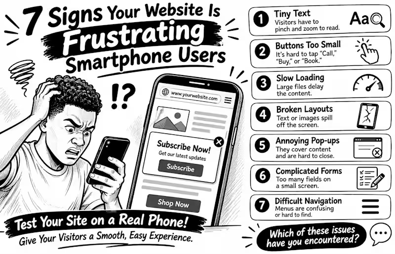
Here are 7 warning signs to check
1️⃣ Tiny text Visitors have to pinch and zoom just to read.
2️⃣ Buttons too small People struggle to tap “Call,” “Buy,” or “Book” without hitting something else.
3️⃣ Slow loading Large images and heavy scripts delay the content people came to see.
4️⃣ Broken layouts Text, images, or menus spill off the screen or overlap.
5️⃣ Annoying pop-ups Full-screen offers cover the content and are difficult to close.
6️⃣ Complicated forms Too many fields make enquiries or checkout tiring on a small screen.
7️⃣ Difficult navigation Menus are confusing, links are crowded, or important actions are hard to find.
Don't just shrink your desktop website and call it mobile-friendly. Open it on a real phone and try to complete a task as a customer would
💬 Which of these problems have you encountered on a business website?
2
1
78
How to Improve Mobile Navigation on a WordPress Website
Ever tried to find a service on a website, only to give up because the menu was confusing? Visitors can face the same frustration on mobile.
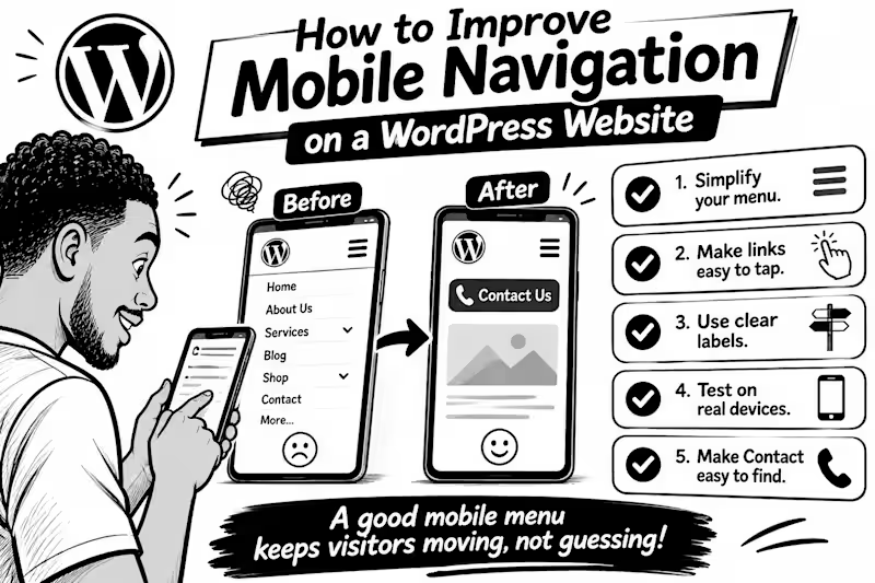
Here are 5 practical fixes
1. Keep the menu simple. Prioritise pages people need most: Services, About, Contact, or Shop. Too many options make decisions harder.
2. Make links easy to tap. Digital.gov (http://Digital.gov) recommends touch targets around 48 CSS pixels, with enough space between them to reduce accidental taps.
3. Use clear labels. “Get a Quote” tells visitors more than “Explore.” Make each menu item’s destination obvious.
4. Test on a real phone. Try every link, check submenus, and make sure the menu opens and closes easily.
5. Make the next step easy to find. If calls or bookings matter, keep Contact, Book Now, or Call visible without crowding the menu.
WordPress’s Navigation block lets you control how menus collapse into a mobile icon and how submenus open so check those settings in your editor.
💬 What frustrates you most on mobile websites: tiny links, confusing menus, or too many options? Tell me below.
1
75

AI Product Builder — working prototypes and MVPs in days
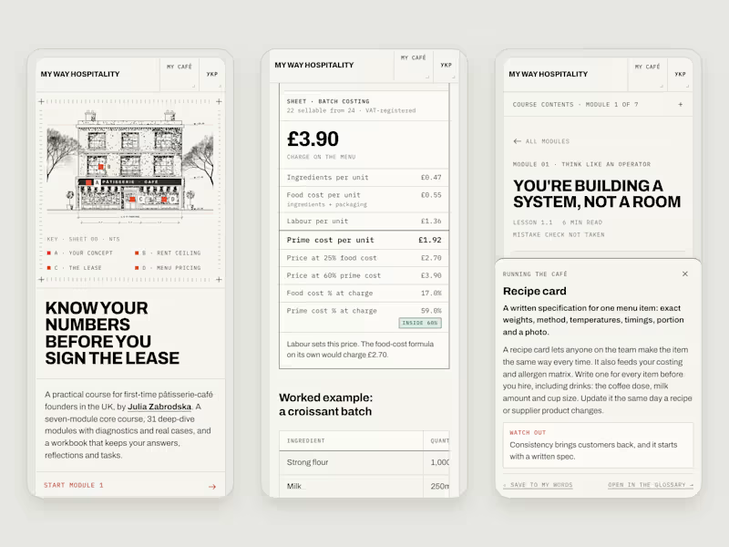
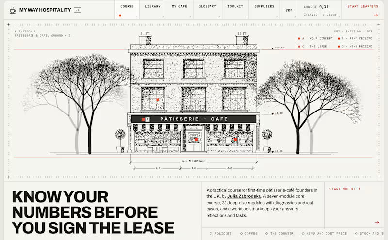
My Way Hospitality — an interactive course for first-time UK café founders
A learning portal for people opening their first pâtisserie-café, coffee shop or restaurant in the UK. I turned 15+ years of running hospitality businesses into a product.
You pick your format and the whole course adapts: three full courses, 214 pages, real UK figures. Every module has a diagnostic, cases with real numbers, a calculator and a mistake check (760 in total). It also includes a 223-term plain-English glossary, a London directory of 176 suppliers, and a project hub that turns your answers into a one-page summary for a bank or investor.
Built with Claude, live on Vercel, tested on desktop and phone with automated and accessibility checks. A Ukrainian version is in progress.
1
0
103
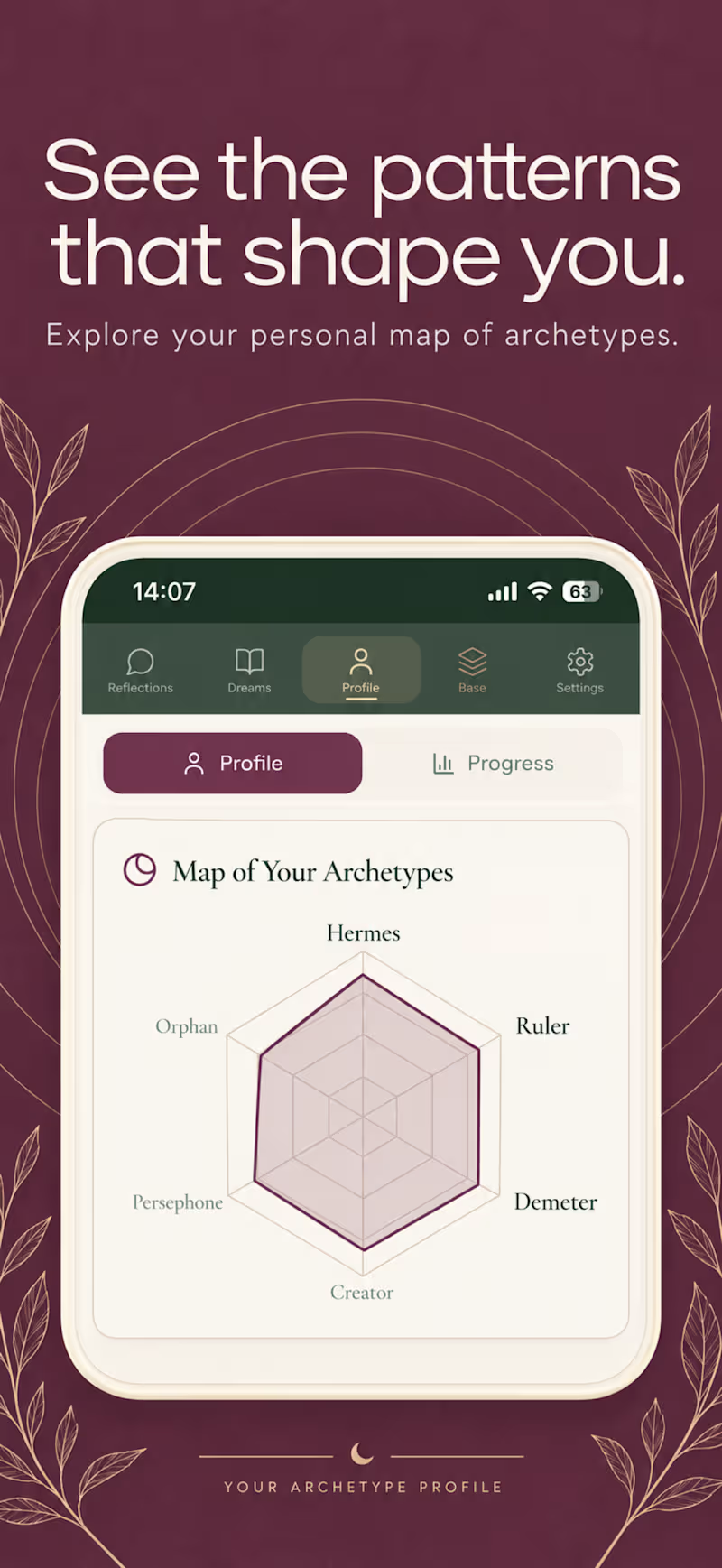
Wildmuse.app (https://Wildmuse.app) is An AI dream journal. You describe a dream, and the app interprets it through Jungian archetypes, building your personal archetype profile over time.
I took it from idea to a live iOS app: product, design, build, and AI evals to keep the interpretations consistent and safe. A beta test with over 100 users showed that onboarding was the biggest drop-off risk, and that finding shaped the next version.
Soon in App Store.
0
138
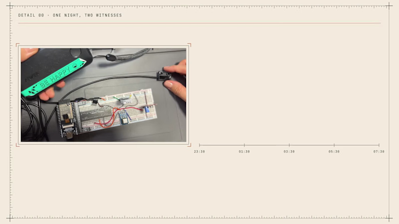
My Oura ring knows how I slept, but it can't see my bedroom. So I built a small box with an ESP32 and four sensors (CO2, temperature and humidity, noise, and a magnet switch on the window) that writes the room down every two minutes. A Google Apps Script lines every 5-minute point from the ring (heart rate, HRV, sleep stage) up with the room readings from the same minutes, and every morning I get one report in Telegram.
Code does all the maths. NVIDIA Nemotron, running on Nebius Token Factory, only turns the facts into a message a person wants to read, and code checks every field before it is sent.
What seven nights showed: on my hottest night (23.1 °C) my HRV was 32 ms against 42 on my other nights, and my pulse was 69 against 60. Seven nights is a hint, not proof.
0
46

Versatile Copywriter, Grammar Guru
Versatile Copywriter, Grammar Guru


View more →

Digital Product & AI Engineering Partner


Digital Product & AI Engineering Partner
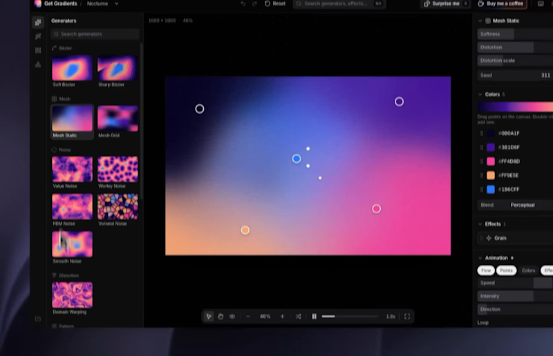
Introducing Get Gradients
A few days ago, we were looking for gradients for our client project but didn't find any good resources. Also, some are premium and expensive.
So, we made one for ourselves. Now it's open for you guys too. It’s completely free.
Love to see what you guys are making? Share your favorite one!
https://getgradients.com
(https://getgradients.com)A great resource for making gradients, also motion too!
3
2
388


Senior Data Analyst | Product & Growth Analytics
Senior Data Analyst | Product & Growth Analytics


🚀 One-Stop Product Design & UX Pro 🚀
🚀 One-Stop Product Design & UX Pro 🚀


View more →