

Visual Strategist / Art Director
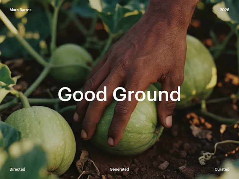
This was a fun one to create :)
The briefing asked for a grower the supply chain can trust and a landscape that reads as cared for.
The image gives that practice a calm face and a morning pace. It fits sustainability reports, producer profiles and season-opening campaigns.
0
35
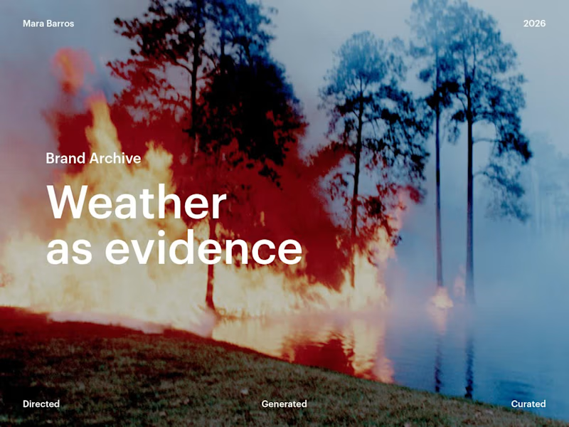
Working on pictures for environmental organizations that report on climate adaptation.
The briefing asked for a visual voice that treats weather as evidence: serious enough for a monitoring report, open enough for a public awareness campaign.
The set keeps a field-survey patience from start to finish. It works as a report image library, a campaign archive, and a season of social posts for a conservation team.
4
2
130

Stop settling for stock that feels like a committee meeting. With textured and high-contrast. AI doesn’t have to be "smooth." These are grit, grain, and mid-century structure. They are built for hero sections that need to say something before the copy even loads. :)
Find them for free on Lummi (https://www.lummi.ai/collection/jyySQm0/geometric-brutalism) (yes for free)or DM me if you need a custom set built for your brand’s specific DNA.
https://www.lummi.ai/creator/donamara
2
455


Designer, Illustrator & Character-Focused Storyteller
- $1k+
- Earned
- 5x
- Hired
- 5.0
- Rating
- 79
- Followers
Designer, Illustrator & Character-Focused Storyteller


Sr Product Designer


𝐖𝐡𝐲 𝐔𝐈 𝐬𝐭𝐢𝐥𝐥 𝐦𝐚𝐭𝐭𝐞𝐫𝐬? #4
The Login screen
A login is more than a form. It’s the first impression — the small gate between curiosity and conversion.
Here’s what a good login gets right:
- Simple and focused: only one primary action, no distractions, no clutter.
- SSO option: a quick “Continue with Google” can be the difference between logging in or giving up.
- Clear alternatives: links for Sign up and Contact support keep users from feeling stuck.
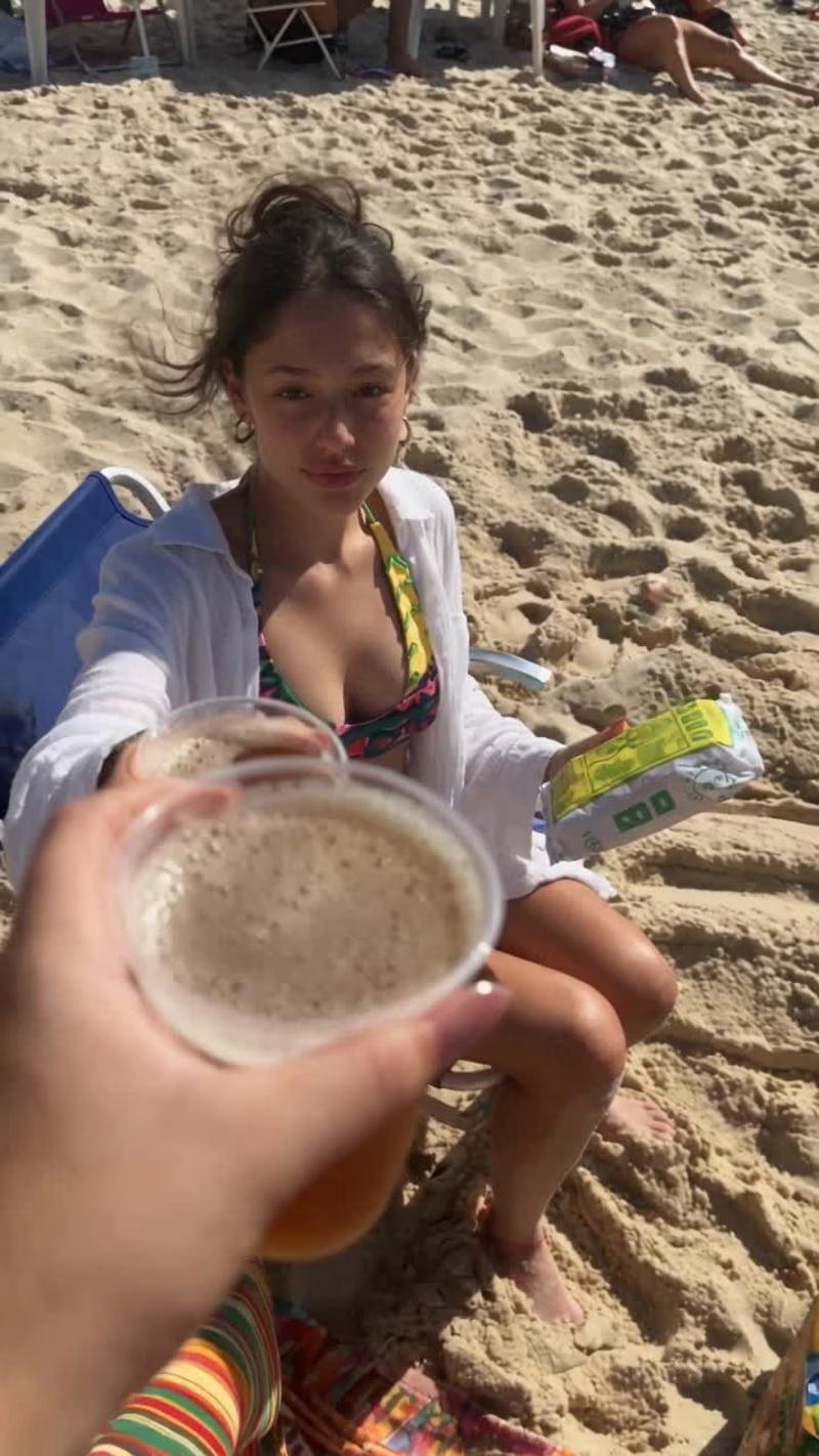
- Emotional context: I used Midjourney to create the beach visual because even small visuals can spark motivation. You’re not just signing in. You’re starting your vacation.
When teams rush through login screens, they forget it’s often the first UX a user experiences.
UI details are not just decoration — they set the tone for the entire product experience.
1
22
376
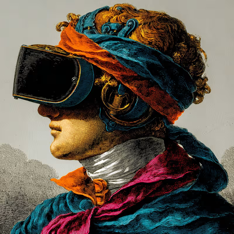
𝐇𝐨𝐰 𝐭𝐨 𝐤𝐞𝐞𝐩 𝐯𝐢𝐬𝐮𝐚𝐥 𝐜𝐨𝐧𝐬𝐢𝐬𝐭𝐞𝐧𝐜𝐲 𝐢𝐧 𝐌𝐢𝐝𝐣𝐨𝐮𝐫𝐧𝐞𝐲
If you’ve ever found an image you loved and couldn’t recreate that same vibe again — this is why '--style' matters.
It defines the overall look and feel of your images, the lighting, contrast, and texture that give them a cohesive personality.
𝐇𝐞𝐫𝐞’𝐬 𝐡𝐨𝐰 𝐭𝐨 𝐝𝐨 𝐢𝐭:
Once you find an image that matches the visual direction of your project, open it and click “Style” and “Prompt.”
From there, you can reuse that same visual base to create new versions.
Just adjust what you need in your prompt — an object, a background, or a small detail — and Midjourney will preserve the same tone, lighting, and visual language.
Now you can move from random explorations to a consistent visual system.
3
34
444

Cinematic AI Films for Brands, Campaigns & Social
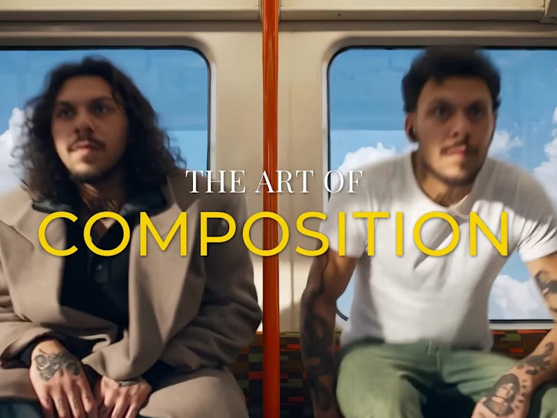
The Art of Composition
A handrail draws your eye across the frame. A doorway frames a landscape. A street pulls everything toward a single point.
A 14-second visual study in how composition guides the eye.
1
74
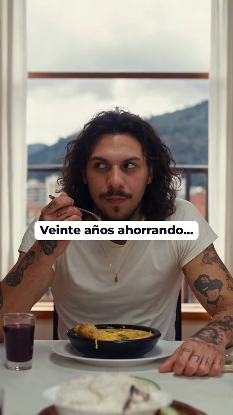
The idea. Every Colombian family has an uncle with a piggy bank. At a Sunday lunch in Bogotá, Tío Hernando announces he has been saving for twenty years and smashes his clay marranito in front of everyone. His sister can’t stop laughing. His niece asks one question: “¿Y cuánto le rindió?” He pauses: “Lo mismo que metí.” She calmly explains that hers earns 10.50% a year and she never has to break anything. The proud uncle gives in: “Mija… ábreme una de esas.”
Script. Built on a classic comedic structure of build-up, payoff and reversal. The product never interrupts the story; it is the punchline. Every line is short, in natural Colombian Spanish, and captioned so the joke lands even with the sound off.
Visual direction. Warm and intimate: overcast Sunday light, the green mountains of Bogotá through the window, black clay cazuelas of ajiaco, blackberry juice, terracotta shards and coins across the tablecloth. The camera behaves like a guest at the table, so the viewer feels seated at the lunch rather than watching an ad.
Edit and sound. Cut like a live-action spot: J-cuts and L-cuts carry the dialogue, a quick reaction insert lands on the hammer hit, and a continuous room tone glues every scene together. A low score runs underneath and lifts into a branded motion end card (“Ponla a rendir.”), with captions in the brand’s palette throughout.
My role: Concept, scriptwriting, art direction, AI cinematography, edit and sound design.
Spec work. Not commissioned by or affiliated with Banco Finandina.
2
1
158

Product Design for SaaS, AI Interfaces & Systems Thinking
Product Design for SaaS, AI Interfaces & Systems Thinking


View more →



Cutting-edge Video and AI Content Creator
Cutting-edge Video and AI Content Creator


Fast & Fluent: 4-Language Content Specialist
Fast & Fluent: 4-Language Content Specialist


