

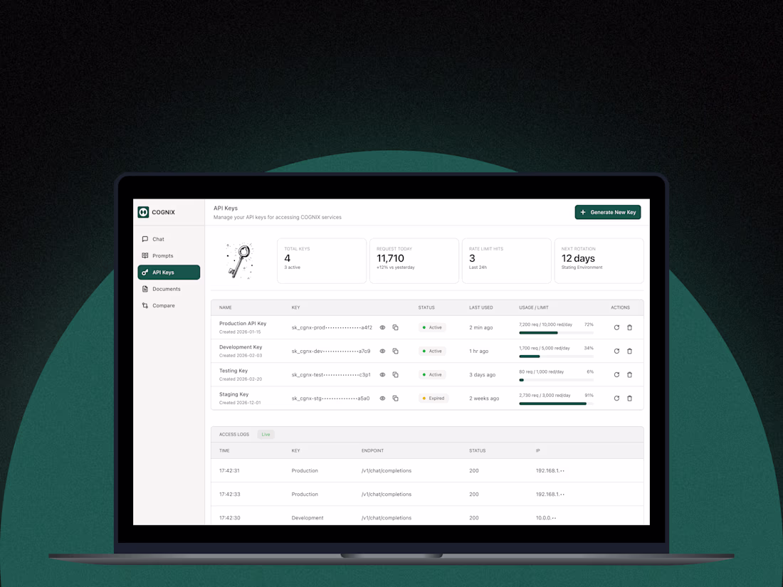
Developer Productivity Platform
0
5
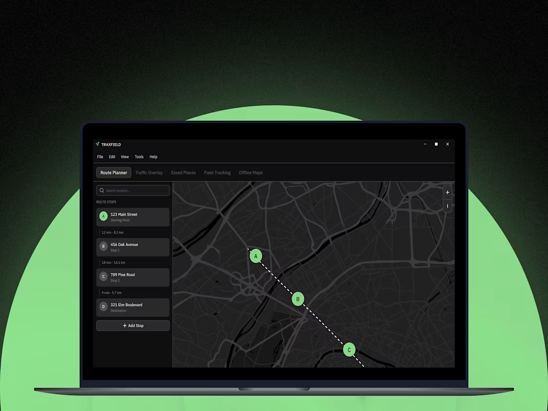
Traxfield Navigation Platform
0
7
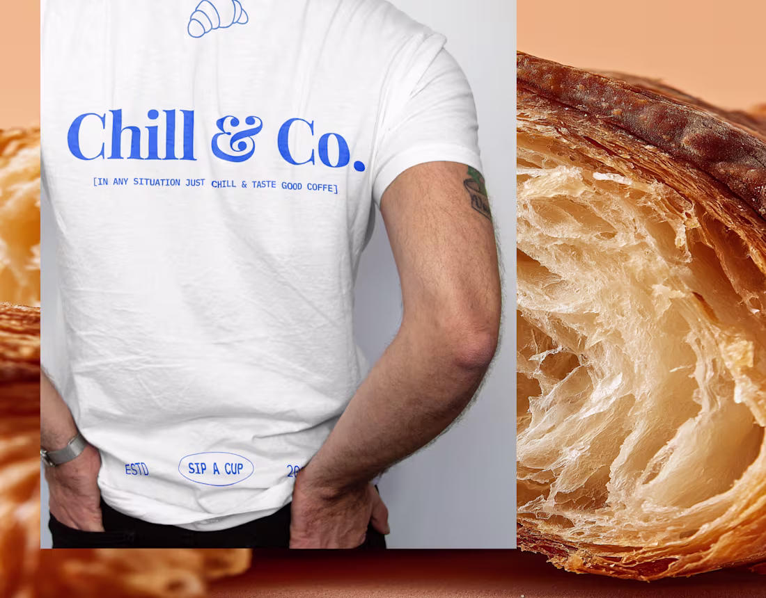
Check out the full coffee branding project on my profile☕️🥐
8
5
335
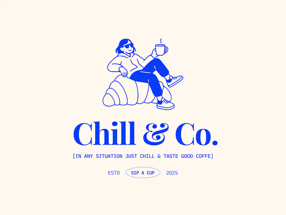
Chill & Co.
2
11
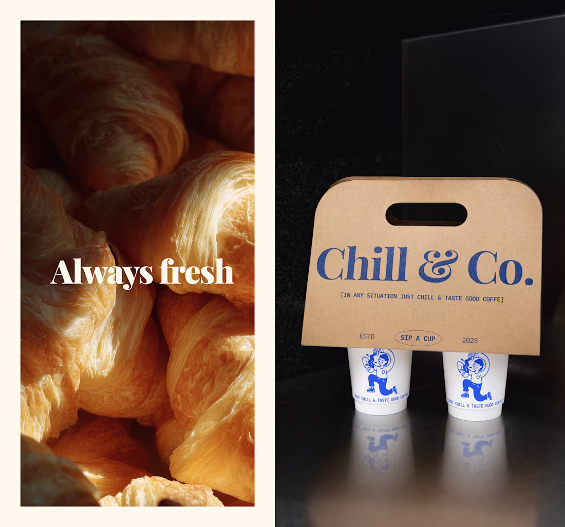
Working on a new branding that’s all about keeping it chill.
7
29
494
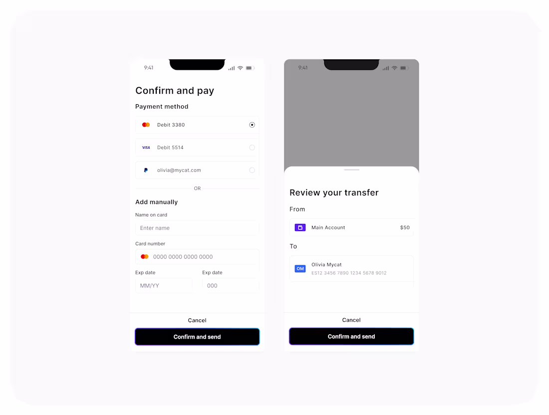
𝐖𝐡𝐲 𝐔𝐈 𝐬𝐭𝐢𝐥𝐥 𝐦𝐚𝐭𝐭𝐞𝐫? #5
Any time someone pays or sends money, there’s a mix of trust, urgency, and stress. That’s where good UI really matters.
A checkout is all about speed. People pick a saved card, add a new one if needed, and move on. The UI should keep things fast and clear.
A transfer flow is different. People slow down and double-check the name, amount, and account number. They want certainty. This is about clarity and reassurance, not extra steps.
Both involve payments, but the mindset is completely different.
When money moves, you’re not just designing screens. You’re designing peace of mind.
14
254
𝐖𝐡𝐲 𝐔𝐈 𝐬𝐭𝐢𝐥𝐥 𝐦𝐚𝐭𝐭𝐞𝐫𝐬? #4
The Login screen
A login is more than a form. It’s the first impression — the small gate between curiosity and conversion.
Here’s what a good login gets right:
- Simple and focused: only one primary action, no distractions, no clutter.
- SSO option: a quick “Continue with Google” can be the difference between logging in or giving up.
- Clear alternatives: links for Sign up and Contact support keep users from feeling stuck.
- Emotional context: I used Midjourney to create the beach visual because even small visuals can spark motivation. You’re not just signing in. You’re starting your vacation.
When teams rush through login screens, they forget it’s often the first UX a user experiences.
UI details are not just decoration — they set the tone for the entire product experience.
1
22
301
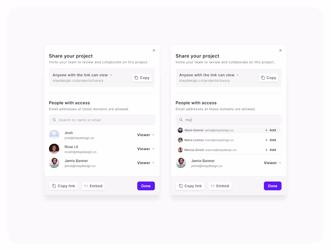
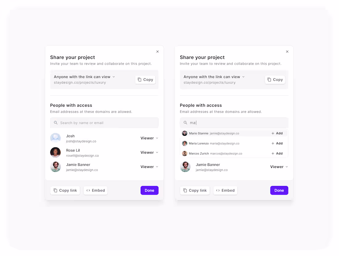
𝐖𝐡𝐲 𝐔𝐈 𝐬𝐭𝐢𝐥𝐥 𝐦𝐚𝐭𝐭𝐞𝐫? #3
AI is changing the way we design — faster drafts, quicker iterations, smarter workflows. But great results still come from solid fundamentals.
In this example, the team shares a project in seconds. Clean hierarchy, clear inputs, smooth flow. It’s a reminder that when structure and clarity meet AI, everything just works better.
I’m all for AI, as long as we keep the craft in the process. Because good UI doesn’t slow you down; it amplifies what AI can do.
19
287
𝐇𝐨𝐰 𝐭𝐨 𝐤𝐞𝐞𝐩 𝐯𝐢𝐬𝐮𝐚𝐥 𝐜𝐨𝐧𝐬𝐢𝐬𝐭𝐞𝐧𝐜𝐲 𝐢𝐧 𝐌𝐢𝐝𝐣𝐨𝐮𝐫𝐧𝐞𝐲
If you’ve ever found an image you loved and couldn’t recreate that same vibe again — this is why '--style' matters.
It defines the overall look and feel of your images, the lighting, contrast, and texture that give them a cohesive personality.
𝐇𝐞𝐫𝐞’𝐬 𝐡𝐨𝐰 𝐭𝐨 𝐝𝐨 𝐢𝐭:
Once you find an image that matches the visual direction of your project, open it and click “Style” and “Prompt.”
From there, you can reuse that same visual base to create new versions.
Just adjust what you need in your prompt — an object, a background, or a small detail — and Midjourney will preserve the same tone, lighting, and visual language.
Now you can move from random explorations to a consistent visual system.
3
34
381
𝐖𝐡𝐲 𝐔𝐈 𝐬𝐭𝐢𝐥𝐥 𝐦𝐚𝐭𝐭𝐞𝐫𝐬? #2
Notifications are everywhere, but poorly designed ones turn
into noise instead of help. In this example, the UI makes
the difference:
- Clear hierarchy (requests, mentions, updates).
- Quick actions in place (accept, decline, open file).
- Subtle visuals that guide without distracting.
Good UI in notifications isn’t just about looks — it saves time, reduces friction, and keeps people in the flow.
22
254
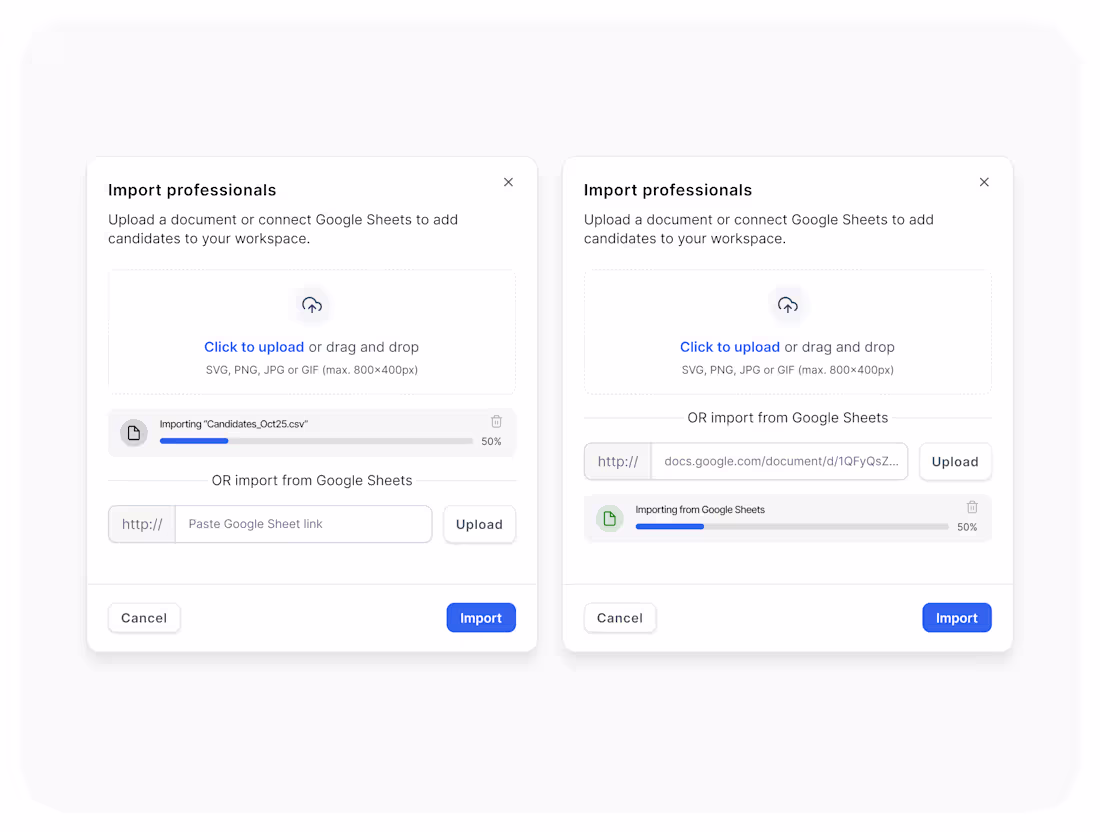
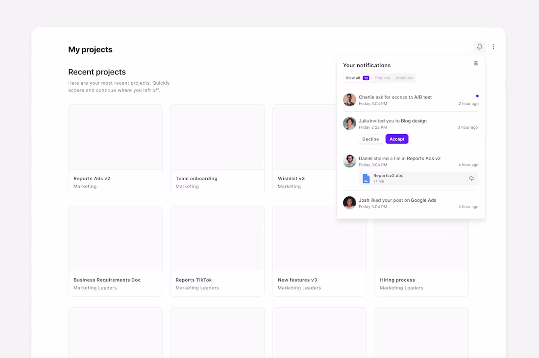
𝐖𝐡𝐲 𝐔𝐈 𝐬𝐭𝐢𝐥𝐥 𝐦𝐚𝐭𝐭𝐞𝐫?
Consistency builds trust.
Here, the same upload progress bar is used across two flows: CSV upload and Google Sheets import. Same logic, same behavior, same visual language.
Reusing familiar patterns reduces cognitive load and helps users feel in control.
Consistency isn’t repetition. It’s clarity.
2
149
Shared Project Flow Interface Design
0
5
Website and Brand Creation for Picked
2
58
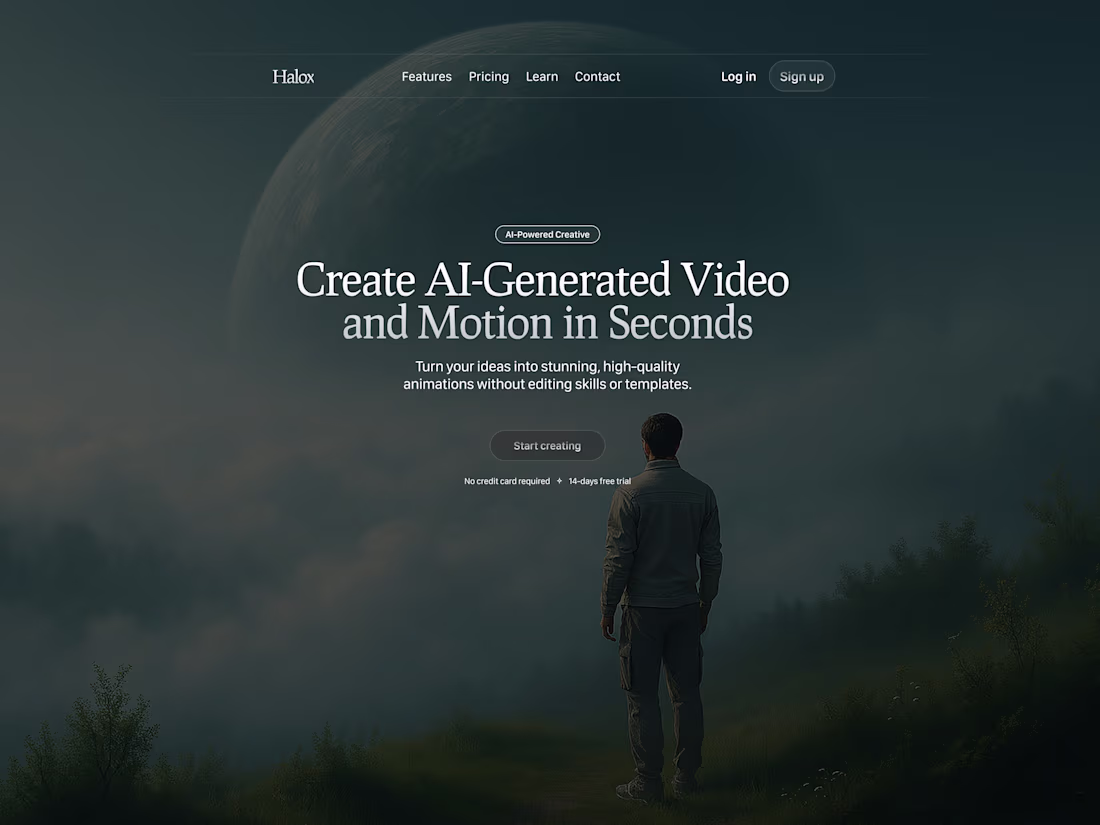
AI-Generated Hero Exploration
0
15
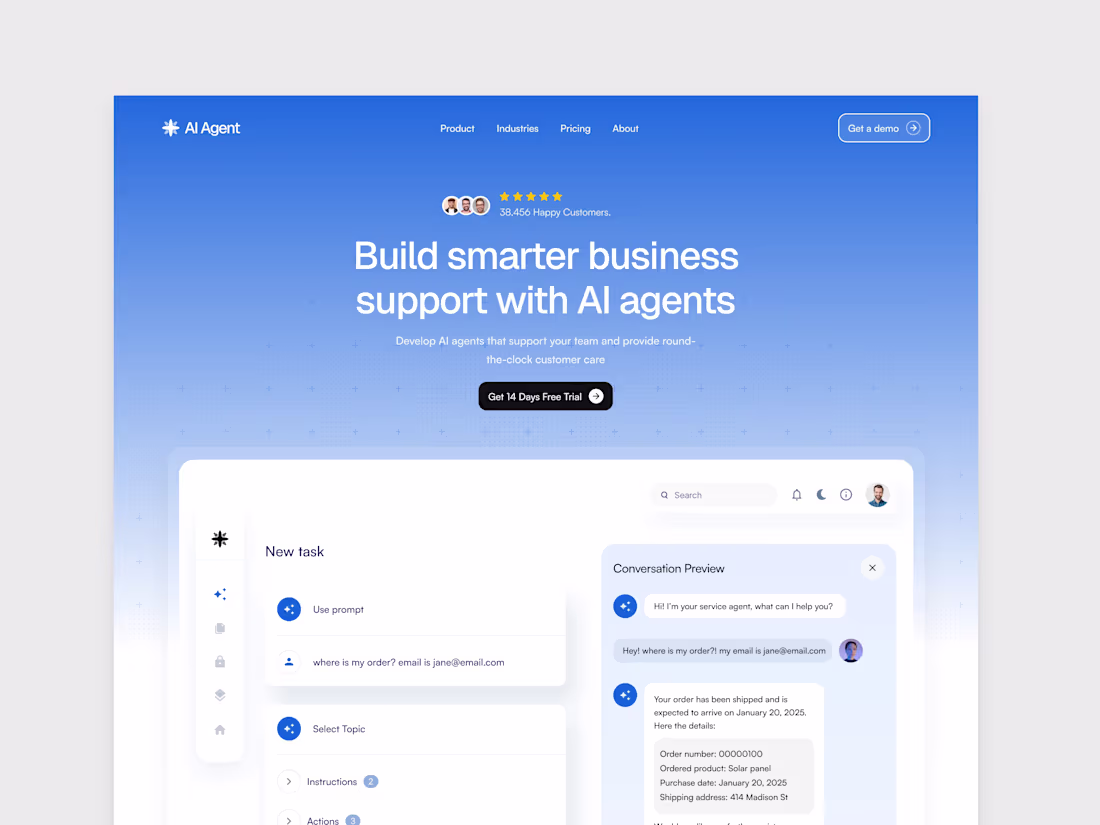
AI Agents – Landing Page Concept
1
10
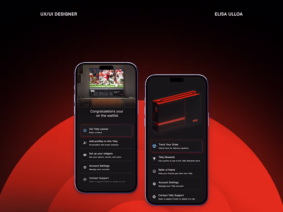
Mobile App Design for a Smart TV Platform
2
32
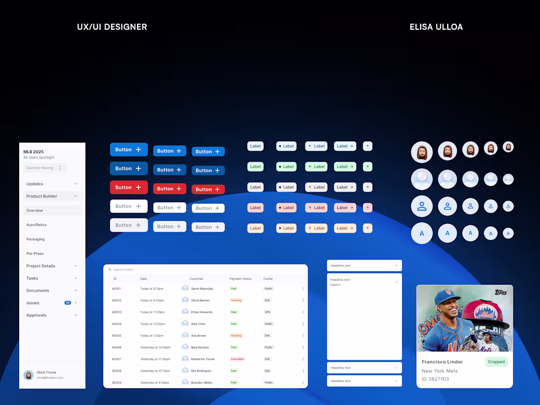
Design System for Global Teams
6
79
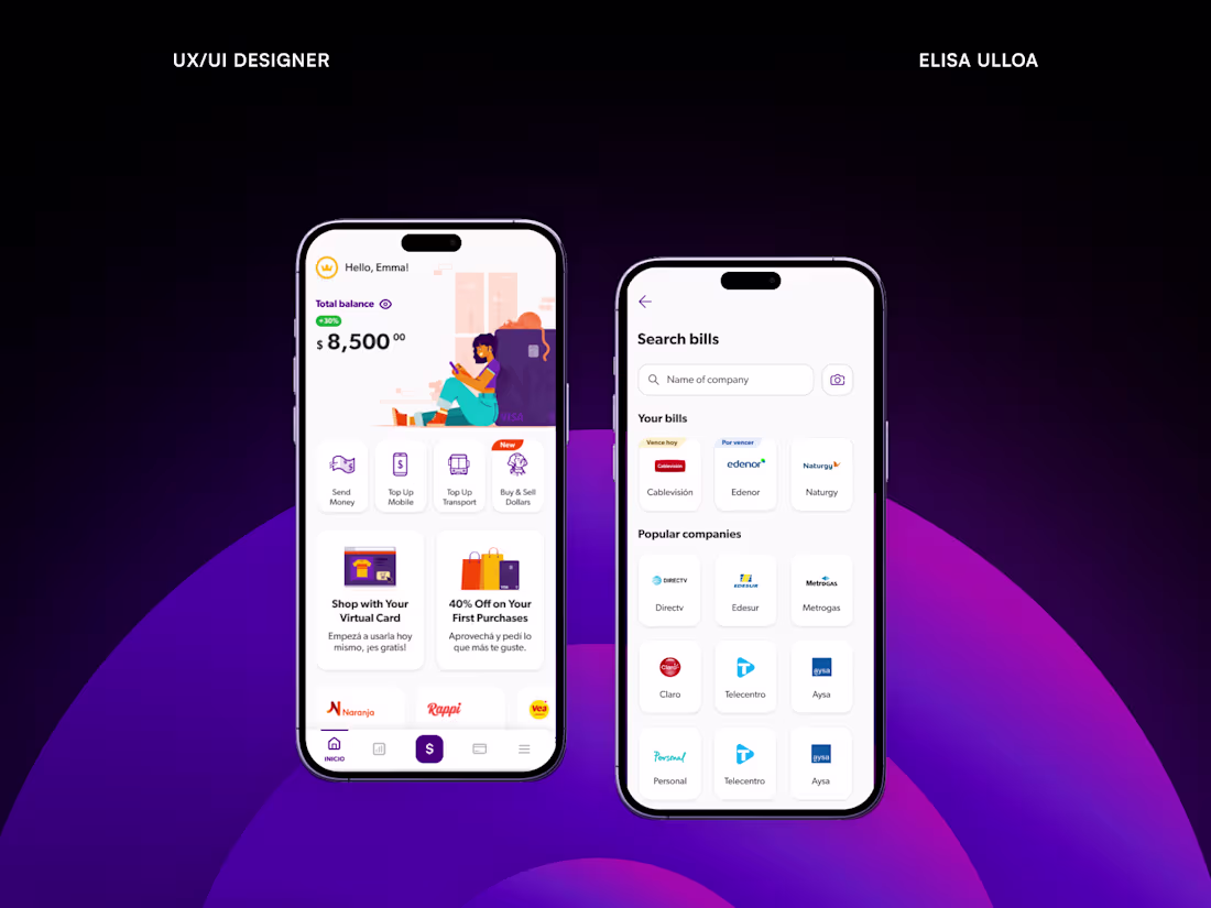
Bill Payment – Mobile App UX/UI Design
0
12