

Creative partner in your brand’s success


Creative partner in your brand’s success


If the founder's LinkedIn looks nothing like the investor deck, while the website tells a different story, where's the credibility?
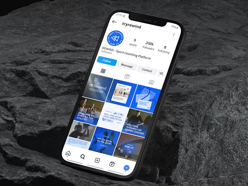
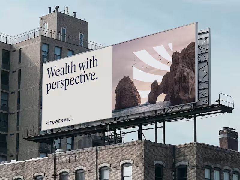
That's where long-term design support becomes essential. For Sully.ai (http://Sully.ai), I provide consistent visual support across channels: social graphics, presentation updates, whitepaper assets and more. Each piece maintains the same sophisticated AI healthcare narrative - from fundraising materials to founder content.
The result: brand coherence that builds trust across every touchpoint.
12
42
3.8K

Connecting brand, design, and strategy
Connecting brand, design, and strategy


Sr Product Designer

𝐖𝐡𝐲 𝐔𝐈 𝐬𝐭𝐢𝐥𝐥 𝐦𝐚𝐭𝐭𝐞𝐫𝐬? #4
The Login screen
A login is more than a form. It’s the first impression — the small gate between curiosity and conversion.
Here’s what a good login gets right:
- Simple and focused: only one primary action, no distractions, no clutter.
- SSO option: a quick “Continue with Google” can be the difference between logging in or giving up.
- Clear alternatives: links for Sign up and Contact support keep users from feeling stuck.
- Emotional context: I used Midjourney to create the beach visual because even small visuals can spark motivation. You’re not just signing in. You’re starting your vacation.
When teams rush through login screens, they forget it’s often the first UX a user experiences.
UI details are not just decoration — they set the tone for the entire product experience.
1
22
381

𝐖𝐡𝐲 𝐔𝐈 𝐬𝐭𝐢𝐥𝐥 𝐦𝐚𝐭𝐭𝐞𝐫? #3
AI is changing the way we design — faster drafts, quicker iterations, smarter workflows. But great results still come from solid fundamentals.
In this example, the team shares a project in seconds. Clean hierarchy, clear inputs, smooth flow. It’s a reminder that when structure and clarity meet AI, everything just works better.
I’m all for AI, as long as we keep the craft in the process. Because good UI doesn’t slow you down; it amplifies what AI can do.
19
363
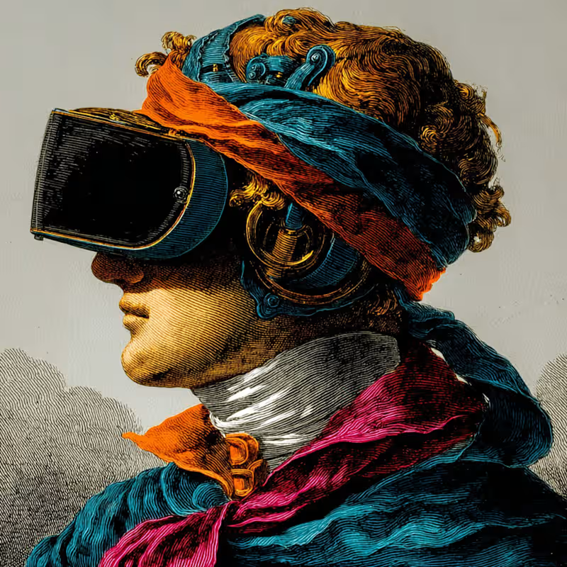
𝐇𝐨𝐰 𝐭𝐨 𝐤𝐞𝐞𝐩 𝐯𝐢𝐬𝐮𝐚𝐥 𝐜𝐨𝐧𝐬𝐢𝐬𝐭𝐞𝐧𝐜𝐲 𝐢𝐧 𝐌𝐢𝐝𝐣𝐨𝐮𝐫𝐧𝐞𝐲
If you’ve ever found an image you loved and couldn’t recreate that same vibe again — this is why '--style' matters.
It defines the overall look and feel of your images, the lighting, contrast, and texture that give them a cohesive personality.
𝐇𝐞𝐫𝐞’𝐬 𝐡𝐨𝐰 𝐭𝐨 𝐝𝐨 𝐢𝐭:
Once you find an image that matches the visual direction of your project, open it and click “Style” and “Prompt.”
From there, you can reuse that same visual base to create new versions.
Just adjust what you need in your prompt — an object, a background, or a small detail — and Midjourney will preserve the same tone, lighting, and visual language.
Now you can move from random explorations to a consistent visual system.
3
34
448

𝐖𝐡𝐲 𝐔𝐈 𝐬𝐭𝐢𝐥𝐥 𝐦𝐚𝐭𝐭𝐞𝐫𝐬? #2
Notifications are everywhere, but poorly designed ones turn
into noise instead of help. In this example, the UI makes
the difference:
- Clear hierarchy (requests, mentions, updates).
- Quick actions in place (accept, decline, open file).
- Subtle visuals that guide without distracting.
Good UI in notifications isn’t just about looks — it saves time, reduces friction, and keeps people in the flow.
22
309

Brand identity & launch websites for early-stage startups ·
- 44
- Followers
Brand identity & launch websites for early-stage startups ·
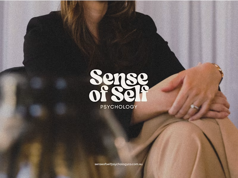



Combining my passions to help you expand. 💫



Purposeful branding, user-focused design & web experiences

Purposeful branding, user-focused design & web experiences
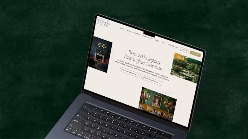
A recent project for The Royal Bell, a heritage venue reimagined as a modern members’ club. I led the brand development across print and digital, designing and building a website that complements the visual identity. The result is a refined brand system that balances heritage character with timeless elegance.
4
23
443


Brand & Digital Product Designer

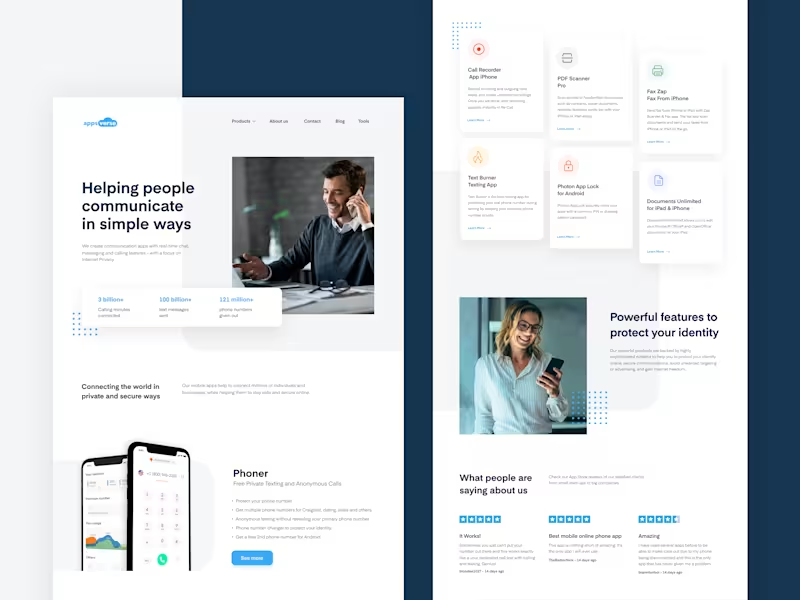
Application for expense management, receipt scanning, snap a photo of your receipt using SmartScan, and start tracking your expenses.
This app automates the entire receipt and expense management process.
3
3
138


Brand & Digital Designer
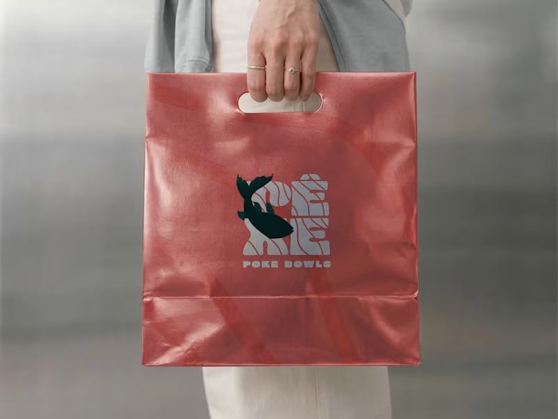
Pêxe: Brand Identity & Packaging for a Poke Restaurant in Lisbon
Pêxe is a poke bowl restaurant in Lisbon, built around fresh fish and a quick, takeaway-friendly experience. The client wanted a brand that felt young, playful and easy to recognise, one that could stand out on the street and also work on small items like stickers and sleeves.
Concept
The identity is inspired by water and the texture of fish. I created a custom wordmark where thin wave-like lines run through the letters, giving the logo movement and a sense of the sea. The accent on the “Ê” adds a local touch and makes the name feel more distinctive.
Secondary mark
For smaller spaces and packaging, I designed a compact version of the logo with a fish illustration cutting through the lettering. It works as a symbol on its own and adds personality to the brand.
Colour & pattern
I paired a deep green with a bright coral red. The green feels fresh and grounded, while the coral brings warmth and makes the food look more appetising. The wave lines from the logo were turned into a subtle pattern that appears across the packaging, tying everything together.
Applications
The identity was applied across the shopfront awning, bowl sleeves, lid stickers and paper bags. The tagline “Your poke to go” reinforces the takeaway side of the business and gives the packaging a friendly, direct voice.
Result
A consistent and recognisable brand that works from the street to the table, with a flexible system that can grow with the restaurant. [Add: “The restaurant opened in (month/year)” or a short client feedback line, if you have one.]
My role: Logo design, visual identity, illustration, pattern, packaging design and signage.
2
235
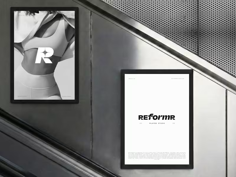
REFORMR — Pilates Studio Brand Identity
REFORMR is a self-initiated branding concept for a modern Pilates studio, built around movement, balance, and a refined visual aesthetic.
The visual identity combines bold typography, minimalist layouts, and monochromatic art direction to create a premium, contemporary brand. The project explores how a consistent visual language can translate across brand materials and advertising applications.
Scope: Logo design, visual identity, art direction, and mockup design.
12
32
1.1K
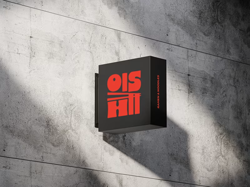
Ramen Brand Identity
Oishii is a self-initiated branding project exploring the visual identity of a modern ramen brand. The concept combines Japanese-inspired aesthetics with a contemporary visual approach, creating a distinctive and cohesive identity across brand applications.
The project explores visual direction, typography, colour, and brand elements to build a memorable identity for a food brand.
22
54
1.4K
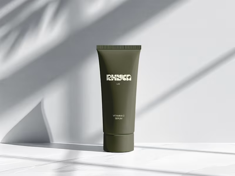
Rhyen Lab: Brand Identity & Packaging for a Skincare Brand
Rhyen Lab is a skincare brand built around science-backed formulas and a sensorial, human approach to beauty. The challenge was to create an identity that feels clinical enough to be trusted, yet warm and expressive enough to stand out in a crowded market.
I designed a custom wordmark with fluid, organic letterforms that echo the texture of serums and oils, paired with a bold monogram “R” for compact applications. A palette of deep olive green and soft cream keeps the brand grounded, natural and premium, while macro photography of skin and product textures reinforces the sensorial tone.
The system was applied across packaging for the Vitamin C Serum, Facial Cleanser and Moisturising Day Cream, ensuring consistency across tubes and bottles.
Deliverables: Logo & monogram · Visual identity · Color palette · Packaging design · Art direction
45
98
2.9K