João Santos - Mechanic Workshop
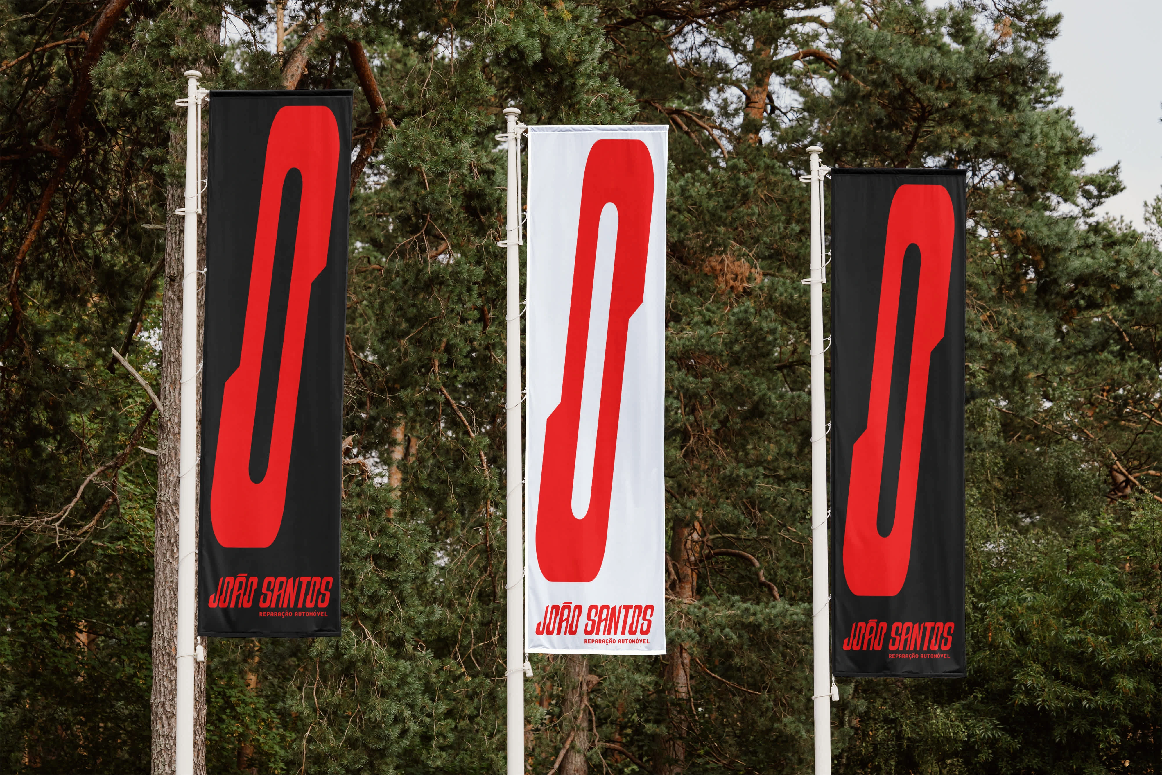
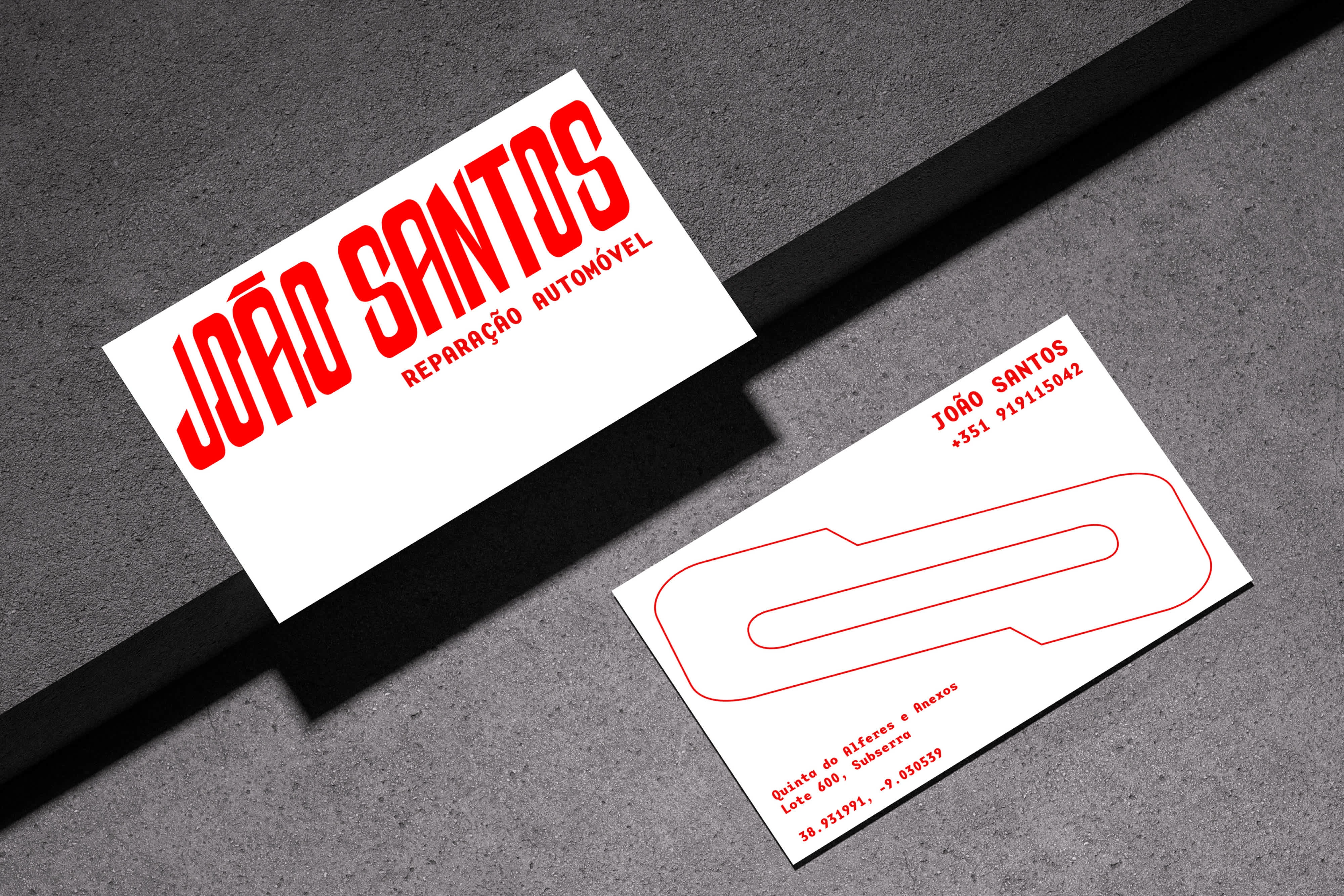
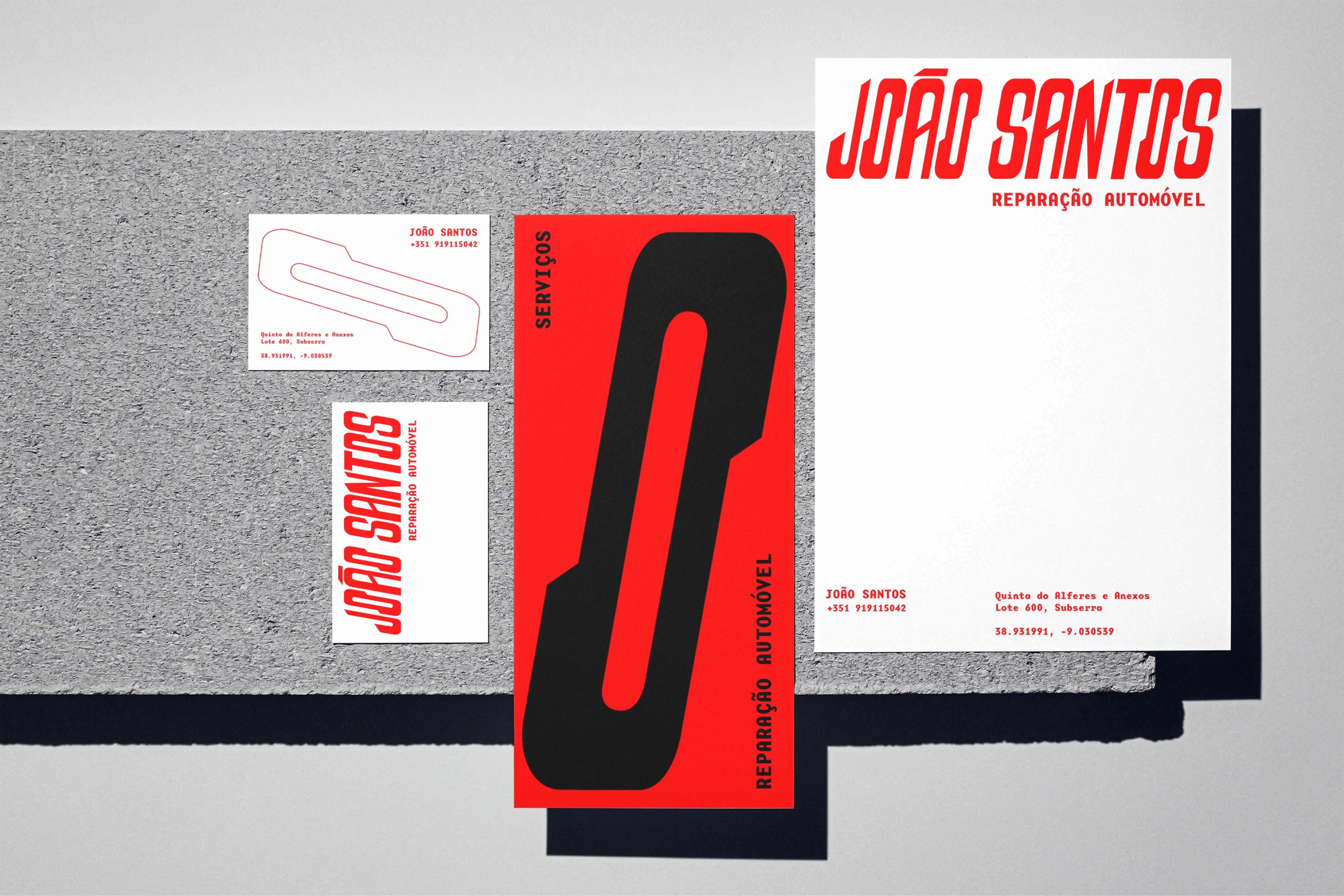
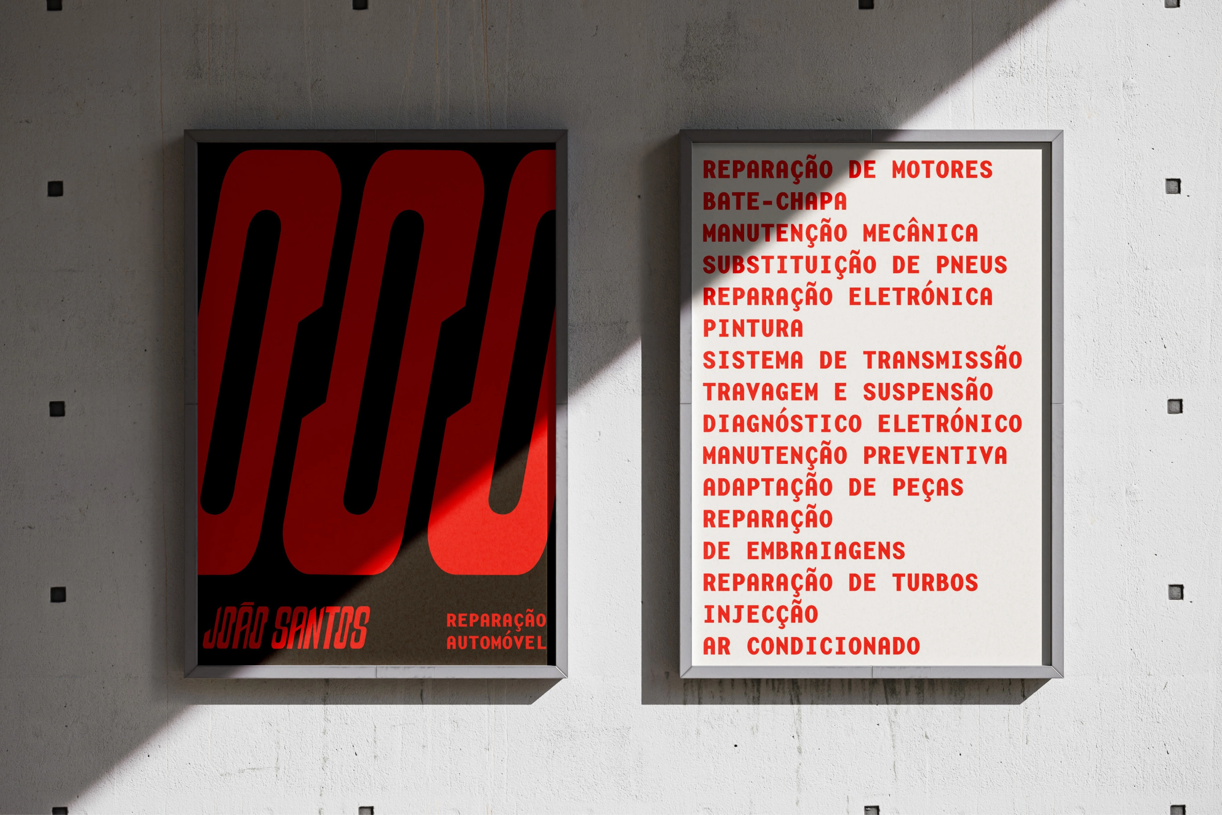
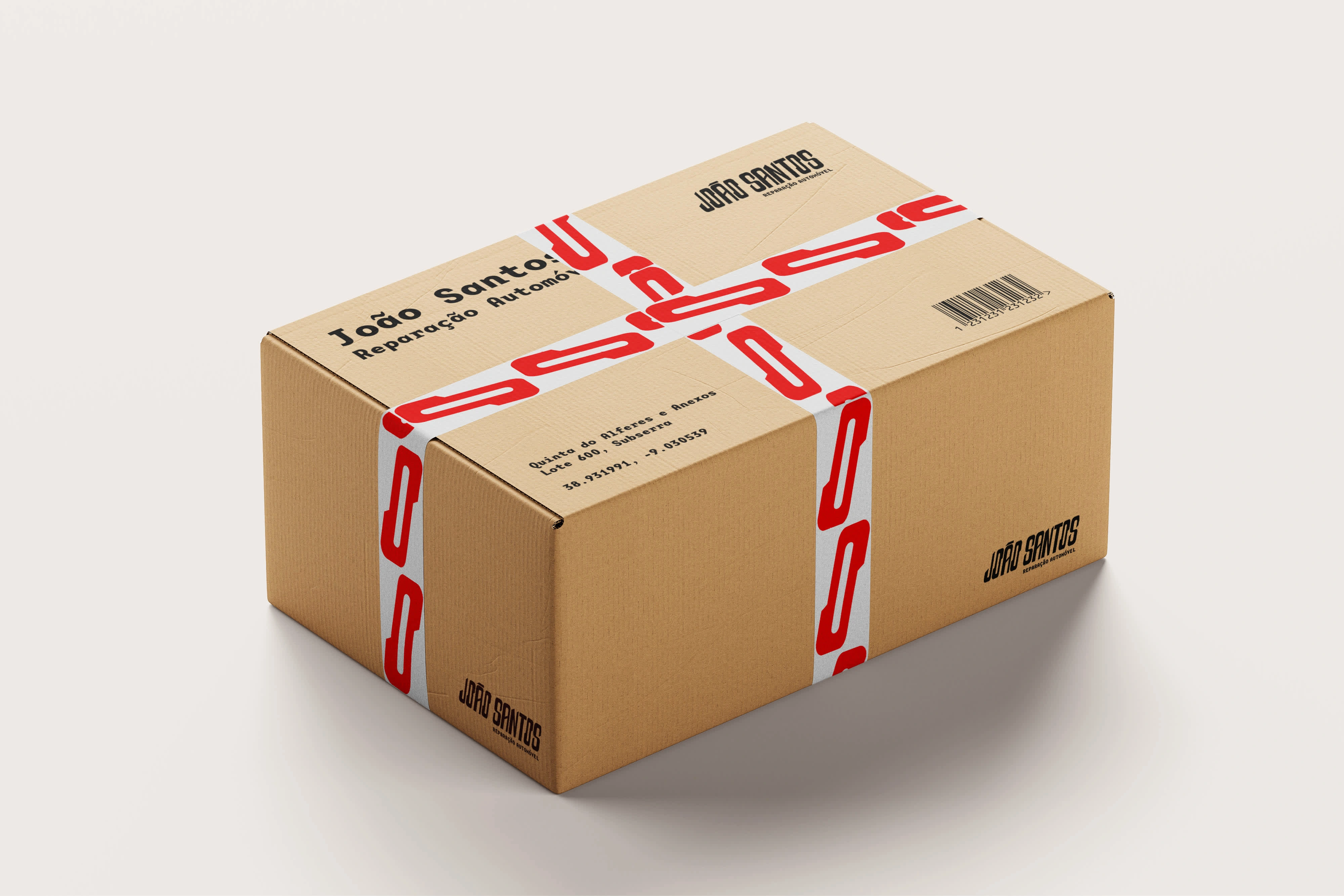
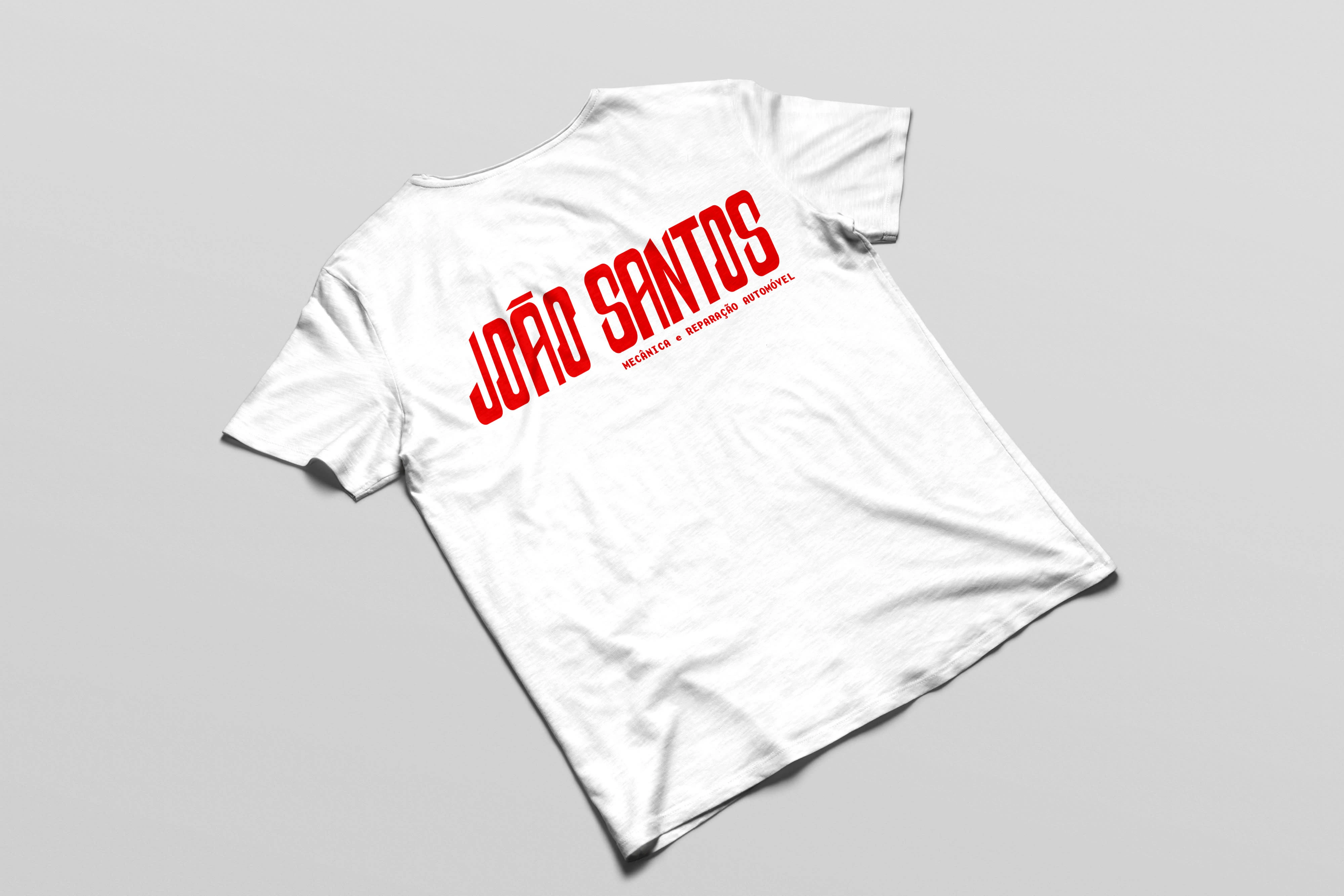
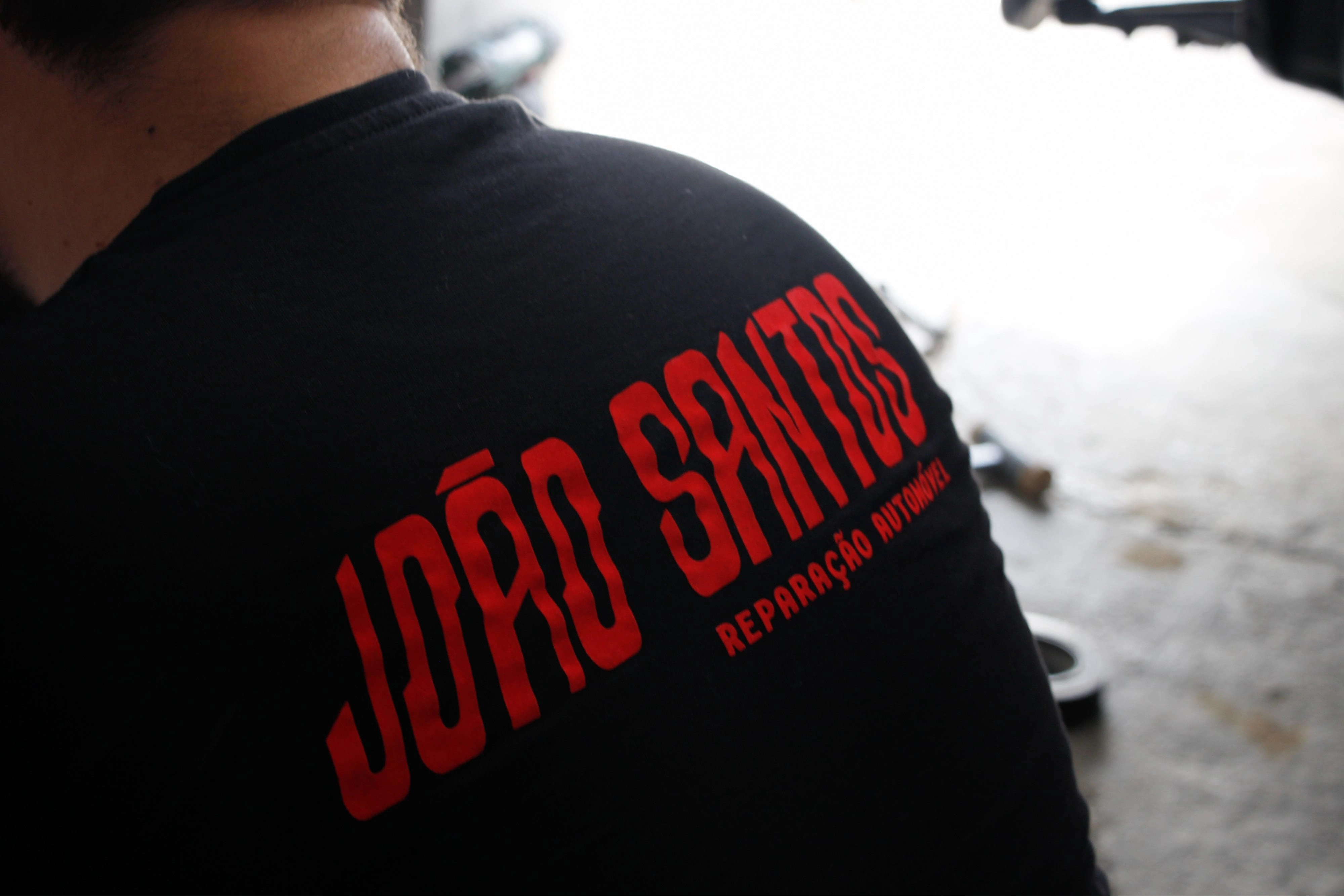
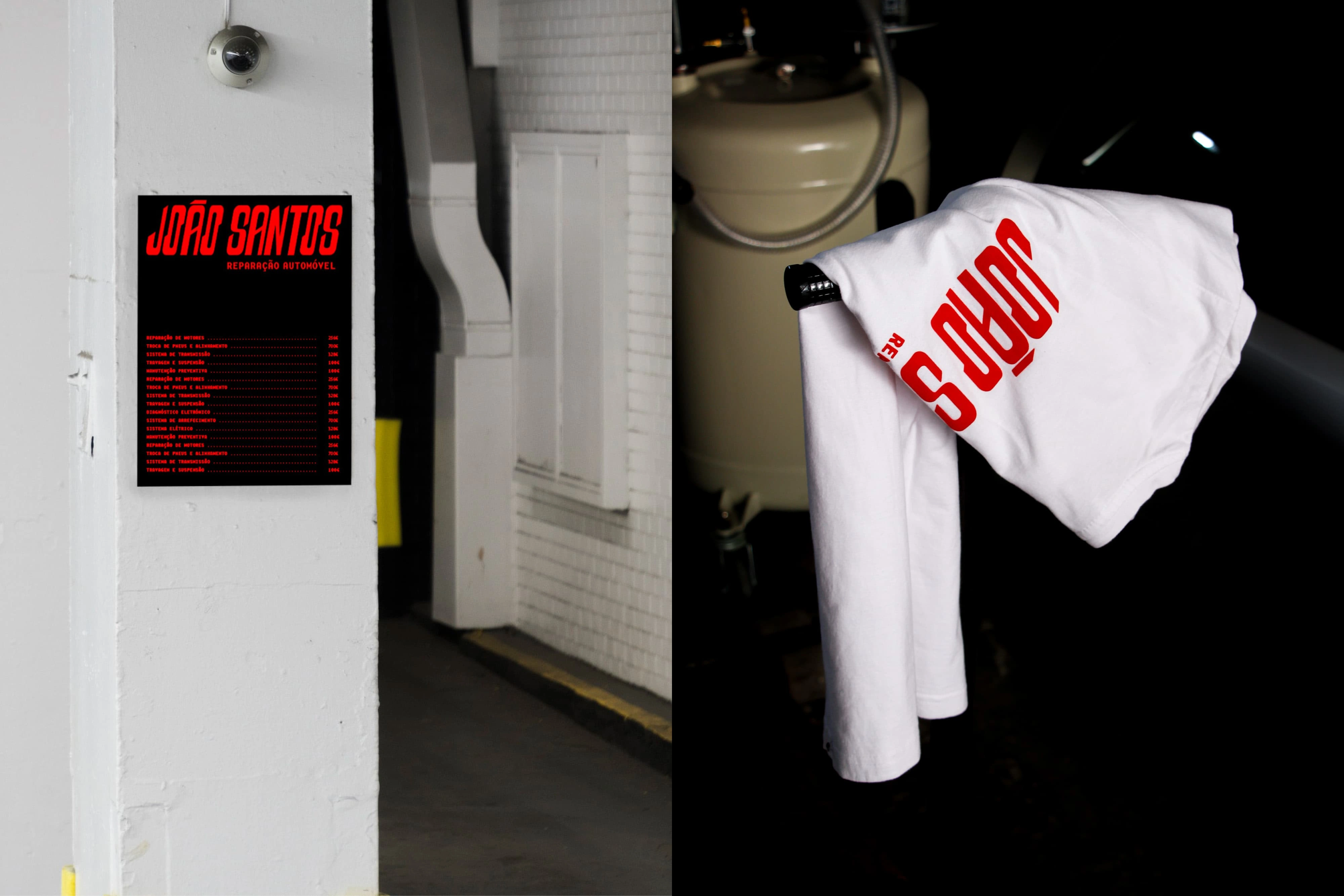
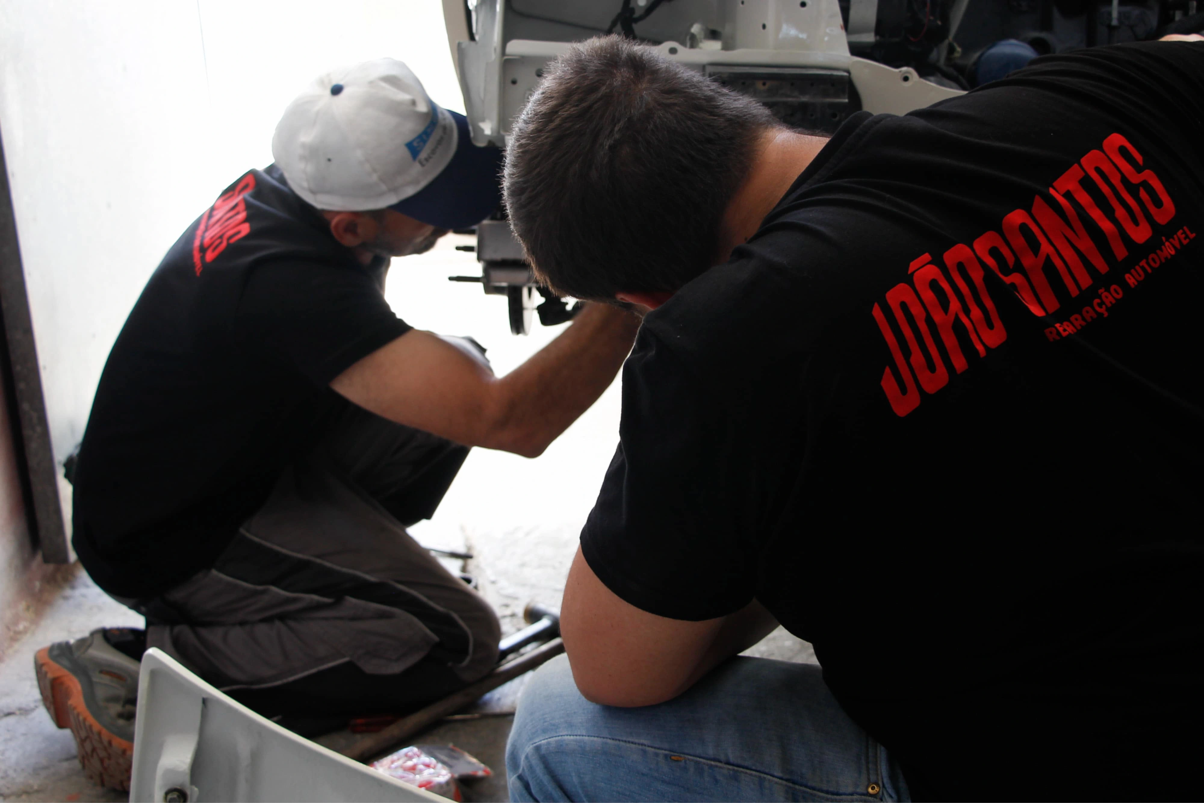
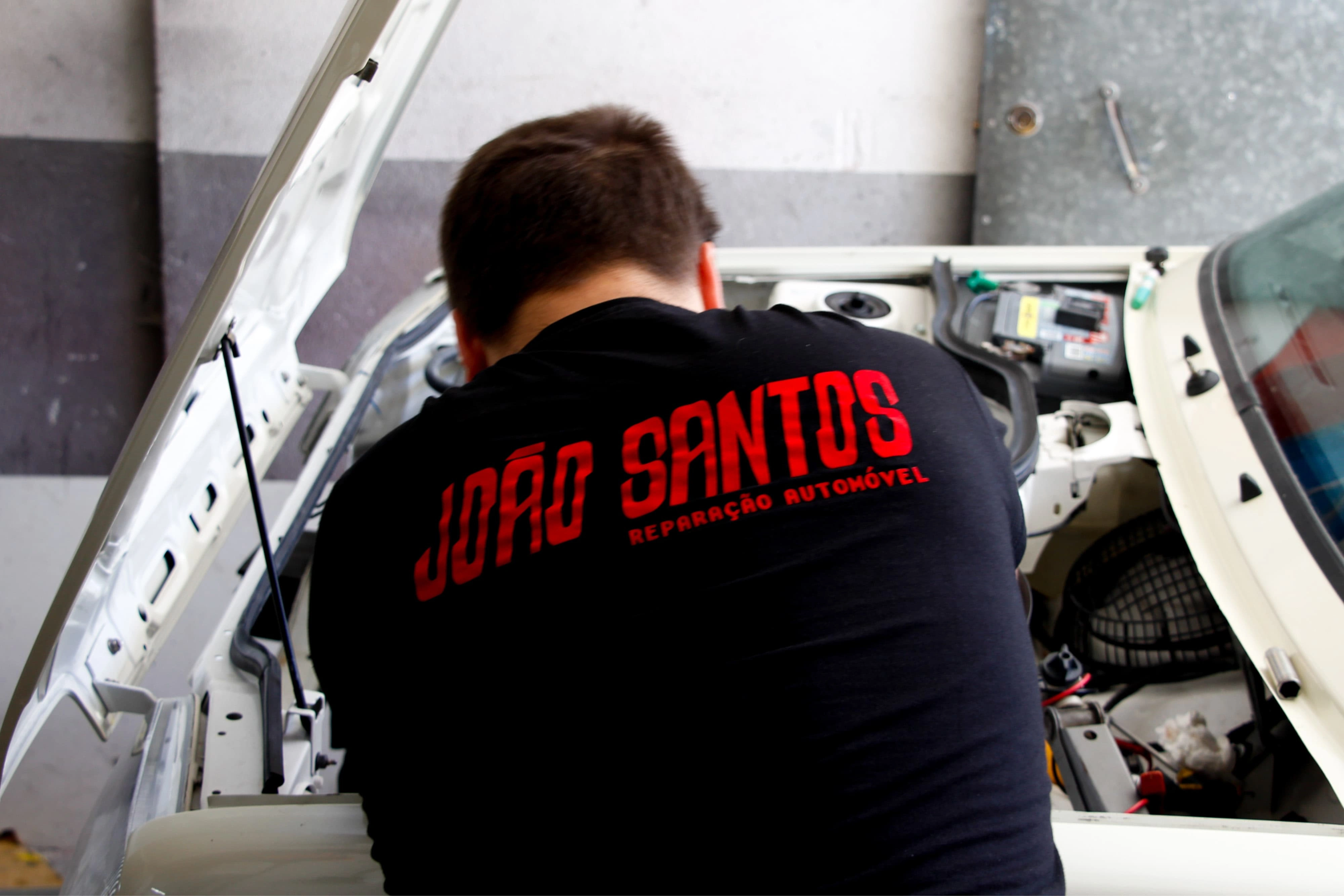
Visual identity designed for a mechanic workshop in Portugal.
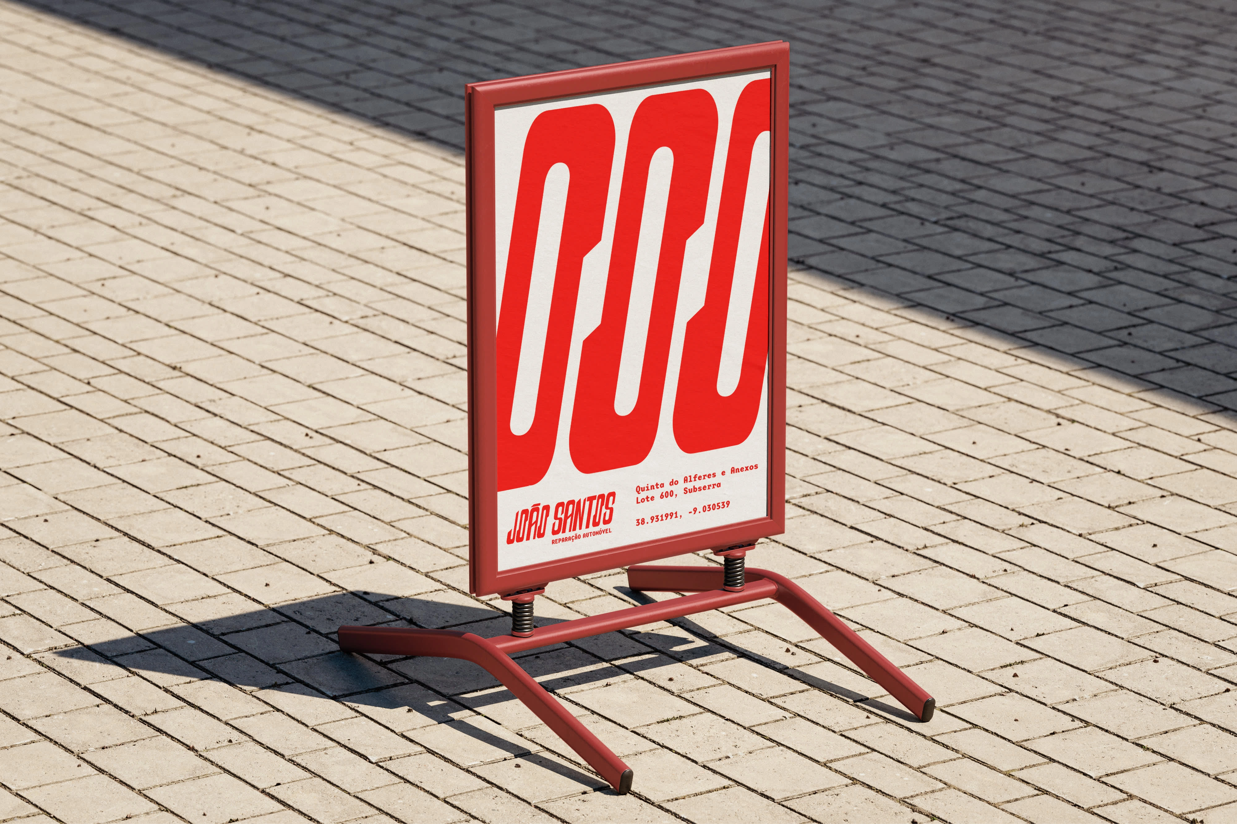
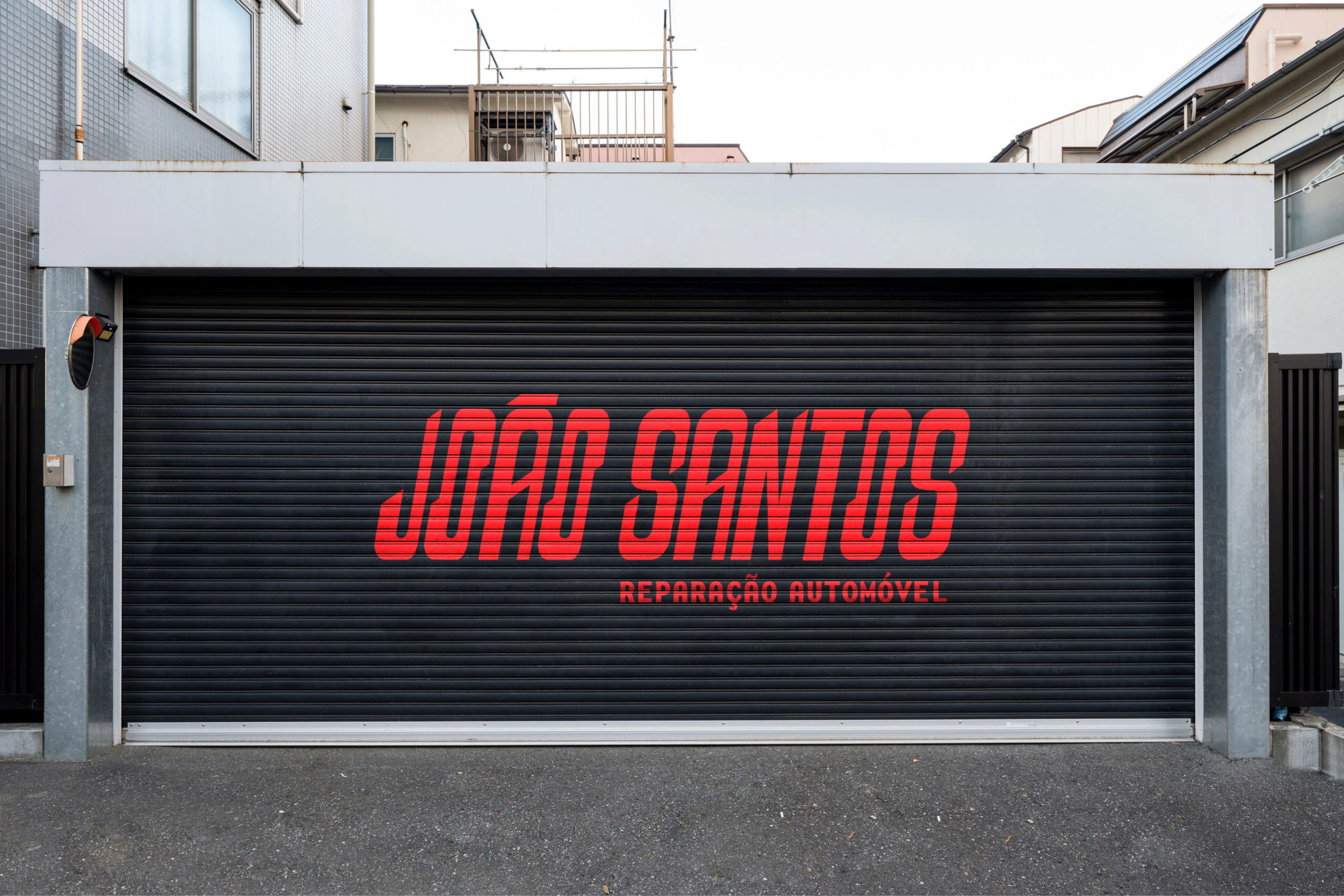
The typography design was inspired on vintage mechanic and automotive logos and the details and the angles of the shapes evoke the lines and geometries of tools and mechanic engines.
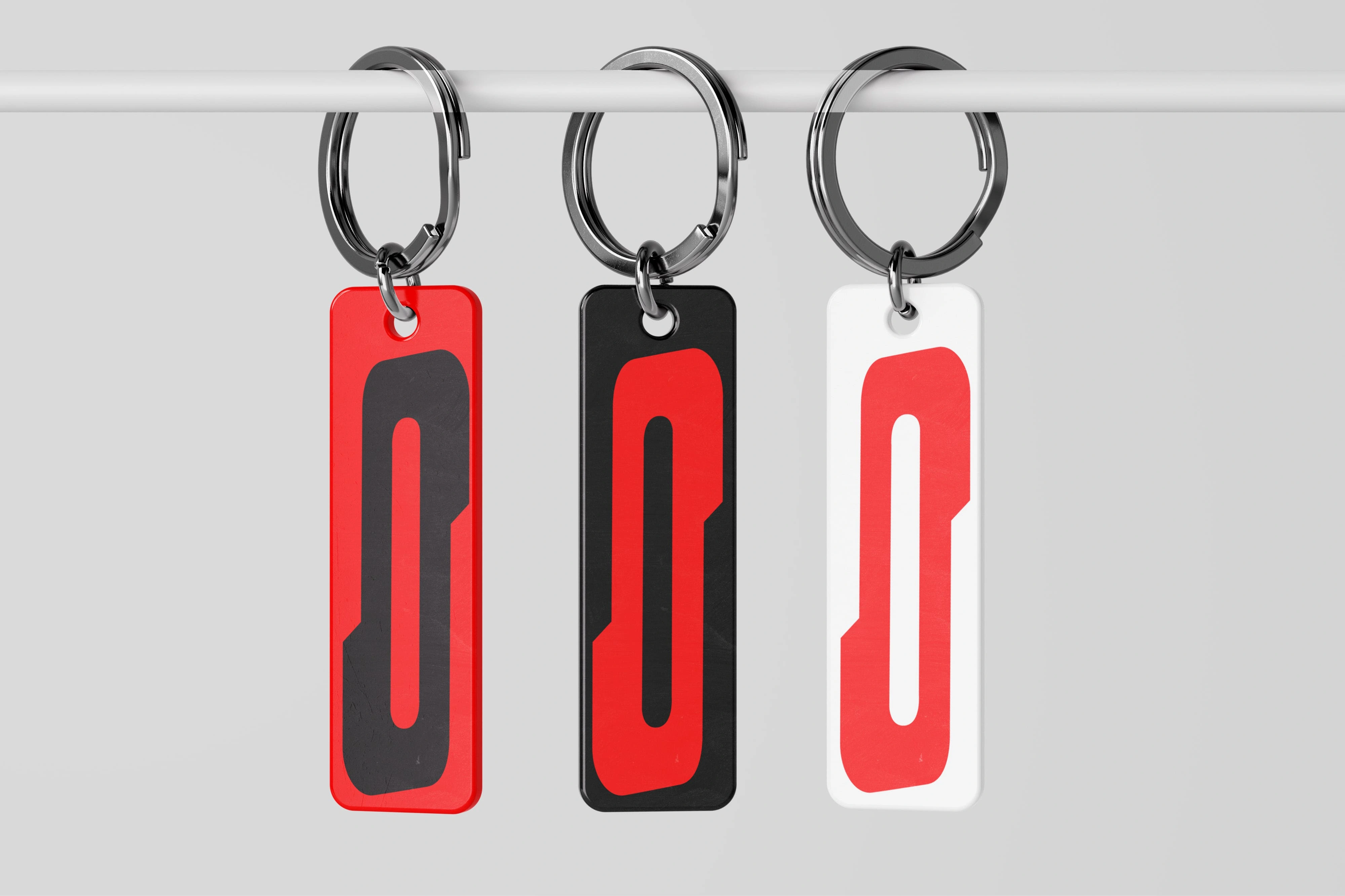
Even though the "O" is not the main letter of the name, the unique design of its shape makes it work as a symbol of the identity, an icon, that established the visual language for the whole wordmark.
Like this project
Posted Mar 26, 2025
Visual Identity for a mechanic workshop in Portugal.
