Shaping the look of online education
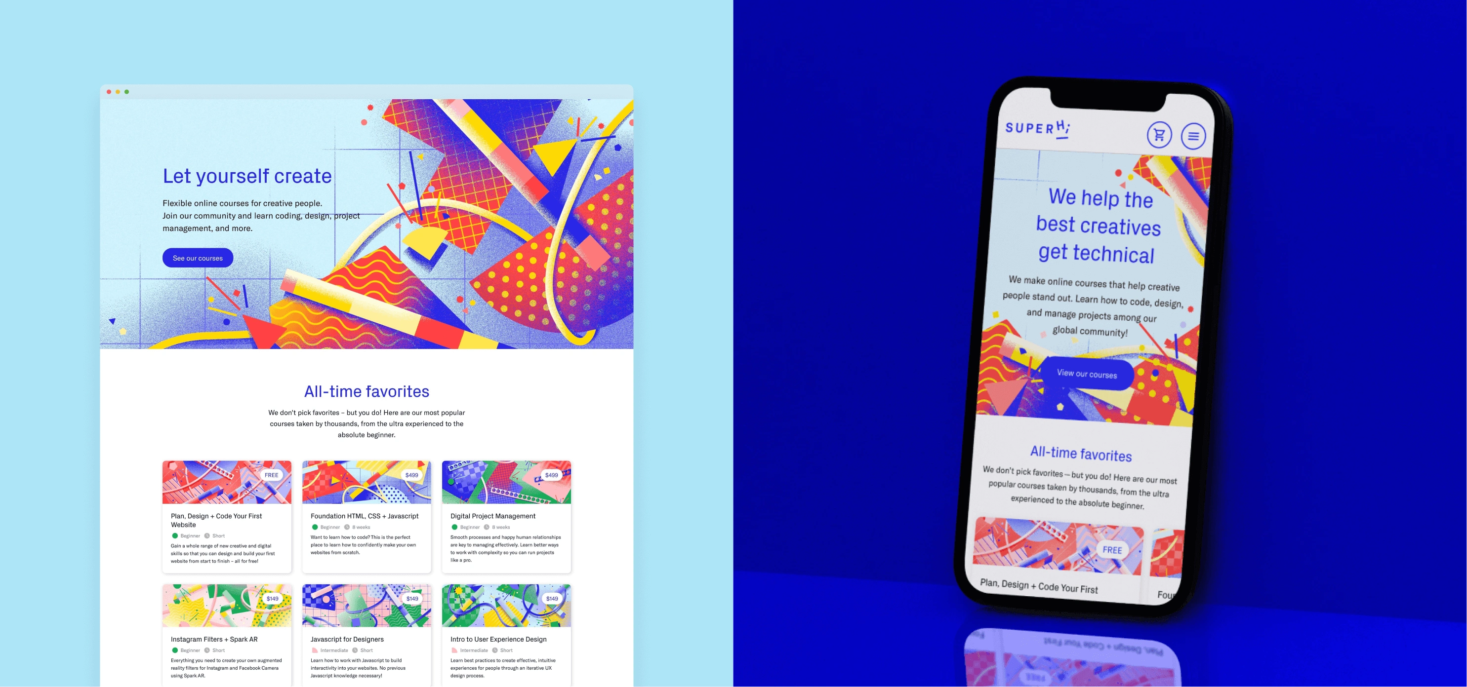
With a clear vision to establish SuperHi as the go-to online destination to learn new creative skills, I crafted a unique and flexible illustration style that can scale as the company grows.
Brand Refresh for SuperHi
Design challenge
SuperHi is an online learning platform providing high-quality, accessible and on-demand education to creative people. Founded by Rik Lomas in 2016, they started out as a code school, but have grown to offer courses in code, design and project management, as well as tools and a thriving community that helps people worldwide expand their skills.
With a passionate community of coders, designers, makers, and learners, SuperHi needed a brand refresh and a revamped website to better represent their growing offering while solidifying their position within the competitive edtech space.
As SuperHi’s only designer (in a team of 8 people), I led the brand refresh, art directing the visual direction of the marketing site, creating 25+ course hero images, and designing lead generation guides—all built into a new visual and brand system.
Brand Audit
The team began by conducting in-depth research to understand SuperHi’s brand values, target audience, and competitive landscape. I’ve led the brand audit that served as the foundation for our strategic approach, allowing us to identify key opportunities to enhance the brand’s visual identity and messaging.
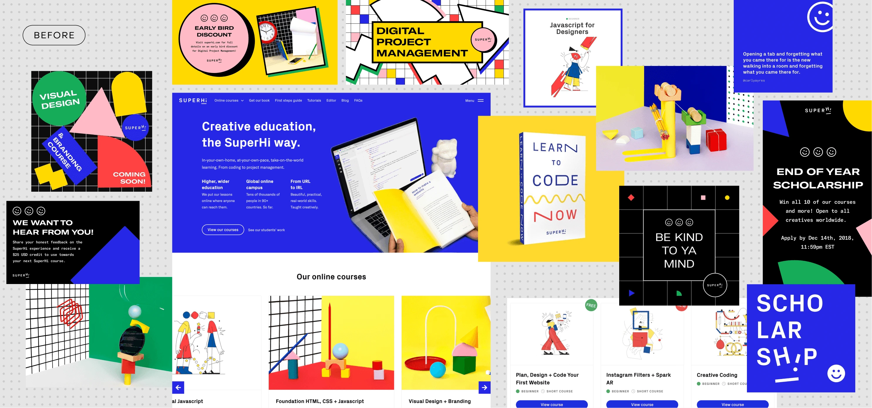
Process
Following the brand audit, I facilitated a workshop to collectively define objectives and strategies for the brand refresh. Additionally, we conducted interviews with students to gather insights and feedback on their experiences with the platform.
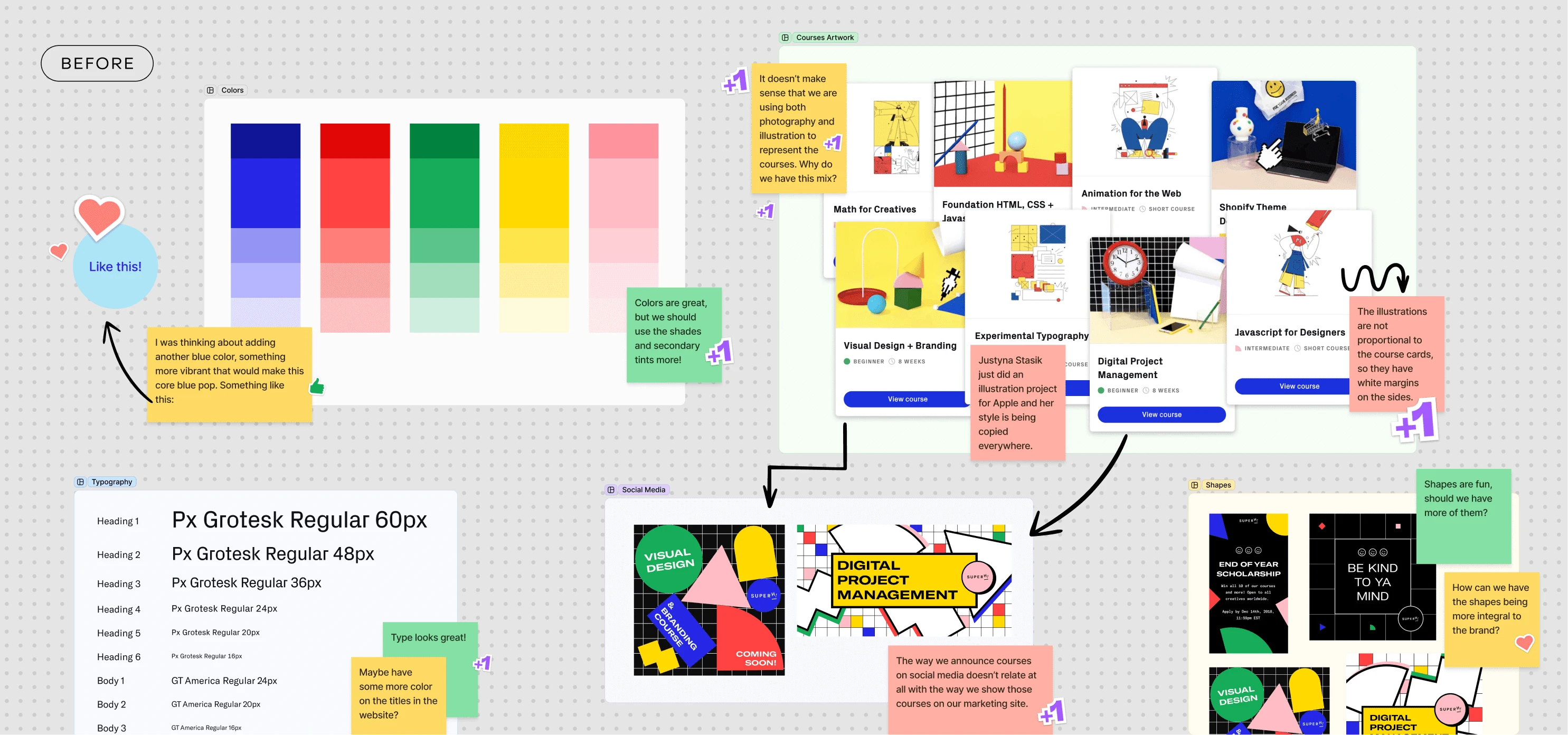
A Design System for the Course Imagery
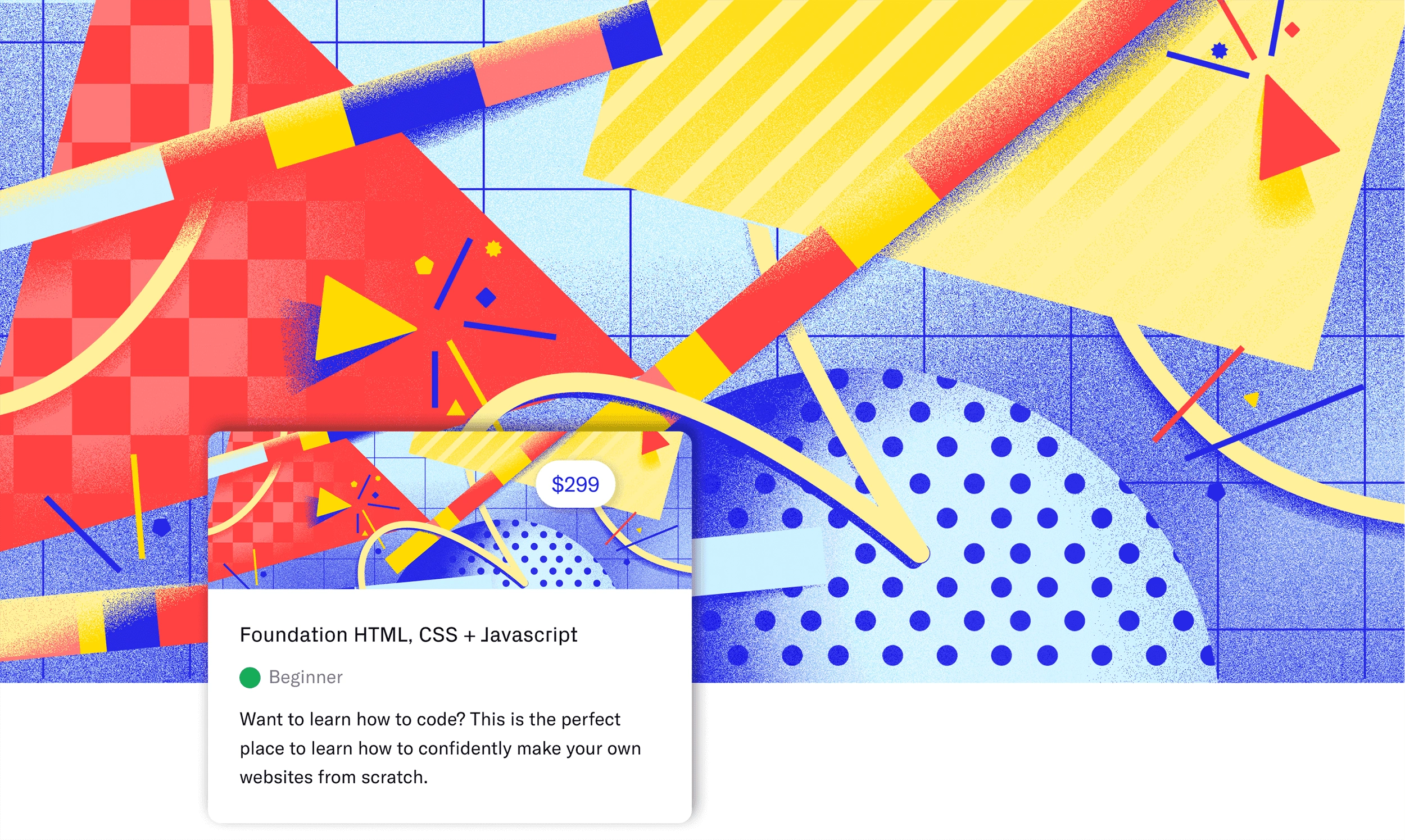
All courses have two characteristics in common: they belong to a discipline and have a level of difficulty. With this insight, I created a layered approach for each course image.
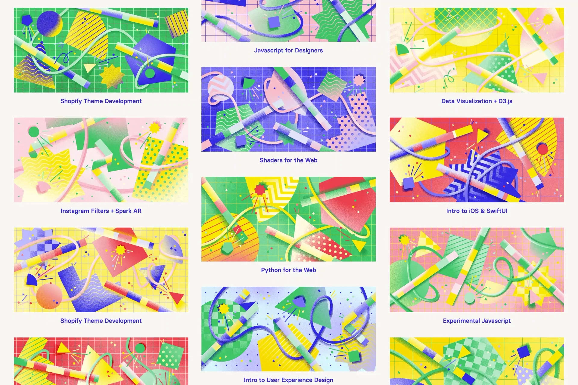
In the system, the discipline each course teaches is represented by the type of grid in the background and by the decorative elements in the foreground. The course difficulty is emphasized by the density of the background grid and by the number of shapes in the middle ground and their scale.
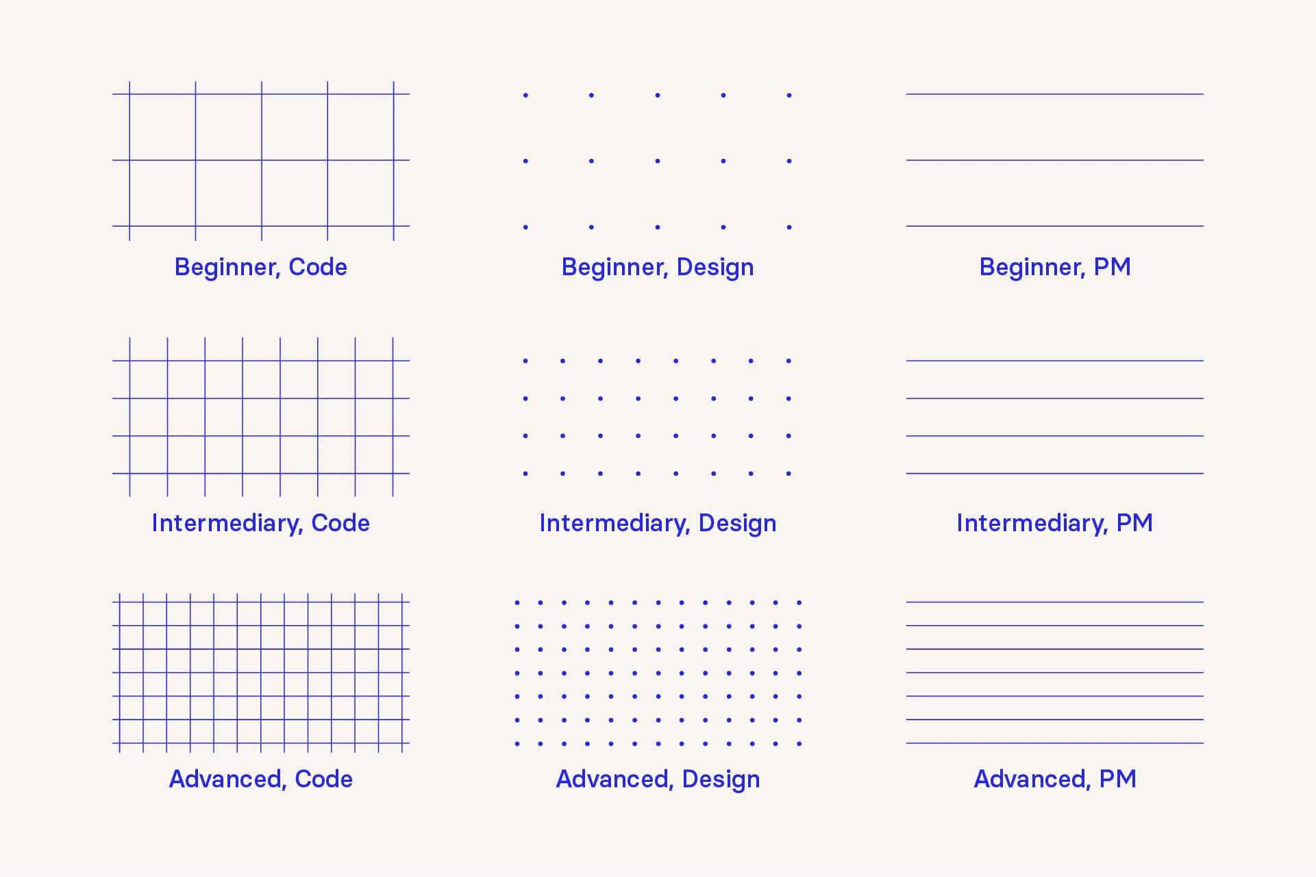
The possible backgrounds for each course, based on their discipline and difficulty level.

The possible shapes and patterns used across all images.
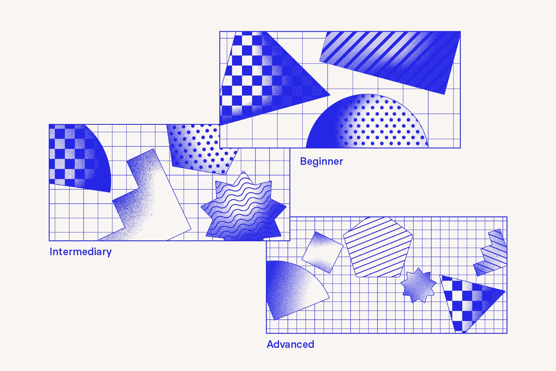
The quantity and scale of the shapes reinforces the difficulty level of the course.
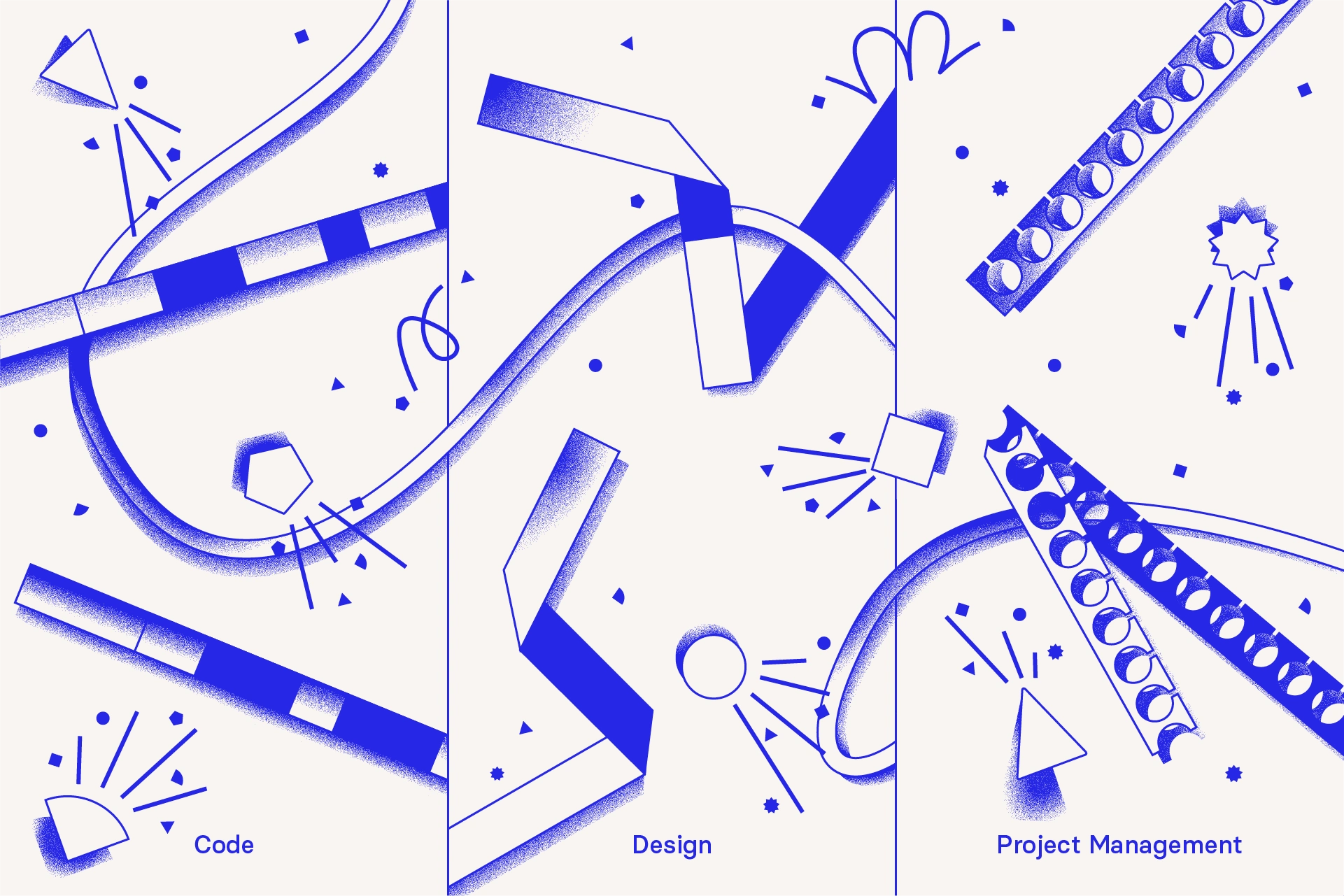
The possible decorative elements used on the foreground layer of each image. The bar-like elements inspired by loading states, paper folds and paper trimmings are specific to each discipline.
The course images
The website
The new layered system that was created for the course images was expanded to encompass other touchpoints of the brand. It was important for the hero section of the website to feel different enough from the course images, while maintaining
a consistent identity and feel. The result is bold, celebratory and builds into the visual direction.
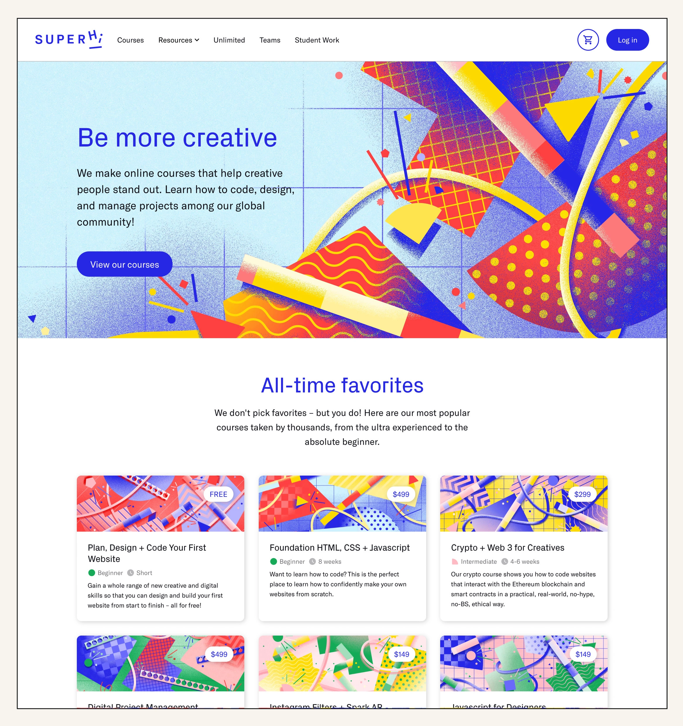
Revamped homepage for SuperHi
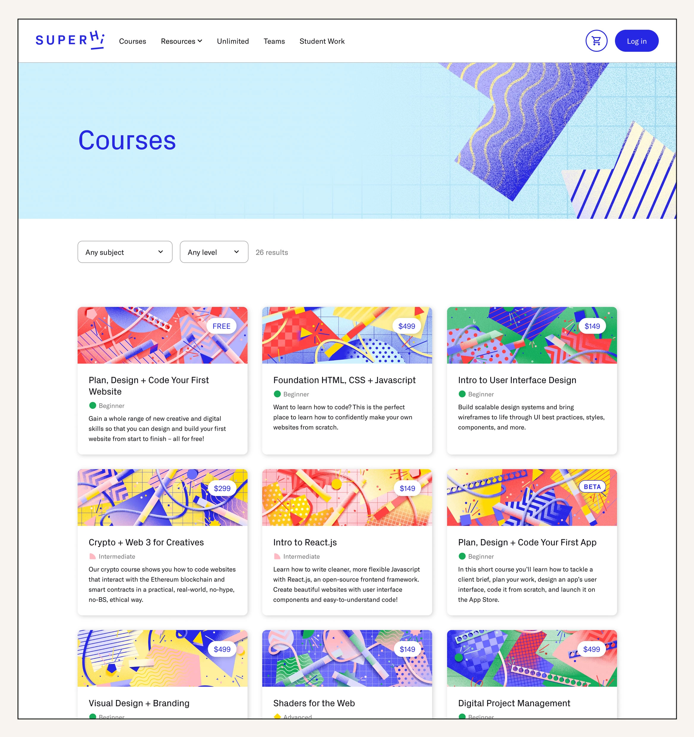
Courses page with updated imagery
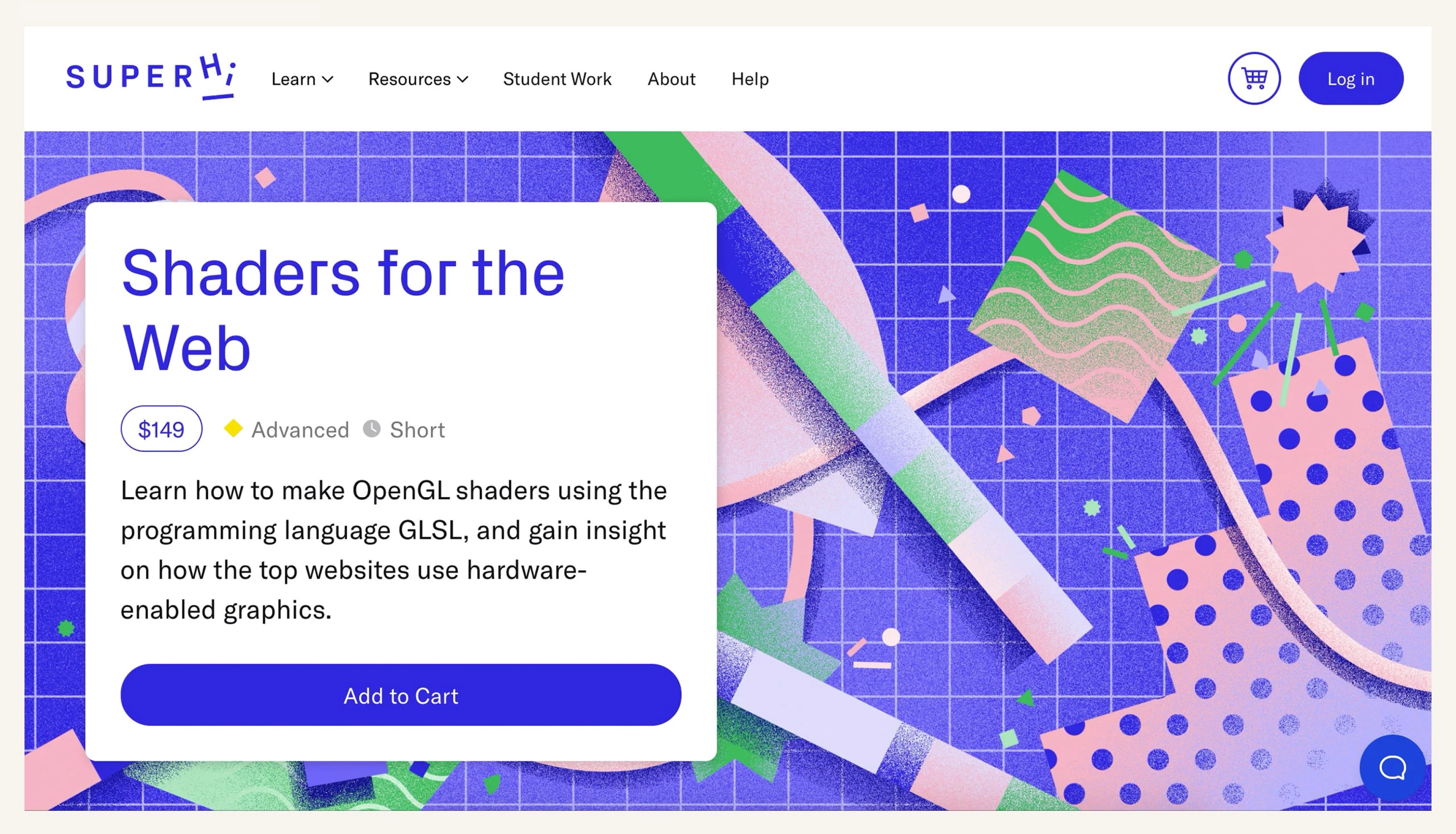
Each illustration is used as a background in the hero section of the respective course page.
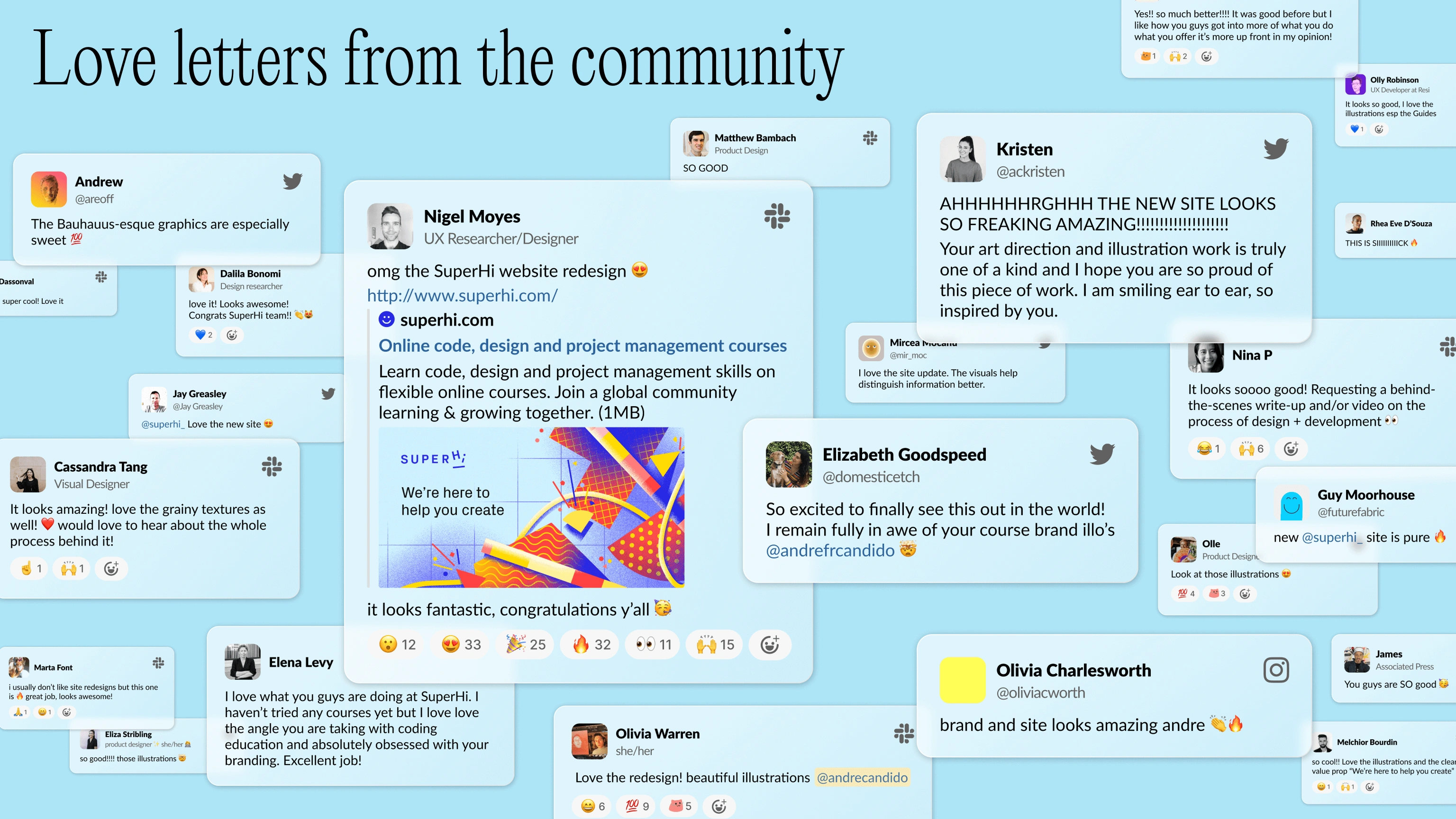
Social Media
SuperHi’s new brand identity made a striking impact, capturing the attention of both existing followers and potential new students. Our link in bio clicks increased by 784% in 6 months, with a CTR of 97.0%!
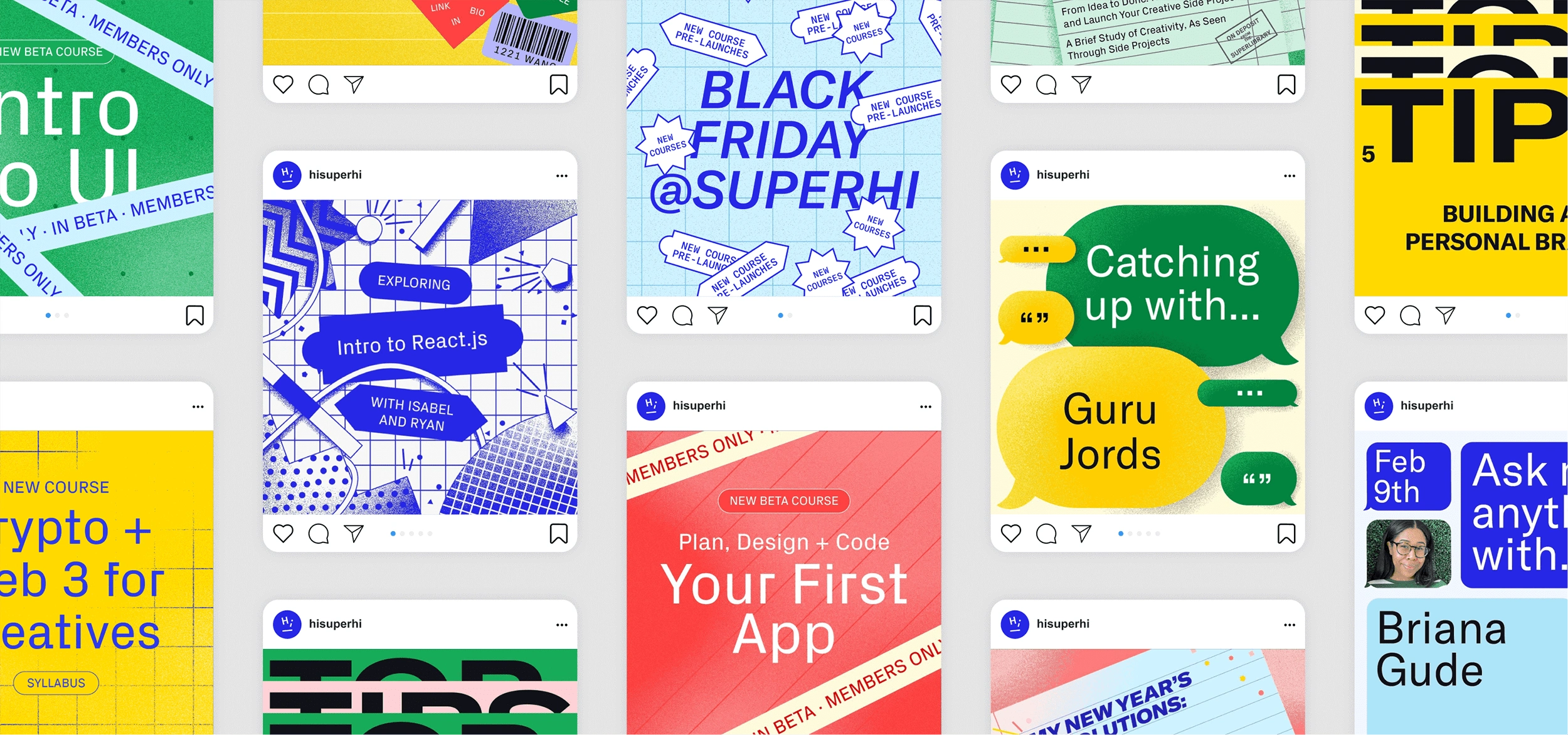
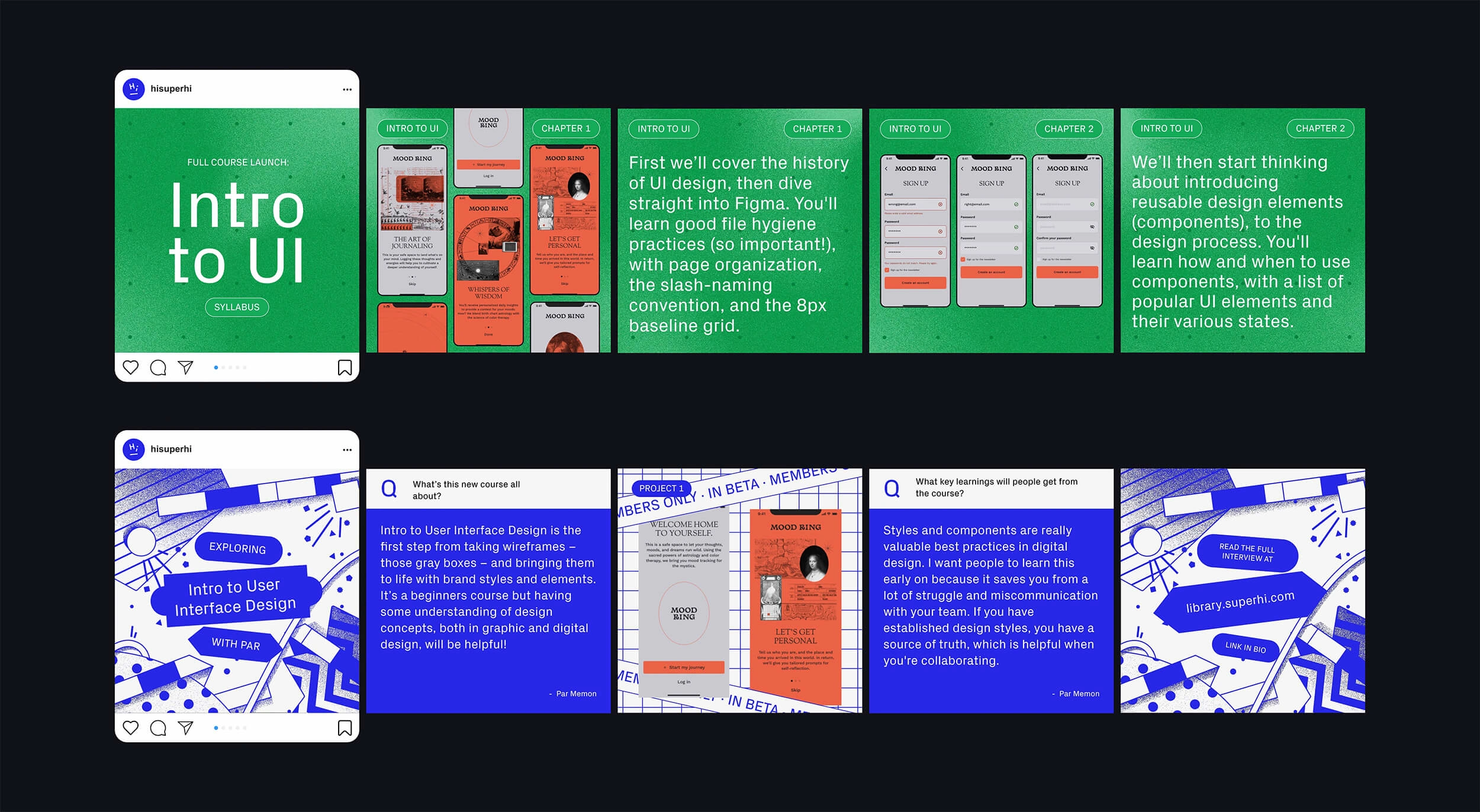
Course images were repurposed across various surfaces: Above, the Intro to UI syllabus mirrors the image’s background grid and color. Below, in a behind-the-scenes interview with the course creator, the image adopts a schematic, blueprint-inspired direction.
First Steps Guides
The First Steps guides are a lead generation and sales funnel content project. Their intent is to introduce people to SuperHi and their three main skill pillars, in a way that’s approachable, real, fun and practical, with a lens on helping people make and use these skills, no matter what role or career path they have or wish to have. This pdf series is derived from key articles from the SuperHi blog.
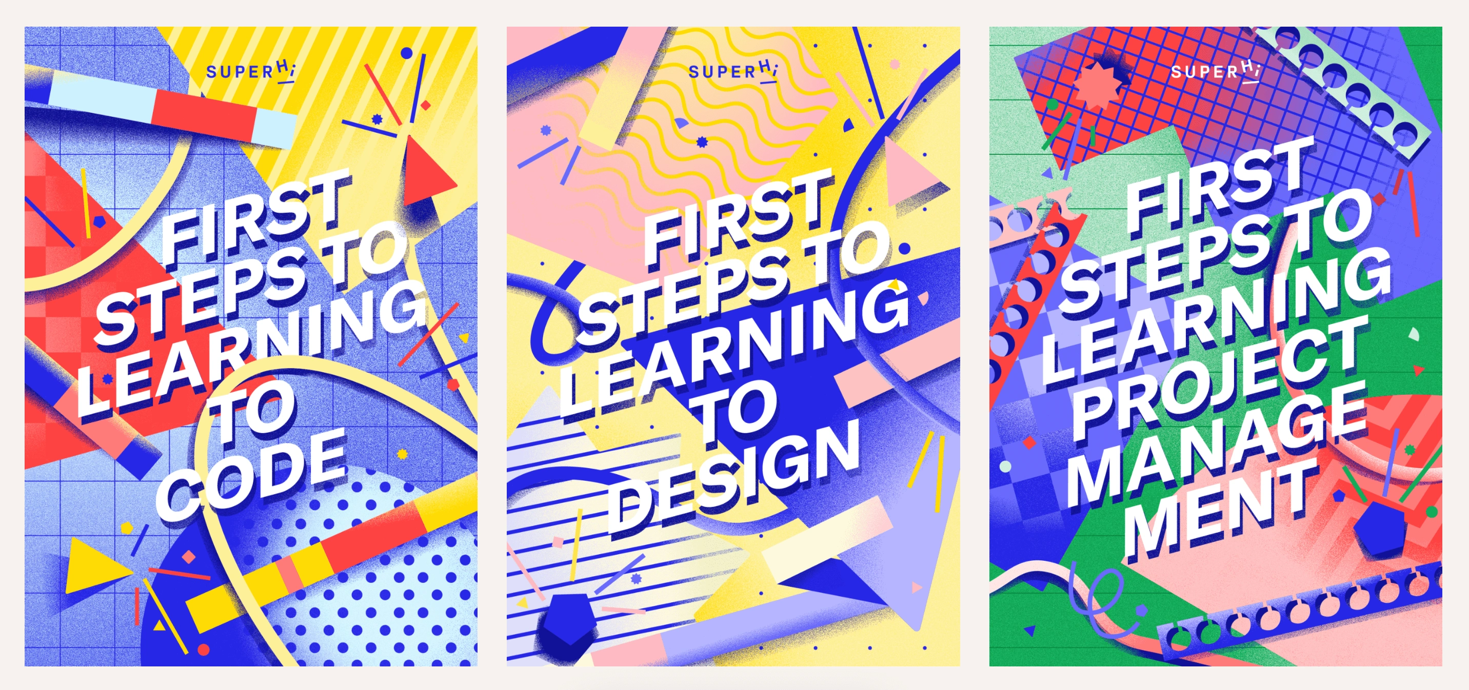
Visually, each guide builds on the corresponding course hero image, expanding the overall system.
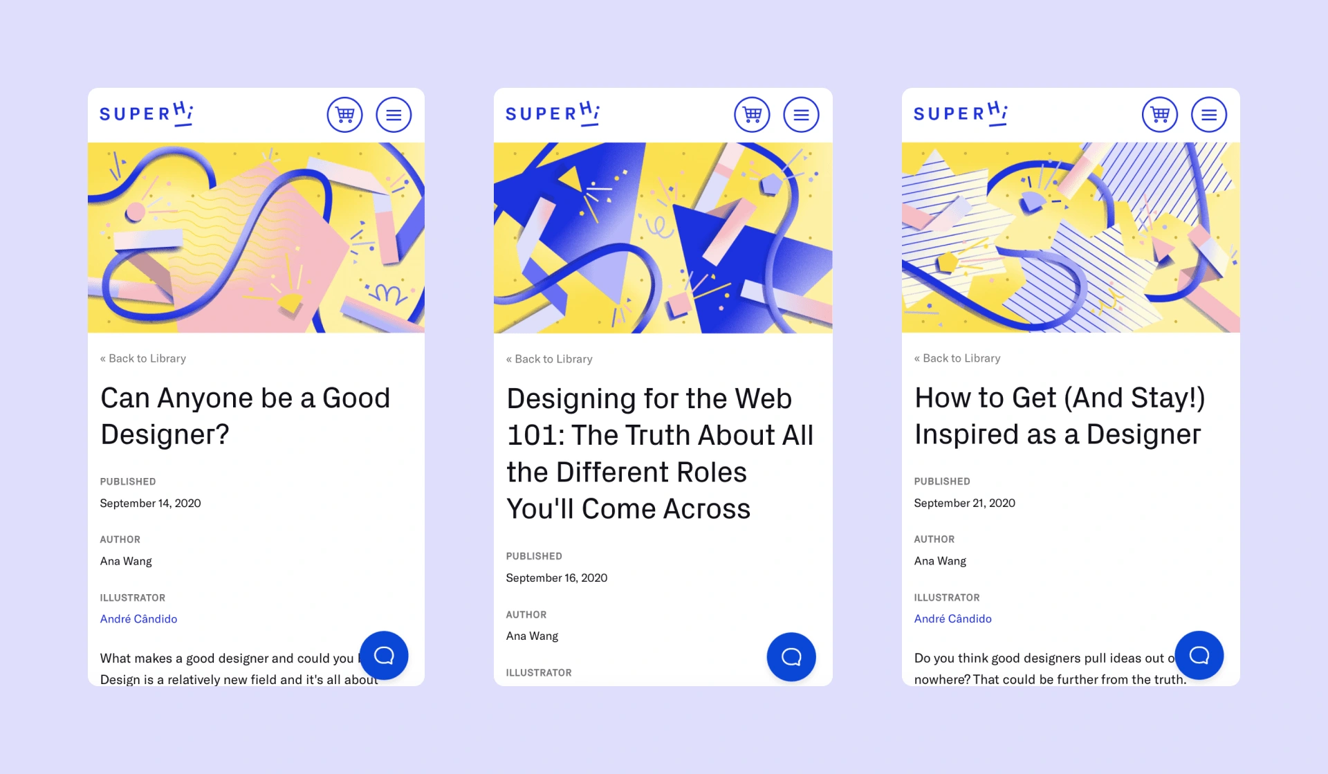
Each chapter opening illustration uses the quantity of shapes to represent the chapter number.
André displayed great attention to detail throughout the entire process, and was able to effectively align the content with our new SuperHi brand and marketing site, which he also creative directed. He's an incisive and talented designer with not only an eye for detail and the skill to take any brief and make something with it, but the ability to think from the big picture and approach projects contextually and within fast-paced startup environments.
Ana Wang
Former Head of Content at SuperHi
and author of the guides mentioned above.
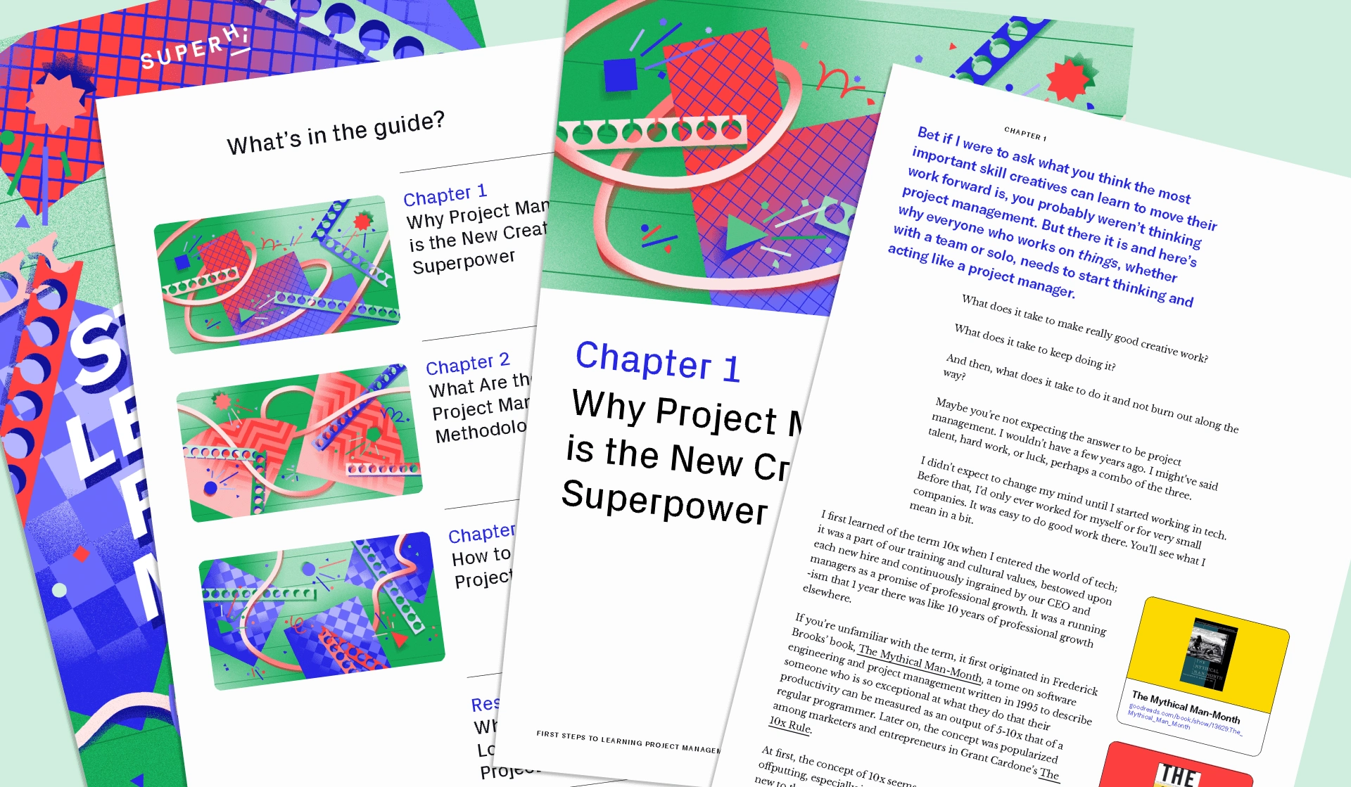
Inside the PDF of the "First Steps to Learning Project Management"
Credits
Course Artwork
Art Direction+ Design: André Cândido
Marketing Website
Art Direction: André Cândido
Product Design: James Shedden
Development: Chris Lawrence
First Steps to Learning Guides
Author: Ana Wang
Art Direction+ Design: André Cândido
For the full case study:
Like this project
Posted May 1, 2025
As SuperHi's designer and art director, I led the brand refresh by building a new visual and brand system – encompassing the marketing site and other collateral
Likes
104
Views
1.3K
Timeline
Mar 1, 2020 - Mar 1, 2021
Clients
SuperHi

