Identity & Packaging Systems Beyond Category Conventions

Identity & Packaging Systems Beyond Category Conventions
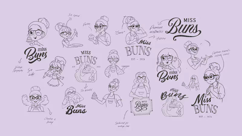
Visual Identity for Miss Buns, a cloud bakery & patisserie bringing a delightful twist to personalization and joyful moments.
Check out the full project (https://contra.com/p/Ur7cUZkb-miss-buns-rebranding-or-packaging-or-collaterals?r=subhandesigns)
2
6
254
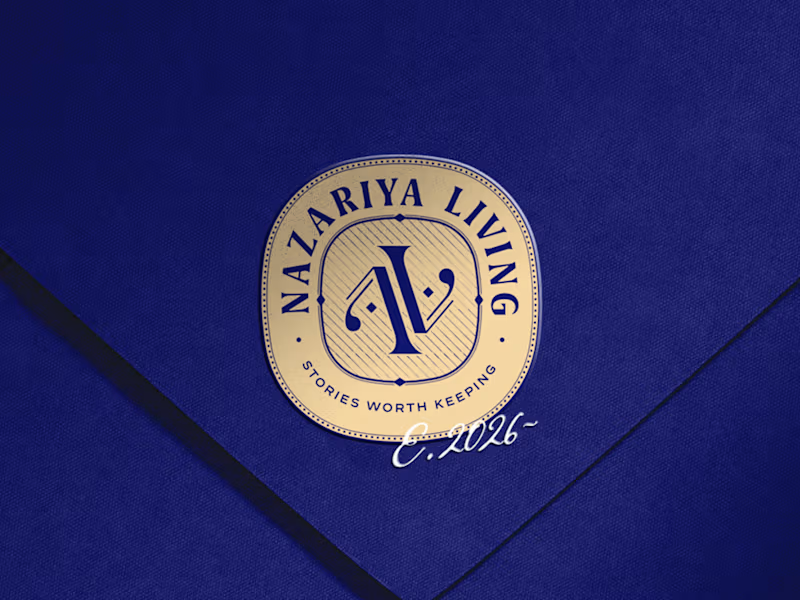
A little look at how Nazariya Living stands apart from its category.
On one side, familiar visual conventions. On the other, an identity with its own character, rooted in stories worth keeping.
We chose not to blend in. :)
Which side catches your eye?
12
16
2.1K
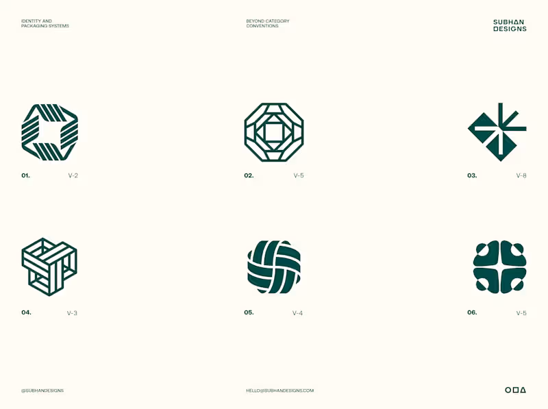
A logo is only a fraction of what we deliver.
The real value starts long before design. Understanding the brand, its audience, personality and positioning lays the foundation for every creative decision we make with our clients.
But logo exploration is where things get interesting. It's where strategy begins to take visual form, setting the direction for the entire identity system.
For Tandem, we explored multiple directions built around four ideas: Shared Progress, Simplified Complexity, Continuous Movement and Unlocking Opportunities.
Six distinct concepts. Six different interpretations of the same brand strategy.
Which direction do you think answers the brief best, and why?
3
210
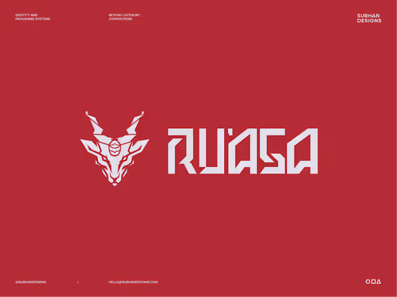
Sphynx or Markhor?
Two very different logo directions, built for the same brand.
One speaks to where the brand comes from.
The other speaks to who the brand is for.
Both had a reason to exist. Only one could define the identity effectively.
Which one do you think the client chose?
And if you’re curious about the thinking, debate and decisions that led to the final direction, I’ve broken down the full story in this post. (https://contra.com/community/MPQe3yrR-sometimes-the-first-idea-makes-perfect)
7
11
732


Brands, Visual Identity & Digital Design
- $•••••
- Earned
- 2x
- Hired
- 5.0
- Rating
- 29
- Followers
Brands, Visual Identity & Digital Design

Logo Designer for Businesses Ready to Scale
- $•••••
- Earned
- 5x
- Hired
- 5.0
- Rating
- 105
- Followers
Logo Designer for Businesses Ready to Scale
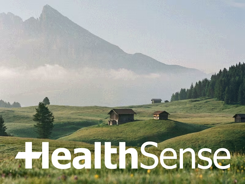
HealthSense Brand Identity
A brand identity project I worked on in March 2026 for HealthSense, a Singapore-based health and wellness information brand focused on making health knowledge clear, accessible, and easy to understand.
The client envisioned something simple, clean, and modern, but with meaning behind it. I explored a minimal wordmark with a medical cross integrated into the lettering, creating a direct connection to healthcare while keeping the identity clear, professional, and memorable.
7
9
799
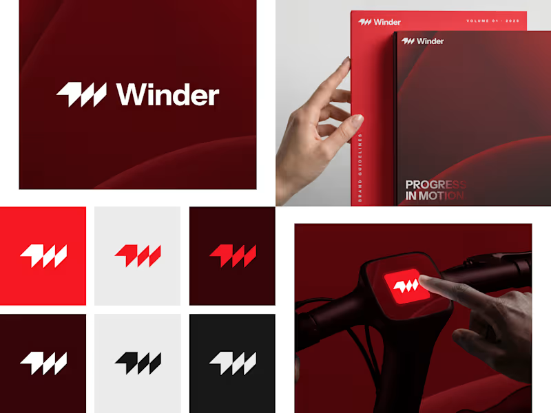
Winder is a bold brand identity built around a geometric W-inspired symbol, combining sharp angles and forward movement to represent progress, speed, and direction.
The identity uses a striking red and deep burgundy palette, supported by clean typography and a consistent visual system across brand guidelines, digital applications, and product mockups.
Progress in Motion.
76
100
5.9K
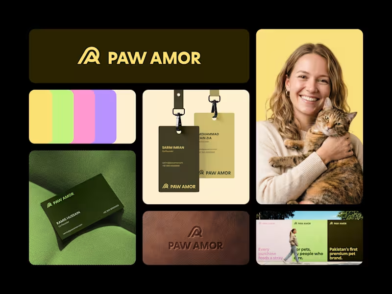
Paw Amor Brand Identity
A premium pet accessories brand concept from Pakistan, designed around the idea of connection between pets and their owners.
The PA monogram represents two forms coming together, inspired by warmth, closeness, and a subtle embrace.
I wanted the identity to feel premium and refined without becoming overly cute or playful, while still feeling warm and approachable.
Logo, color system, business cards, tags, packaging, and campaign applications.
2
4
571

Branding and Marketing Strategist
- $1k+
- Earned
- 3x
- Hired
- 5.0
- Rating
- 26
- Followers
Branding and Marketing Strategist



Top 1% Brand Designer and Content Lead
Evmize - Visual Identity
Evmize is an ecommerce brand focused on premium accessories to customize electric vehicles from a Tesla to Rivian and Polestar.
They reach me with a clear challenge: create a visual identity that communicates Evmize’s core values of modernity, elegance and simplicity, while resonating with forward‑thinking EV riders who care as much about aesthetics as performance.
All design elements were carefully chosen and crafted to convey Evmize’s brand values, including modernity, elegance, and simplicity.
4
4
371

I always look to make logos more creative and useful
Fuser is a new creative workflow suite!
I turned the logo into stylize
Then into something you can play with
This could make the website fun for the visitor
This is part of a larger workflow I built inside @Fuser concepting, compositing, mockups and interactive experiece.
Here is my workflow: app.fuser.studio/view/c33c154b-8bbd-4ea3-9c4a-6f288b2fa6ac (https://app.fuser.studio/view/c33c154b-8bbd-4ea3-9c4a-6f288b2fa6ac)
11
7
434


CRO & Web Design Expert for Growing Brands and Top Creators

CRO & Web Design Expert for Growing Brands and Top Creators

UX/UI | Framer Designer & Developer | SaaS, Startup Websites
UX/UI | Framer Designer & Developer | SaaS, Startup Websites
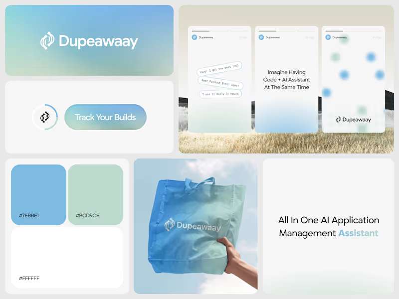
Just wrapped up this logo design for Dupeawaay.
The goal was to create a clean, memorable identity that feels modern, trustworthy, and easy to recognize across digital platforms. I explored a simple geometric approach, focusing on balance, scalability, and a strong visual presence without overcomplicating the mark.
Always enjoy the challenge of turning an idea into a logo that feels both distinctive and timeless.
Would love to hear your thoughts 👇
8
10
792


Standout Brand Designs Tailored to Your Needs