Freelance Mascot Designs in Lagos
Sign Up
Post a job
Sign Up
Log In
Filters
2
Projects
People
Henry Tochukwu
pro
Lagos, Nigeria
One designer. Messy ideas to shipped, working products.
$25k+
Earned
3x
Hired
5.0
Rating
113
Followers
expert
Expert
+3
Follow
Message
One designer. Messy ideas to shipped, working products.
6
Just introduced SageOwl π¦ A symbol of clarity, focus, and smarter thinking in a noisy world. This is more than a mascot, it represents tools that help you learn faster, think deeper, and move with intention. Still early, but this is the start of something built for people who want to see clearly in a cluttered digital world.
2
6
872
3
Designing expressive mascot & character illustration Recently started exploring mascot design, character illustration, and expressive character animation and honestlyβ¦ I get it now Designing interfaces is one thing. Designing characters people emotionally connect with is a completely different game. Been experimenting with personality, poses, emotion, and storytelling through simple mascot concepts like this little guy πΏοΈ What surprised me most is how much emotion a character can communicate without saying a word. A small pose change can make a product feel: β’ more friendly β’ more alive β’ more memorable Now I fully understand why the best brands donβt just build products, they build characters people remember. This is definitely a new creative rabbit hole for me π
2
3
899
5
UI revamp for CluckSave π₯πΈ The focus was making finance feel more human, supportive, and engaging, not cold or intimidating. I leaned deeper into the CluckSave mascot system, using the character to react to spending habits, savings progress, and budget limits in a way that adds personality to the experience while still guiding users clearly. What changed: β’ Cleaner dashboards and spending insights β’ More emotional, mascot driven feedback states β’ Softer budget alerts that feel supportive β’ Improved savings tracking and category visuals β’ Better hierarchy, spacing, and readability overall The goal was simple: Turn financial stress into a more approachable experience.
5
5
1.1K
2
CluckSave Mascot illustration
1
2
594
Mascot Design
(5)
Follow
Message
Ibrahim Tejuosho
pro
Lagos, Nigeria
Founding Design Partner for Startups. Lead @ Tecton Studio
$25k+
Earned
21x
Hired
4.9
Rating
86
Followers
Top
expert
Follow
Message
Founding Design Partner for Startups. Lead @ Tecton Studio
5
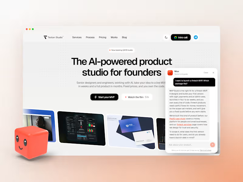
Meet Moe. MoeΒ isΒ theΒ mascotΒ andΒ AIΒ guideΒ weΒ designedΒ forΒ ourΒ studio'sΒ website.Β WeΒ startedΒ withΒ theΒ character:Β aΒ soft,Β friendlyΒ cube,Β modelled,Β litΒ andΒ renderedΒ inΒ Blender.Β AllΒ sixΒ expressionsΒ (happy,Β wink,Β wow,Β thinking,Β chill,Β curious)Β areΒ posedΒ fromΒ theΒ sameΒ 3DΒ model,Β soΒ heΒ staysΒ consistentΒ acrossΒ theΒ siteΒ andΒ ourΒ socials. OnΒ theΒ site,Β MoeΒ isΒ rebuiltΒ inΒ code.Β HeΒ waitsΒ inΒ theΒ corner,Β blinks,Β followsΒ yourΒ cursorΒ withΒ hisΒ eyes,Β andΒ dozesΒ offΒ whenΒ ignored,Β thenΒ opensΒ intoΒ aΒ chatΒ thatΒ helpsΒ foundersΒ workΒ outΒ whatΒ theyΒ need:Β whichΒ packageΒ fits,Β what'sΒ included,Β theΒ timelineΒ andΒ howΒ soonΒ workΒ canΒ start.Β HisΒ answersΒ comeΒ straightΒ fromΒ theΒ site'sΒ CMS,Β soΒ theyΒ stayΒ currentΒ whenΒ pricingΒ changes,Β andΒ heΒ handsΒ offΒ toΒ theΒ teamΒ whenΒ aΒ questionΒ needsΒ aΒ person. NeedΒ aΒ mascotΒ forΒ yourΒ brandΒ orΒ anΒ AIΒ assistantΒ onΒ yourΒ website?Β SendΒ usΒ aΒ message here;Β we'dΒ loveΒ toΒ buildΒ yours.
5
5
556
1
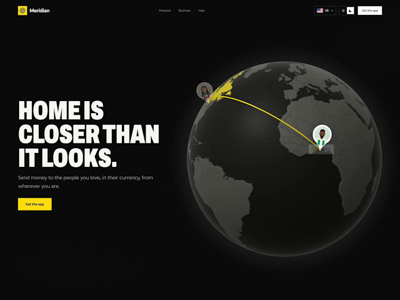
I designed a 3D hero concept for a cross-border money transfer app. Instead of a rate table, it shows what a transfer actually means: money leaving one person and arriving with another. The globe is real 3D, built with three.js. Pins and send lines stay attached to it and slip behind the horizon as it turns. Each send lights up the country, travels along the arc and lands in the local currency, then the next transfer picks up from there. Building a fintech or payments product? Send a DM let's discussΒ
1
57
1
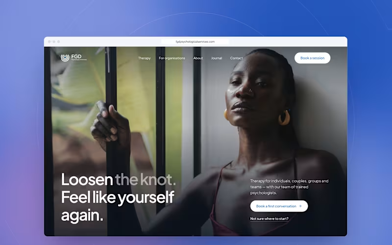
Brand Identity and Website Design for Therapy Sevice
1
4
1
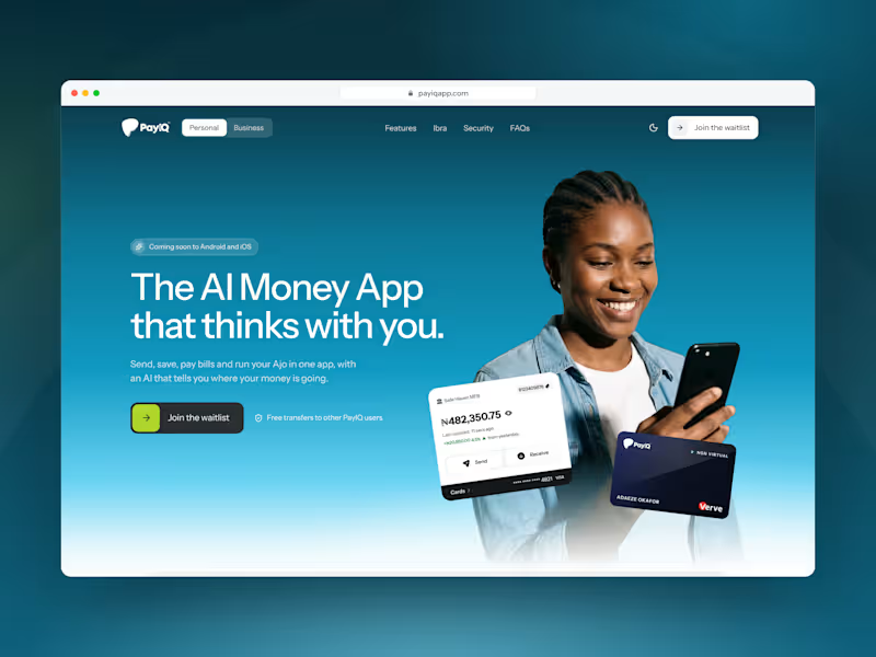
Fintech App Landing Page
1
9
Mascot Design
(1)
Follow
Message
Samson Akintunde
Lagos, Nigeria
Client-focused Logo & Branding
47
Followers
Follow
Message
Client-focused Logo & Branding
0
Tareum Brand Identity
0
5
11
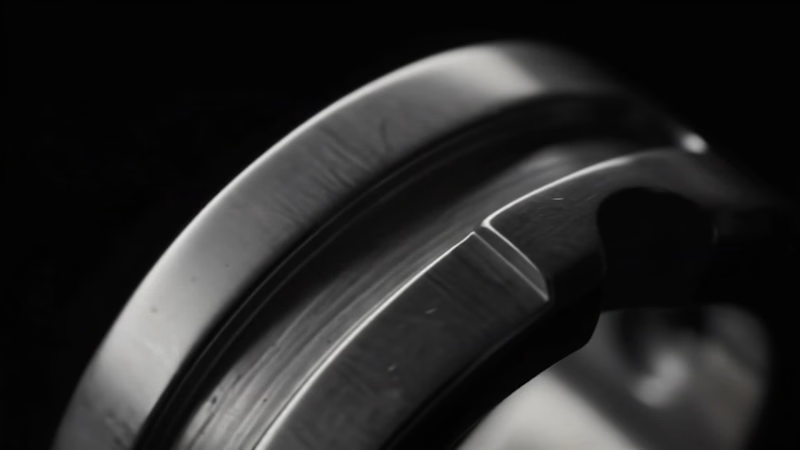
Working on this project has pushed me to explore AI more deeply, especially its use in commercial production. For this one, my goal is to showcase the ring as one of the statement pieces in Wollseyβs jewelry collection, using AI to bring it to life. Full case study real soon...
6
11
436
20
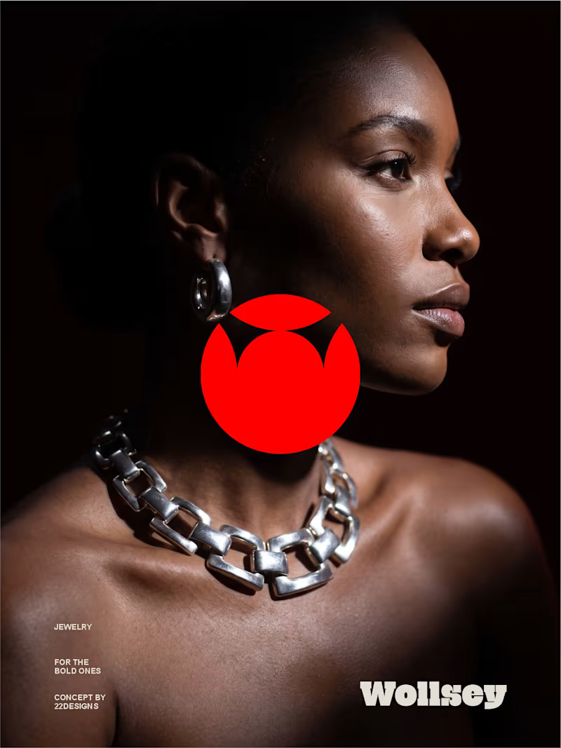
WOLLSEY - Jewelry for the Bold Ones Wollsey is a jewelry brand built on one idea: bold jewelry should never blend in. The identity centers on two interconnected principles; presence and permanence. The symbol takes the form of a solid, self-contained mark: a circular silhouette holding a crown-like negative space at its center, representing a piece of jewelry as an object of its own weight and status, not an accessory borrowed from someone else's trend cycle. This concept carries through the entire visual system. The custom wordmark is built in a bold, condensed sans β compressed, confident letterforms that read as a stamp rather than a script, echoing the same solidity as the symbol itself. The color palette pairs deep matte black with a controlled, high-impact red, balanced by warm cream and stone tones across packaging and supporting materials β a system built for contrast and attention rather than quiet luxury. Full casestudy is coming soon
17
20
2.5K
15
Here's a short commercial I made for Wollsey, a brand that's into making and selling of bold jewelry. I made sure to preserve every single detail of the character while showcasing all the jewelry pieces using light. And yes, I made it using AI More on this project is coming.
6
15
958
Mascot Design
(1)
Follow
Message
Onyechere Elizabeth
Lagos, Nigeria
Illustrator&brand designer|helping brands standout visually
5.0
Rating
23
Followers
Follow
Message
Illustrator&brand designer|helping brands standout visually
3
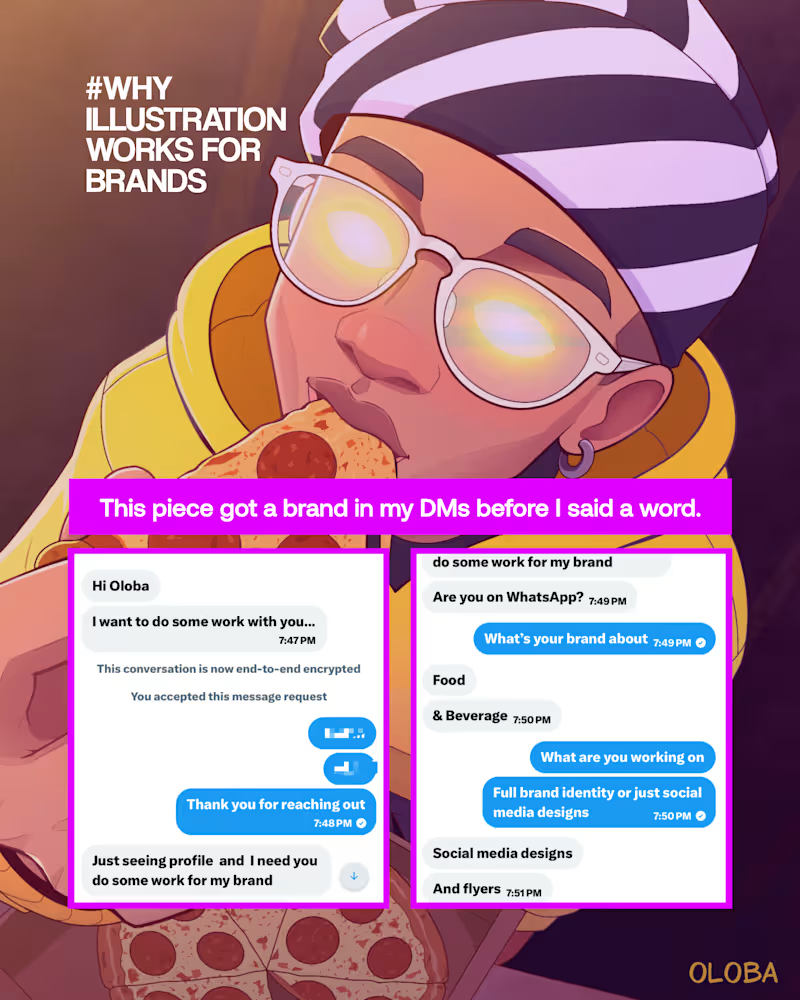
A founder hired me over his own designer not because my work was prettier. Because it made people feel something. Hereβs what he told me. I created this piece for Bitcoin Pizza Day, and it really moved! This piece attracted food tech founders who reached out, wanting the same style for their food brands. During a discovery call, I knew one of the founders personally, as I was familiar with his designer. I asked him why he chose to contact me to handle his brand designs. He replied that there is something special about illustrated pieces. He even sent me a previous design and said it was awesome but didnβt capture emotions or in-depth attention like illustrations that show how the person eating the food feels the emotions, etc. The storytelling aspect of illustrated art is top-notch! Those responses were very satisfying, I must say, as we continued the call. So if you are a founder and you own a Food-tech brand, This is for you, you might want to drop whatever you are doing to learn. As a founder looking to gain people's trust, evoke emotions, and showcase how good your food looks and tastes, investing in illustrations is one thing you should take seriouslyβ¦ The use of illustration will: Make your brand stand out by adding personality and visual differentiation. It often makes your brand feel more premium and authentic, which increases perceived value. Make your brand feel more distinctive, trustworthy, memorable, fun to watch, and easy to associate with. It helps communicate taste, emotions, brand personality quickly, along with cultural storytelling, resulting in a stronger emotional connection with consumers. (Brands like Chowdeck utilize this.) Help brands communicate faster than just text. Create anticipation in customers' minds: illustrated ingredients can suggest flavors, which builds anticipation. Aid in giving buying choices; with illustrated ingredients, buyers already have an idea of what the food contains. If youβre a founder who already owns a food-tech brand but needs more visibility, more trust, and buyers who actually feel something when they see your product, illustration is your best bet. Think onboarding screens that welcome instead of just function. Packaging that shows freshness before anyone opens it. Icons for spices and ingredients that do the explaining for you. Playful mascot-style art that says spicy, delicious, yummy, without a single word. Social content that feels approachable, builds cravings, and makes people feel before they buy. If this is what your brand needs, Iβm onboarding commissioned projects for July. Slots are limited. DM me or use the link/email in bio to lock yours in. To my fellow creatives youβre one small shift away from a new level. Times are changing, and 3 seconds of intentional design can scale the brand youβre working on, pull in the clients you want, and open doors you havenβt even knocked on yet. You know what to do. You are welcome We keep doing 10x!
1
3
168
2
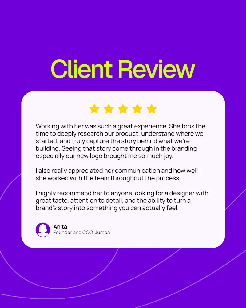
Gentle reminder: My work speaks for itself and here is a collection of feedback from clients Iβve had the privilege of working with so far. Looking for an effective identity that drives conversions, a 24/7 sales-enabled store, monthly design content to stay connected with your audience or clients, and strong user-generated content to market your product and boost revenue? My schedule is open! Send a DM or email to cthumbs213@gmail.com (mailto:cthumbs213@gmail.com) To book a slot below β¬οΈ https://cal.com/elizabeth-onyechere
3
2
241
1
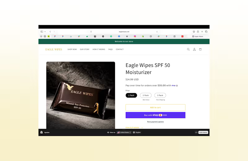
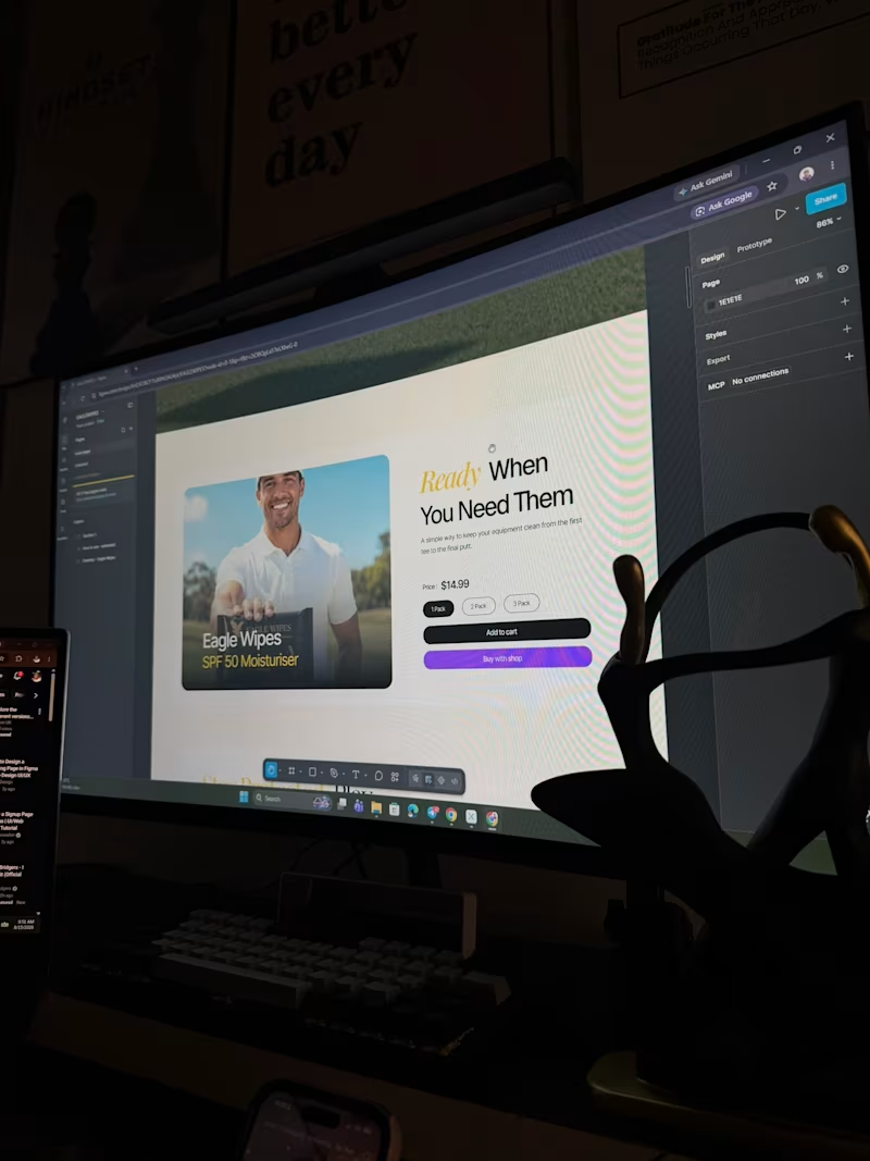
Your product is premium. Does your store reflect the same quality? πΒ Here's a look at a Shopify website redesign we did for a golf wipes brand.Β Before β After The goal wasnβt just to create appealing visuals, but to connect with golfers looking to improve their look with wipes, engage golf enthusiasts, and position the brand and product as premium. Weβre starting the week strong. My schedule is open this week for Shopify redesigns, new store setups, and static ad designs that turn scrolling into sales. DM me "STORE" or email cthumbs213@gmail.com (mailto:cthumbs213@gmail.com) to get started. #GolfBrand #WebsiteRedesign #ShopifyDesigner #shopify #StaticAdDesign
1
1
94
1
INDUSTRY:Β Golf PRODUCT:Β SPF50 Sunscreen Wipes Wipes for golfers. Designed to deliver SPF50 protection that looks like part of the bag. β³ Whether you're teeing off or finishing a tournament round, these wipes keep you covered without slowing down your game. I designed a series of static ads for a golf brand, experimenting with different formats, visual styles, and messaging angles. The goal: make each concept feel premium, resonate with golfers, and stay clear enough to drive conversions. Because a great ad isn't just seen. It's chosen. Have a product that needs a premium look? DM me "ADS" or send and email to cthumbs213@gmail.com (mailto:cthumbs213@gmail.com) and let's create it. Β #staticads #adcreative #golfer #golf #floridaΒ
1
1
153
Mascot Design
(1)
Follow
Message
Korede Aremu
Lagos, Nigeria
Brand Identity Designer & Strategist
Follow
Message
Brand Identity Designer & Strategist
0
Web3 Arts & Illustrations
0
5
0
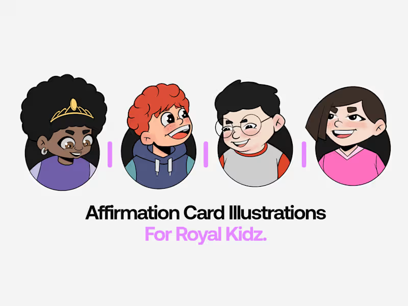
Affirmation Card Illustration for Royal Kidz
0
0
0
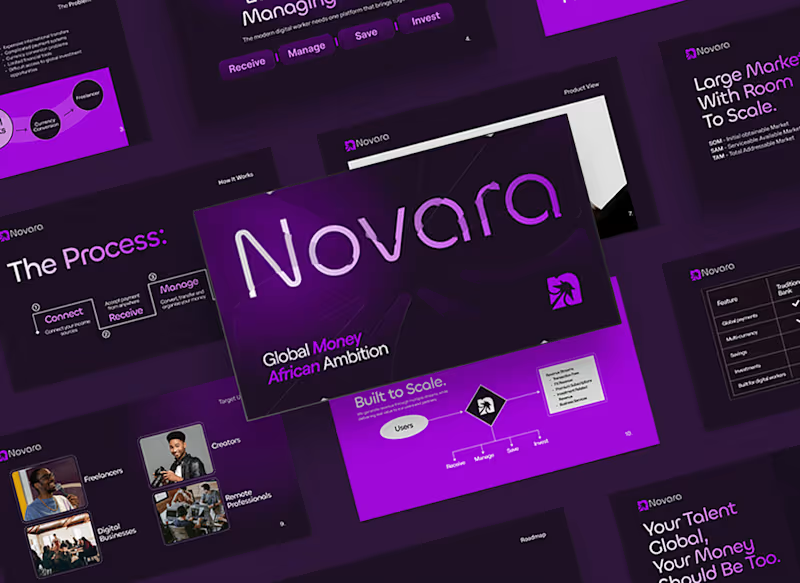
Novara Pitch Deck
0
1
0
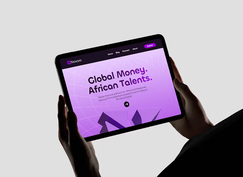
Novara
0
2
Mascot Design
(1)
Follow
Message
Funmilayo Adewale
Lagos, Nigeria
Social Media Designer & Content Creator | Reels, Growth
75
Followers
Follow
Message
Social Media Designer & Content Creator | Reels, Growth
0
Cross product ads campaign
0
54
0
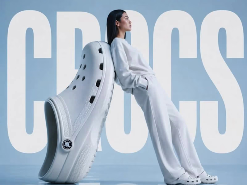
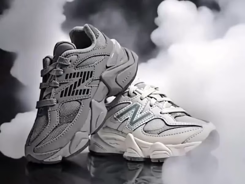
Product Video ads for shoe Brand
0
80
0
AI UGC Product promotional video
0
85
0
Ai Video Ads for juice product
0
95
Mascot Design
(1)
Follow
Message
Matthew Komolafe
Lagos, Nigeria
Brand Identity & Graphic Designer | Helping Businesses Build
32
Followers
Follow
Message
Brand Identity & Graphic Designer | Helping Businesses Build
0
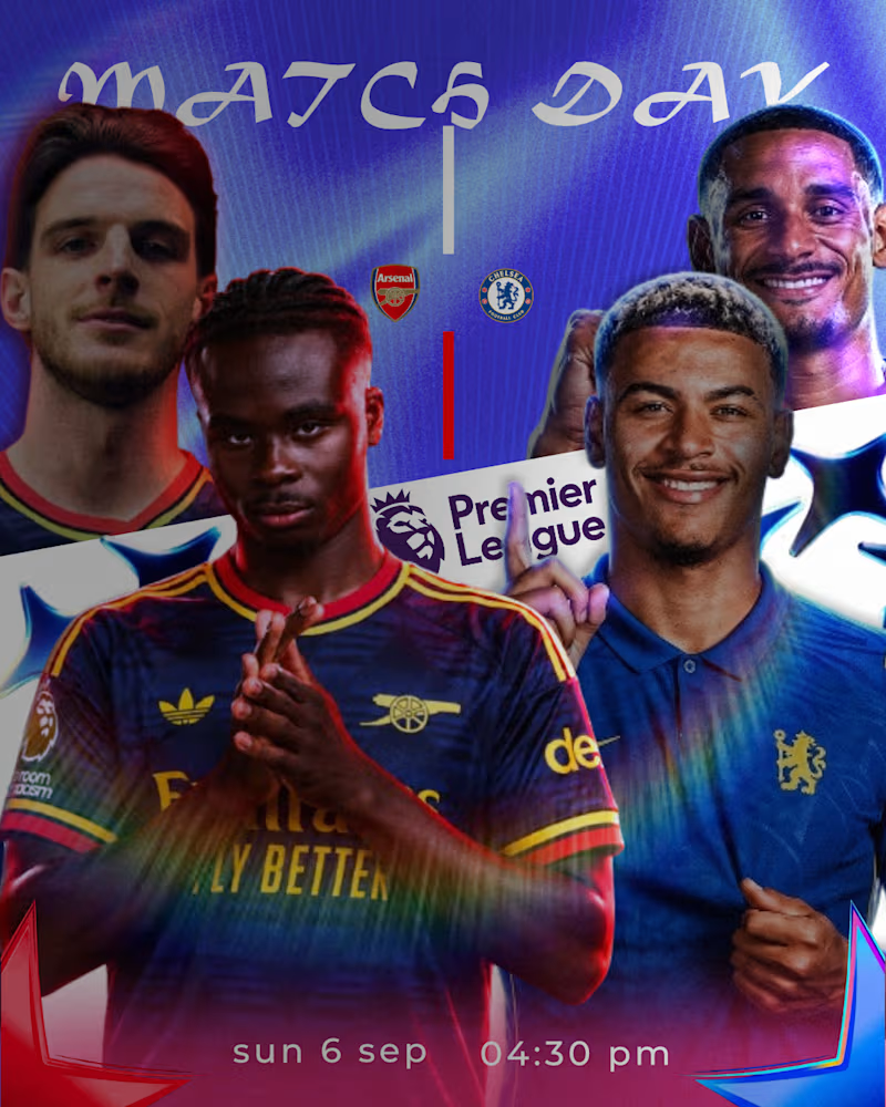
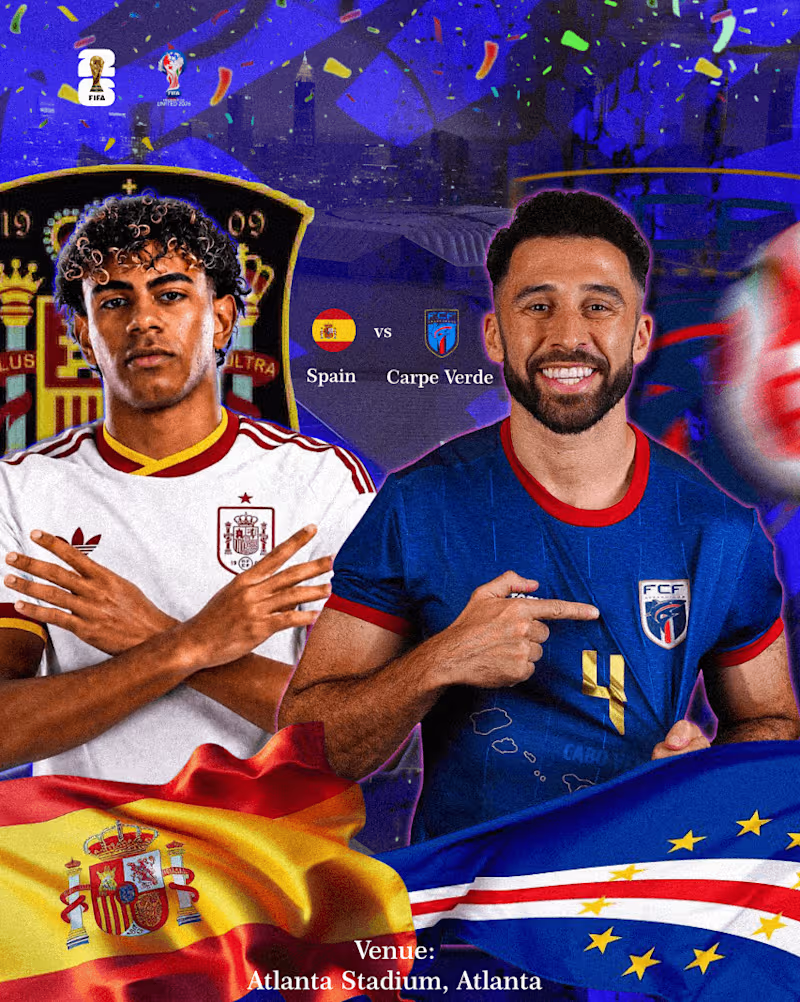
Spain vs Cape Verde Matchday Poster πͺπΈβοΈπ¨π»
0
10
0
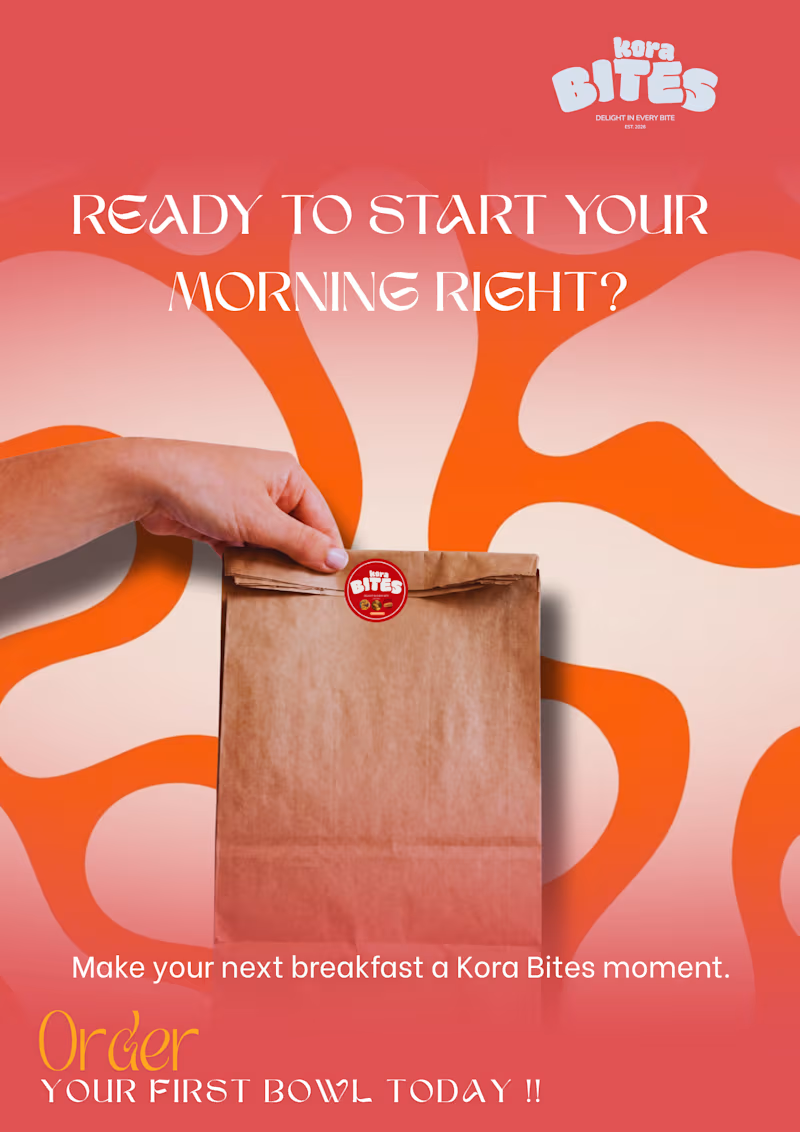
Preparing for Canvathon Africa π¨π³π¬ As part of my preparation, I challenged myself to build a complete brand experience for Kora Bites β beyond just creating a logo.
0
63
1
From the visual identity and campaign designs to the website and promotional content, I focused on creating a consistent brand experience for busy students and young professionals. This project pushed me to think more about strategy, communication and how every design decision connects. Good mornings start here. π₯£π
1
124
0
This personal project explores a modern approach to football matchday graphics through cinematic lighting, bold typography, and clean composition. The goal was to create a visual that feels premium while maintaining a strong editorial aesthetic suitable for digital campaigns and sports marketing. Tools Used-Affinity Designer Project Type- Sports Poster β’ Matchday Graphic β’ Personal Concept
0
160
Mascot Design
(1)
Follow
Message
Efeosa Aizesogie
Lagos, Nigeria
Creative Frontend Developer
9
Followers
Follow
Message
Creative Frontend Developer
1
Wip
1
28
2
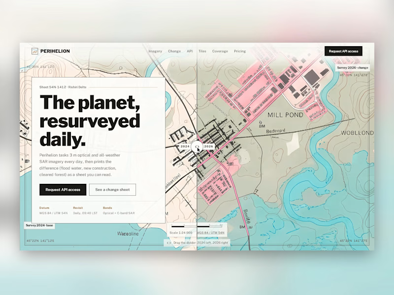
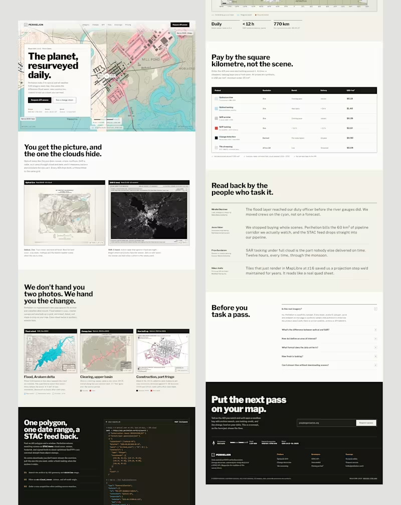
Perihelion: a concept landing page for daily satellite imagery. Designed like a printed survey map instead of a mission-control dashboard. Contour lines, map grid references, and a hero you can drag to see two years of change. Concept project; all data is fictional. #webdesign #landingpage #uidesign #productdesign #cartography #designinspiration
1
2
39
2
Concept landing page
2
110
2
I designed a clothing store where the camera turns, not the page
2
46
Mascot Design
(1)
Follow
Message
Explore people