The network for creativity
Join 1.25M professional creatives like you
Connect with clients, get discovered, and run your business 100% commission-free
Creatives on Contra have earned over $150M and we are just getting started
Back to feedPost

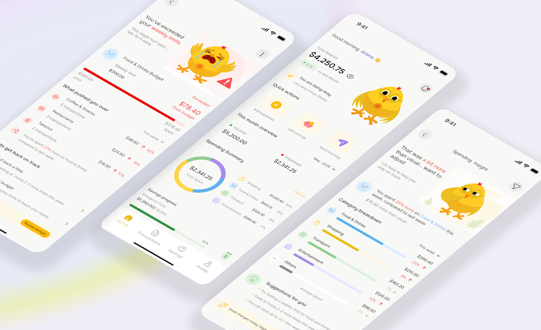
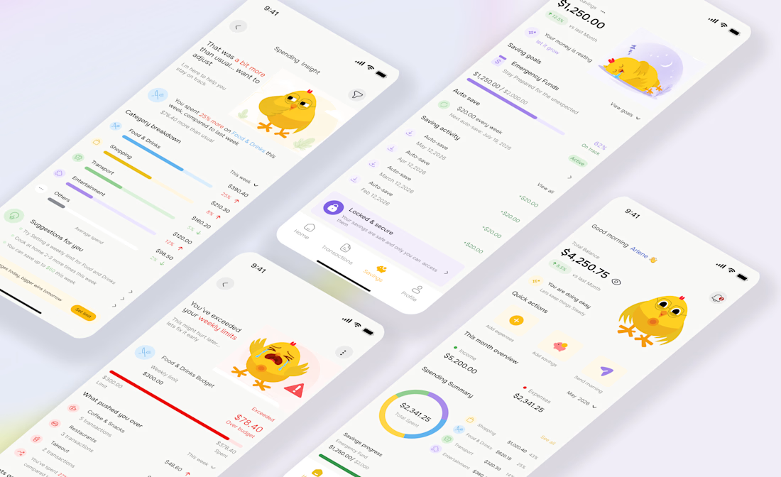
UI revamp for CluckSave 🐥💸
The focus was making finance feel more human, supportive, and engaging, not cold or intimidating.
I leaned deeper into the CluckSave mascot system, using the character to react to spending habits, savings progress, and budget limits in a way that adds personality to the experience while still guiding users clearly.
What changed:
• Cleaner dashboards and spending insights
• More emotional, mascot driven feedback states
• Softer budget alerts that feel supportive
• Improved savings tracking and category visuals
• Better hierarchy, spacing, and readability overall
The goal was simple:
Turn financial stress into a more approachable experience.




thank you


Awesome work👏🔥🔥
Thank you

Love this!
The network for creativity
Join 1.25M professional creatives like you
Connect with clients, get discovered, and run your business 100% commission-free
Creatives on Contra have earned over $150M and we are just getting started

Challenges
View all


Related posts



A look at the identity we designed for Vetti, a dog health monitoring brand.
There’s a lot of data behind a product like this but the person using it just wants to know their dog is okay.
That’s the balance in the design with a connected dot system that feels precise and warm colors and photography that keep it close to what people care about.
Also, an excellent excuse to spend far too long choosing dog photos.


Wonder -- Visual Expressions


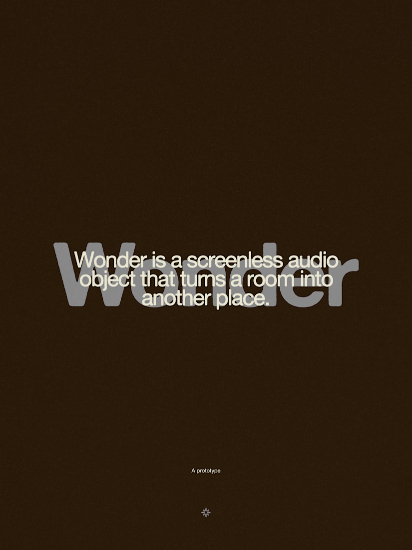




The restraint in the warm palette really lets the sound-object concept breathe—especially that shift from readable type to atmosphere.