The network for creativity
Join 1.25M professional creatives like you
Connect with clients, get discovered, and run your business 100% commission-free
Creatives on Contra have earned over $150M and we are just getting started
Back to feedPost
WOLLSEY - Jewelry for the Bold Ones
Wollsey is a jewelry brand built on one idea: bold jewelry should never blend in.
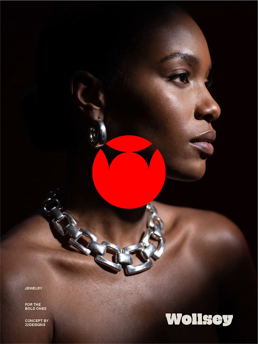
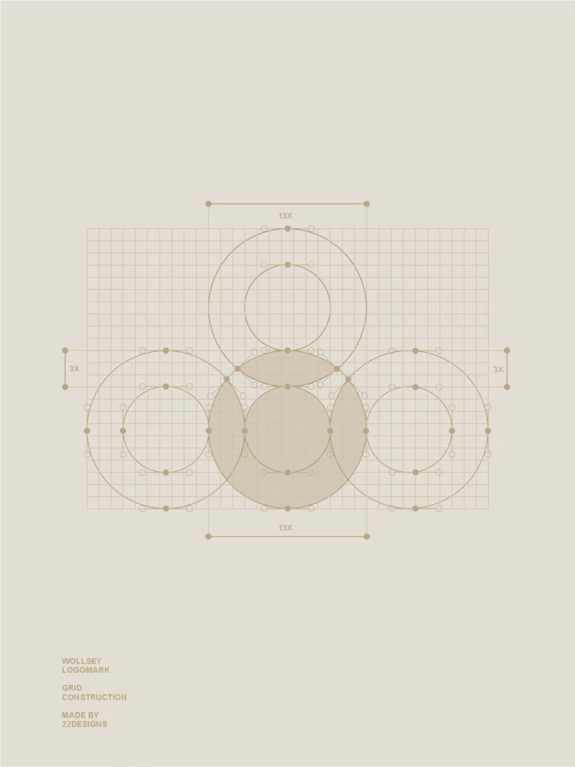
The identity centers on two interconnected principles; presence and permanence. The symbol takes the form of a solid, self-contained mark: a circular silhouette holding a crown-like negative space at its center, representing a piece of jewelry as an object of its own weight and status, not an accessory borrowed from someone else's trend cycle.
This concept carries through the entire visual system. The custom wordmark is built in a bold, condensed sans — compressed, confident letterforms that read as a stamp rather than a script, echoing the same solidity as the symbol itself.
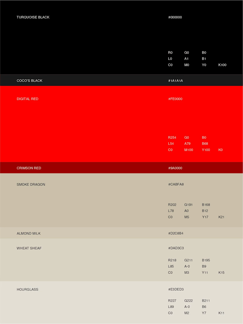
The color palette pairs deep matte black with a controlled, high-impact red, balanced by warm cream and stone tones across packaging and supporting materials — a system built for contrast and attention rather than quiet luxury.
Full casestudy is coming soon
jewelrylogojewelrybrandidentityLogo DesignBrand DesignGraphic DesignAdobe IllustratorAdobe PhotoshopCorelDraw



Amazing work!

Thank you

Top notch work. Samson like it.
Thanks mate

Nice work everything from color palette and designs is professionally created ❤️❤️
Appreciate the feedback... Thanks man

Thank you

The solid circle with that notched cut reads as presence really clearly against the chunky chain photography. Curious how you tested the mark at very small sizes, like a clasp stamp or hallmark, where that negative space has to hold up?

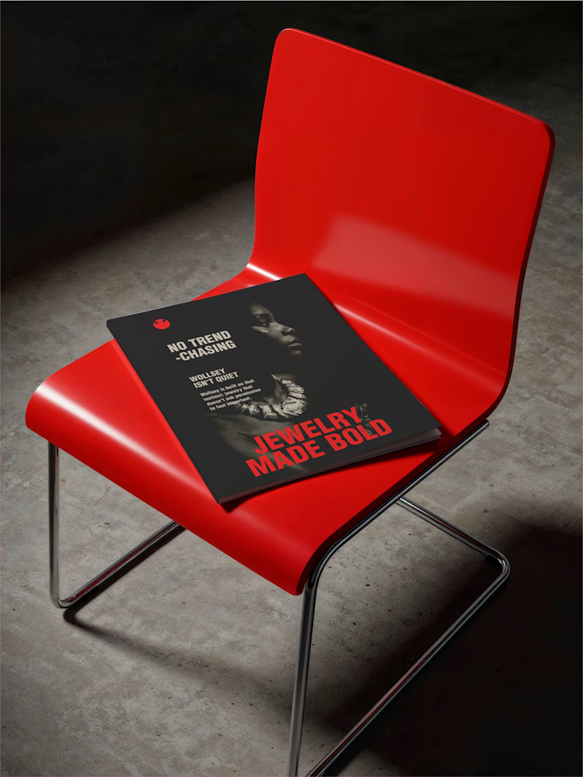
Bold jewelry should never blend in is the perfect one-line brief, and that solid red mark on the chained editorial shot backs it up completely. Jewelry Made Bold on the lookbook ties it all together. Presence and permanence really come through in the whole system.
You know whatsupp... Thank you

That solid circular geometry gives the identity such physical weight it anchors the high-contrast editorial photography so cleanly.
Appreciate that

The bold red visual identity really fits the jewelry concept strong, distinctive, and consistent across the brand.
Thanks man

This is Great!
Thank you
The network for creativity
Join 1.25M professional creatives like you
Connect with clients, get discovered, and run your business 100% commission-free
Creatives on Contra have earned over $150M and we are just getting started











Related posts

How can branding make people feel part of a community?
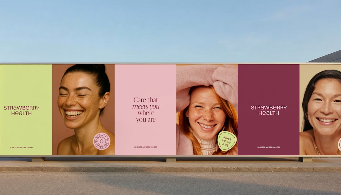
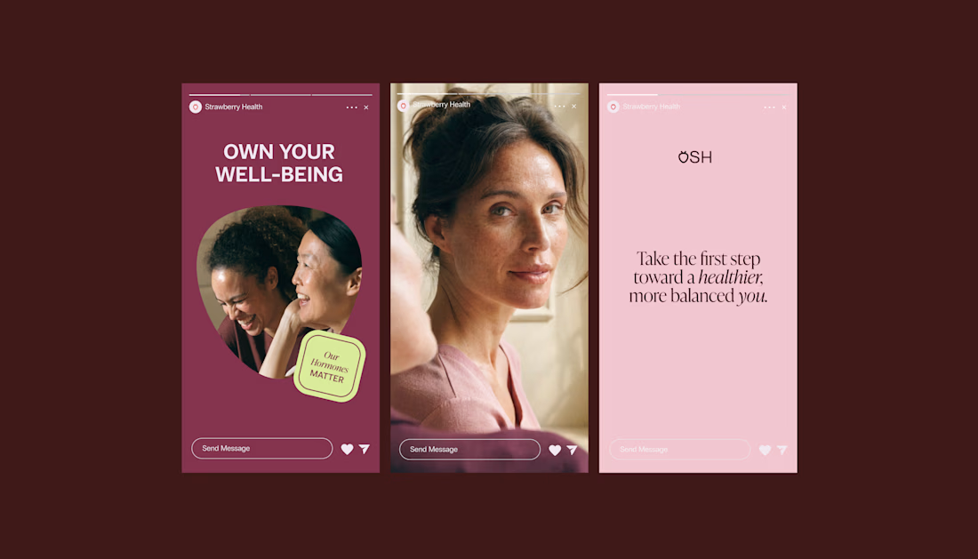
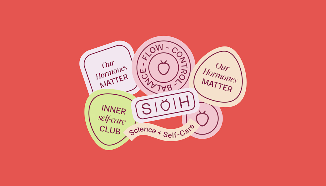
When working on Strawberry Health, we explored how visual identity could make women’s health feel more approachable and collective.
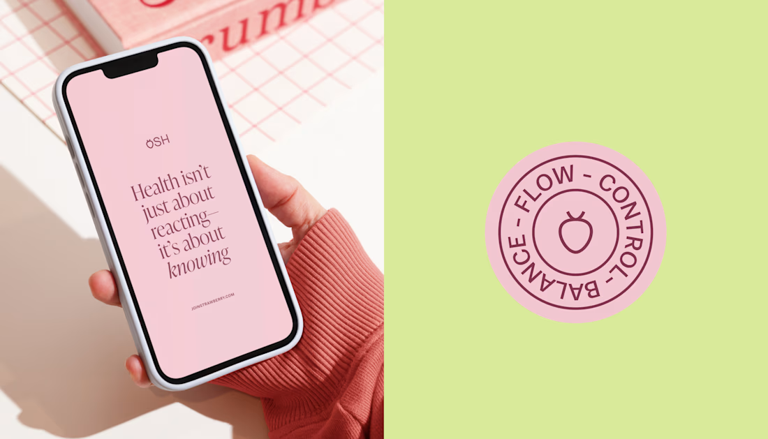
One of the ways was through supporting brand elements: stickers, badges and phrases that could live beyond the logo and become expressions of belonging.
These elements turned the identity into something people could interact with, share and make their own.
It’s a small detail, but I think it’s an important part of building brands around communities: the identity shouldn’t only identify the brand. It should give people something to identify with.

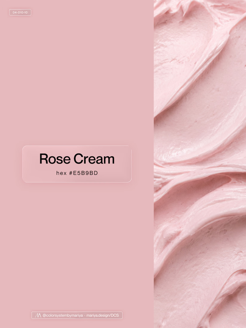
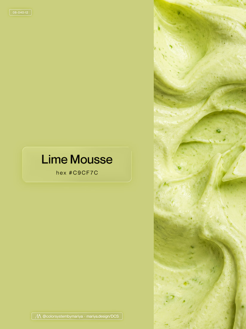
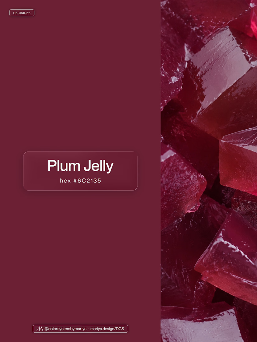
Love, love, love the colors. My mind goes: Rose Cream, Lime Mousse and Plum, hmmmm, which Plum... Plum Jelly. And of course, Strawberry Sorbet.
Let me match the vibe using my delicious swatches 😊

This is my biggest client success story of my carreer.
It's hard to capture 3+ years of work into a single use case page.
Though I gave it a try (it's never perfect 😉)
Read the use case here and let me know what you think of the work. Thanks!🤙🏻

Distilling three years of multidisciplinary work into one use case page is the real craft here, Tim. Long-term client relationships are the best portfolio proof there is. Congrats on the DeFi brand journey.

New case study added!
Crahhy is a speciality coffee brand rooted in the relatable human psychology of coffee cravings.
The objective was to design a brand that is minimal on the outside yet delightfully chaotic on the inside, blending specialty coffee aesthetics with honest, humorous storytelling.


minimal outside chaotic inside is the right brief for coffee