
Jason Ports
Ai-Savvy Creative with good taste in Designs & Systems🎨


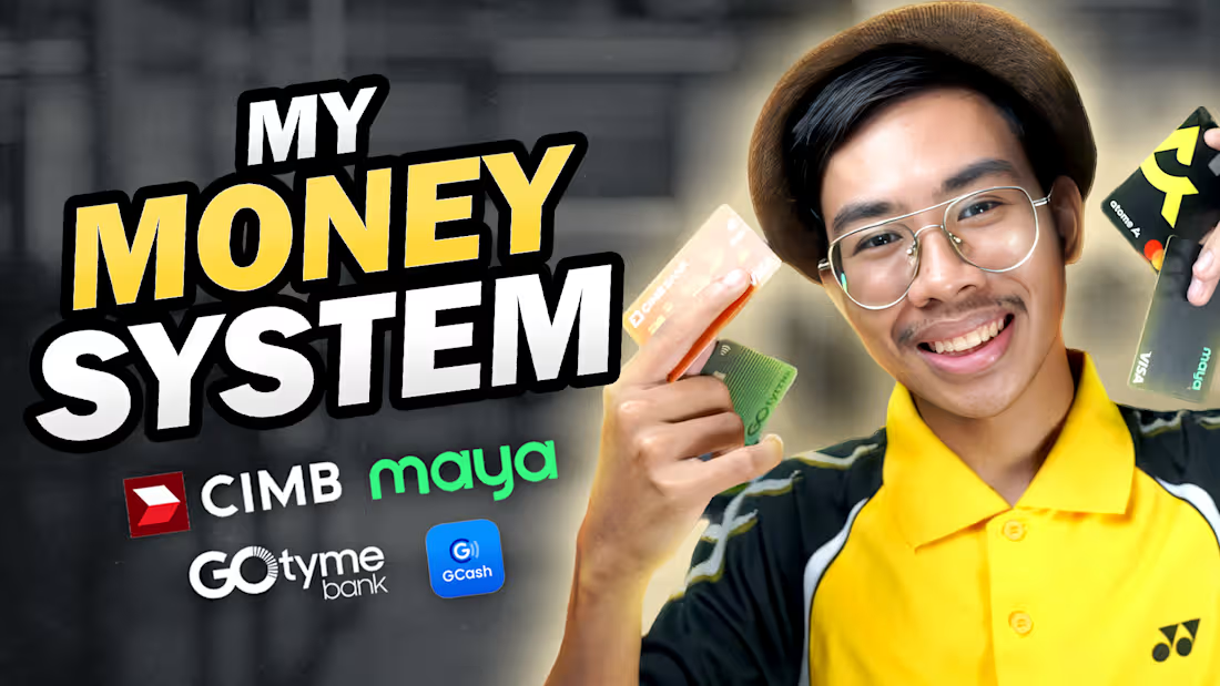
Want more views? Start with a good thumbnail! 🛑💸
I designed these vibrant YouTube covers to make personal finance topics instantly clickable. High-contrast typography paired with expressive cut-outs is the ultimate cheat code for boosting your click-through rate.
Be honest as a viewer, which of these four videos would you click on first? Drop your vote in the comments! 👇
#ThumbnailDesign #YouTubeThumbnails #GraphicDesign #CreatorEconomy #ClickThroughRate #FreelanceDesigner #PersonalFinance
0
48
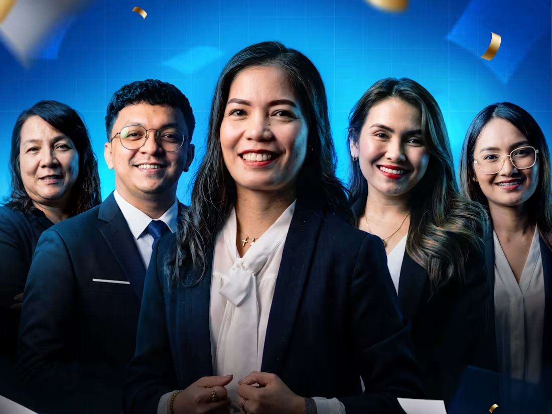
Designing corporate recognition graphics is all about making the achievers feel valued. 🏆✨
I recently designed this suite of milestone posters for the Yakal New Business Office to celebrate their Q3 2026 Top Advisors. The project required a comprehensive Top 15 roster, a focused Top 5 group banner, and personalized spotlight layouts for the highest performers.
To give the assets a premium, prestigious feel, I paired a deep blue gradient background with elegant gold typography. Balancing 15 different headshots in a single cohesive layout can be tricky, but using a strict grid and consistent photo treatments brings it all together seamlessly.
What’s the largest team photo composite you’ve ever had to tackle? Let me know below! 👇
#CorporateDesign #PosterDesign #GraphicDesign #FreelanceDesigner #LayoutDesign #ContraDesign #TeamRecognition
1
81
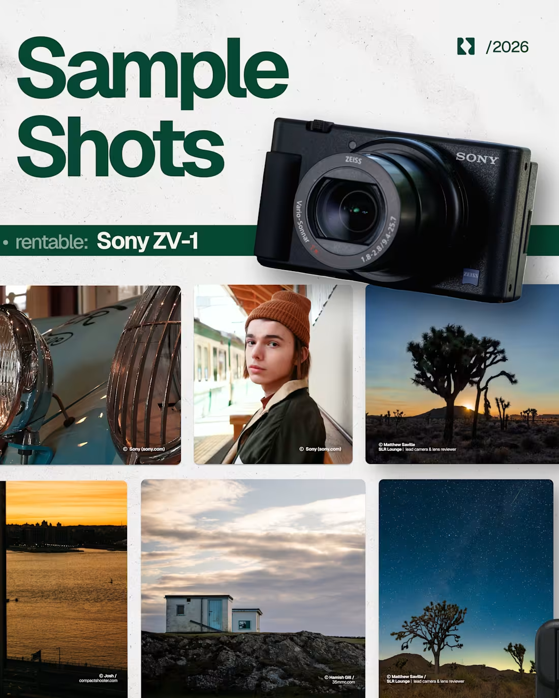
Making gear rentals look as good as the content they capture. 🎥✨
I designed this clean, scannable carousel for Rentable to showcase their Sony ZV-1 package in Cebu. The goal was to make the details highly digestible so users can quickly spot the August booking calendar, the ₱500/day rate, and the complete gear inclusions.
To keep viewers swiping, the layout starts with a bold hook, flows right into striking sample shots, and breaks down creator-focused features like vertical shooting for Reels and instant smartphone transfers.
What do you think of the typography and layout on this one? 👇
#GraphicDesign #CarouselDesign #SocialMediaDesign #LayoutDesign #FreelanceDesigner #ContraDesign
1
116
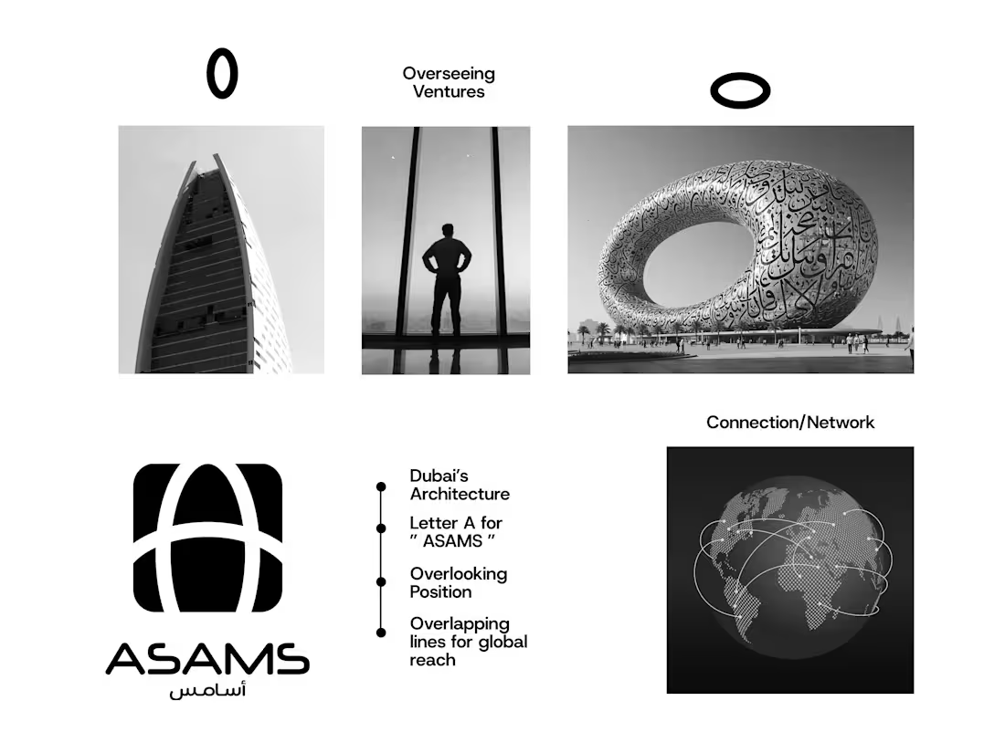
This brand identity for ASAMS anchors itself in the architectural marvels of Dubai 🚀
The core concept for the logo was to project the authoritative presence of an industry powerhouse. The minimalist geometric mark combines two overlapping vertical pillars inspired by Iris Bay with a sweeping horizontal curve that subtly mimics the Museum of the Future. Together, these elements symbolize a continuous global network and a boundless reach across diverse industry sectors.
To establish a clean and modern aesthetic across all communications, the typography system relies on Neuropol for the stylized wordmark, Almarai for commanding headlines, and Host Grotesk for highly readable body copy. This precise visual hierarchy translates seamlessly to their corporate stationery, where a sleek black and gold palette pairs with custom Dubai skyline line art to create a deeply sophisticated physical presence.
How do you approach blending architectural inspiration into corporate branding? Let's discuss your process in the comments below.
#BrandIdentity #CorporateBranding #LogoDesign #DubaiArchitecture #Typography #BrandGuidelines #GraphicDesign #FreelanceDesigner
1
114