
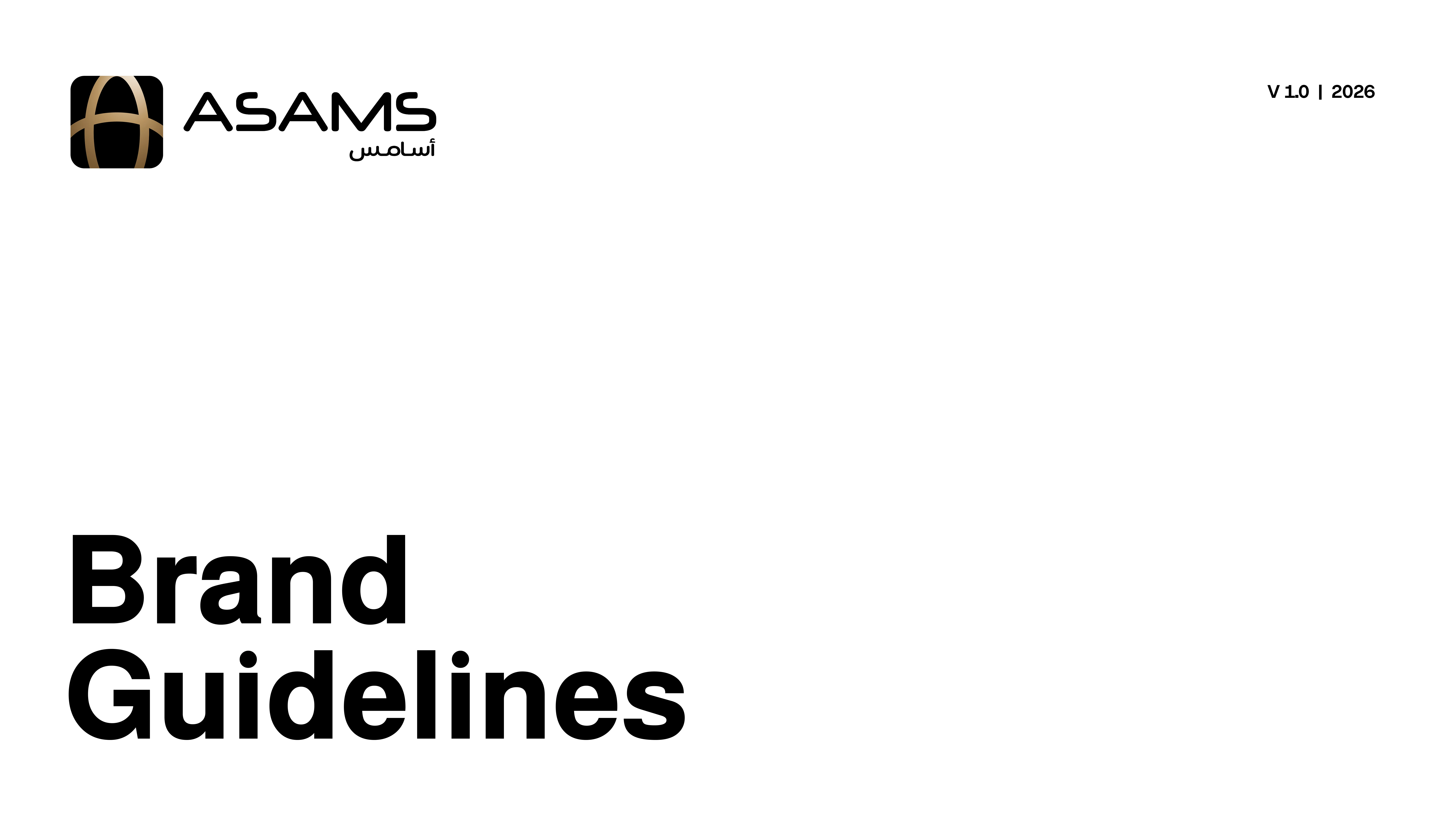
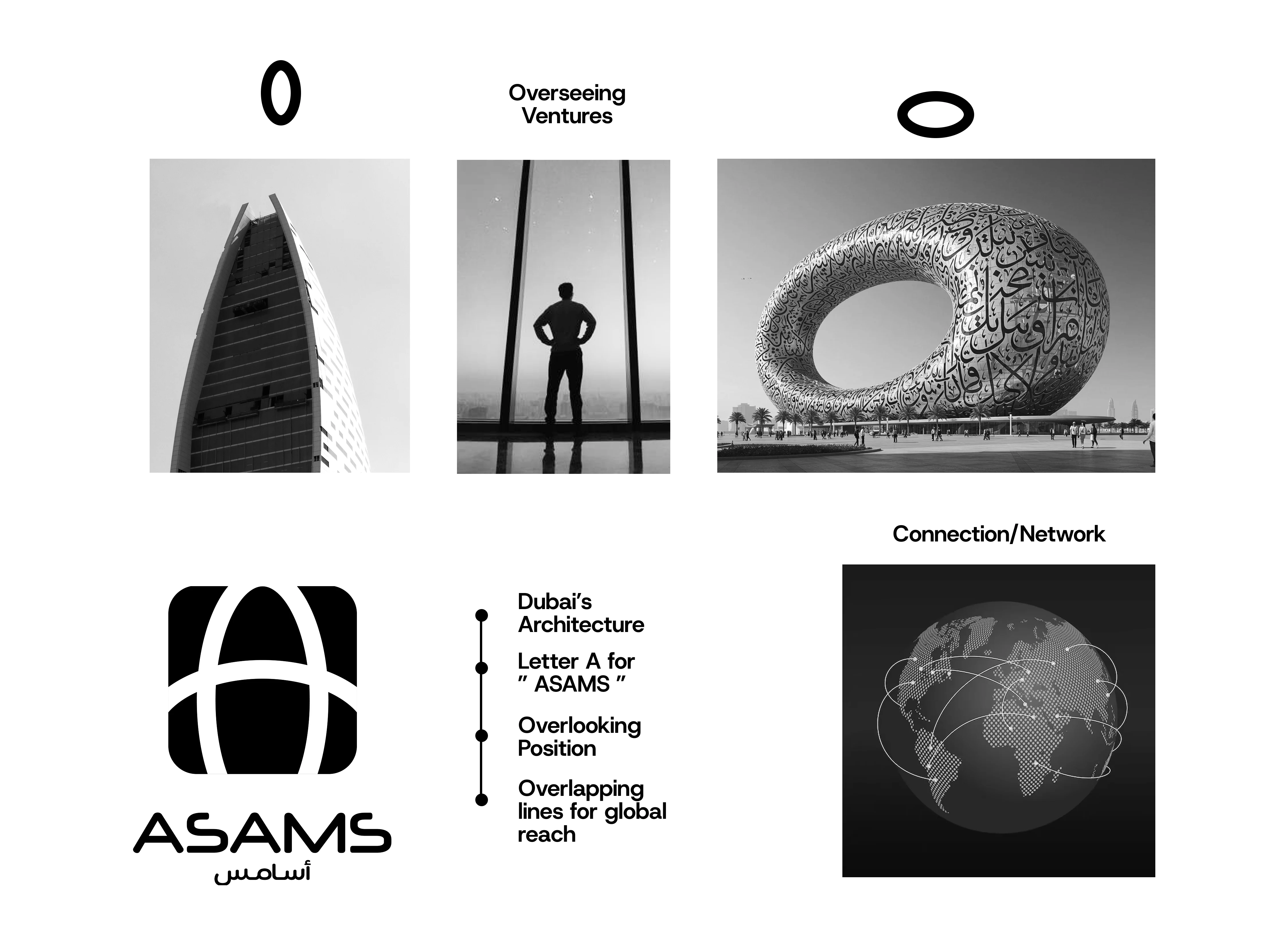
This brand identity for ASAMS anchors itself in the architectural marvels of Dubai 🚀
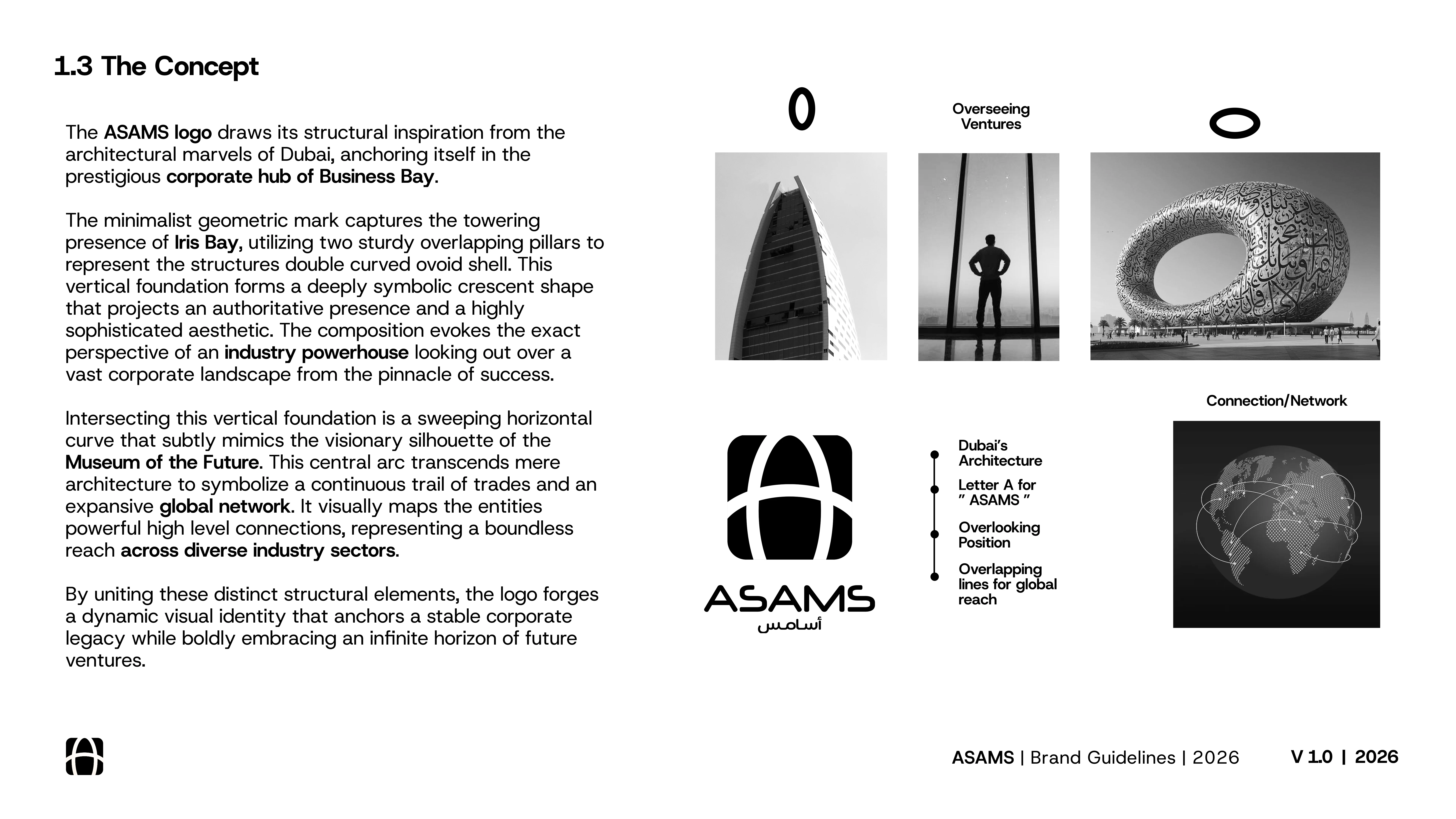
The core concept for the logo was to project the authoritative presence of an industry powerhouse. The minimalist geometric mark combines two overlapping vertical pillars inspired by Iris Bay with a sweeping horizontal curve that subtly mimics the Museum of the Future. Together, these elements symbolize a continuous global network and a boundless reach across diverse industry sectors.
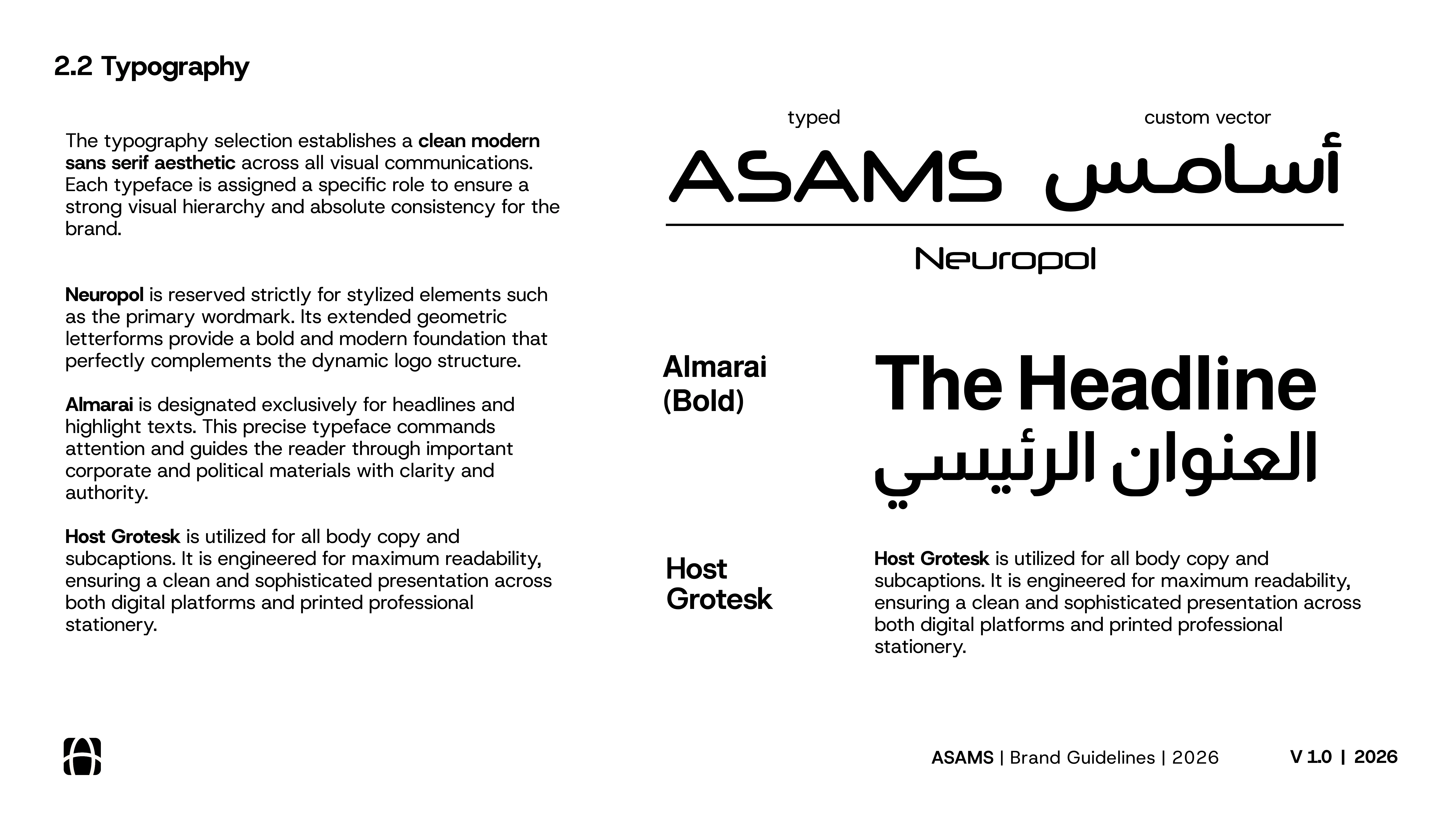
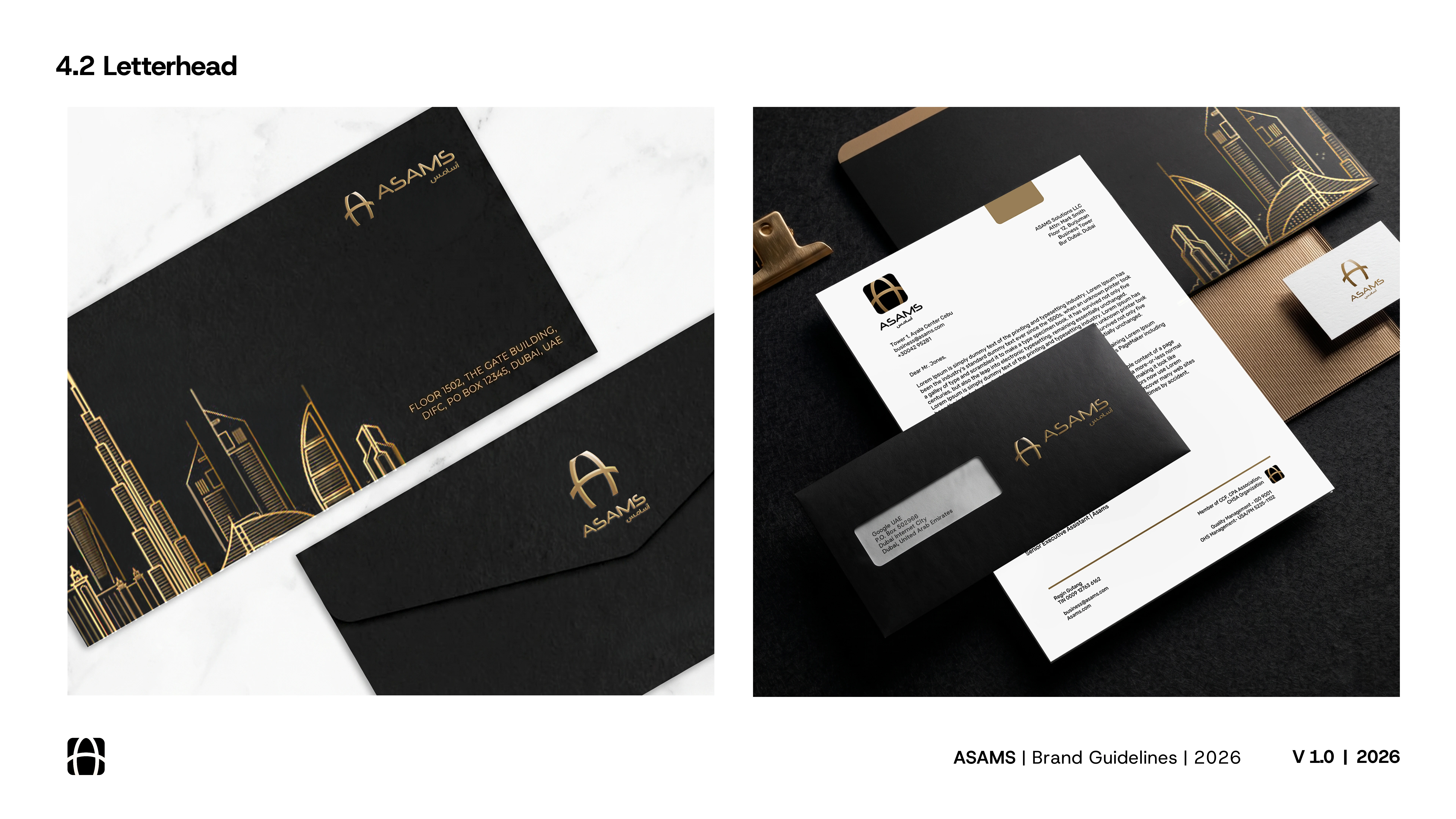
To establish a clean and modern aesthetic across all communications, the typography system relies on Neuropol for the stylized wordmark, Almarai for commanding headlines, and Host Grotesk for highly readable body copy. This precise visual hierarchy translates seamlessly to their corporate stationery, where a sleek black and gold palette pairs with custom Dubai skyline line art to create a deeply sophisticated physical presence.
How do you approach blending architectural inspiration into corporate branding? Let's discuss your process in the comments below.
#BrandIdentity #CorporateBranding #LogoDesign #DubaiArchitecture #Typography #BrandGuidelines #GraphicDesign #FreelanceDesigner
0 likes · 1 view · Sep 28, 2026
This brand identity for ASAMS anchors itself in the architectural marvels of Dubai 🚀 The core concept for the logo was to project the authoritative presenc...


