Freelance Frontend Engineers in KarachiFreelance Frontend Engineers in Karachi
Full-Stack & AI Developer | Next.js, AI Agents
$50k+
Earned
12x
Hired
5.0
Rating
242
Followers
Full-Stack & AI Developer | Next.js, AI Agents

$25k+
Earned
7x
Hired
5.0
Rating
54
Followers
Full-Stack & AI Developer | Next.js, AI Agents
Innovative Solution-Driven Developer
$1k+
Earned
1x
Hired
4.9
Rating
1
Followers
Innovative Solution-Driven Developer
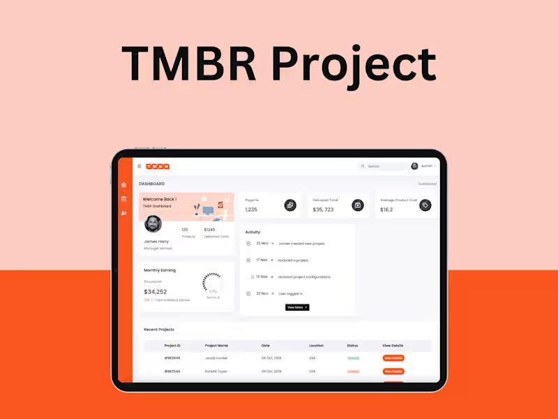
Product Design, Growth and Developer | E-Books and Software
5.0
Rating
11
Followers
Product Design, Growth and Developer | E-Books and Software
Cover image for I designed this concept website
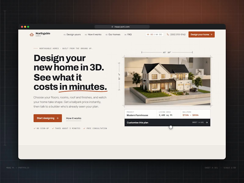
I designed this concept website for a custom home builder. The idea was to let people design their house themselves and see a real price before they ever speak to a salesperson. The challenge was to make something as complex as building a home feel simple, visual and even fun. Hero. The headline makes the promise in bold, tightly set type: "Design your new home in 3D. See what it costs in minutes.", with a hand-drawn rust underline beneath "in minutes." On the right, a model farmhouse sits inside an architect's frame with dimension lines (65′ 10″ × 32′ 6″) and a north arrow. Under it, a project card shows the design name, living area and ballpark price, with a dark "Customise this plan" bar. Three small checkmarks, "No sign-up," "Takes about 3 minutes" and "Free consultation," remove hesitation before the visitor starts. Visual language. I built the whole site around an architectural drawing set: Numbering: every section is labelled like a blueprint sheet (A-102, A-201, A-301), and monospace labels read like annotations on a plan. Grid: a faint drafting grid runs behind the page. Palette: warm paper cream, charcoal ink and one rust-orange accent for buttons and key prices. The navigation is numbered too (01 Design yours, 02 How it works, 03 Our homes, 04 FAQ), with a US/UK currency switch and a click-to-call phone number. The 3D designer. This is the heart of the site. On the left, a live 3D model of the house; on the right, a step-by-step panel: Start: choose from four starting designs (Contemporary, Modern Farmhouse, Traditional, Single-Storey) or start from scratch. Size: storeys, a living-area slider, a rectangle or L-shaped footprint, ceiling height and basement. Rooms: steppers for bedrooms and bathrooms, plus chips for a home office, laundry, pantry or media room. Roof: shape, pitch, material and colour swatches. Exterior: cladding type, colour and accent options like a stone base. Windows: window count, window style, rear doors and balconies. Outdoor: garage size, porch and patio, plus a roof terrace or fireplace. Finish: Essential, Premium or Luxury, ending on a summary. Every choice rebuilds the 3D house instantly, and a live estimate at the bottom of the panel updates with each decision. The viewer has its own controls: front, back, side and aerial cameras; a night mode with glowing windows; an inside cutaway of the floor plan; dimension overlays; and zoom. Supporting the decision. The rest of the page answers what a buyer asks next: "Three steps from first sketch to front door" uses large outlined numbers and simple line icons. "One team. One price. No surprises." lists the builder's guarantees. "Start from a favourite" shows four home designs as plan cards with specs and prices, each loading straight into the designer. The build schedule is a Gantt-style timeline across 11 months, from consultation to handover, separating "with you" steps from "we handle it." Client notes and FAQ: client notes pull out one large quote, and the FAQ gives five straight answers. The page closes on a dark section, "Your home, designed in minutes.", with a line drawing of a house and two clear actions: design your home or talk to the team.
0
16
Cover image for I designed this website for
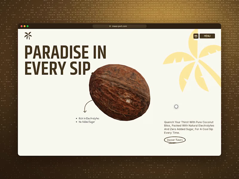
I designed this website for Palmo, a cold-pressed coconut water brand. The goal was to make a simple drink feel fresh, natural and premium, and to tell the product story through motion instead of long blocks of text. Hero. The page opens with oversized condensed type in deep husk brown, "PARADISE IN EVERY SIP.", beside a photorealistic 3D coconut. A soft butter-yellow palm illustration sits in the corner. A small hand-drawn arrow points to two quick benefits, "Rich in electrolytes" and "No added sugar," and a short brand line sits on the right with a hand-circled "Discover Flavors" link. The header stays minimal: a palm logo, a basket icon and a pill-shaped "MENU" button that opens a full-screen brown menu with large stacked links and a palm silhouette. The scroll story. I made the main section one continuous scroll-driven sequence, so it plays like a short film: The crack: the coconut rotates as "THE REAL SOURCE OF EVERY SIP." splits apart around it, then cracks open to show the water inside. The facts: round badges float in one by one: 500mg potassium, 0g sugar, 45 kcal and 100% natural hydration. The transformation: the shell closes, and a progress label tracks the journey from "Whole coconut" to "Canned." The reveal: the coconut becomes a Palmo can, "KEEP SIPPING.." scrolls past, and the page drops into a scalloped brown section. Visual language. The palette comes straight from the product: creamy coconut white, rich husk brown and a sunny butter yellow. I paired a tall condensed display typeface with a handwritten accent font for small details like labels and buttons, which keeps the brand bold but friendly. Wavy, scalloped edges between sections look like the rim of a cracked shell and tie the whole page together. Shopping. In "EXPLORE ALL FLAVOURS," each flavour sits on its own card: Natural Pure, Golden Pineapple and Ruby Watermelon. Hovering a card flips its background to that flavour's colour and shows the can in 3D. A plus button opens pack-size options, so visitors can add to the basket without leaving the page. Trust and close: "YOU DESERVE THE BEST FOR YOUR HEALTH." pairs a short mission line with a scattered stack of holiday-style photos. "SIPPERS SAY !" is a review slider of short quote cards. "THE BOX OF HEALTH" is a flavour carousel where the background changes colour with each can. The footer turns into a mini game: visitors swipe to slice falling coconuts above a giant PALMO wordmark, which gives the brand a playful, memorable goodbye.
0
15
Cover image for PRESTORATIVE™ (Pacific Plant Nutrients)
I designed
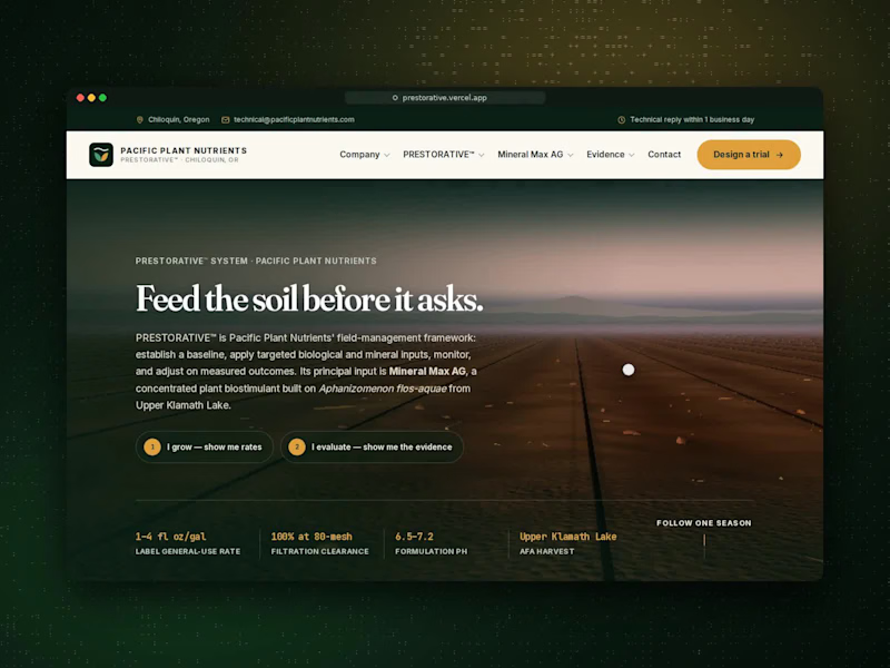
PRESTORATIVE™ (Pacific Plant Nutrients) I designed this website for an agricultural biostimulant brand whose buyers are practical and sceptical: growers who want application rates, and agronomists and distributors who want proof. The challenge was to make a biological product feel credible and easy to understand without relying on big marketing claims. The hero opens on a 3D farm field at dusk under the headline "Feed the soil before it asks." Two buttons split visitors by what they need: "I grow — show me rates" and "I evaluate — show me the evidence." Key product facts sit below in amber monospace type, like readings on a field instrument. I paired an editorial serif with that data typeface, on a palette of deep forest green, warm cream and amber. The centrepiece is "One season," a scroll-driven 3D story. As visitors scroll, a single seed sits in the soil, puts down roots and grows into a full field of crops under a setting sun. Along the way the five stages of the program appear: Assess, Plan, Apply, Measure and Adapt. Floating labels mark the water, root zone, biological activity and mineral environment, and a stage tracker at the bottom shows where you are in the season. It turns an abstract field-management method into something visitors can watch happen. The rest of the page is built around proof rather than promises: Three names, one job each: clear cards separate the company, the system and the product. Product specification: laid out like a technical data sheet. Crop rate engine: choose one of six crops, a growth stage and your acreage, and it calculates the dose and carrier volume. Technical assistant: answers questions from the product documentation. Evidence library: a record carousel with a grading system, "Read the grade before you read the number," so every result shows how strong its evidence is. Toxicology section: tackles the toughest objection head-on: "Isn't this the toxic Klamath algae?" After grower testimonials, the page closes with a confident invitation: "Don't take our word for it. Test it against your current program."
0
37
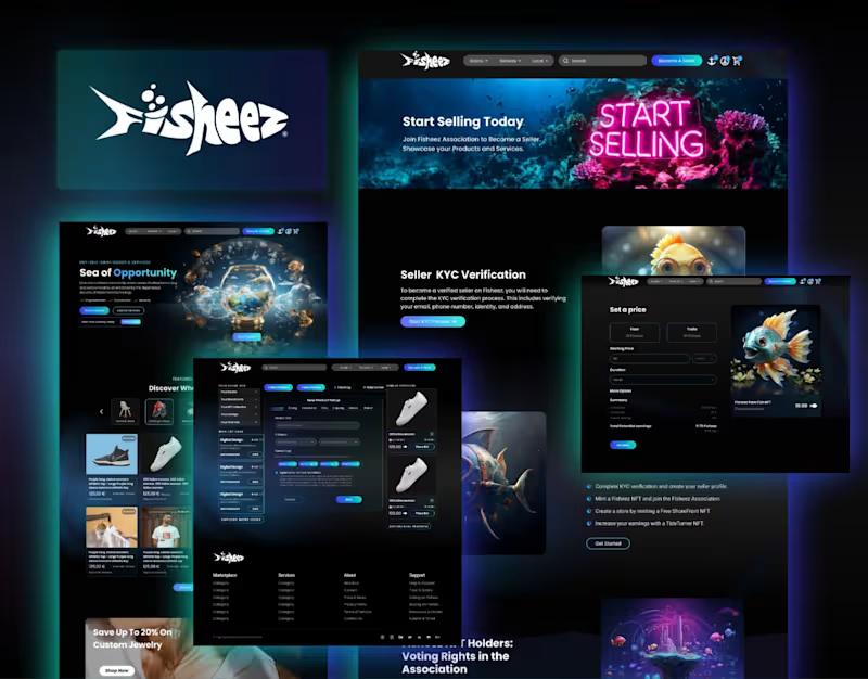
UI/UX designer | Figma and Framer expert
5.0
Rating
UI/UX designer | Figma and Framer expert
Full-stack Engineer 8+ years of experience building websites
5.0
Rating
Full-stack Engineer 8+ years of experience building websites