Digital illustration Projects in ItalyDigital illustration Projects in ItalyAtlas of Forgotten Queens
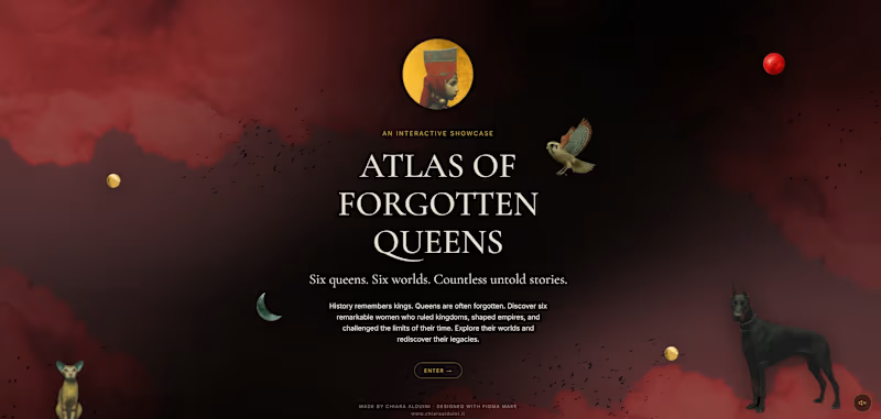
Six queens. Six worlds. Countless untold stories.
History remembers kings. It often forgets queens.
The idea | Atlas of Forgotten Queens is an interactive visual-storytelling project that reimagines six historical women rulers — Zenobia, Nefertiti, Dihya, Tamara, Roxelana, and Artemisia I — through a symbolic, narrative-driven lens. Rooted in historical research across different cultures and eras, it focuses on influential women whose stories have been overlooked in traditional history.
The approach | Rather than presenting history as a fixed reconstruction, the project translates it into a layered visual language where meaning is suggested through imagery, atmosphere, and symbolism. It is at once an archive and a reinterpretation — each queen sits between documentation and imagination, a shifting image shaped by symbols, suggestion, and a subtle sense of myth.
The craft | Each queen is built as a digital collage combining photography, original illustration, and AI-generated imagery, fused into a single portrait that reads as historical identity reinterpreted, never literal reconstruction. Each queen's name is written in her own historical script — Egyptian hieroglyphs for Nefertiti, Tifinagh for Dihya, alongside Arabic, Georgian, and Greek — so that each ruler is named in her own writing, not only in ours.
The process and tools | The project was designed, prototyped, and built in Figma Make, used both through its AI-driven generation and its code editor for precise refinement — Figma Make is the spine that turns the concept into a living, interactive site. Around it sits a wider creative pipeline: Photoshop and Illustrator for visual development and the gold-line maps; Midjourney for image generation; Gemini to compose the original score "The Last Prayer of the Sultan"; and Claude to develop and structure the narrative. The result is a genuine multi-tool, AI-and-manual workflow, with Figma Make at its center.
The experience | The site unfolds like a museum. A soft, slowly drifting haze with floating, parallax collage elements gives way to a gallery of circular portraits; each queen's page reveals her in colour and invites the visitor to read symbolic hotspots placed directly on the artwork. The Geography of Silence gathers all six rulers onto a single map — where they ruled, and where memory let them fade. The Language of Emblems is the project's lexicon, collecting the recurring symbols — the hawk, the fox, the colour red — and reading them in their universal meaning: a key to the clues marked on each portrait. The journey closes with The Unwritten, where the names of other forgotten queens — Sheba, Amanirenas, Nzinga, Boudica, and more — surface and fade around a final illustration: an unfinished, ever-expanding tribute to the countless women still waiting to be remembered. The experience is fully responsive across desktop and mobile: on smaller screens it is rethought for touch rather than scaled down, with a collapsible menu, a pinch-to-zoom map, and enlarged tap targets.
If you've read all the way to here — thank you for your interest! 😊
Figma Site | https://atlasqueens.figma.site/
(https://atlasqueens.figma.site/)Share | https://www.figma.com/make/uXm8S9lkymkTd8URAjmj6C/ATLAS-OF-FORGOTTEN-QUEENS?p=f&t=twAEHRsb3gv3aWaI-0
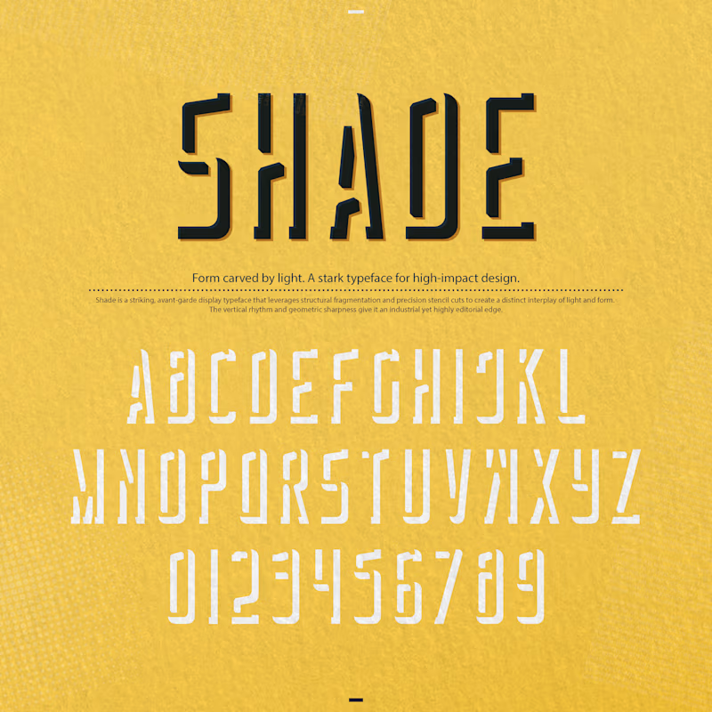
Community | https://www.figma.com/community/file/1646095544450556274 "Shade" is a striking, avant-garde display typeface that leverages structural fragmentation and precision stencil cuts to create a distinct interplay of light and form. The vertical rhythm and geometric sharpness give it an industrial yet highly editorial edge.
You are spot on—it is exceptional for posters, but its unique mechanics make it a powerhouse across several high-impact applications 💯
Posters & Exhibition Graphics: In large-scale formats, the fragmented stencil cuts and tall proportions transform text into a graphic texture, making it command attention from a distance.
Editorial Design & Cover Art: It shines in cultural, art, and architectural magazines where headlines need conceptual depth rather than standard neutral typography.
Avant-Garde & Cultural Brand Identities: Perfect for music festivals, contemporary art galleries, independent fashion labels, or design studios looking for a stark, memorable voice.
Structural Packaging: For limited-edition product boxes or sleek, minimal outer packaging where the typography itself acts as the primary visual asset.
It avoids generic display tropes by using negative space as an active architectural element. How do you see yourself deploying it first—print, digital, or a specific brand identity? 🔥