Valentino - My V Experience
Luis Felipe Bueno
MY V EXPERIENCE - VALENTINO SERVICE PROMOTION
KINETIC TYPOGRAPHY VIDEO
Valentino commissioned us to create a powerful and snappy kinetic typography video to promote their new VIP clients service. The brief included a predetermined script and product photography, with specific mandatory elements: a popular chat interface opening and a geo-localization moment. What seemed like a straightforward motion graphics project quickly became an exercise in creative constraint and typographic innovation.
Process Overview
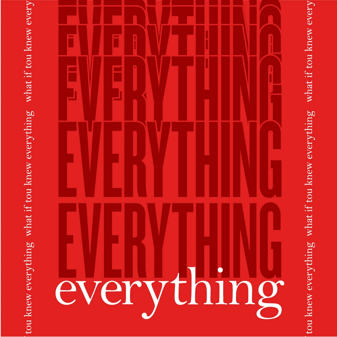
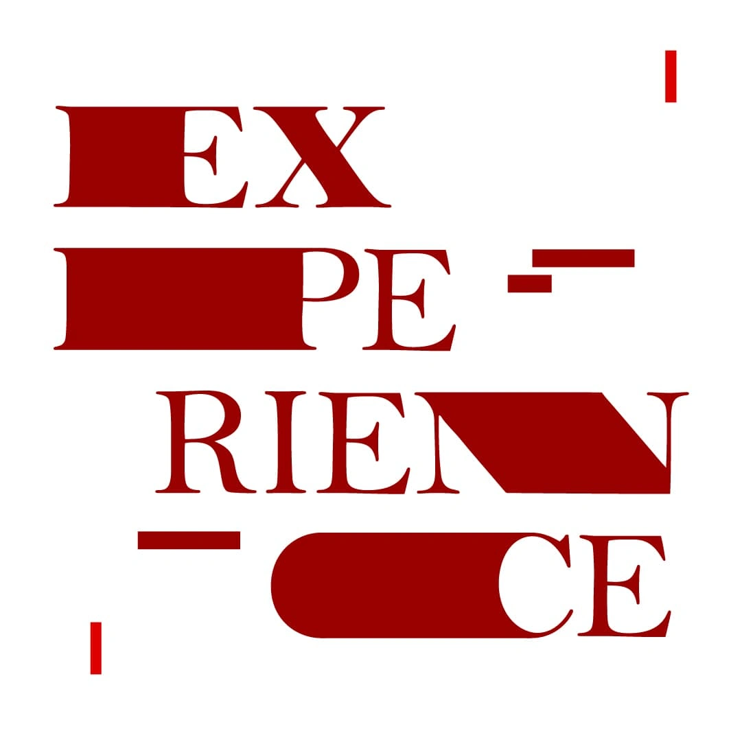
Initial Concept & Creative Constraints Our first instinct was to embrace colorful brutalism with quirky, grotesque sans serif typography - but Valentino had other plans. They restricted us to a single color: red
#990000, and mandated the exclusive use of Bell MT, which would become Valentino's official typeface. Bell, a late 18th century typeface originally designed for The Oracle newspaper in England, presented unique challenges for modern motion graphics with its limited variants, minimal glyphs, and inherent stiffness.Typographic Solution & Visual Language Rather than fight Bell's constraints, we embraced them and introduced Knockout as a complementary typeface to create dynamic alternation and repetition. While Bell delivered readable messages in a quasi-print approach, Knockout deconstructed them through geometric compositions and shape-shifting montages. After testing, Valentino approved this dual approach, provided the secondary visual language remained supportive rather than dominant.

Color Palette Expansion We negotiated the use of two additional red shades plus rare appearances of an off-black tint, creating a restrained yet effective color system that maintained brand consistency while allowing for visual hierarchy and depth.
Animation Approach We adopted hard cuts, shifts, stretches, and inflation effects to energize the motion while completely avoiding soft approaches like dissolves and motion blur. This created a sharp, rhythmic visual language that complemented the typographic constraints and enhanced the overall brand aesthetic.
Sound Design & Music Integration Music came first in our creative process. We developed a tightly rhythmic track using organic sounds that felt fashionable without being overly glamorous or tacky. The goal was precise, frame-by-frame choreography between sound and visuals, with additional sound elements punctuating animations.
Final Deliverables The completed kinetic typography video successfully promotes Valentino's My V Experience app while establishing a distinctive visual and sonic identity that works within strict brand guidelines, proving that creative constraints can lead to innovative solutions. The project was very successful and was translated into 8 different languages for global distribution.
Like this project
Posted May 14, 2025
Produced a premium motion graphic video for Valentino's VIP customers, delivering captivating kinetic typography for their service announcement.
Likes
0
Views
34
Clients
Valentino