The network for creativity
Join 1.25M professional creatives like you
Connect with clients, get discovered, and run your business 100% commission-free
Creatives on Contra have earned over $150M and we are just getting started
Back to feedPost

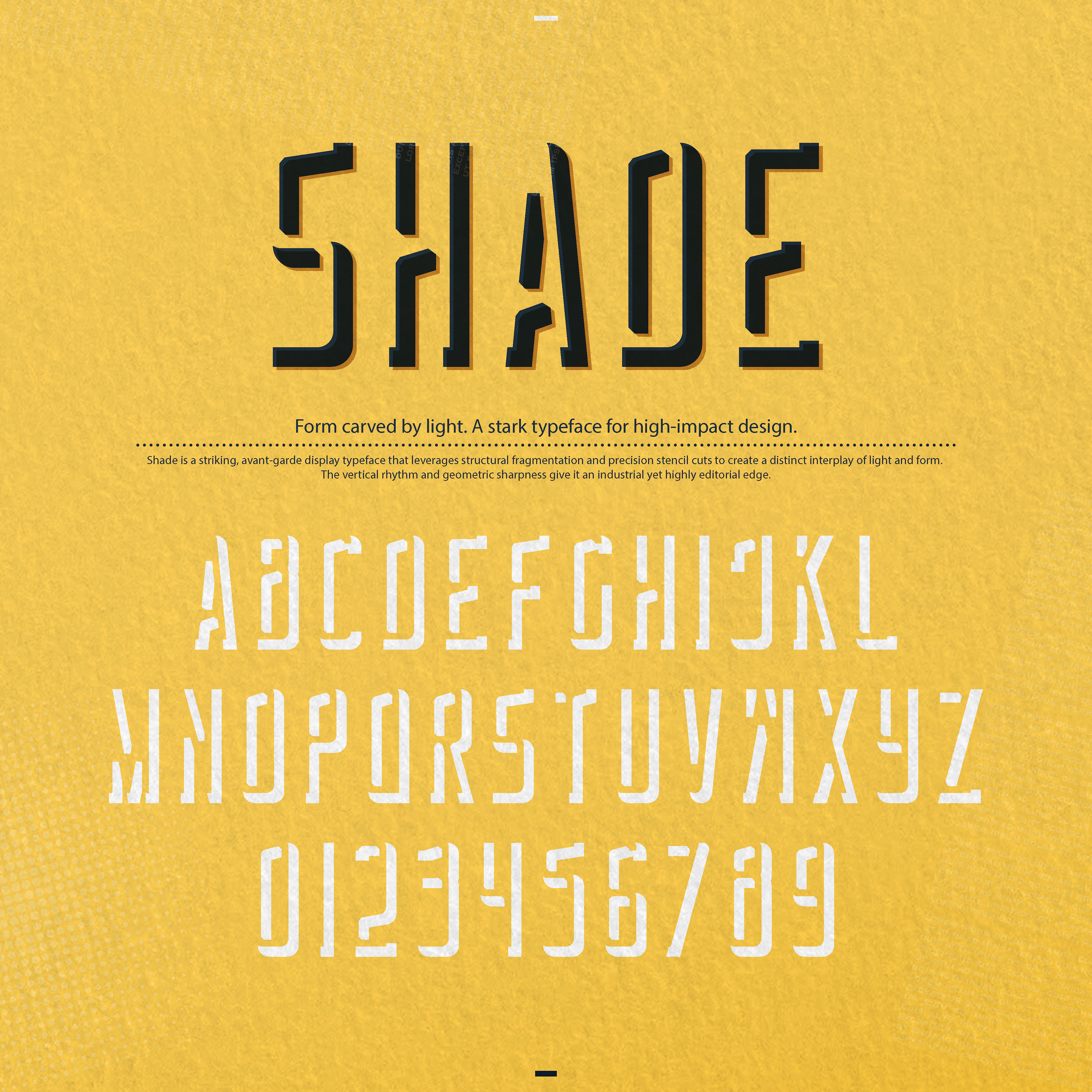
"Shade" is a striking, avant-garde display typeface that leverages structural fragmentation and precision stencil cuts to create a distinct interplay of light and form. The vertical rhythm and geometric sharpness give it an industrial yet highly editorial edge.
You are spot on—it is exceptional for posters, but its unique mechanics make it a powerhouse across several high-impact applications 💯
Posters & Exhibition Graphics: In large-scale formats, the fragmented stencil cuts and tall proportions transform text into a graphic texture, making it command attention from a distance.
Editorial Design & Cover Art: It shines in cultural, art, and architectural magazines where headlines need conceptual depth rather than standard neutral typography.
Avant-Garde & Cultural Brand Identities: Perfect for music festivals, contemporary art galleries, independent fashion labels, or design studios looking for a stark, memorable voice.
Structural Packaging: For limited-edition product boxes or sleek, minimal outer packaging where the typography itself acts as the primary visual asset.
It avoids generic display tropes by using negative space as an active architectural element. How do you see yourself deploying it first—print, digital, or a specific brand identity? 🔥


The network for creativity
Join 1.25M professional creatives like you
Connect with clients, get discovered, and run your business 100% commission-free
Creatives on Contra have earned over $150M and we are just getting started











Related posts

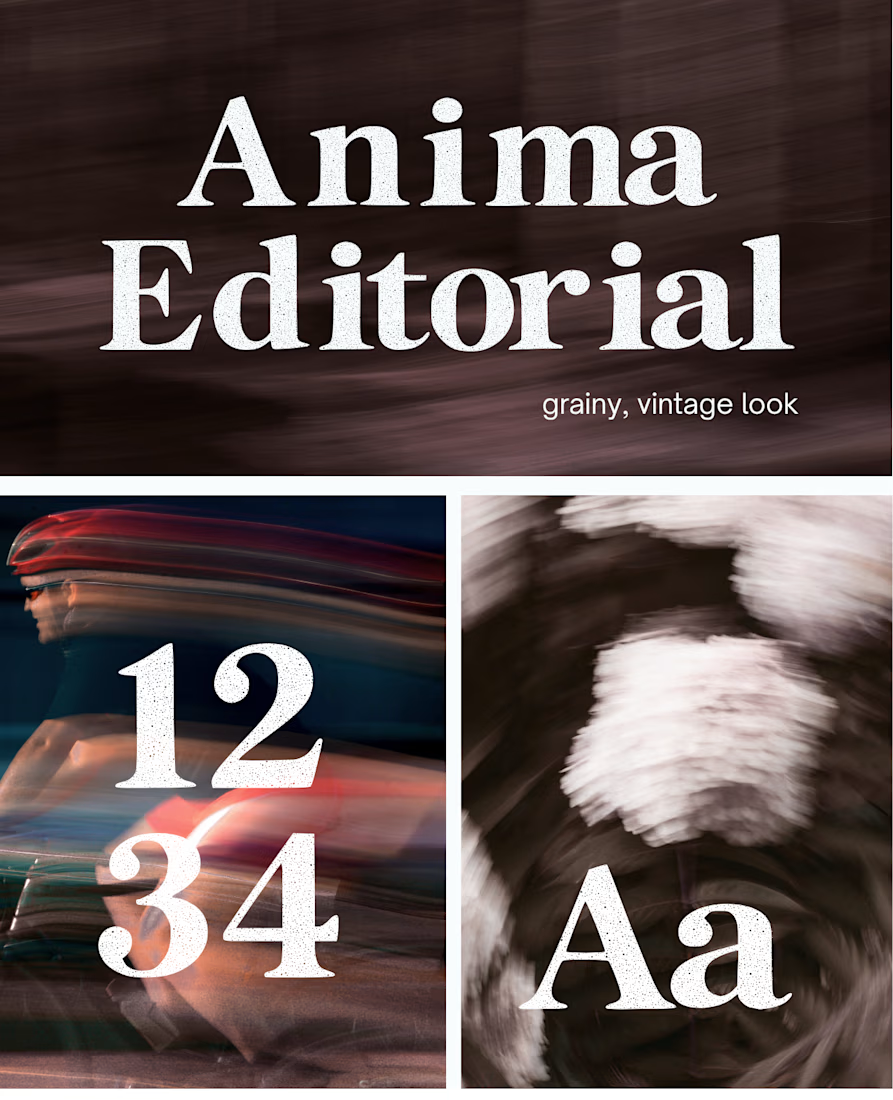
I created this font & it is free to download and use in your free or paid projects. Enjoy 🚀 find it at https://twaperdigital.com/anima-editorial



I like this font
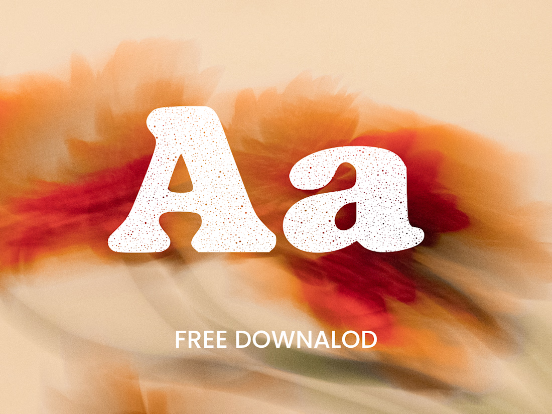
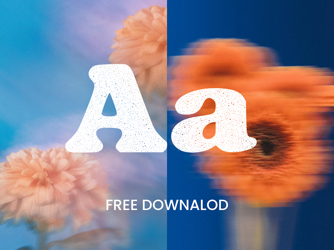
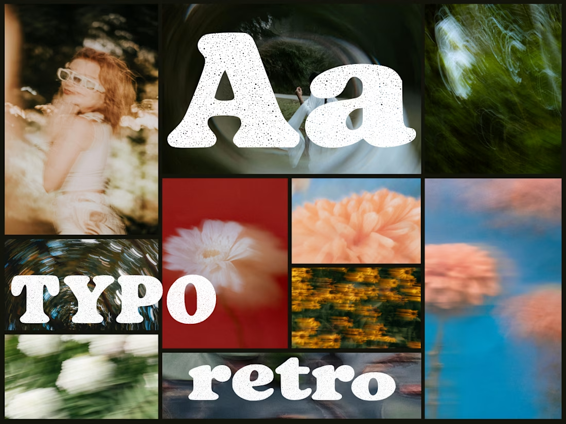
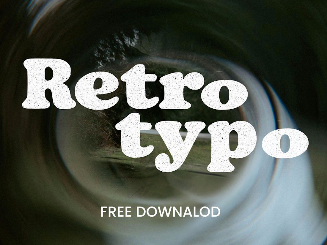
Anima is a self-initiated type design project inspired by vintage print, worn ink and analog photography.
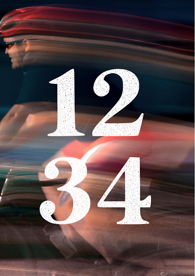
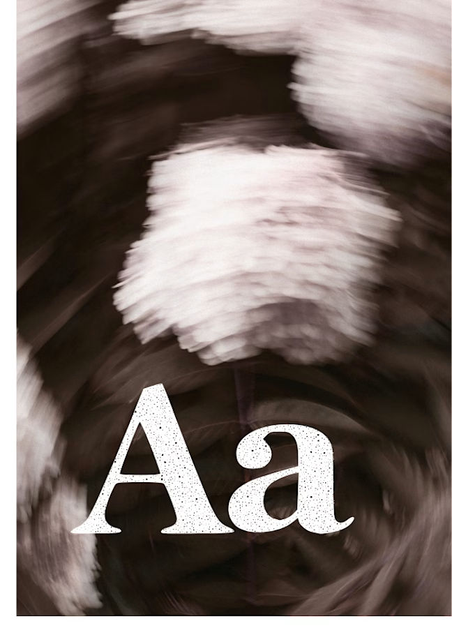
The collection includes two experimental serif typefaces: Anima Editorial, with elegant proportions and contrasting strokes, and Anima Retro, with softer, bolder shapes. Both feature grain built into the letterforms.
I developed the creative direction, custom fonts and promotional artwork, combining AI-assisted exploration with font development. The campaign pairs textured typography with motion-blurred photography to capture a warm, nostalgic mood. FREE DOWNLOAD AT https://twaperdigital.com/anima-retro


Great job Denisa the font style background and it's effects are great 🎉🎉🎉🎉
keep going Denisa🔥🔥🔥🔥




Clean and confident work! The green gradient with the mark feels very modern for fintech - trustworthy but not boring. The app screens look really polished. Curious how you landed on this mark, does it represent growth / movement?