Freelancers using Vercel in IslamabadFreelancers using Vercel in Islamabad
I ship SaaS platforms, mobile apps, and automation systems.
New to Contra
I ship SaaS platforms, mobile apps, and automation systems.
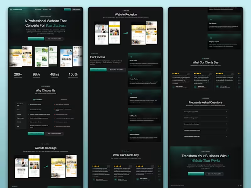
Web Designer & Developer | Figma to Next.js | UI/UX
$1k+
Earned
3x
Hired
5.0
Rating
34
Followers
Web Designer & Developer | Figma to Next.js | UI/UX
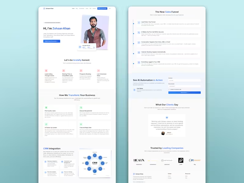
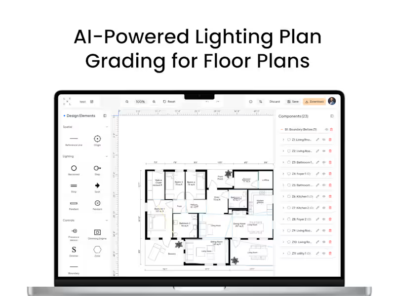
🚀 AI & Fullstack Developer | MERN Expert 🚀
$10k+
Earned
5x
Hired
5.0
Rating
29
Followers
🚀 AI & Fullstack Developer | MERN Expert 🚀
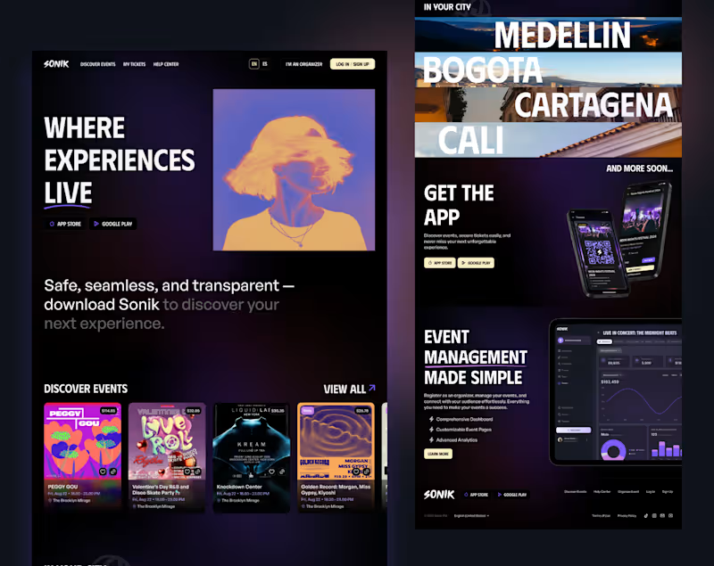
Graphic Designer, Al-Assisted Web Developer & UI/UX Designer
New to Contra
Graphic Designer, Al-Assisted Web Developer & UI/UX Designer
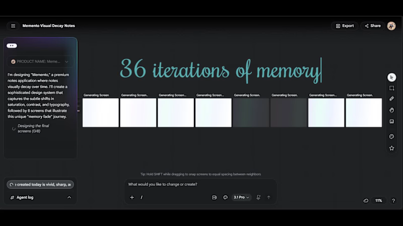
Cover image for Memento — A Notes App
Memento — A Notes App Where Memories Decay Live app: https://memento-navy.vercel.app Every notes app treats a thought from three years ago identically to one from this morning. Memento doesn't. Notes decay visually from the moment they're created — across typography weight, contrast, border integrity, and color temperature — until they become near-invisible archaeological artifacts. A note from today is sharp and vivid. A note from six months ago is a ghost. The archive isn't a list. It's fog. Pinning a note revives it — it returns warm and glowing, carrying the memory of having faded. Eight decay states. One continuous system. The interface is alive because time is acting on it constantly — even while you sleep. — HOW I USED STITCH I've been using Stitch since it first launched, and this project pushed it harder than anything I've built with it. The entire visual system — all 8 decay states — was designed simultaneously on Stitch's infinite canvas using multi-screen generation. I wrote a single detailed prompt specifying exact hex values, typography weights, opacity levels, and border behavior for each state, then used targeted follow-up prompts to refine individual screens without disrupting the system. The workflow was: Stitch for the full design system → HTML/CSS export → Antigravity to build the functional React/Next.js app using Stitch exports as visual reference → deployed on Vercel. The most interesting challenge was making decay feel considered rather than broken — Stitch's rapid iteration helped me find the line between "elegantly faded" and "unreadably dark" faster than any other tool would have. — FEEDBACK ON STITCH I've used Stitch across several projects since launch and it's genuinely changed how I approach UI work — the speed from concept to exportable interface is unlike anything else available. One honest observation: visual continuity across screens can drift, particularly on the Flash model. When generating a system of related screens, subtle inconsistencies in spacing, border radius, and color values creep in between generations. The Pro model handles this significantly better, but it's worth noting for anyone building multi-screen products. That said — Stitch moves the bottleneck from "can I design this" to "can I think clearly about what I want." That's exactly where the bottleneck should be.
1
2
294
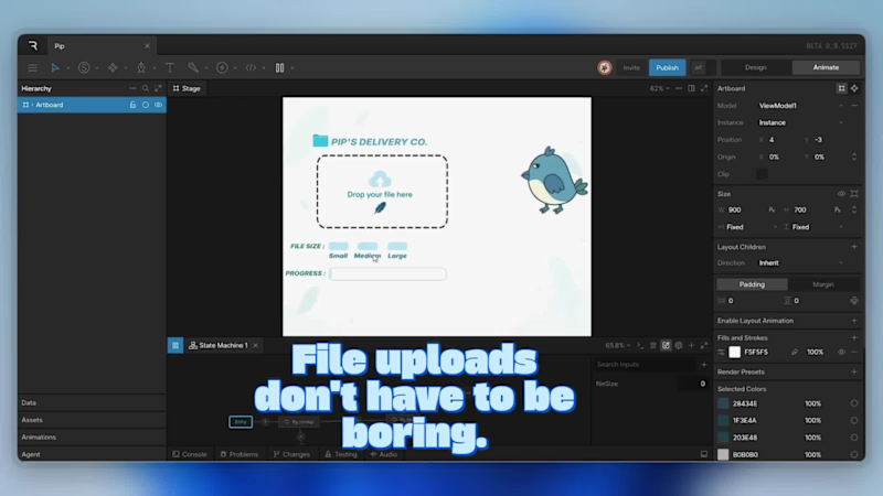
Cover image for Pip's Delivery Co. | Interactive
Pip's Delivery Co. | Interactive File Upload UI Overview Waiting for files to upload is usually pretty boring. For my final entry in the Rive interactive character challenge, I wanted to see if I could make a standard progress bar a bit more fun. Meet Pip, a digital courier who reacts to your file sizes. The Concept Instead of a standard loading spinner, I tied the animation directly to the size of the upload. Small files are a breeze for him, but if you drop a massive 5GB file into the drop-zone, he physically struggles and starts sweating. It’s just a simple trick to make the wait time a little more entertaining. Under the Hood The whole component is pretty lightweight and runs on a single number input in Rive (fileSize). Simple Logic: I mapped that one input to three different animation timelines, allowing Pip to smoothly transition from a happy, bouncy flap to a heavy, exhausted struggle depending on the number. Adding Weight: To sell the illusion of a heavy file, I used some slight downward translation and scaling. When the file size gets larger, gravity actually pulls him down a bit in the UI. The Interface: I wrapped the character in a clean, minimalist frosted-glass card. I wanted the overall design to still feel like a functional piece of software you'd actually use, letting the Rive animation provide all the personality. The Result A fun, interactive UI component that proves functional design doesn't always have to take itself so seriously. Rive Project : https://editor.rive.app/file/pip/2393868?linkId=pdg68woDFU2Crc0OcHmPCA X Post : https://x.com/Haseeb47176936/status/2072435026470531133?s=20
2
192
AI & Full-Stack Engineer turning ideas into intelligent appl
New to Contra
AI & Full-Stack Engineer turning ideas into intelligent appl
Expert WordPress Website Developer

Full Stack Developer @ThemeTwist Building Digital Solutions
18
Followers
Full Stack Developer @ThemeTwist Building Digital Solutions