Product Design Partner For Founders



Product Designer ↟ Team Leader ↟ Teacher ↟ Geek
Product Designer ↟ Team Leader ↟ Teacher ↟ Geek


Design Partner for Growing Businesses
Design Partner for Growing Businesses


Transforming AI capability into products people trust.
Transforming AI capability into products people trust.


Product Design | Mobile apps | Web apps
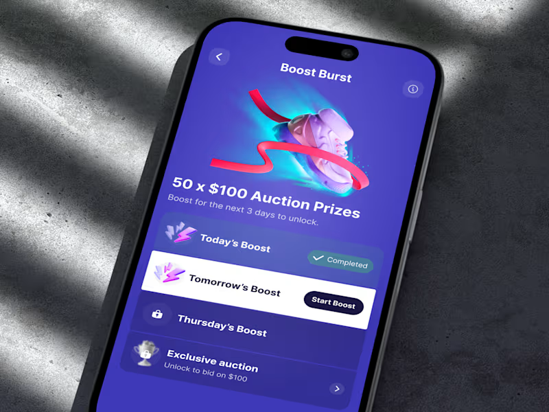
Sweatcoin LiveOps: the Boost Burst screen
Last time I showed the whole flow. This is the screen it all leads to. There was no onboarding modal for this campaign, so the list itself does the explaining: what you've done, what's next, and what you unlock at the end. The only white row is tomorrow's boost, because the next step should be the easiest thing to find.
1
113

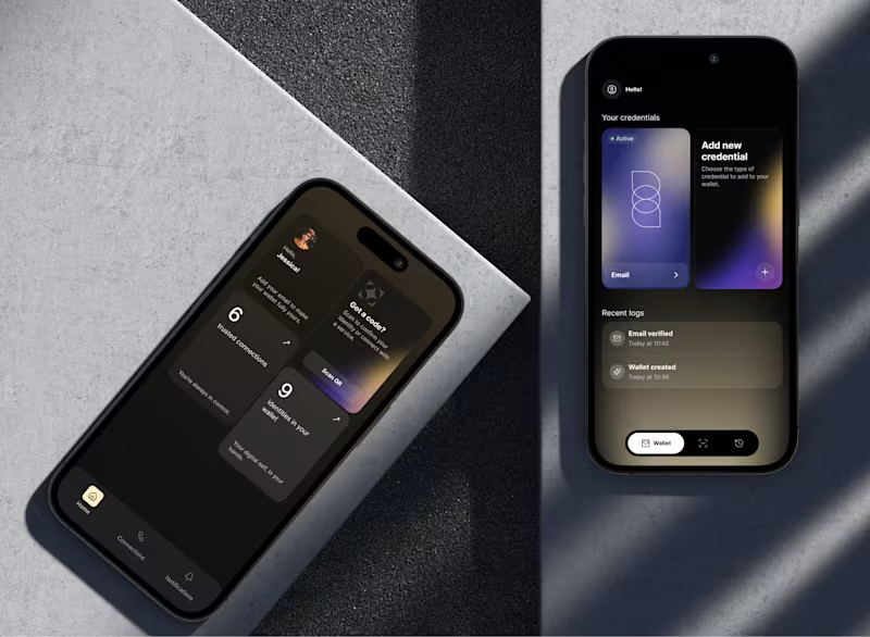
The wallet vote closed. 8% picked counts up front, 92% picked cards.
I promised the reasoning either way, so here it is.
The old home screen showed your credentials directly. You saw the card, you tapped it, done, plus a log of what just happened. A few people made that case in the comments, and they are right that taking it away costs a step.
The reason I took it anyway: the card row only works while the wallet is small. At twenty or thirty documents a horizontal swipe stops being access and turns into a search problem, and the card you need is never the one on screen. So the home screen stopped trying to be the wallet. It became a summary, with the real list one tap down where it can be sorted and filtered, and Scan QR moved to the top because scanning a code is what people open this app to do.
The outside signal we had was weak, and I want to be straight about that. The product sits in a regulated space under NDA, so no open user testing. We ran internal sessions and demoed both versions at industry events, where 88% of partners and investors picked the counts version and kept using the word premium. That tells me it reads as credible to the buying side. It does not tell me how it feels on the tenth open of the month. Different questions.
What would change my mind: if people turn out to open a specific credential often, pinning one or two to the home screen is the cheap fix. I would rather add that later than start from a layout that breaks at scale.
Thanks to everyone who argued with me. That was the point.
cc. @Agadon Creative @Maty Sandoval @Mark Barliet @Leena | Product Design, UX/UI & Web
2
275


Your Framer Expert & Digital Designer


Senior Product Designer & Next.js Developer | SaaS, Fintech