

Brand & Motion Designer | AI Video, Visual Identity, UI/UX


Brand & Motion Designer | AI Video, Visual Identity, UI/UX

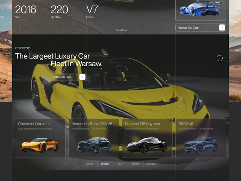

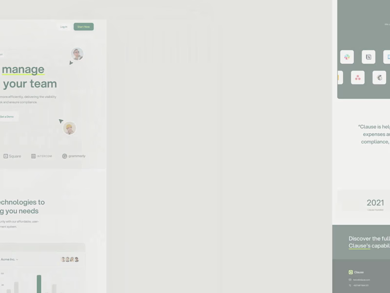


AI & SaaS launch sites + design systems in Framer & Webflow


AI & SaaS launch sites + design systems in Framer & Webflow

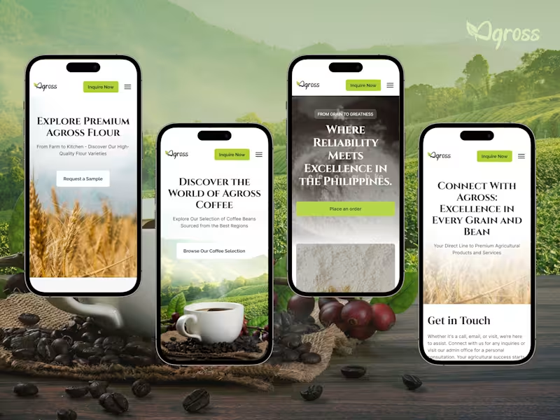
Redesigning Agross Agri Trading, our primary focus was designing for their reality.
Farmers and buyers aren't at a desk.
They're checking prices in a field, ordering from a truck.
Fast speed, as rural networks are slow.
Lead with data: prices, stock, and seasonal availability.
Make buttons bold and text readable outdoors.
Visible CTA always.
Is your agriculture business website built for the people actually using it or just the people who built it?
5
451

No-Code Web Designer With Framer Expert & Webflow
No-Code Web Designer With Framer Expert & Webflow



Brand & Website Designer | AI Video | UI/UX

Brand & Website Designer | AI Video | UI/UX

Award-Winning UI & Framer Designer for Stunning Websites

Award-Winning UI & Framer Designer for Stunning Websites


Framer Developer • UI UX Designer • topudesign.com
Framer Developer • UI UX Designer • topudesign.com

Product Designer | SaaS, Fintech & AI
Product Designer | SaaS, Fintech & AI
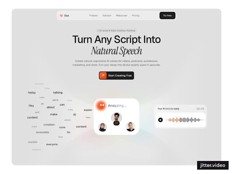
Designed a modern AI Voice SaaS Landing Page.
A soft light interface with gentle color glows, warm orange accents, and elegant italic serif headlines for a calm and creative first impression.
A floating word cloud turning into a voice wave, a language grid, a dark voice gallery with real faces, and use case cards for podcasts, audiobooks, video, and marketing make AI voice creation feel easy to understand. Clean spacing and soft cards keep the whole page light and easy to explore.
3
2
268

Designed a modern Finance Management Landing Page.
A sleek dark interface with an emerald green glow, mint accents, and a mix of clean sans and italic serif headlines for a premium and confident first impression.
Layered app and chart previews, bento style feature cards for analytics, budgeting, and reports, a growth score gauge, clear pricing plans, and a simple FAQ make managing money feel smart and easy. A bold glowing wordmark footer and consistent green highlights keep the whole page polished and easy to explore.
1
140

UX-led product design & dev agency for b2b saas and AI
UX-led product design & dev agency for b2b saas and AI
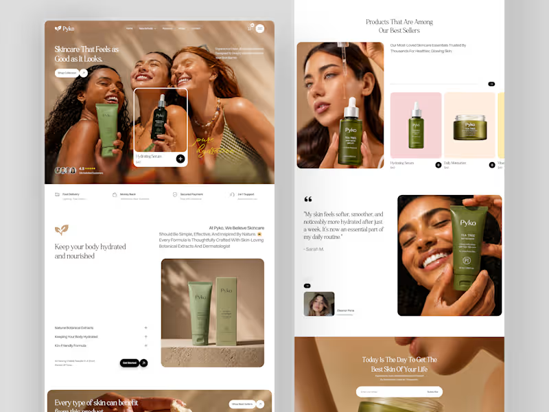
Most skincare websites sell products. Pyko was designed to sell confidence before the cart is even opened.
Botanical extracts, dermatologist-crafted formulas, and a landing page that makes every serum, moisturiser, and sunscreen look like it belongs on a shelf you've always wanted. 4.5 stars. 25K satisfied customers. "My skin feels softer, smoother, and noticeably more hydrated after just a week."
Check it out (https://dribbble.com/shots/27696488-Pyko-Botanical-Skincare-E-commerce-Website-Design)
1
352

Where moments become visual stories and the website should too.
Omnix.Studio's full web design, crafted by Orbix Studio (https://www.orbix.studio/). Four services, 120+ projects, 8+ years behind the lens, and clients like Deloitte, Fujifilm, Heineken, and Michelin all presented on a soft mint canvas that steps back so the photography can lead.
Clean. Considered. Confident.
Does this feel like a studio website worth booking a shoot from? 👇
Tools: Figma, Jitter
#WebDesign #PhotographyStudio #UIDesign #ContraFreelance #LandingPage #BrandDesign #OrbixStudio
11
18
1.1K
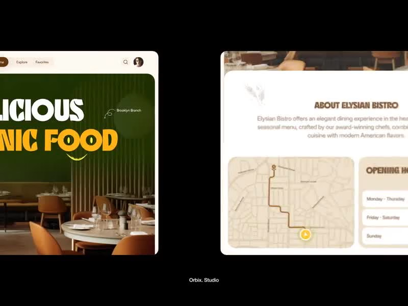
A great restaurant makes you hungry before you even sit down. The website should do the same.
Puredish is a restaurant web design built for Elysian Bistro, an organic dining experience in the heart of Brooklyn where classic French cuisine meets modern American flavors. The design brief was simple: make people want to book a table before they finish scrolling.
Deep forest green hero with bold retro typography. Warm cream sections that feel as inviting as the dining room itself. Opening hours, a structured menu with pricing, food photography that earns its placement, and an about section that gives the brand a personality before a guest ever walks through the door.
Truffle risotto at $24. The burger is at $28. Every dish is presented with the same care the kitchen gives it.
This is what restaurant web design looks like when the food is the hero and the design knows to stay out of its way.
Does this make you want to make a reservation? 👇
Tools: Figma · Jitter
#WebDesign #RestaurantDesign #UIDesign #FoodUI #LandingPage #ContraFreelance #BrandDesign #OrganicFood
2
689
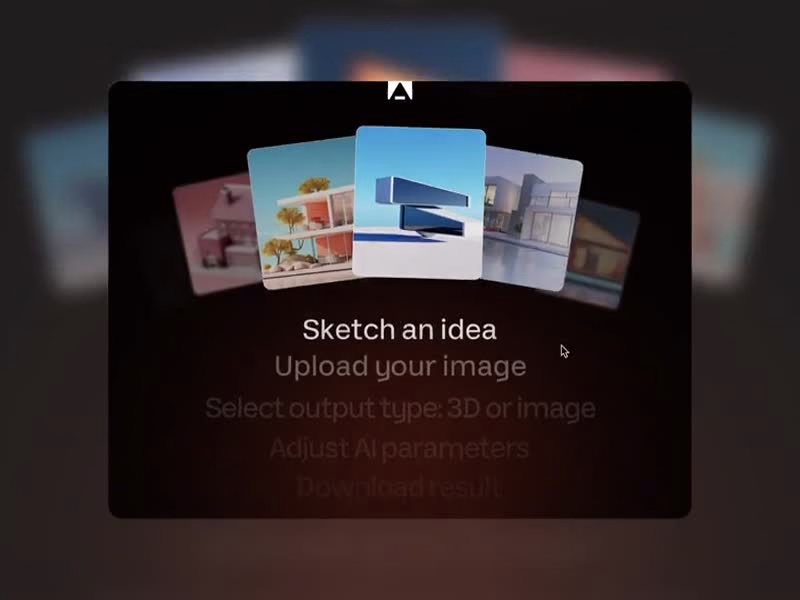
Architecture has always started with imagination. Arcus was designed to make that the easy part.
Arcus is an AI-powered rendering platform built for architects and designers who need to visualize ideas faster than a traditional workflow allows. The landing page had to communicate that instantly a deep dark canvas, a cinematic 3D building render glowing against a night-sky hero, and a product UI that shows exactly what's possible before the user ever signs up.
Image to image. Text to image. Image to video. Upscale. The tool panel sits quietly in the corner, letting the rendered architecture command the screen.
Render settings. Generation controls. Aspect ratios. Image counts. Everything a professional needs, packaged into an interface that feels like the future of the industry rather than another tool added to the stack.
Best AI for the Architecture. The headline sets the bar. The design clears it.
Does this feel like a product that changes how architects work? 👇
Tools: Figma · Jitter
#AIDesign #WebDesign #SaaSUI #LandingPage #DarkUI #ArchitectureAI #ContraFreelance #ProductDesign
1
628