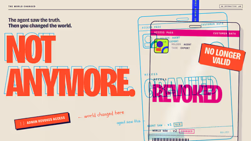
Interaction Design Projects in GatineauInteraction Design Projects in GatineauThe agent saw the truth. Then I changed the world.
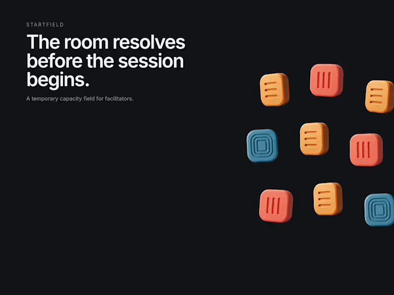
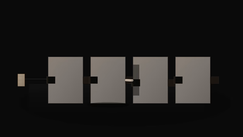
Just published THE WORLD CHANGED, an interactive AI agent lab where you change reality after an agent has observed it, then see whether it notices before it acts.
The core interaction is simple:
LOOK → PULL THE GAP → CHANGE THE WORLD → ACT
From there it expands into multiple worlds, a timed challenge, replayable receipts, checked vs. unchecked outcomes, and a genuine recorded Claude Opus 5.5 run.
I wanted the idea to feel physical rather than technical, so the whole visual system is built from passes, tickets, stamps, paper and print misregistration.
Would love feedback on the interaction and art direction.
🔗 https://contra.com/p/FXvqOAEA-the-world-changed-an-interactive-ai-agent-lab AFTER THE SIGNAL: The System Chose Consistency. The Human Chose Meaning.
For the Envato × Contra Human by Design challenge, I created AFTER THE SIGNAL, an editorial design system about a specific creative conflict:
What happens when the automatic answer is polished, coherent, and still wrong for the meaning?
Issue 01 established a confident visual system.
For Issue 02, the automatic recommendation was obvious: repeat the same typeface, image language, density, and rhythm.
The result was consistent.
It was also too certain for a story about the silence before anyone knows whether a system has failed.
My Human by Design moment was not “make it different.”
It was:
REPEAT THE ESTABLISHED IDENTITY ×
PRESERVE WHAT ISSUE 02 NEEDS ✓
I redirected the typography, grid, hierarchy, spacing, image meaning, motion rhythm, and sound around hesitation and uncertain transmission.
Envato was used across:
ImageGen
VideoGen
SoundGen
MusicGen
The fjord became the language of stability.
The relay became the language of uncertain transmission.
The handoff click marked the exact moment human judgment took control.
The tools generated the visual and sonic ingredients.
Human judgment decided what they meant.
Interactive prototype:
https://actor-sweat-63115452.figma.site
THE SYSTEM CHOSE CONSISTENCY.
THE HUMAN CHOSE MEANING.
#envatochallenge #HumanByDesign #MotionDesign #CreativeDirection #EditorialDesign Before Bar One: The First Version Proved the Mechanism. Squarespace Turned It Into an Experience.
Before Bar One did not begin as a website.
It began as a small functional prototype for Day 3 of my 30 Days of Real Business Problems challenge.
The original idea came from a very specific orchestral problem:
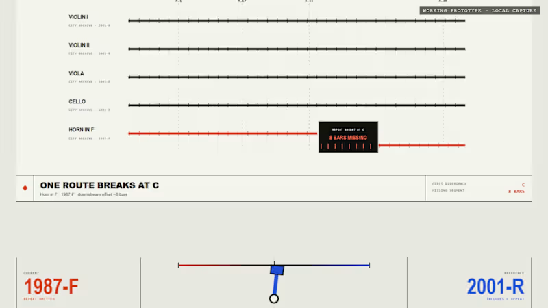
Five musicians receive their parts and begin rehearsal together. Four parts continue normally from rehearsal mark C to rehearsal mark D. But in one edition, the Horn in F part contains eight missing bars.
The page still looks complete.
The paper is still ruled.
The rehearsal continues.
But one musical route has quietly disappeared.
That first prototype was designed to prove a single interaction:
The mechanism worked.
Visitors could move from the fictional 1987-F field edition to the revised 2001-R edition and watch the orchestral route reconnect.
But the experience still felt like a product demonstration.
It explained the mechanism, but it did not yet feel like the kind of environment where someone might discover, inspect and interpret an edition discrepancy.
For the Squarespace Make It Real Challenge, I decided not to replace the original idea with a more conventional brand website.
I kept the interaction and rebuilt everything around it.
The result is Before Bar One An Interactive Critical Archive.
Rather than presenting the problem as a dashboard or software tool, the Squarespace experience treats it as a fictional archival incident.
The visitor enters an editorial environment built around records, catalog references, edition controls, rehearsal routes, incident reports and constructed evidence.
The visual system uses warm ivory, charcoal, archival brass, fault red and restoration mint. Editorial serif typography is paired with monospace archive labels, fine rules, stamps and catalog notation.
The central question remains simple:
What changes when the edition changes?
In the 1987-F state, the Horn in F becomes silent between rehearsal marks C and D.
The visitor can inspect:
five orchestral routes;
one interrupted path;
eight empty measure cells;
a ruled but unprinted passage;
a tactile archive record;
an unresolved incident status;
a restoration diagram that remains incomplete.
The part does not look damaged.
That is the point.
The issue is not the physical copy.
The issue is the edition.
When the visitor selects 2001-R, the archive changes with it.
The missing measures return.
The archive object is recatalogued.
The incident status changes.
The Horn in F route reconnects.
The five parts arrive together again.
The edition selector is therefore not simply a visual toggle. It becomes the central reading device for the entire experience.
I also created a second page called The Reading Room.
This page expands the interaction into a fuller archival consultation and includes:
Archive Record 001;
Archive Record 002;
a direct edition comparison;
an Incident Report;
an Evidence Wall;
a Build Record;
the final closing notice.
The Evidence Wall presents several fictional artifacts: a photographed leaf, a copyist-style marginal cue, a constructed sketch source, a restoration analysis tag and a transcribed cue sheet.
All institutions, dates, editions, records and musical evidence in the project are explicitly labelled as fictional or constructed. The goal is not to imitate a real historical discovery, but to demonstrate how an edition-comparison workflow could be transformed into an interactive narrative.
One of the most important additions came late in the process.
I realized that visitors could see the missing passage, but they could not yet hear what it changed.
So I created two versions of the same short orchestral rehearsal:
Both versions use the same tempo, harmony, strings, duration and arrangement.
The only intended difference is the Horn in F during the central eight-bar passage.
In 1987-F, the strings continue while the horn disappears.
In 2001-R, the horn remains present and rejoins the ensemble through the restored passage.
These recordings were added through a native Squarespace Listening Station using Squarespace Audio Blocks.
The visitor can now:
Squarespace became more than the place where the prototype was published.
It provided the structure for turning one interaction into a complete public experience:
a clearer five-second introduction;
a responsive editorial layout;
a two-page narrative architecture;
navigation between the Archive and Reading Room;
native audio presentation;
a stronger visual hierarchy;
a final layer of polish and atmosphere.
The core edition mechanism is implemented as a custom HTML and CSS interaction embedded within Squarespace. Around it, Squarespace provides the public-facing framework, page structure, responsive composition and native Listening Station that make the project feel complete.
The transformation was not:
It was:
The original version proved that the idea could work.
The Squarespace version gave the idea a world, a rhythm and a reason to explore it.
Explore the project
Interactive Critical Archive
https://horse-grey-66kc.squarespace.com/before-bar-one
The Reading Room
https://horse-grey-66kc.squarespace.com/reading-room
Password
1234
Original Day 3 prototype
https://faadil1.github.io/before-bar-one/
The first version proved the mechanism.
Squarespace turned it into a visual, editorial and audible experience.
Before every rehearsal,
check the edition.
#SquarespaceChallenge #MakeItReal #Squarespace #FinishLayer #WebDesign #CreativeDevelopment #InteractionDesign #EditorialDesign #SoundDesign #UIUX #Contra Day 7 of 30 Days of Real Business Problems: Northline
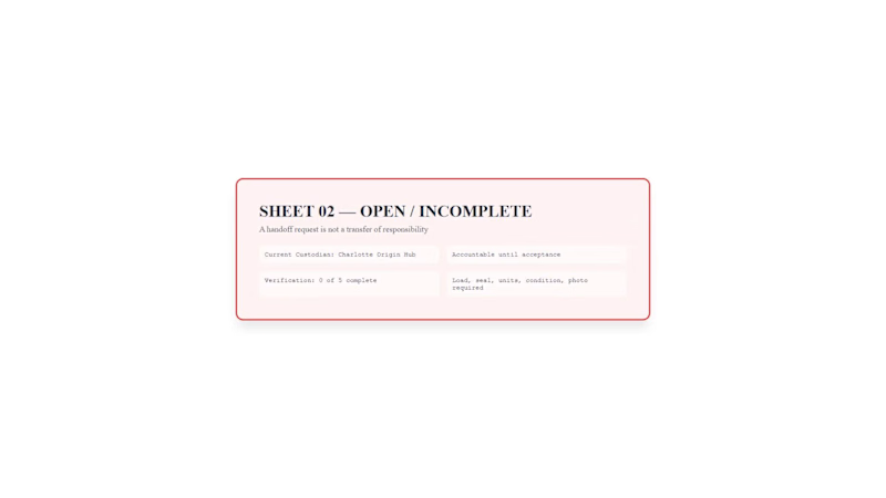
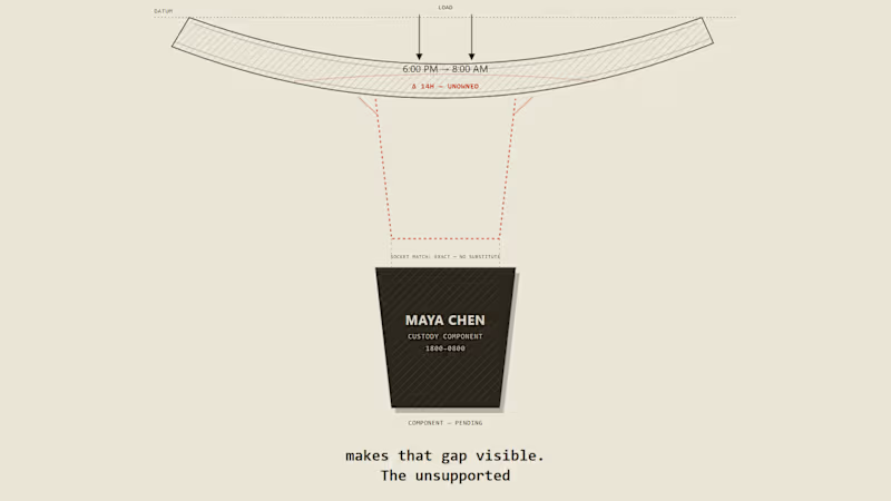
A handoff request is not a transfer of responsibility.
I built Northline, a custody passport for workflows where accountability must remain explicit during a handoff.
The receiver can verify the load, seal, units, condition, and photo evidence. Even when every check is complete, custody has not moved.
Only explicit acceptance creates the Transfer Imprint, locks the new custody sheet, and makes Northline the current custodian.
When the handoff expires, no imprint is created. Charlotte remains responsible. An exception can be assigned to Jordan Lee, but exception ownership does not transfer custody.
The central design principle:
Responsibility moves only when acceptance leaves a permanent imprint.
Live prototype:
https://faadil1.github.io/northline/
I’ll add a closer look at the accepted and expired states in the comments. Day 5/30: MISREGISTER
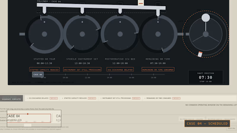
An operating-room case can still look ready on paper after it has stopped being operationally executable.
I built MISREGISTER to make that gap physical.
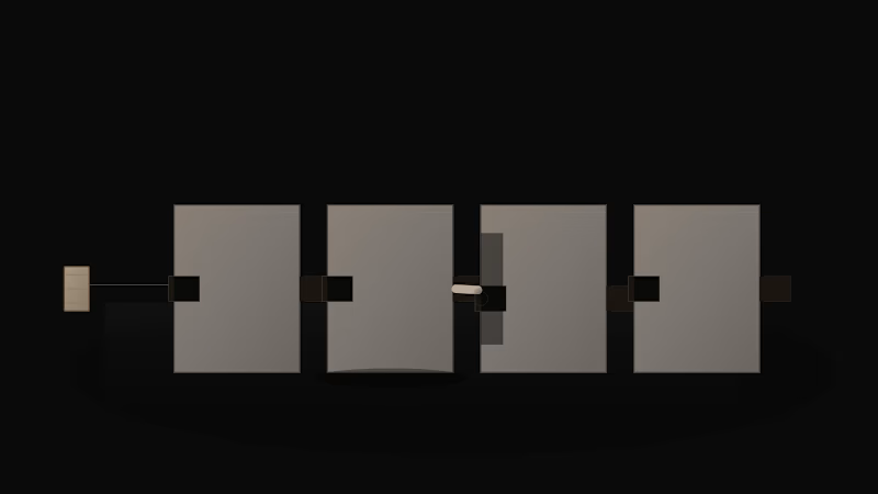
CASE 04 is connected to four changing dependencies:
— staffed OR team
— sterile instrument set
— postoperative ICU bed
— remaining operating-room time
As those windows drift apart, the operating list stays unchanged.
The signature moment: the crank freewheels to the end-stop while CASE 04 still reads SCHEDULED.
Only after that failed test does a human re-strike the case as DELAYED or RESEQUENCED.
This is not clinical decision support. It is a synthetic operational prototype exploring the difference between a scheduled slot and executable capacity.
Built with React, TypeScript, SVG, Playwright, Remotion, Claude Code, Kimi, Agent Reach, ChatGPT, and AI33Pro.
Live prototype:
https://faadil1.github.io/misregister-day-5/
Source:
https://github.com/Faadil1/misregister-day-5