The network for creativity
Join 1.25M professional creatives like you
Connect with clients, get discovered, and run your business 100% commission-free
Creatives on Contra have earned over $150M and we are just getting started
Back to feedPost
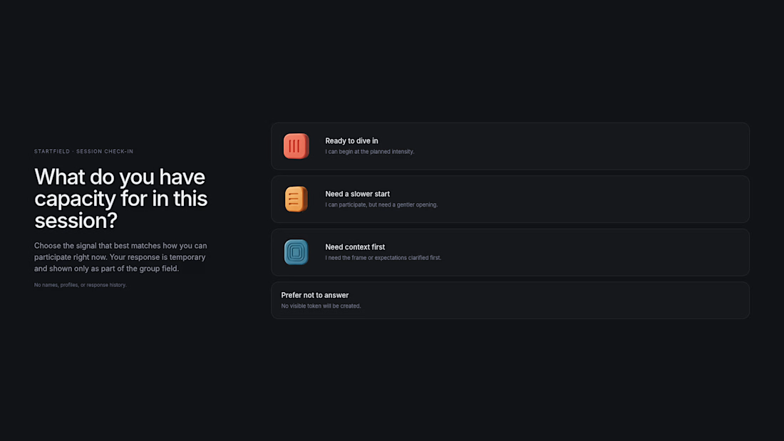
Most check-ins ask how people feel. STARTFIELD asks what the room has capacity for.
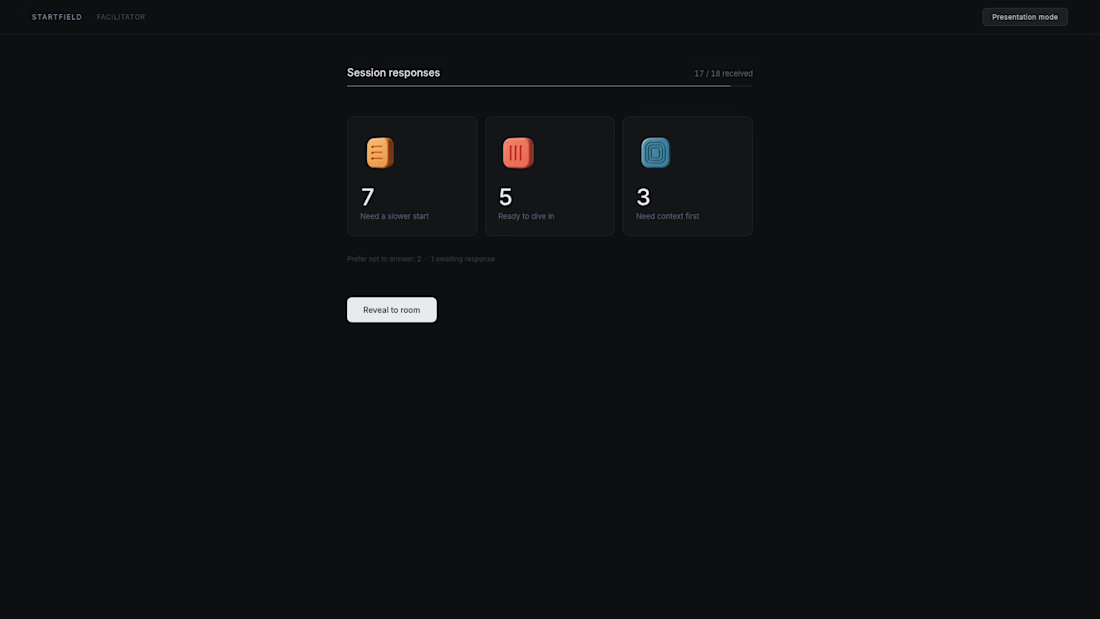
Two minutes before a workshop or team session, a facilitator often has to decide whether to begin as planned, slow down, add context, or reduce the scope.
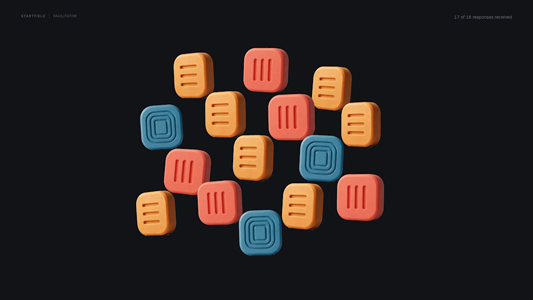
STARTFIELD turns three anonymous, temporary responses into a tactile collective field:
Ready to dive in
Need a slower start
Need context first
No names. No personal profiles. No historical tracking. No automated recommendation.
The field makes the group’s current capacity visible, while the final decision remains human.
Built as Day 12 of my 30 Days of Real Business Problems challenge, using Figma Make, original 3D token assets, and Animos for the presentation film.
The room resolves before the session begins.
Live prototype:
https://shrub-gong-08594418.figma.site
How should a facilitator read the room without turning a check-in into surveillance?



One of the best designs have seen so far today..... Keep up the great job

Thank you so much, really appreciate that. I wanted the visual system to feel calm and tactile without turning the check-in into another dashboard.

No names and no historical tracking is what makes this actually usable instead of another mood tracker nobody trusts. My guess on your own question: as long as the field only shows aggregate state and resets every session, it stays a tool instead of a record. Did anyone in testing push back on that assumption anyway?
That’s exactly the boundary I was trying to protect: the field should help with one session, then disappear rather than becoming a record about the team.
I haven’t run broad live testing yet, so I can’t claim that assumption has been fully validated. The current version is a...
The network for creativity
Join 1.25M professional creatives like you
Connect with clients, get discovered, and run your business 100% commission-free
Creatives on Contra have earned over $150M and we are just getting started

Challenges
View all


Related posts


A look at the identity we designed for Vetti, a dog health monitoring brand.
There’s a lot of data behind a product like this but the person using it just wants to know their dog is okay.
That’s the balance in the design with a connected dot system that feels precise and warm colors and photography that keep it close to what people care about.
Also, an excellent excuse to spend far too long choosing dog photos.


Engaging website for a New York–based architecture and construction studio, balancing bold typography, immersive imagery and a minimal editorial layout.


Wonder -- Visual Expressions


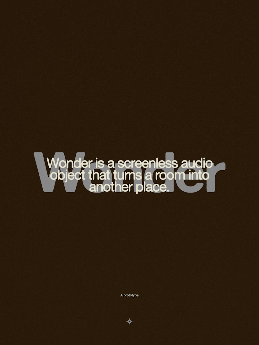


The restraint in the warm palette really lets the sound-object concept breathe—especially that shift from readable type to atmosphere.


