Freelancers using Canva in Federal Capital TerritoryFreelancers using Canva in Federal Capital Territory
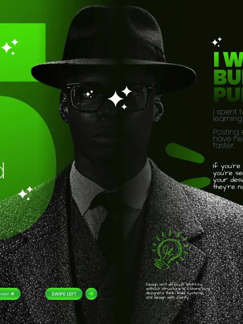
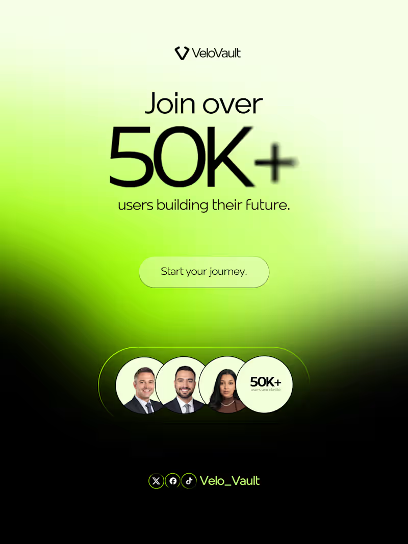
Social Media designs for Brands that want to stand out
5.0
Rating
147
Followers
Social Media designs for Brands that want to stand out
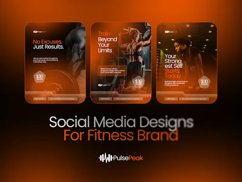
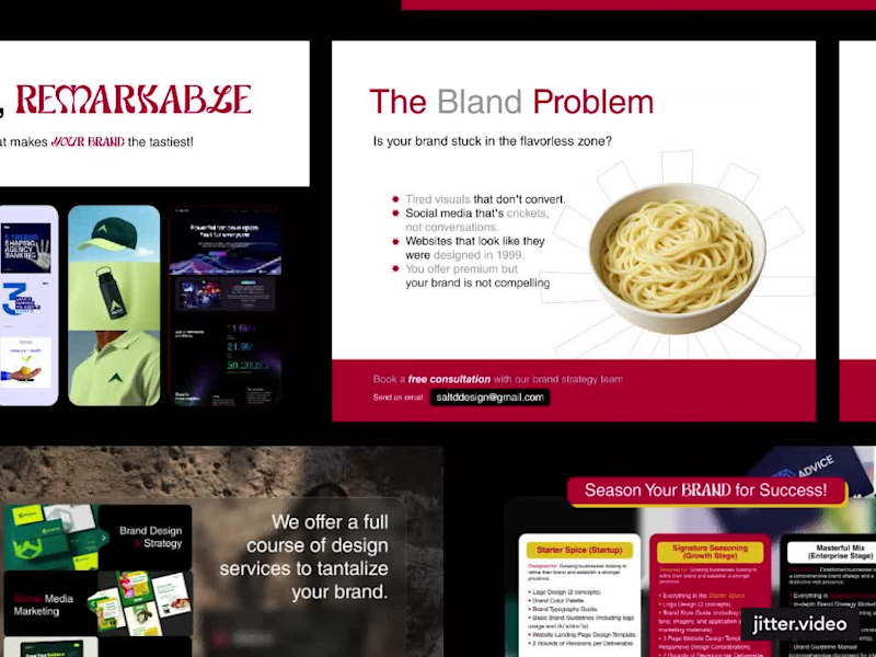
Tastefully Crafting Remarkable Brand Experiences ⚡⚜️
5.0
Rating
21
Followers
Tastefully Crafting Remarkable Brand Experiences ⚡⚜️
Cover image for Building the "Do More" UI:
Building the "Do More" UI: From Sketch to Vision When I set out to design the Do More app, my mission was to translate a very specific set of requirements—raw sketches and a clear functional hierarchy—into a high-end, minimalist productivity tool. I wanted to move beyond the typical cluttered task manager and create something that felt both authoritative and inspiring. Here is how I brought the "Do More" vision to life: The Aesthetic Foundation I leaned heavily into a high-contrast dark mode, utilizing a deep black background and crisp white typography. While the brief called for a black-and-white scheme, I made the executive decision to introduce muted accent tones—soft purples and mint greens. I used these sparingly to highlight progress bars and active states, ensuring the interface feels alive rather than static, without sacrificing that clean, "Opal-inspired" sophistication. The Home Page: Instant Clarity On the Home page, I focused on immediate orientation. I placed the date selector right at the top with a "Yesterday, Today, Tomorrow" pill toggle so the user always knows where they stand. Underneath a daily motivational quote, I dedicated the largest portion of the screen to "Focus Now." This section acts as the app's brain, intelligently merging prioritized long-term goals with immediate to-do items to eliminate decision fatigue. The Everyday Page: Actionable Structure For the Everyday page, I followed the brief’s request for a top-heavy calendar. This allows users to see their goal-driven deadlines at a glance. Below that, I reimagined the standard To-Do list. Instead of basic bullet points, I designed rounded-rectangle cards that feel tactile and modern. I also integrated a dedicated "Memories" block, providing a seamless space for the requested journaling feature without cluttering the daily task flow. The Goals Page: Mapping the Dream This is the heart of the app. I titled this section "Long-Term Visions" to elevate the stakes. I structured each goal as a comprehensive card where the "Dream" (the long-term goal) sits in bold, prominent text at the top. Underneath, I mapped out the "Steps"—the short-term pathway required to get there. To make these visions feel attainable, I integrated high-quality, atmospheric imagery into each card, turning a simple list into a visual bucket list. Ultimately, I wanted Do More to feel like a premium digital sanctuary for achievers. By balancing functional constraints with a "human-first" design philosophy, I’ve created a UI that doesn't just track tasks—it architecturally guides users toward their biggest ambitions.
0
28
Social Media Manager driving growth through planned strategy
New to Contra
Social Media Manager driving growth through planned strategy
Web/graphics designer
10
Followers
Web/graphics designer
Passionate Visual Identity Designer with Experience