The network for creativity
Join 1.25M professional creatives like you
Connect with clients, get discovered, and run your business 100% commission-free
Creatives on Contra have earned over $150M and we are just getting started
Back to feedPost
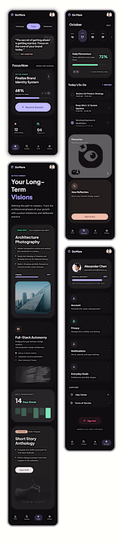
Building the "Do More" UI: From Sketch to Vision
When I set out to design the Do More app, my mission was to translate a very specific set of requirements—raw sketches and a clear functional hierarchy—into a high-end, minimalist productivity tool. I wanted to move beyond the typical cluttered task manager and create something that felt both authoritative and inspiring.
Here is how I brought the "Do More" vision to life:
The Aesthetic Foundation
I leaned heavily into a high-contrast dark mode, utilizing a deep black background and crisp white typography. While the brief called for a black-and-white scheme, I made the executive decision to introduce muted accent tones—soft purples and mint greens. I used these sparingly to highlight progress bars and active states, ensuring the interface feels alive rather than static, without sacrificing that clean, "Opal-inspired" sophistication.
The Home Page: Instant Clarity
On the Home page, I focused on immediate orientation. I placed the date selector right at the top with a "Yesterday, Today, Tomorrow" pill toggle so the user always knows where they stand. Underneath a daily motivational quote, I dedicated the largest portion of the screen to "Focus Now." This section acts as the app's brain, intelligently merging prioritized long-term goals with immediate to-do items to eliminate decision fatigue.
The Everyday Page: Actionable Structure
For the Everyday page, I followed the brief’s request for a top-heavy calendar. This allows users to see their goal-driven deadlines at a glance. Below that, I reimagined the standard To-Do list. Instead of basic bullet points, I designed rounded-rectangle cards that feel tactile and modern. I also integrated a dedicated "Memories" block, providing a seamless space for the requested journaling feature without cluttering the daily task flow.
The Goals Page: Mapping the Dream
This is the heart of the app. I titled this section "Long-Term Visions" to elevate the stakes. I structured each goal as a comprehensive card where the "Dream" (the long-term goal) sits in bold, prominent text at the top. Underneath, I mapped out the "Steps"—the short-term pathway required to get there. To make these visions feel attainable, I integrated high-quality, atmospheric imagery into each card, turning a simple list into a visual bucket list.
Ultimately, I wanted Do More to feel like a premium digital sanctuary for achievers. By balancing functional constraints with a "human-first" design philosophy, I’ve created a UI that doesn't just track tasks—it architecturally guides users toward their biggest ambitions.
The network for creativity
Join 1.25M professional creatives like you
Connect with clients, get discovered, and run your business 100% commission-free
Creatives on Contra have earned over $150M and we are just getting started
Related posts
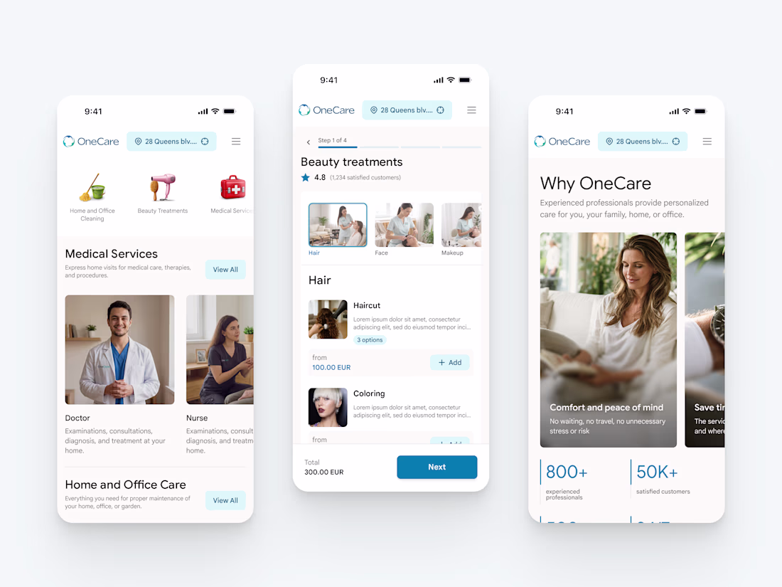
New project in the works - OneCare.
One app for premium care delivered to your address. Cleaning, beauty, healthcare at home, handyman, plumbing, pest control, pet care, laundry, and a lot more.
More to come soon 🤌
Nice work
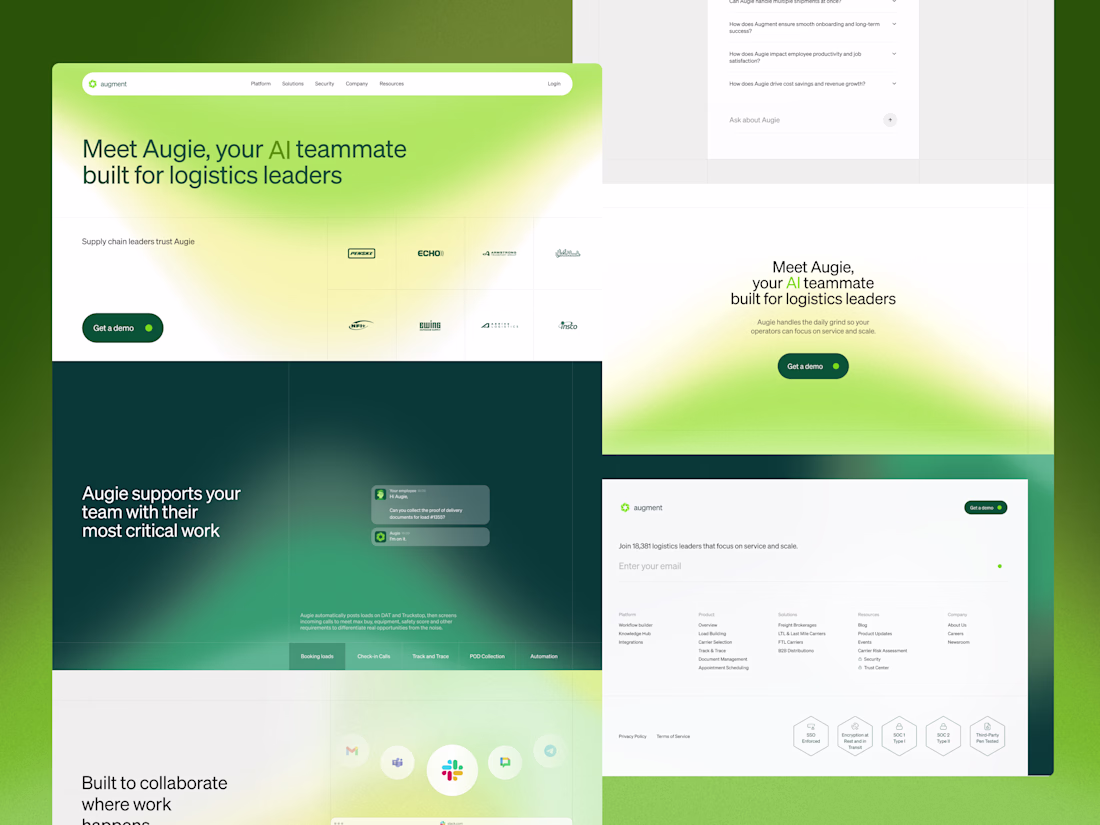
The strategic challenge for the full website was sequencing. A logistics leader landing on this page may understand the problem Augie solves but not yet understand what AI actually does for their team day to day.
Each section was built to answer one specific question in the order a visitor would naturally ask it. What does Augie do. Does it work with the tools we already use. Is it built for our specific type of operation.
Green runs through every section consistently, carrying the same brand language from trade show booth to digital so the brand feels the same wherever the audience encounters Augment. The grid gives the page rhythm without making it feel rigid, each section carrying its own structure while elements occasionally cross between them.
Another project wrapped up! 🙌
I recently designed this homepage with a focus on simplicity, clarity, and creating an engaging user experience. It's always exciting to see ideas evolve into polished interfaces.
Would love to hear your thoughts!
Trending
Claude
Claude has entered the design space. How are you using Claude Design?
Contra University
Learn from expert creatives how to earn more using next-gen AI tools.
creativeaiflow
Creative AI workflows are evolving. What tools do you use, and what are their strengths and weaknesses?
freelancerlife
Freelancer life is wins, pivots, and everything in between. What’s yours right now?