
peter kolawole
A digital Marketer || Website Designer || Graphic Designer |



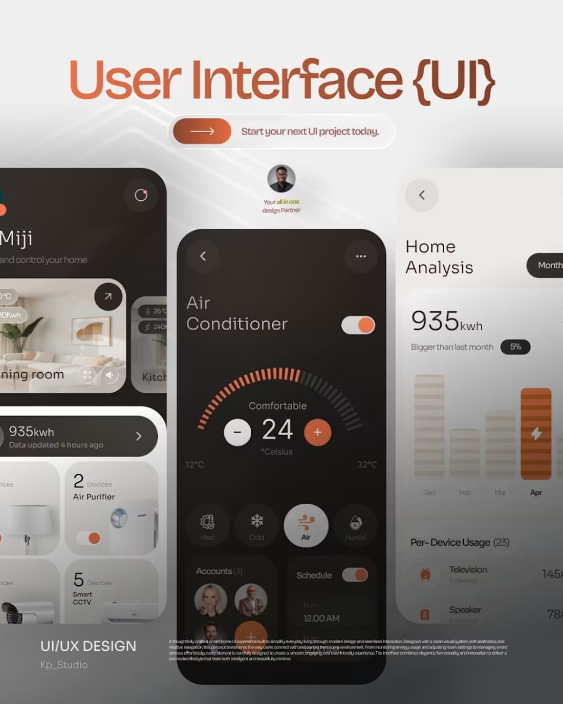
Designing for the home means designing for life's quietest moments.
This smart home UI concept started with a simple question: what does effortless actually feel like?
The answer wasn't more features — it was fewer friction points.
↳ Modern aesthetics that don't fight for attention
↳ Intuitive flows that anticipate, not complicate
↳ A digital experience that feels as natural as flipping a light switch
When your home just works, you stop thinking about technology and start living again.
That's the experience worth designing for.
#UIDesign #SmartHomeUI #UXDesign #InterfaceDesign #DigitalDesign
3
68
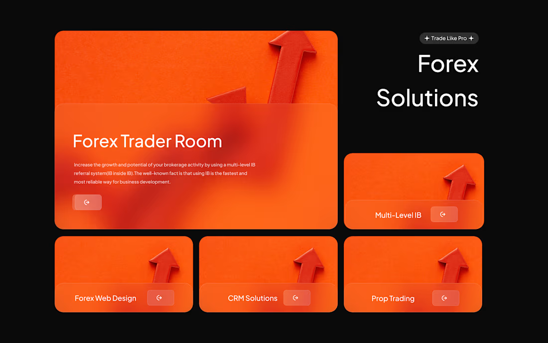
This project is a modern landing page design for Techysquad, a web design and digital agency. The goal was to create a professional, tech-focused interface that immediately establishes authority in the web development and Forex CRM space.
The design features a sleek dark theme with vibrant lime green and orange accents to guide the user's attention to key services like PHP development and SEO. I focused on a clean, centered layout with a strong value proposition, using card-based navigation and social proof elements to build trust and ensure a seamless browsing experience.
2
2
122
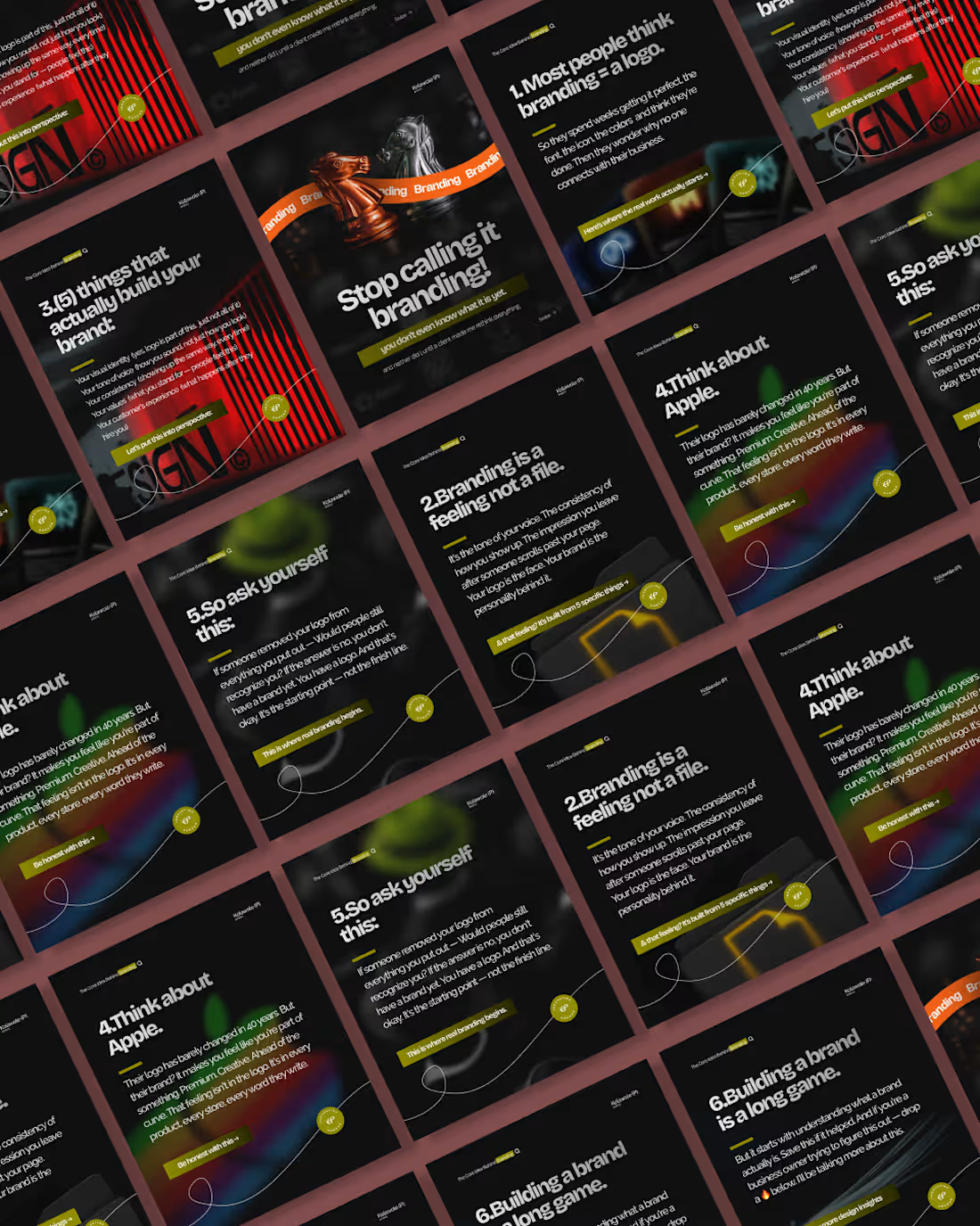
This project is an educational social media carousel designed to simplify complex marketing concepts into engaging, "bite-sized" content. The primary goal was to create a visual journey that explains the difference between a simple logo and a complete brand identity in a way that is easy for business owners to understand. By breaking the topic down into a story-driven, five-step format, the design keeps users interested and encourages them to swipe through to the end.
The design uses a modern "dark mode" aesthetic, featuring high-contrast text and glowing gradients that make the information stand out on a mobile screen. I chose bold 3D elements, such as chess pieces, to serve as eye-catching anchors that stop users from scrolling past the post. Every slide maintains a consistent professional layout, ensuring that the brand’s message remains the main focus while demonstrating a high-end digital style.
Overall, this work highlights my ability to combine strategic storytelling with clean typography and social media design. It shows how I can take deep academic or professional ideas and turn them into visual content that is both beautiful and functional for growing a digital presence.
1
103
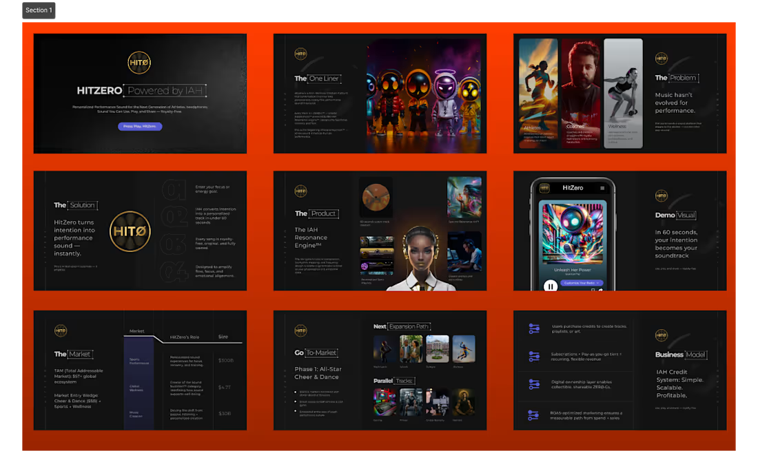
The Concept: HitZERØ is a high-tech platform that uses AI to create professional music instantly. It’s designed for athletes, gamers, and content creators who need powerful, high-energy soundtracks for their work.
What I did:
I designed a 10-slide presentation (Pitch Deck) to help the brand explain its business to investors. The goal was to make the complex technology look exciting and easy to understand.
Design Highlights:
Bold Style: I used a "Dark Mode" theme with bright orange accents to give it a fast, futuristic, and energetic feel.
Clear Information: I turned complicated market data and business plans into simple, clean layouts that are easy to scan.
Modern Visuals: I used high-quality 3D images and mockups to show exactly how the AI app would look and feel in real life.
Key Results:
The final deck clearly explains the "Problem" (music is hard to make), the "Solution" (our AI engine), and the "Market" (a multi-billion dollar opportunity).
1
134