Branding Identity Designer
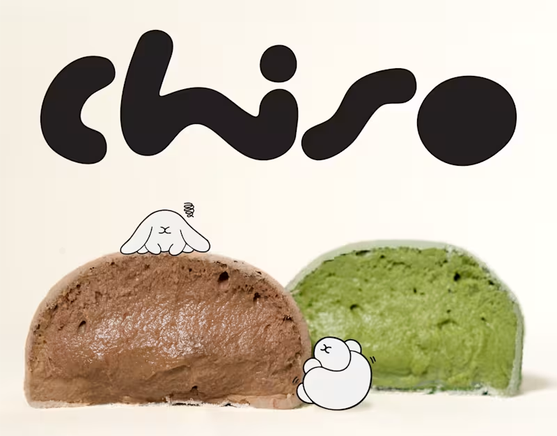
Chiso | Branding & Packaging Design
A good brand is more than what meets the eye. It's how every little detail comes together.
For Chiso, we explored a visual direction inspired by Japanese aesthetics, bringing together a distinctive logotype, soft visual elements, and thoughtfully designed packaging for mochi and soy milk.
From the typography to the packaging details, each element was designed to create a consistent identity that feels fresh, playful, and effortlessly recognizable.
A simple idea, thoughtfully brought to life.
0
13
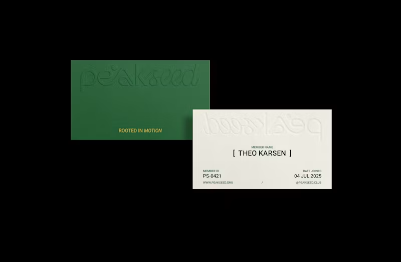
Peak Seed | Brand Identity
Inspired by the trail culture and alpine landscapes of Chamonix, France, Peak Seed is a mountain running community that sees running as more than a pursuit of performance. It is a continuous journey of movement, awareness, and connection with nature, ourselves, and one another.
The logotype combines organic typography with a defined geometric structure, balancing fluidity with precision. Its flowing curves and connected letterforms draw inspiration from the rhythm of each stride, the breath that sustains it, and the ever-changing contours of mountain trails.
The resulting identity reflects Peak Seed’s philosophy: moving freely while staying grounded, embracing the journey while remaining consistent, and finding connection along every path.
Have a brand in mind? Let’s build something meaningful together.
0
57


Crafting Brands That Last 🚀


Brand Identity Designer | Logo Design & Premium Branding
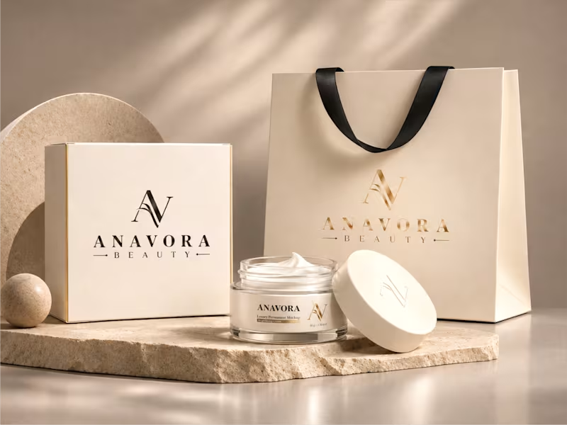
ANAVORA BEAUTY — Luxury Beauty Brand Identity
ANAVORA BEAUTY is a refined luxury beauty brand identity created to establish a timeless and versatile visual foundation for a growing beauty business.
The identity centers around a sophisticated AV monogram paired with an elegant wordmark, supported by a soft champagne-gold and warm neutral color palette. The system was designed to communicate luxury, elegance, trust, and professionalism while remaining flexible across both digital and physical applications.
1
210
Hot Milli — Bold Identity, Refined Experiences.
A digital presence designed to bring the Hot Milli brand to life through a bold visual direction, rich tones, and an editorial-inspired layout.
A balance of character, aesthetics, and visual storytelling.
Designed to make an impression.
1
308
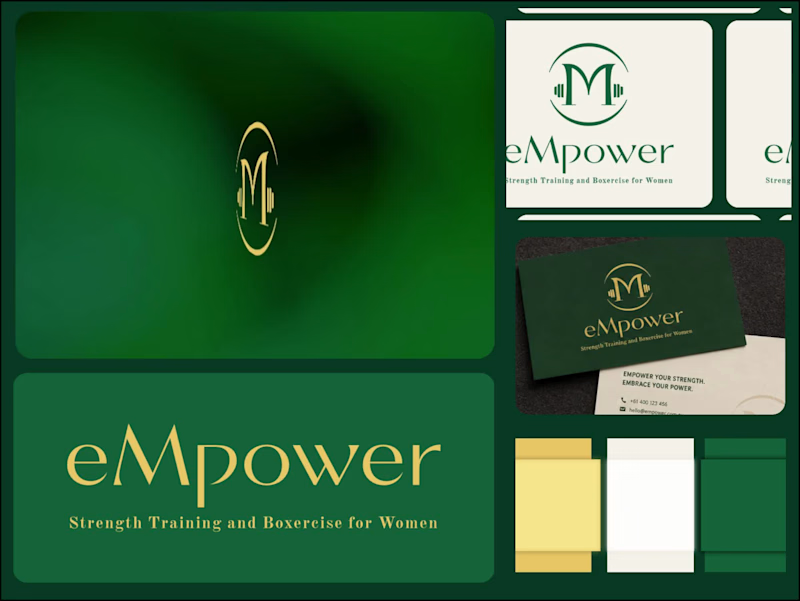
eMPower — Building a Brand Identity Around Strength and Confidence.
A brand identity should do more than look good. It should communicate a brand’s purpose, personality, and values through every visual detail.For eMPower, a women-focused strength training and exercise brand, the direction combines deep emerald green, warm gold, and soft neutrals to create a visual identity that feels confident, refined, and empowering.
From the monogram and wordmark to the color palette and brand applications, every element works together to create a cohesive visual language.The goal was simple: create an identity that feels strong without losing its elegance.
Services: Logo Design · Brand Identity · Visual Direction
1
359

Design Agency for Stand Out Businesses
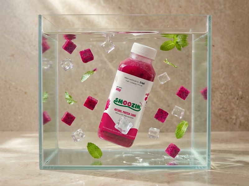
SMOOZIN is a dragon fruit-based beverage positioned as a Natural Protein Shake, combining pasteurized egg whites, dragon fruit, and stevia. We developed a packaging design that balances the product's natural fruit identity with its protein shake positioning, creating a fresh, simple, and appealing visual presentation. Using a soft red color palette and distinctive dragon fruit imagery, the design enhances product recognition while clearly communicating the brand name, tagline, and essential product information. The final packaging delivers a cohesive and approachable brand identity, tailored to a 500g polypropylene bottle and designed to stand out through its clean and well-balanced layout.
0
54
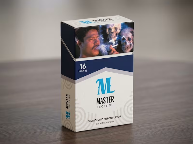
Premium Packaging Design for Master Legends
For Master Legends, a distinctive tobacco brand, we designed a refined and highly recognizable packaging identity that perfectly captures its bold character.
Guided by the client's specific vision, we crafted a custom "M" logo and applied a clean, premium white color palette with sophisticated navy blue accents across two distinct flavor variants (Orange and Melon). The final design delivers a structurally precise and visually compelling presentation that successfully elevates the brand's shelf presence and appeals to its target market.
Ready to make your product stand out with stunning, tailor-made packaging? Let's colaborate to bring your vision to life!
0
92
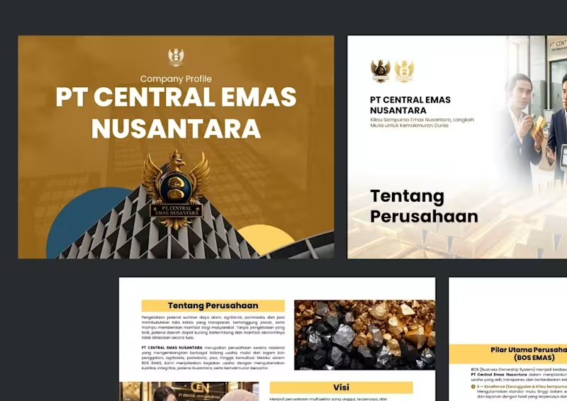
Unifying Complex Operations: Crafting a Premium Company Profile That Drives Growth.
For PT Central Emas Nusantara, an Indonesian multisector enterprise spanning mining, agribusiness, tourism, and consulting, the challenge was consolidating diverse operations into a single, cohesive corporate identity.
We designed a highly structured and visually compelling company profile that seamlessly aligns their expansive business portfolio with their core values and long-term vision. By translating multifaceted services into a clear, credible, and engaging narrative, this project successfully elevated their brand presence to attract high-value partners.
Ready to make a powerful first impression and showcase your company's full potential? Let’s collaborate to craft a premium company profile tailored to elevate your business!
0
79


Graphic Designer | Logo, Pitchdeck, Branding


Logo & Brand Identity Design


Brand Identity Designer for Startups & Modern Businesses
Brand Identity Designer for Startups & Modern Businesses


Exhibition & Event Designer | Brand Designer | AI-Powered
New to Contra
Exhibition & Event Designer | Brand Designer | AI-Powered